The bar chart (Invented by William Playfair) is tool used to visually represent categorical data. Categorical data is derived from qualitative data and parsed into discrete groups (Ex. Month of Year, Country of Origin). This form of visualization lends itself best for comparison between categories of data. The bar chart is different from a histogram which uses bars to graphically represent the frequency of quantitative data.
Pre-processing that needs to occur between the raw data and the resultant chart consists of ensuring the data is parsed into proper groups and considering the axes. There are two axes in a bar chart the x axis and the y axis. One axis shows the categories being compared, and the other axis represents a distinct value.
The bars are rectangular shapes that are proportional in height or length to the value they represent, as bar charts can be either horizontally or vertically aligned. The bars need to be the same width and there is proportional space between each bar. Colour is used to represent the categories. Multiple colours can be used for comparison purposes or to represent sub-categories.
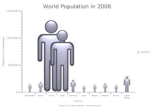
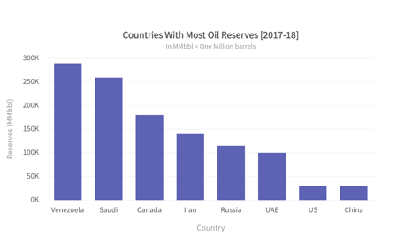
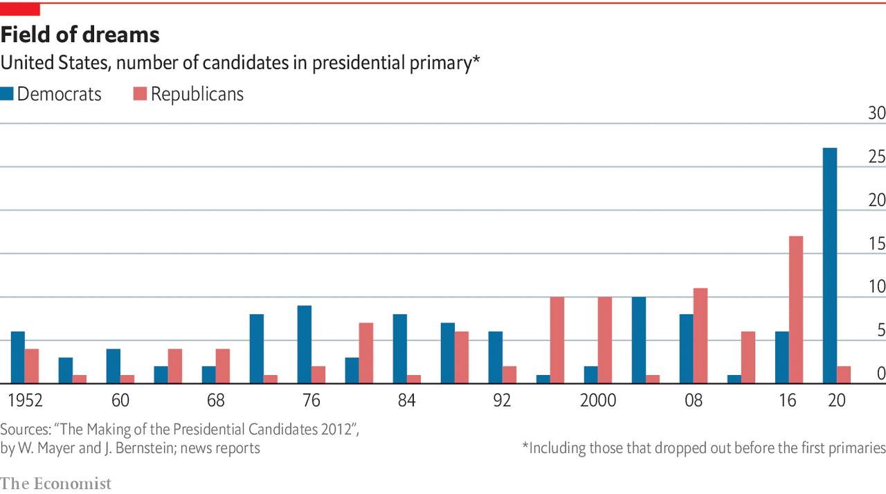
Good examples
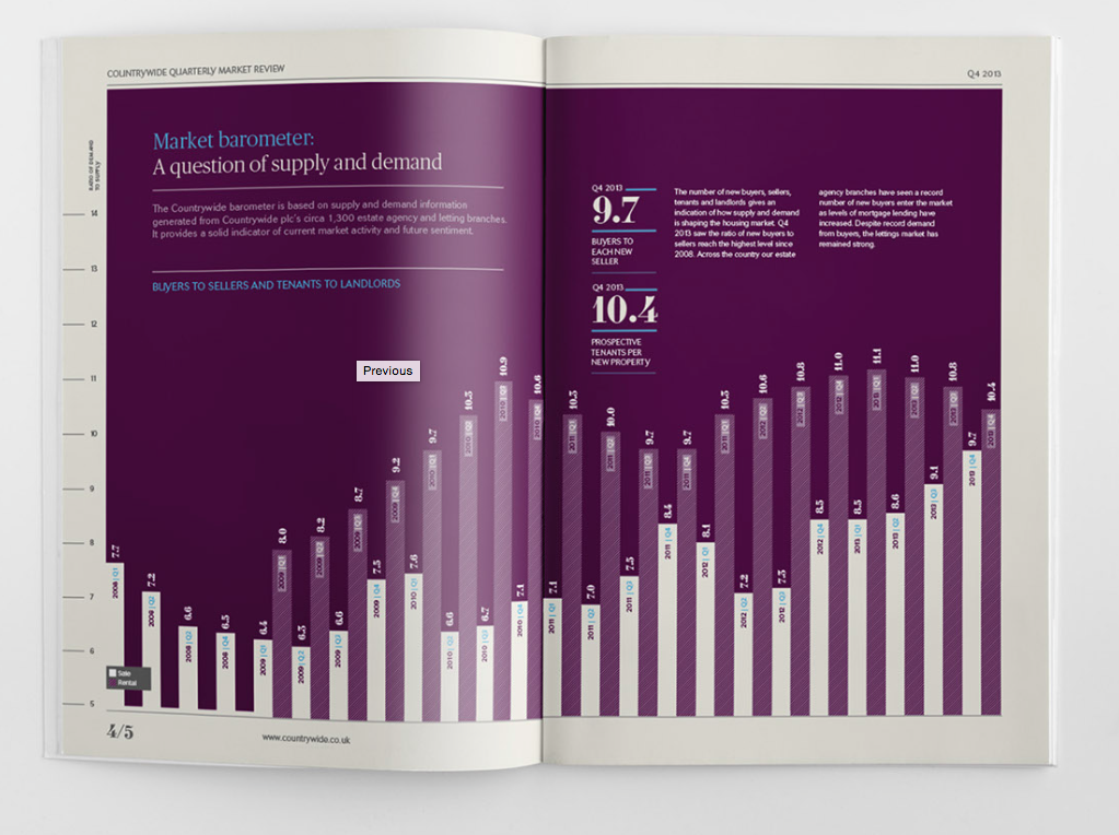
Not the best examples