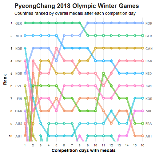
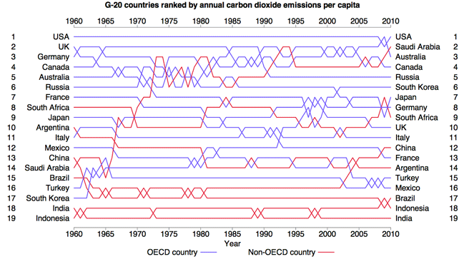
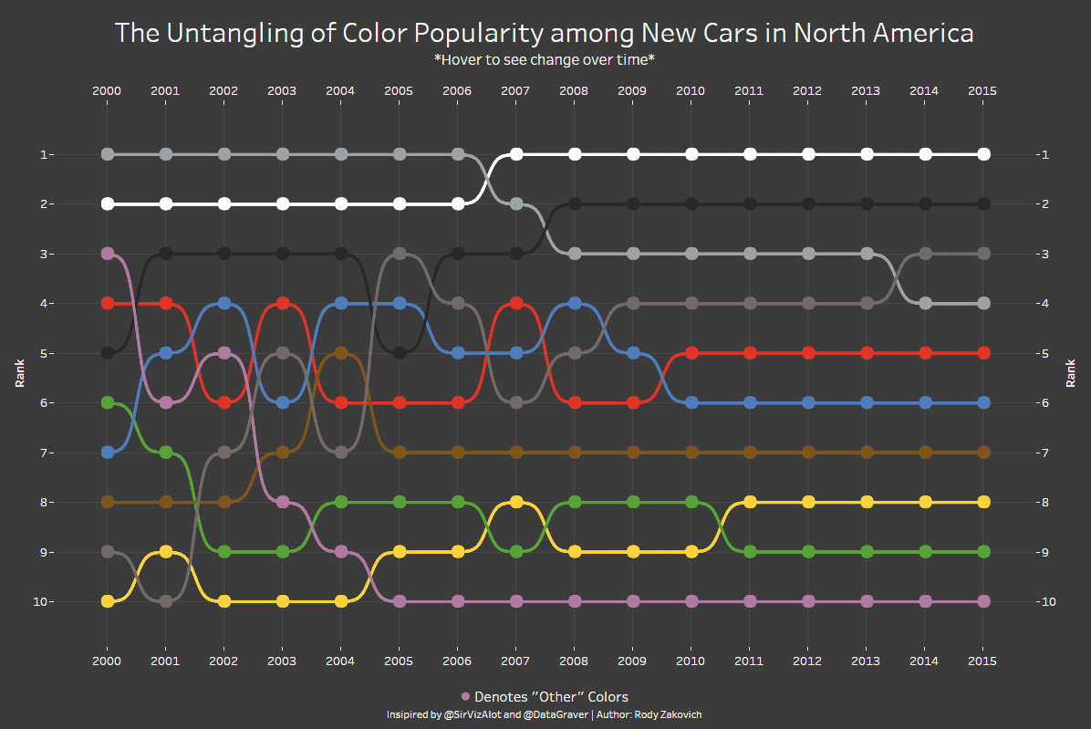
Bump charts offer viewers a concept of ranking by comparing values of similar entities over time or place. Line, Area, and Stream graphs are close in composition to bump charts, with the main difference being each line represents an entity within a certain category, and the comparitive value (ranking) is the goal of the expression. Each line can also show the volume of the entity's data, as you can see in the example below. The values represented are quantitative/numerical, usually in interger form, but could possibly show percentages or fractions in other situations.
Pre-processing is involved in this graph type. Totals need to be calculated at defined time intervals, and those are then associated to each entity and then related to the totals of other entities in the same category, giving us a ranking at each interval. As lines cross eachother along the graph, it would define a change in ranking between two entities.
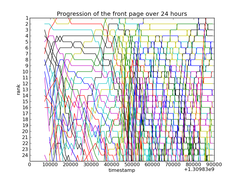
There are many things going on within the mapping and resultant display of this graph. Entities are being compared to one another, their values dynamically display on the Y-axis, and all of this is realted to the context of time on the X-axis. It is important to be mindful of the amount of entities you choose to analyze becasue, as you can see in the poor chart examples, the information can be lost in too many colors or overlapping lines. Also, the relative thickness of the line needs to be thoughtfully chosen and scaled.
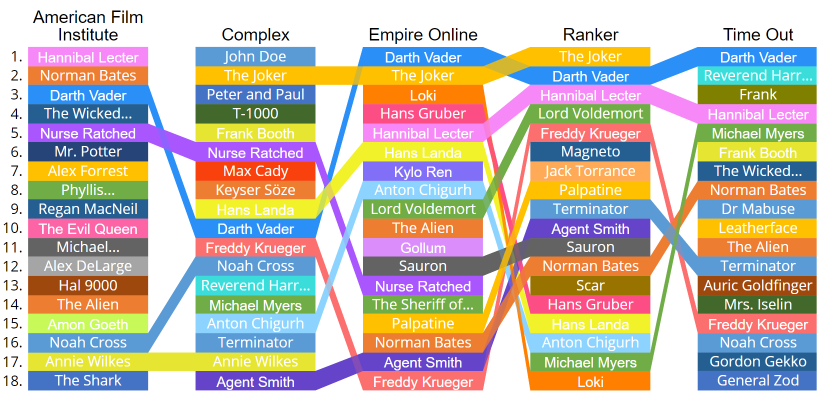
Good examples:
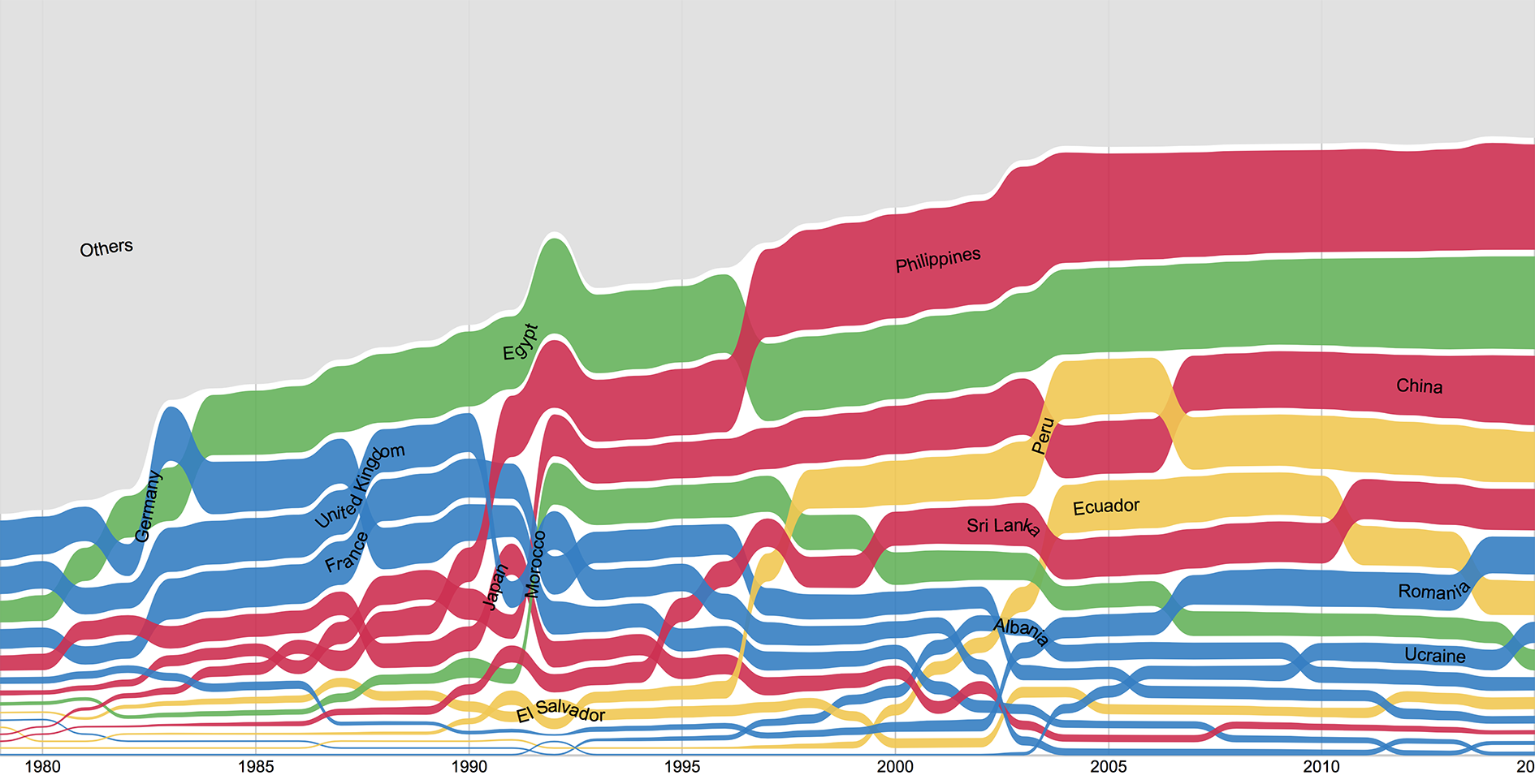
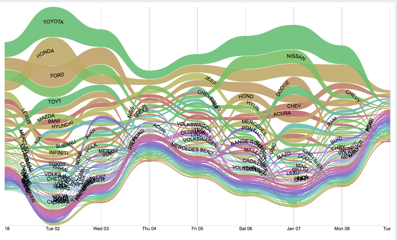
Not so great examples: