Choropleth maps depict variations in spatial data by shading geographic areas according to a statistical measure. They make use of a gradient of hue, value, and texture, and often follow pre-defined geographic boundaries such as census tracts, cities, states, or countries.
Values
The choropleth map can represent various values including percentages, percentiles, rates, integers , and fractions by grouping these values into graduated categories (from small to large etc.).
Pre-processing
Raw data must be linked spatially to areas on a map, and categorized into brackets or organized using break points. Common groupings include equal intervals, quantiles, jenks, and natural breaks.
Mapping
Choropleth maps utilize a gradient of colors, values or patterns to represent the spectrum of values across an area for a given variable. An increase in the statistical value of measure is reflected by a proportionate change in value or texture of the fill in the geographic area of the map.
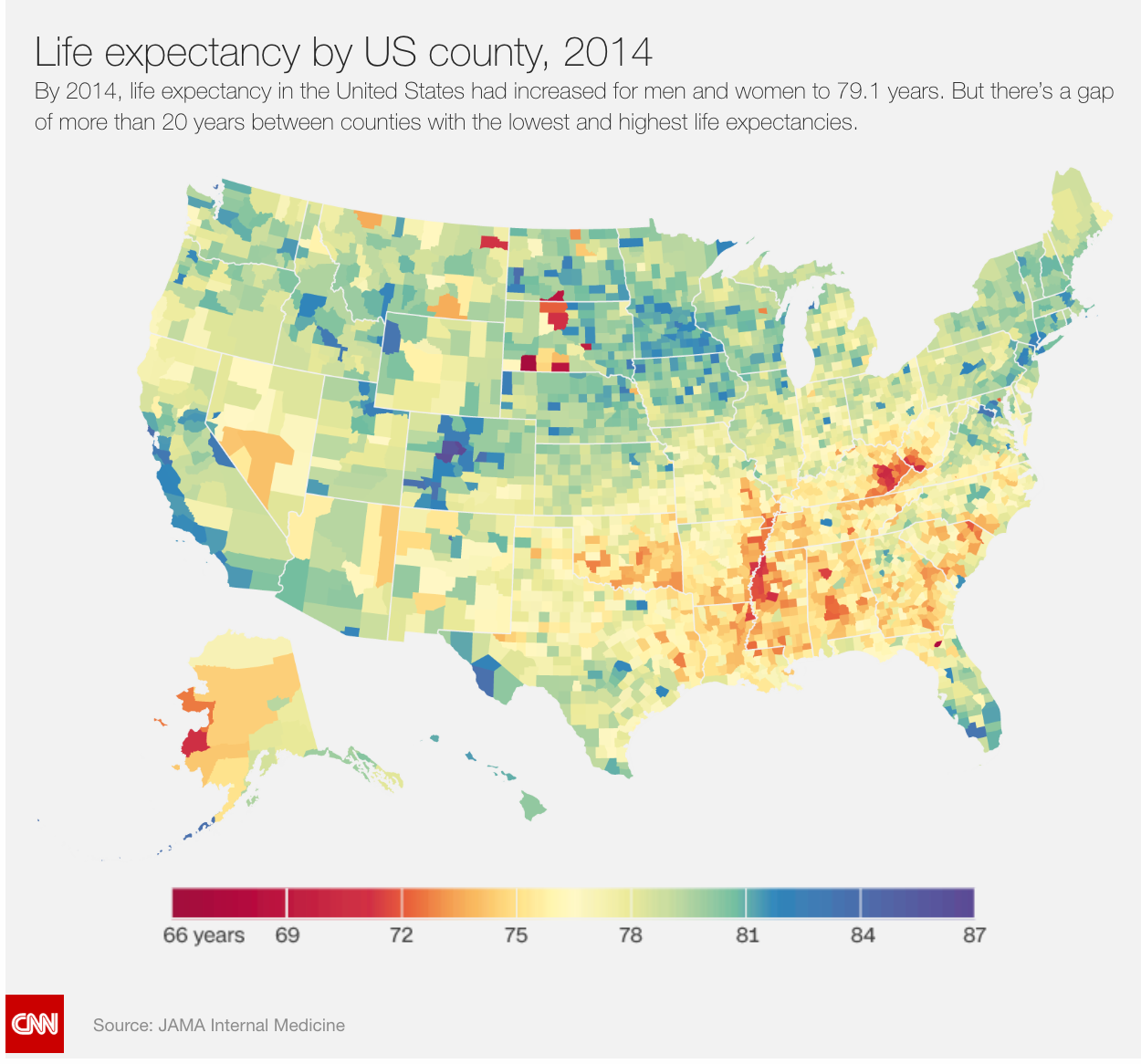
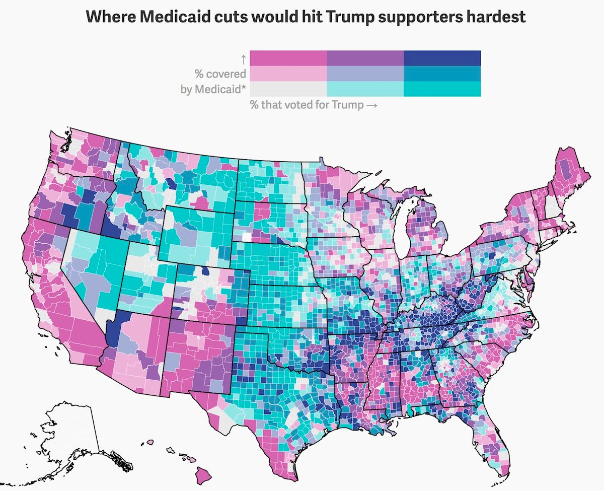
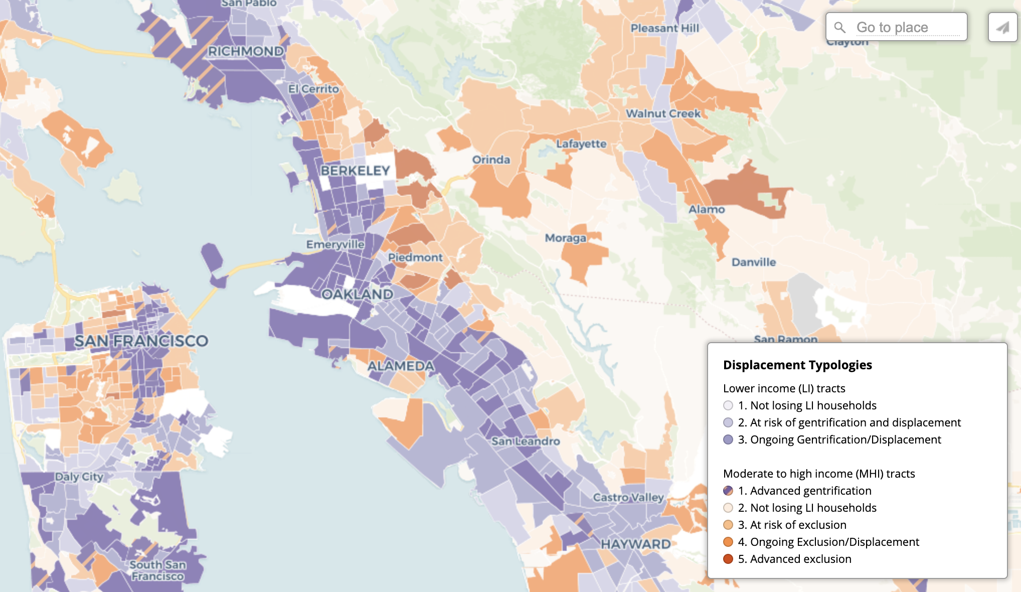
Good Examples
CNN - Life Expectancy
Quartz - Donald Trump's "mean, mean mean" health care bill is meanest to his most crucial voters (Bivariate choropleth map)
Urban Displacement Project - Displacement Typologies in the Bay Area
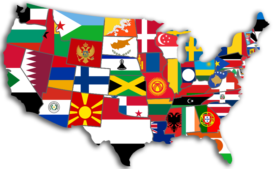
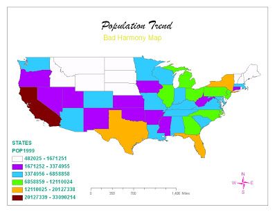
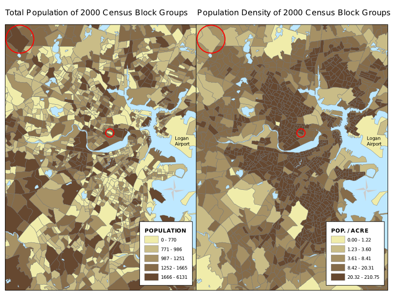
Bad Examples
Too many patterns - Map of the US state populations using country flags with comparable population size
Non-intuitive color scheme - Population of the US by State
Misleading due to lack of normalization - population by census block group
References:
https://en.wikipedia.org/wiki/Choropleth_map