What is it?
-Showing relationship among entities through hierarchy.
-Showing simliarity among entities by the physical distance within the graphic.
- doesn't seem like a graphics. more like a table or some... something like another series of text set.
Does it require you to do pre-process the raw data?
Of course. I believe all the data visualization tools require this... (I'm not sure though.)
It demands a huge amount of work in advance to visualizing it. Because you have to have a deeper understanding of the relationship among single entities such as how much are they close/similar to one another, what seats on top of the entities in terms of hieararchy... stuff like this. Just by collecting and sorting the data is never enough.
The downside of this analysis is it doesn't seem to convey numerical analysis well. It focuses more on the relationship and hierarchy among entities.
Examples
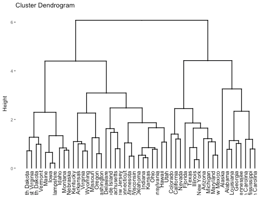
Bad ones-1

first,
hard to read.
The X-axis shows what are the entities and the distance between individual entities tells you how similar and strongly related among entities. Since the single object in the axis are very packed, it is hard to read the information as well as it is even hard to read what it is.
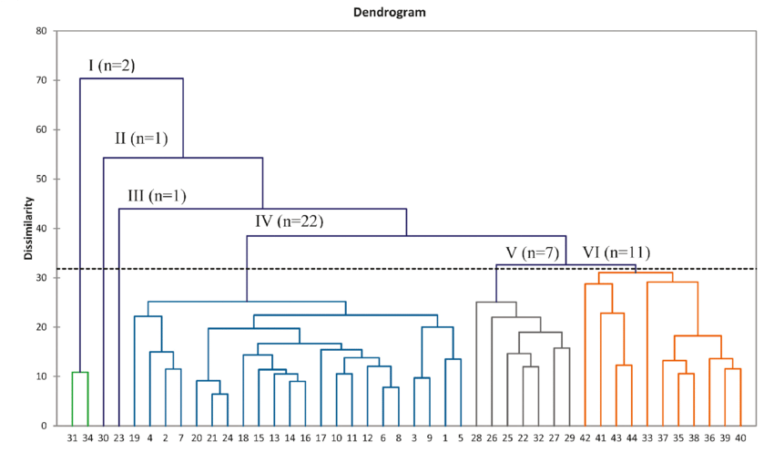
Good ones-1

This dendrogram solves the issue on the above bad example. It groups four sub groups which tell you that entities in one color zone have similarities. And also individual entities have font color and branch colors as well. It enhances readability.
It could have been better if it tells you what X axis tells you about. The Y axis is Height. And it is shown on the visualization tool while X axis has no information about what X axis is. However, still it seems like a good example.
Bad Ones -2
Hierarchy doesn't seem intuitive. I believe people's intrinsic sense of hierarchy is top-down, not in a horizontal way. Therefore, as a dendrogram, horizontal layout isn't a good idea. The coloration of entities are confusing too. Readers might expect proximity among related entities while it has scattered entities with one color.
Good Ones -2
Hierarchy and relationship is easy to read. Additional information/ note on each pivotal point helps to understand the data handled in the graph. The proximity among entities are easy to read and color variation depending on its sub groups are clear enough.
Bad Ones -3
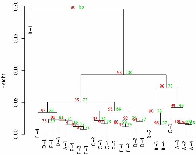
Additional notes on its anchor points are hard to read and too many information sits on the branch points. It confuses reader that it's hard to understand which data are main things to be understood. The size of notes and main entities are same as one another which leads to misunderstanding that color-coded information is more important information. In addition, B-1 entity on the upper left corner seems off context.
Good ones -3
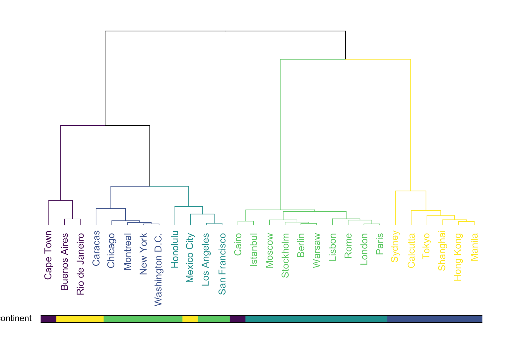
It's an improved version of the above bad example. The additional graphics below plays a helpful role in the graph. it becomes a legend for color code of entities in the graph so readers could easily understand the logic for sub grouping and refer back to the legend to identify what colors are meaning in the graph.