This series of readings, Robert Simmon lays out a simple guide of strategies and schemas to help with decision around color in visualization. It sets up set up a deceptively simple framework for choosing and working with color in visualization. Starting with conceptualizing color along three parameters:
- Hue: the pure pigment that can be objectively perceived from person to person
- Saturation: the intensity of the color
- Lightness: the variation in the perception of the color or color space's brightness/ tone
we can examine our decisions with respect to how human perception interacts with each parameter, and how meaning is encoded with color.
Another key set of distinctions are the different types of data:
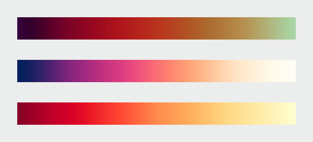
- Sequential: data is changing continuously
- Divergent: data has a midpoint from which both ends of the spectrum diverge
- Qualitative: data is categorical
With these two sets of first principles in place, some other key findings from research on perception and visualization come into focus:
- a palette should minimize errors from the color shifts introduced by nearby areas of differing color or lightness (simultaneous contrast)
- different palettes are suited for different types of data
- color scales with varied hues and contrast are suitable for representing different datasets.
Computer colors are linear and symmetrical, human color perception is non-linear and uneven
In the above statement, he cautions that designers must pay attention to the ways in which color, shape and space can collaborate to trip up human perception. Since visualizations should aim for universal comprehensibility, we must make adjustments for optical illusions or "artifacts" that the human brain can create where no data is actually being encoded.

For me, one of the most effective presentations of this phenomenon was "simultaneous contrast", in which the same color of grey (50% lightness) can be perceived dramatically differently when placed against a background that also changes lightness.
Calling upon the literature, Simmon advises that "a color scale should vary consistently across the entire range of values, so that each step is equivalent, regardless of its position on the scale. In other words, the difference between 1 and 2 should be perceived the same as the difference between 11 and 12, or 101 and 102, preserving patterns and relationships in the data."
To further support this point, we are duly warned to avoid the temptation to use the "rainbow color scale", as our brains have trouble correctly perceiving shifts in color, which can distort our perceptions of changing patterns in the underlying data.
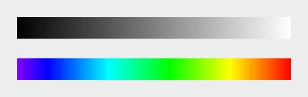
Instead, he advises us to combine a continuous increase in lightness with a shift in hue
this preserves both form and quantity.
Intuitive Color
The guidelines for what colors to use seem to continue to follow the internal logic of "picking the ones that immediately register as sensible to the human mind"
For example- water is blue in nature, therefore blue hues are the most natural candidate to represent water (unless the data is about water temperature- in which case a sequential red palette may work better)
Vegetation is green in nature, therefore so should it be in a visual encoding of the presence of vegetation on a map.
There is a slight caution here however to be aware of cultural biases in assuming that these associations can be universal (e.g. red might be an obvious choice for temperature, but it also has an implied significance in Western cultures for fiery emotion, evil, or "bad indicators, whereas in Eastern cultures, it has more positive connotations). This is more of a subjective note, and is more of a reminder to think about the intended audience/ be aware of such nuances between cultures.
Unfortunately I can’t provide any hard and fast rules to design visualizations that are aesthetically pleasing (or even beautiful). I can only encourage you to keep your eyes open. Look for good design, good art, and good visualization. Figure out why it works, and incorporate those elements into your own projects.
It was slightly deflating to have this disclaimer come only at the end of the 4th installment- is there really an objective way to make these calculations in every case given the research or is it all really still a matter of subjective judgement? How do we really know that we are making the right choice if intuition can still play such a large role?
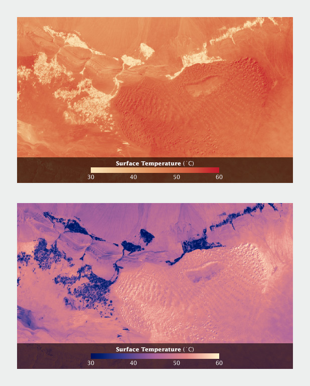
without any guidance on how this color scale works- would the average person realize that the white values in the second image actually represent higher temperatures? (my guess is no). This is the kind of artifact of the way humans are practiced to interpret colors and color scales that we are forewarned about.
My Concluding Thoughts
Color is still one of the most challenging aspects of visualization that I grapple with, even with these guidelines provide by Simmon. But that's why I'm grateful for the existence of Chroma.js and Color Brewer to minimize some of the anxiety around these choices.
Finally, since much of what is discussed in this reading relates exclusively to visualizations on computer screens/ static paper, I wonder how the psychology of color differs with real world/ 3-D printed visualizations?