Physical mapping is a visualization displaying a precise relative positioning of physical elements to each other in space. Physical elements can represent landforms and terrain, but also imaginary boundaries and measurement systems like borders, zip codes, or longitude and latitude. The physical map is a dynamic form of visualization, lending itself to a wide variety of representations and data types, all with the common constraint of displaying their relative locations in physical space.
Due to the level of abstraction and scale associated with physical maps, they often require significant interpretation by the end user. Many maps are presented with a legend, which is a key that enables the user to see what a symbol, texture, or color's meaning is supposed to be. Physical mapping also requires precise proportions, which, before the invention of longitude and latitude, meant that many maps often over- or under-estimated the relative placement and sizes of landmasses, oceans, or other physical elements.
Limiting Examples
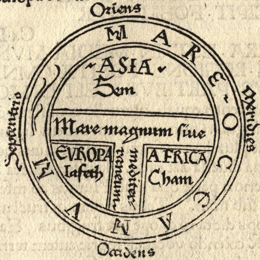
The first maps made no effort to be precise about the exact relative physical locations of their elements. In O and T maps, which stands for orbis terrarum, the world represented as a flat disc with three distinct continents, the only ones known to exist in medieval times. This particular map associates the inhabitants of each continent with a particular son of Noah: Ham, Shem, or Jaiputh, which according to medieval thinkers was the basis for physical differences among native populations of each continent.
Early maps are difficult for modern users to parse, due to their lacking of features which we today take for granted. In the above example, the orientation is top-eastward, and all our maps are oriented top-north. Secondarily, there is no specification of the actual, physical form of the landmasses or bodies of water between them, resulting in a very simple geometric form. However, it is possible that the map's design is meant to be more evocative than accurate.
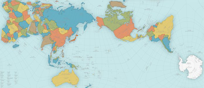
All physical maps are subject to a degree of distortion, especially considering that maps of the Earth are meant to represent a round, or more precisely, a shape of an oblate spheroid. The "projection" of this three dimensional object onto a two dimensional plane causes varying degrees of distortion depending on its layout. The map above uses a method of projection that causes a visible and unhelpful level of physical distortion. To see it, look at how warped the lines of latitude and longitude have become in order to graft the Earth onto this plane. This would mean that any scale in inches, that would represent a number of miles, would be inaccurate. Towards the equator, the latitude becomes stretched out even though each latitude-longitude "pane" represents the same overall area of the Earth.
The most common world map uses what is termed a Mercator projection, which makes sure all parallels of latitude have the same length as the equator, allowing for more accurate measurement of distances on the map from north to south. However, it suffers from slight distortion of longitudinal meridians, meaning that it is still not "perfectly proportionally" representing the physical distance between any two east-west points.
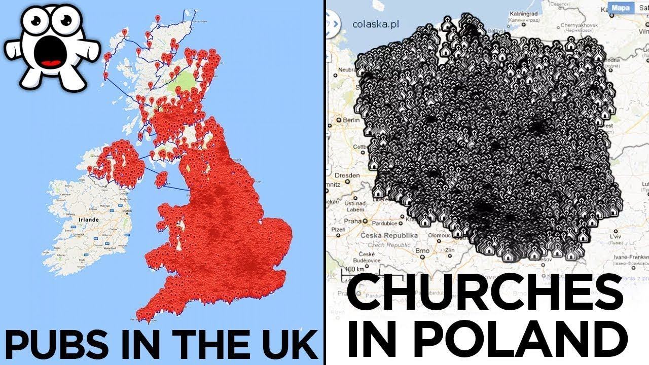
Even maps that are perfectly physically accurate suffer from problems. In this case, while there is little reason to doubt that each dot represents a physical church or pub, the information layer is too broad and too "zoomed out" to be useful. Maps work best when they focus on a theme - which is why on maps with many political features, such as borders, capitals, and major cities, you rarely see geographical or topographical features such as elevation represented, or, if they are, they are represented without words and usually as colors. Maps also work best when the theme they are exploring is at the proper scale. A physical map of New York with every single Starbucks highlighted may also overload the user of the map too much to be useful.
Interesting and Useful Examples
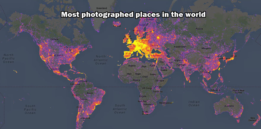
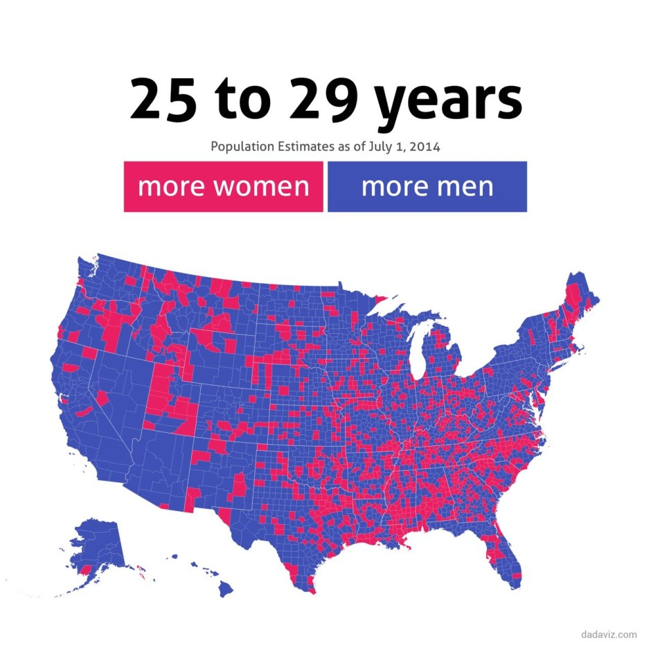
This map displays the most photographed places in the world. Projection of non-geographical data with a geographical vector onto a physical map is an interesting extension of physical mapping.This map's sparse use of topographical features or political boundaries and labels is quite effective, as well as its method of highlighting missing data. This map is a great example of how visualizing data can probe further questions about the underlying data, and may even reveal worthy areas of study and inquiry. In this case, it could mean that there are simply far more very concentrated groups of late twenties women, and late twenties men are more spread out per square mile. Women may tend to choose to live in locations with a large concentration of women, avoiding areas with too many men. Regardless, this map exposes some interesting topics. Show Comments