This chapter presented a sprawling thesis on the qualities that make some visualizations better than others. The recurring theme of each examination of that question is that "graphs as meant to be looked at by someone": Healy calls for a great deal of empathy for the audience of visualizations, taking into account how human perception interacts with shapes, colors (chrominance and luminance), depth, and angles. This was a sound mediation on a set of principles that Healy organized around the aesthetic, the substantive and the perceptual, and it was a sobering reflection on the fact that even tasteful, well-constructed graphics can mislead us.
A great example of this was the controversy of Yacha Mounk's "Democracy in Decline" small multiples chart: though elegant and seemingly succinct in delivering a persuasive hypothesis (that a decline in the belief in democracy was becoming more pervasive among youth in Western societies), the chart was misleading because the data was presented as a longitudinal study, rather than the contemporary responses of people born in different decades. These sorts of pitfalls (deliberate or unintentional) can be easy to miss at first blush, but the impact of them once revealed can be quite severe, in terms of loss of credibility. Episodes like these also serve to bring some humility back to the field, as they reveal that simpler, more familiar types of visualizations can often be more effective and less misleading than more ambitious/ sophisticated attempts at conveying information.
I appreciated this reading because of the way it explores this dialectical tension that can sometimes exist between truth and beauty; two concordant objectives of Data Visualization.
As an analogue to Healy's three cardinal points, I found a parallel framework for assessing (mostly) good data visualization in Alberto Cairo's "The Truthful Art". On page 128, he posits in the words of Enrico Bertini, that a successful one has these qualities:
- It is truthful, as it’s based on thorough and honest research.
- It is functional, as it constitutes an accurate depiction of the data, and it’s built in a way that lets people do meaningful operations based on it (seeing change in time).
- It is beautiful, in the sense of being attractive, intriguing, and even aesthetically pleasing for its intended audience—scientists, in the first place, but the general public, too.
- It is insightful, as it reveals evidence that we would have a hard time seeing otherwise.
- It is enlightening because if we grasp and accept the evidence it depicts, it will change our minds later
Healy's approach is a bit more lemmatic it its treatment of the success criteria, but I think that both systems arrive at the same conclusions; it gives the user of the visualization a great degree of freedom and autonomy to inspect the facts being presented by limiting as many barriers to comprehension as possible, while providing a pleasant experience as they gain an insight or apply it for some practical use.
One point that I would contend with in this reading was Healy's statement on the example he gave for the arguments for zero baselines.
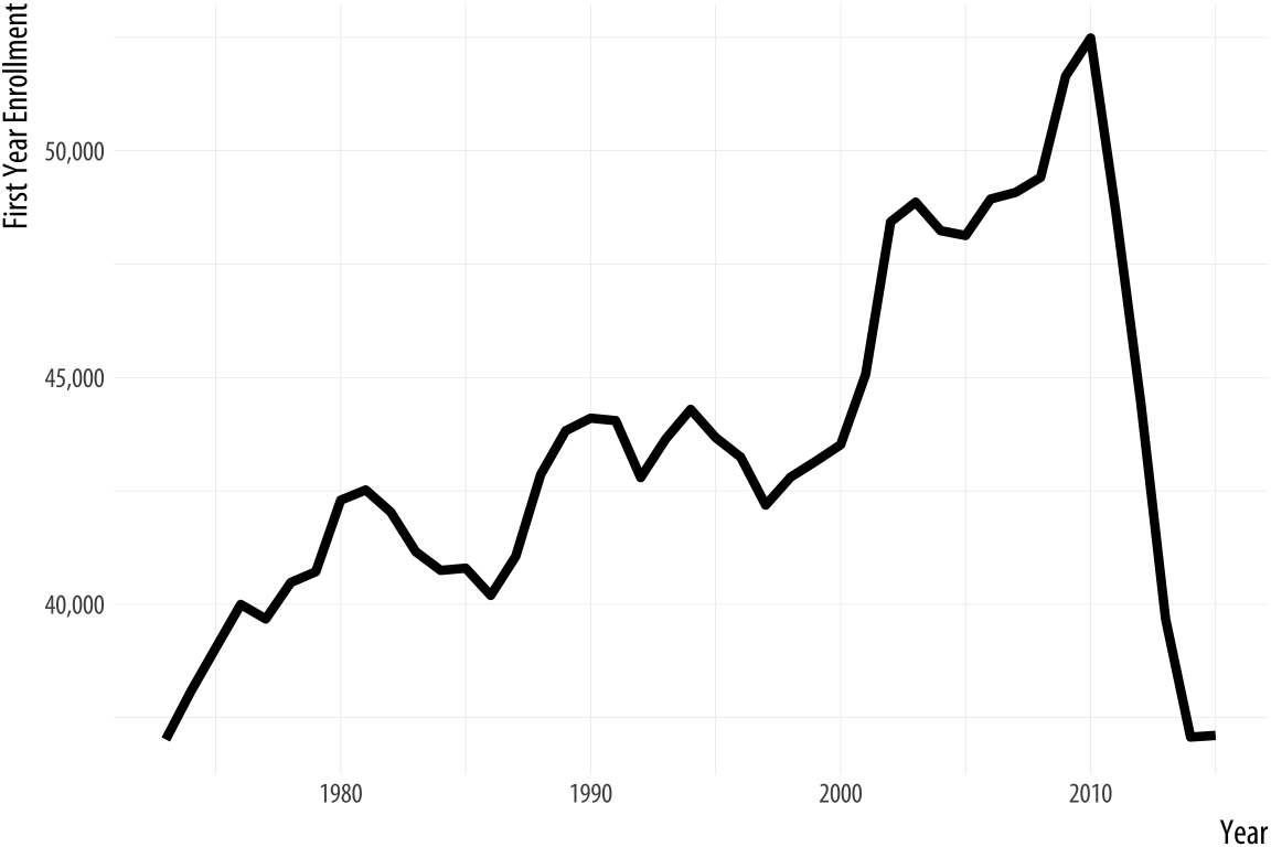
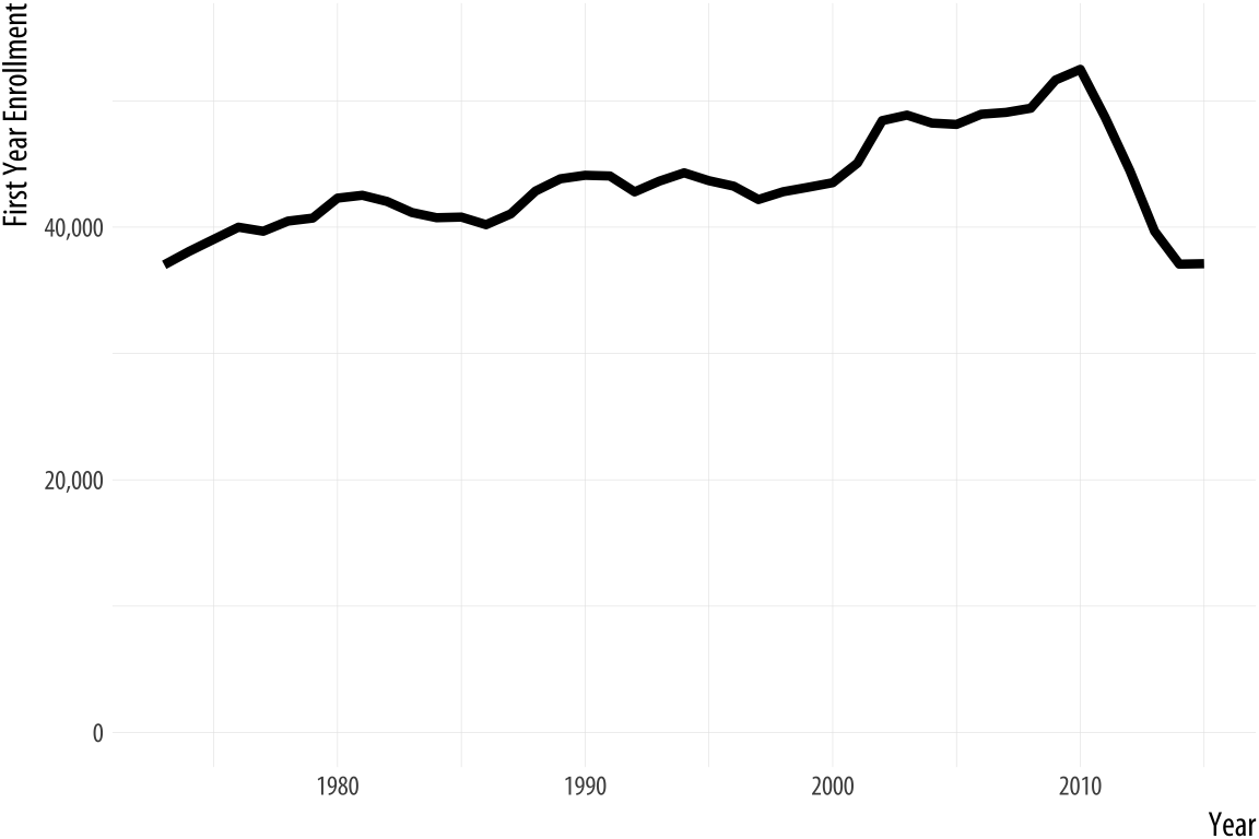
The decline in law school enrollments does look (and I would agree that it -is- substantive) after 2010 (it dropped to levels not seen since the 1970s). Healy asserts that "The chart with the zero baseline, meanwhile, does not add much additional information beyond reminding you, at the cost of wasting some space, that 35,000 is a number quite a lot larger than zero." I would counter argue that having the zero baseline might serve to help the person looking at the trend realize that there was a simply a "market correction" to the average of ~35k per year after 2010 (contextually, perhaps because that period marked the height of the Global Financial Crisis, and made law school a less attractive career path due to its high investment cost and low perceived payoff). My editorializing on that aside, I think that this is one case where the larger picture does matter a bit more than optimizing for space. Sometimes the point of data visualization is not to shock/ wow the audience, but to bring them back to sobriety.
To end, one of my favorite examples of "poor form" comes from Fox News. It also happens to be a 3-D pie chart (the most eligible to win first place in any parade of horribles in data visualization to be sure)
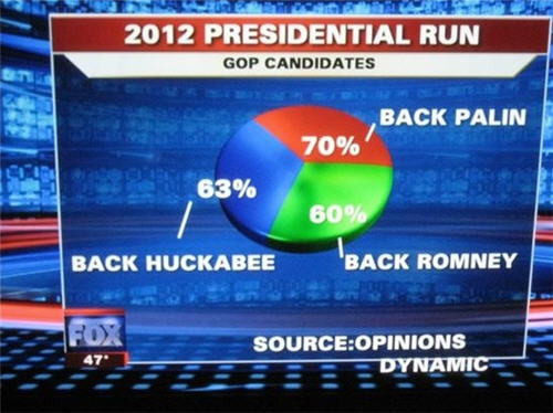
The violations speak for themselves.