The subtleties of colour is both insightful and intriguing. It is amazing to consider the vast amount of resources that are linked to this series of blog posts and the knowledge base to draw from, not to mention the many tools that are available; which are most definitely worth bookmarking.
The reference to the existence of the International Commission on Illumination (CIE) is a welcome inclusion into the series of resources, which illustrates the level of formal background behind the post.
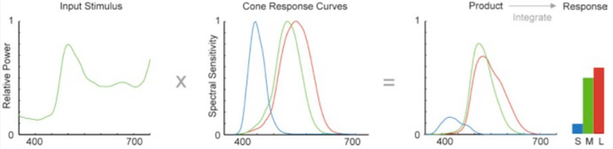
The explanation of the human eye colour frequency (wavelength) response is extremely helpful to understand human colour perception in a way that makes the author’s aversion to the “rainbow spectrum” understandable. A reference from the book by Maureen Stone (see below) amplifies this illustration and makes me wonder if modelling AI and Computer vision would have to include modelling these types of shifts in perspective, and reminds me of the human ear response, that has similar effects on how humans perceive sound.

The author makes a very strong case for using the CIE LCH model to generate palettes, although it seems sad that computer colours aren’t optimized for expression in this format.
The knowledge to create pallets which are primarily scaled by “lightness” (and then chroma and hue) is a very welcome insight to have. It seems that the effort to convert these pallets to standard RGB values might be a contributing factor to the reason many people just “pick a pallet”. The author mentioned work on an all-encompassing tool to incorporate all the different aspects of the various colour tools into one, which would be a very attractive tool to have.