In the blog series Robert Simon reemphasized the relationship between color and data visualization —color should enhance clarity, aids storytelling, and draws a viewer into your dataset— touched the importance about assigning appropriate color palette based on the data type. He also mentioned the intuitiveness of color as well as the cultural values they embodied, and how can we utilize that to add cues into our visualizations.
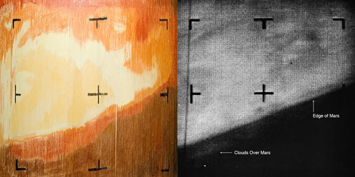
The most memorable example to me was the first image of Mars hand-colored by NASA’s Jet Propulsion Laboratory. It’s amazing to see how they translate numeric values to color’s hues and utilize that to visualize something human eyes wouldn’t detect from the number itself. And it turns out that the human generated picture is very close to the computer generated image. Although it wasn’t intentionally, but the brown/red color scheme they picked randomly resonate with Mars actual color.

Speaking of intuitive palettes, if we look into our daily lives we would find out a pattern there as well. Why the majority of fast food restaurants use red&yellow color for their logo (eg. McDonalds, KFC, Chick-fill-A, In-and-Out you name it…)? Why most of banks use blue as their main tone(eg. Chase, Citibank, Capital One)? According to scientific research, color red revs up people's appetites, it has just become synonymous with fast food over time, perpetuating the idea that red makes you hungry. And we tend to associate confidence and stability with color blue, that’s how banks want us to think that way by looking at their logo as well. However this intuitiveness might vary across different cultures
Another interesting fact that’s been raised in this reading is that we human perceives color differently from computers. Robert pointed out that “We perceive light exponentially as opposed to the linear way of a computer. We are more sensitive to changes at low light levels, and the range of colors perceived by us is uneven.” it's customary to ignore that fact that color defined by computers are different from human definitions, when we are designing visualization we need to consider its ultimate media whether it will be put up on a website or printed out as a tangible piece. Because colors on screen look different from printed material as well.