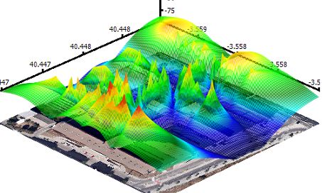
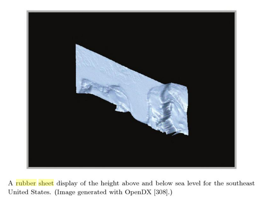
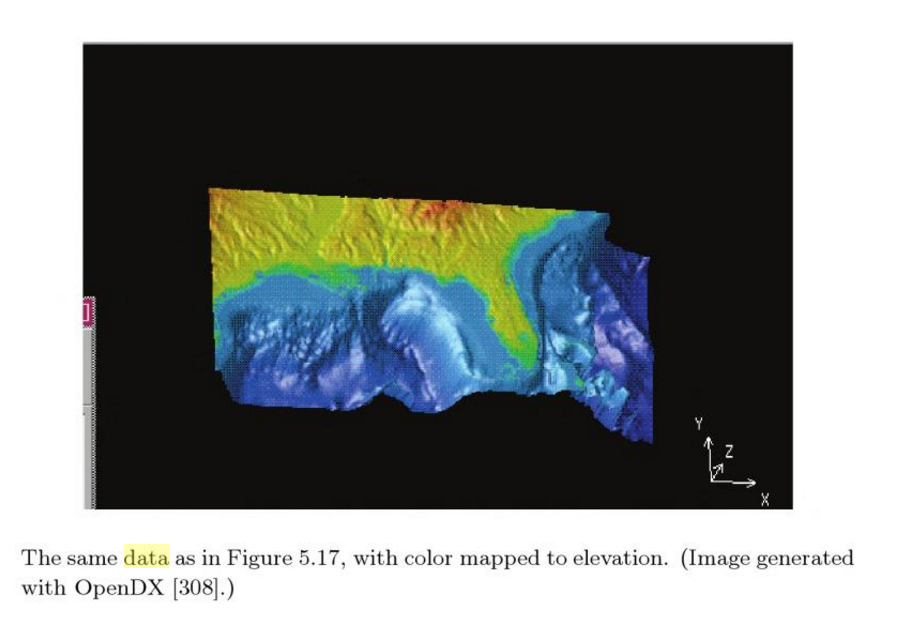
- Sometimes it is also be called "3D heat map".
- It usually be used for geo-related information lay out.
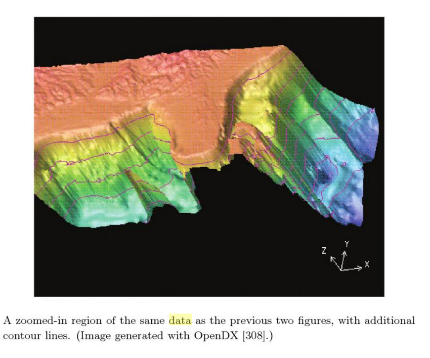
- Except the 2D map, it can also holding at least two kinds of informations, which can be presented by heights and colors.
- Rubber Sheet also usually be compared with isosurfaces, which have similar features. They always are used in visualizing temperature, weather and Ocean current.
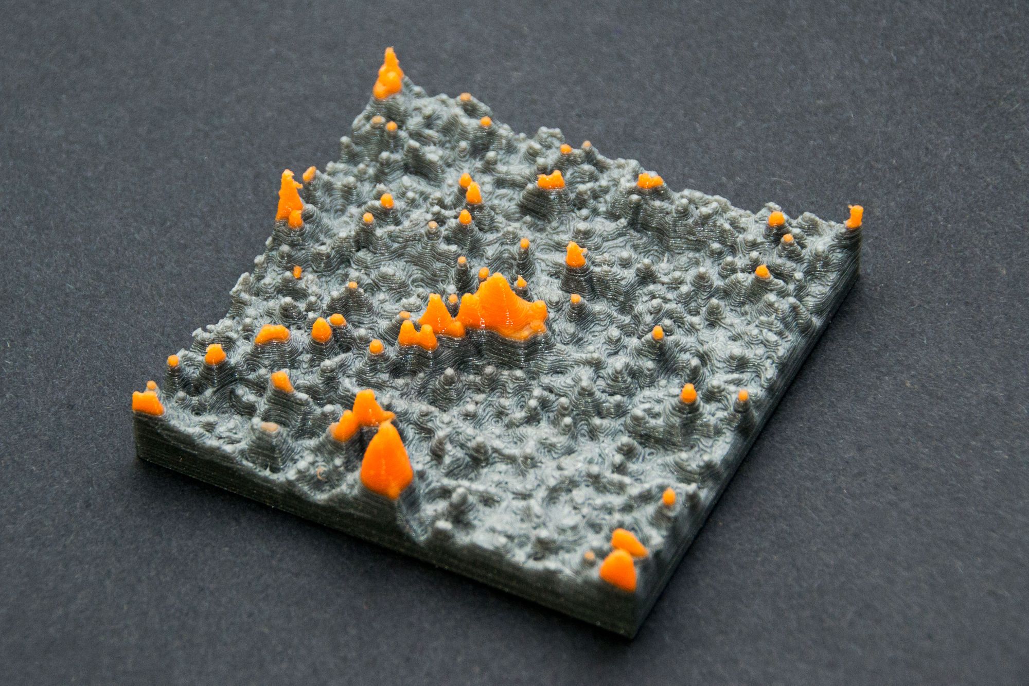
- This visualization method usually be used to making physical model.
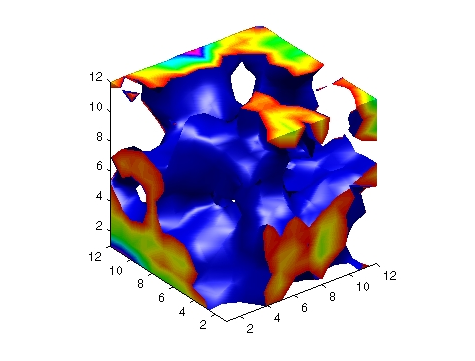
(An isosurface is a three-dimensional analog of an isoline. It is a surface that represents points of a constant value (e.g. pressure, temperature, velocity, density) within a volume of space; in other words, it is a level set of a continuous function whose domain is 3D-space.)
Good Examples
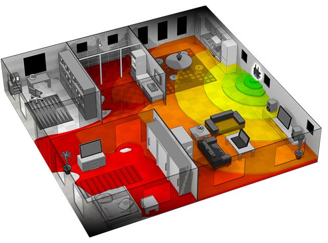
3D heat map be used to visualize Wifi signal strength. This example can be use for mapping Wifi signal strength in the space with multiple routers.
Physical Visualization Models
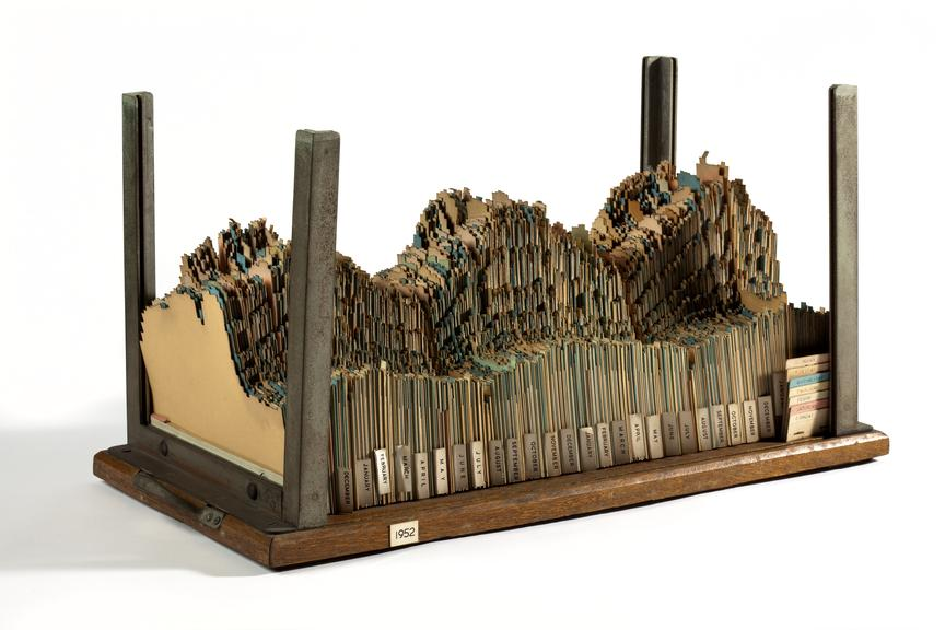
A 3D chart made out of a jagged cardboard for each year representing generated electricity and demand over time.
Bad Examples
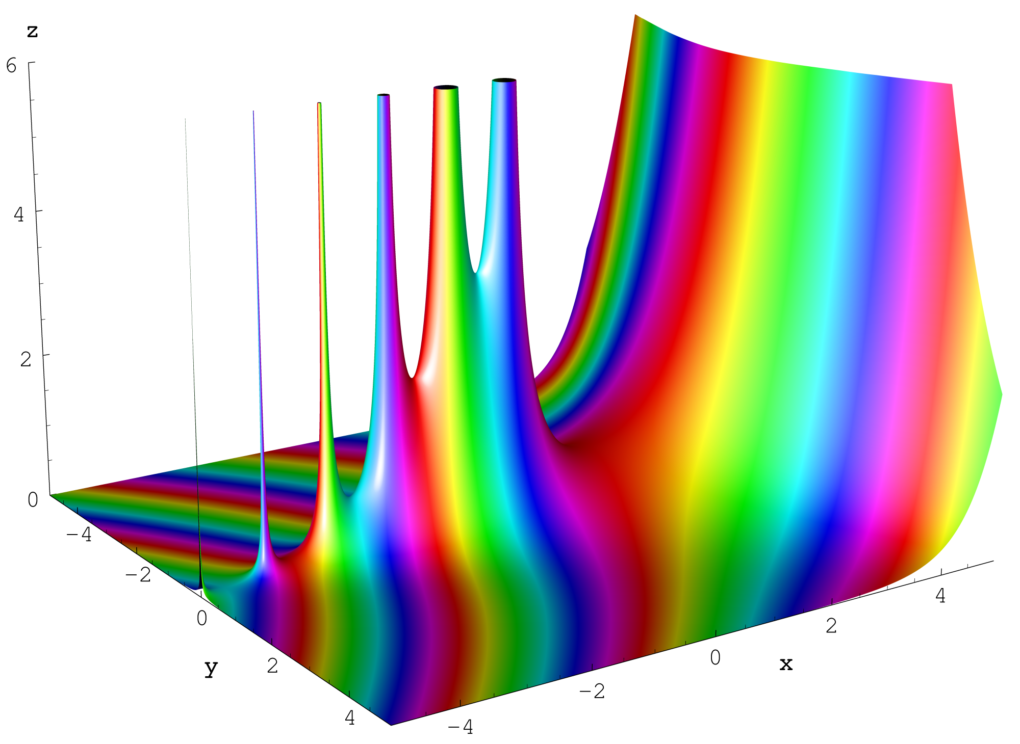
This a combination of surface plot and heat map, where the surface height represents the amplitude of the function, and the color represents the phase angle. By the color seems just like rainbow colors which provides no useful information.
Reference:
https://ldld.samizdat.cc/2016/rubber-sheet/