How to visualize data ?
There are absolute no methods to technically critique a method of visualization. However, after visualizing data for centuries now; we can discuss the rule of thumb which makes the data more accessible and readable. The author of the article attempts to explain the idea of these rules by critically examining some not so great examples of info-graphics.
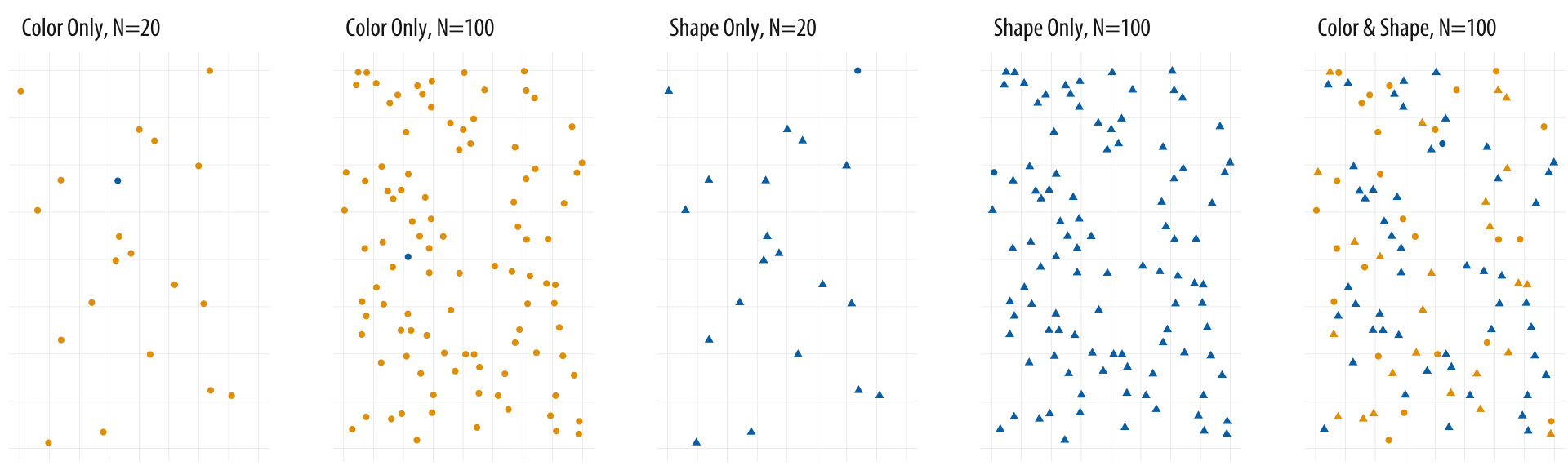
It helps a designer to create guidelines for each element of design. The examples explains in gist the importance of appropriate information, color palettes, composition principles, dimensions, placements and shapes. The example below sums up an important discussion of a thought process of designer in understanding and deciding the presentation method i.e. to use color or shape as a design element.
The references to the literature like The Visual Display of Quantitative Information(1983) by Edward R. Tufte gives the viewer perspective from different critiques of the visualization world. It also almost touches the concept of cognition in the visualization as it discusses the impact of the audience in comprehending information to have deeper impact rather than just an information to explore and forget. The balance of appropriate information is one of the most difficult decision. A balance between incomplete information and excess information.
However, the most important takeaway is the learning of 'artist's' judgement of an appropriate call for the design. Personally, I think each individual has their own taste of aesthetics. But literature like this article assists in developing taste and improving an overall understanding for avoiding mistakes previously done.