What’s scatter plot?
Scatter plot is a type of diagram using Cartesian coordinates to display values for typically two variables for a set of data. It shows the correlation between variables. In two dimensions, it uses dots to represent the values obtained for two different variables, one plotted along the x-axis and the other along y-axis.
However, scatter plot is not limited to two variables only, it can be extended to more variables if you want to add in more dimensions. Additionally, if the dot itself is coded in terms of size color and shape, one or two additional variable can be displayed when it's needed.
Pre-processing
A scatter plot can be used either when one continuous variable that is under the control and the other depends on it or when both continuous variables are independent. Before we dive into the data sets, we need to figure out dependency relationship, then assign the variable value to each axis. Also we need to sort through paired combinations of each data point before hand.
Mapping
The correlation between data sets are converted into positions of data points. Pattern of dots slopes indicates the type of correlation which can be positive, negative or null.
Good Use Cases
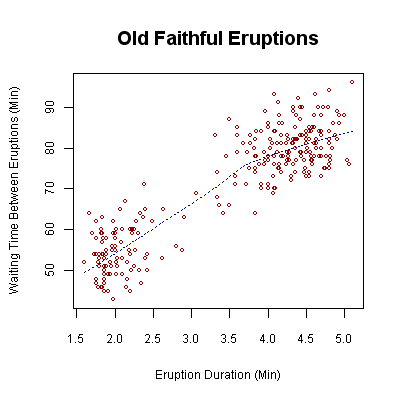
1/ This scatter plot shows the waiting time between eruptions and the duration of the eruption for the Old Faithful Geyser in Yellowstone National Park. From the plot there are two clusters of data points which might suggests that there are two types of eruptions: short-wait-short-duration, and long-wait-long-duration.
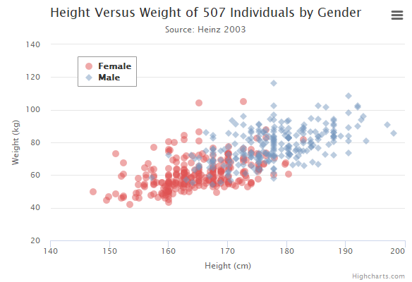
2/ This scatter plot indicates the correlation between people's weight and height among different genders, the transparency of dot can reveal the concentration level at certain area.
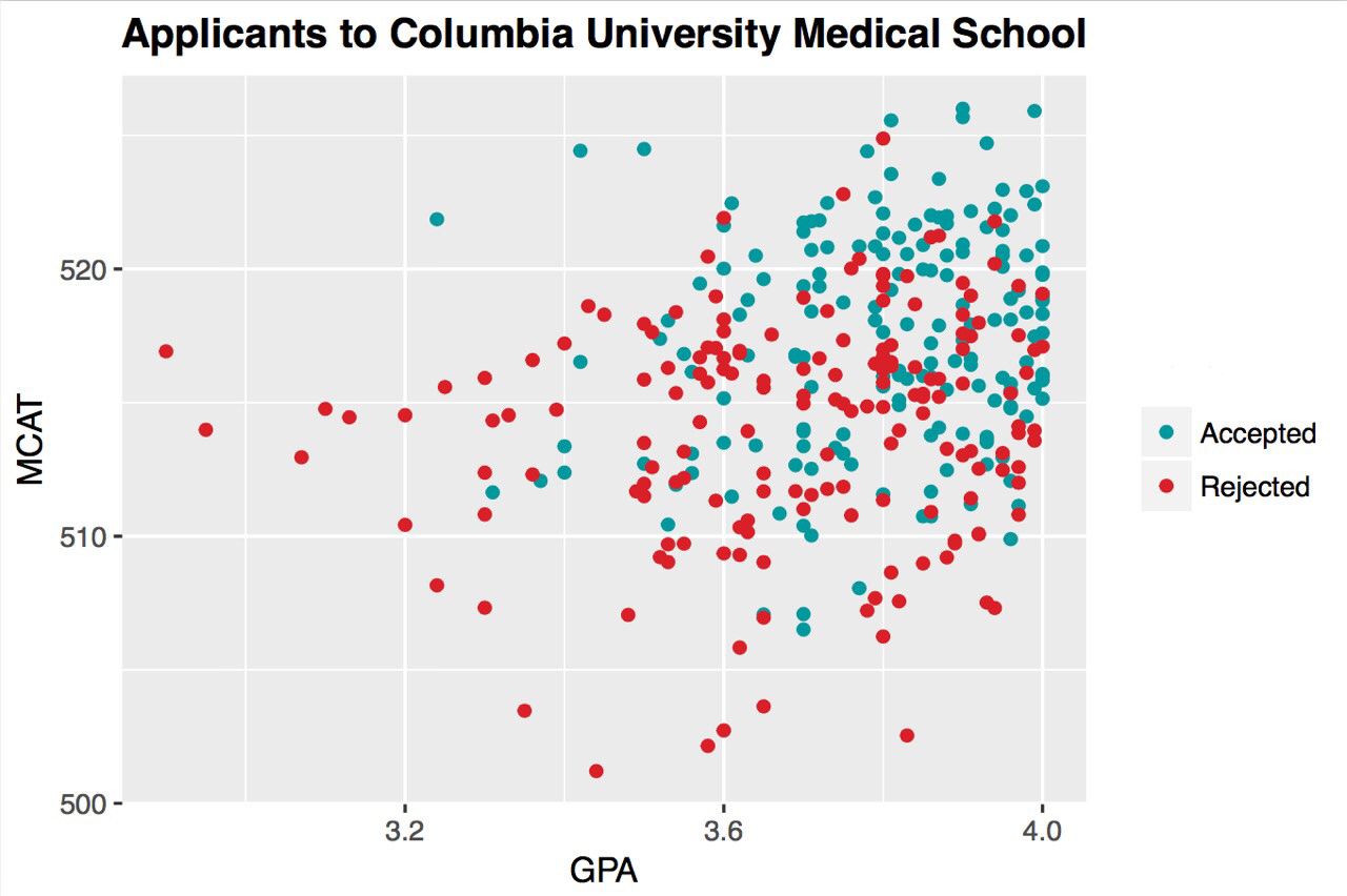
3/ This is a scatter plot of applicants who are either accepted or rejected by Columbia University Medical School. Two variables here are GPA and MCAT, what we can learn from this graph is that 1) Most applicants have a GPA between 3.6~ 4.0 and MCAT between 510 ~ 520. 2)people who have a high GPA and high MCAT is more likely to be accepted...
Bad Use Cases
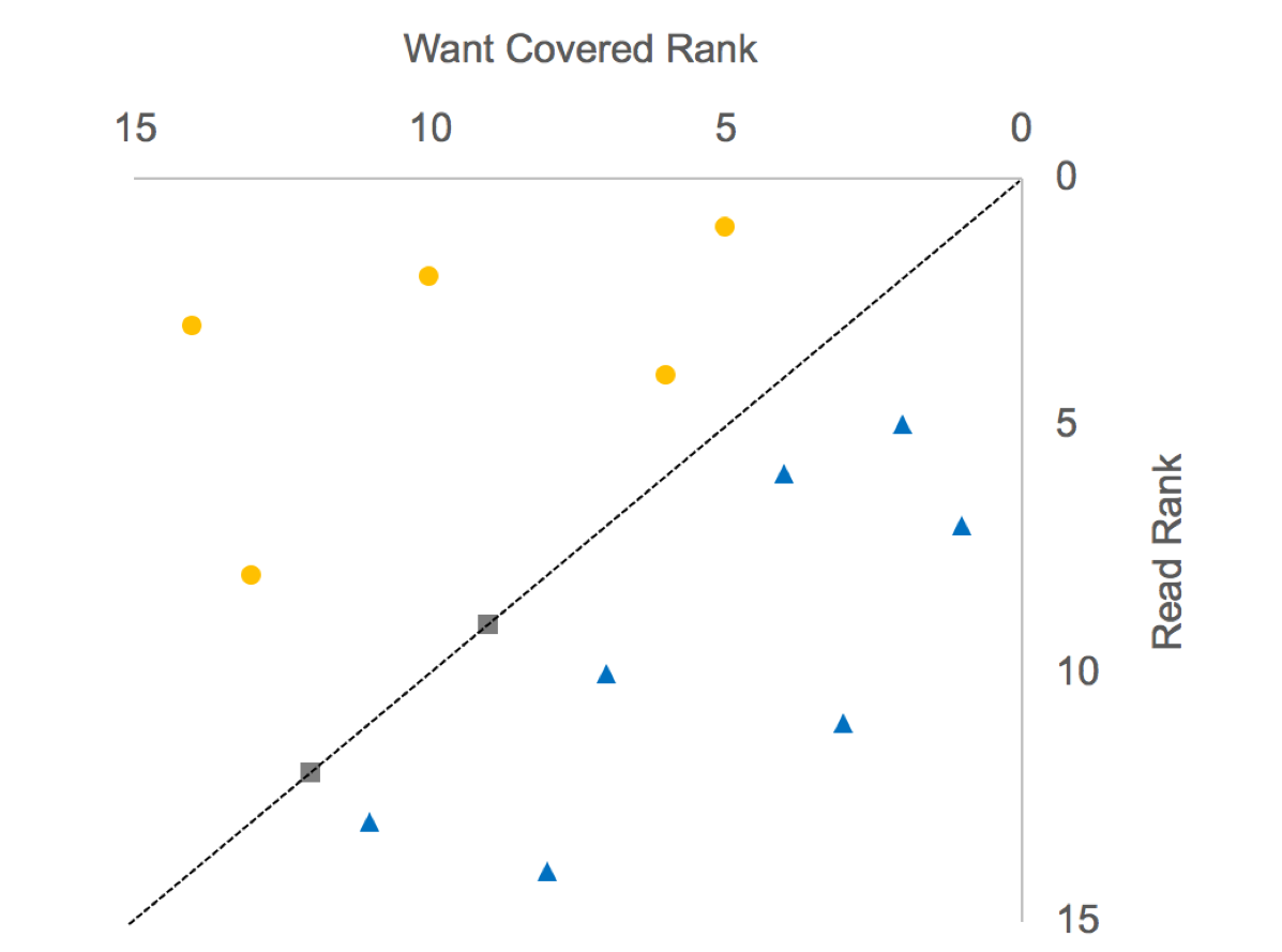
1/ The two sets of ranks are basically uncorrelated, as the regression line is almost flat. The analyst tried to"rescue" the data in the following way: draw the 45-degree line, and color the points above the diagonal blue, and those below the diagonal orange. Color the points on the line gray.
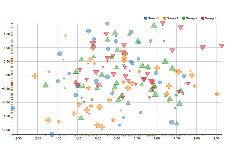
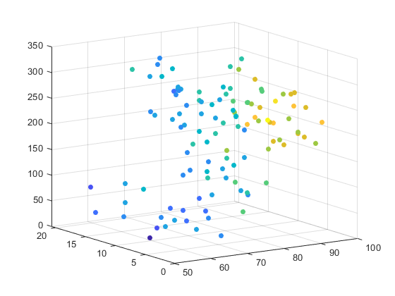
2/ This scatter plots is visually too complex, a lot of visual elements are piling up inside this diagram, the dot itself contains three variables already: color, size and shape. It's hard to digest all the information at once without reading the legend.
3/ The color choices are too close to each other which might cause confusion for certain readers such as people who are color-blind.
References:
https://en.wikipedia.org/wiki/Scatter_plot https://seaborn.pydata.org/generated/seaborn.scatterplot.html https://chartio.com/learn/dashboards-and-charts/what-is-a-scatter-plot/ https://towardsdatascience.com/everything-you-need-to-know-about-scatter-plots-for-data-visualisation-924144c0bc5