Reading Response of the article http://socviz.co/lookatdata.html
When I saw such an article detailing how to visualize data in science, I can't help but wonder, do we really need such a dogma about design? How does data visualization balance between science and art?
If these are two questions we have to answer, they are simple and obvious. It depends on what scene we going to use those graphics, perhaps as a stand-alone project (poster, design or art project), we can ignore part of the objectivity and readability. However, if it is a diagram of a magazine article, we may need to match a familiar design form of data visualization to meet the habit of quick reading.
But maybe we already have enough tools to complete the need to quickly make charts, they have become a design "symbol" that everyone is familiar with. Designers who design data visualization tools only need to put in more customized designs. So, what is the purpose of data visualization as a separate profession?
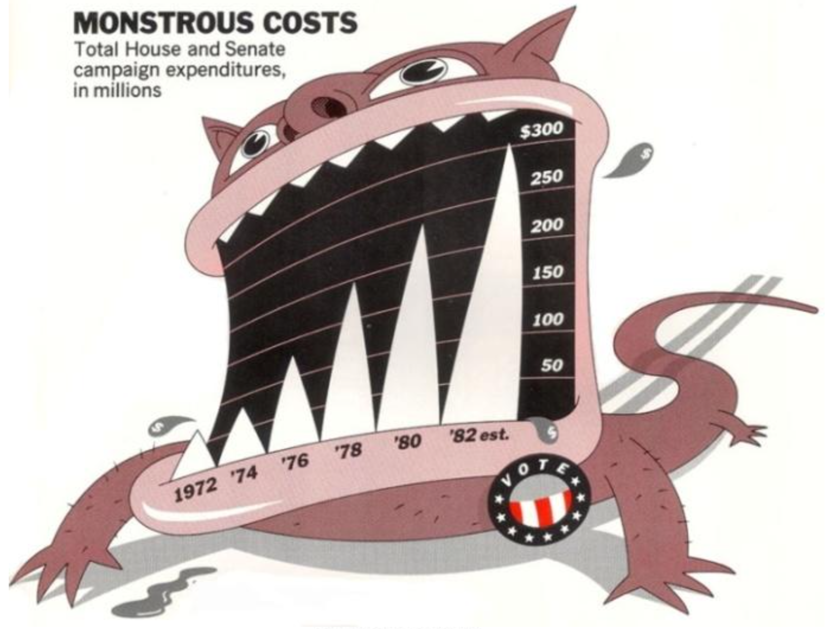
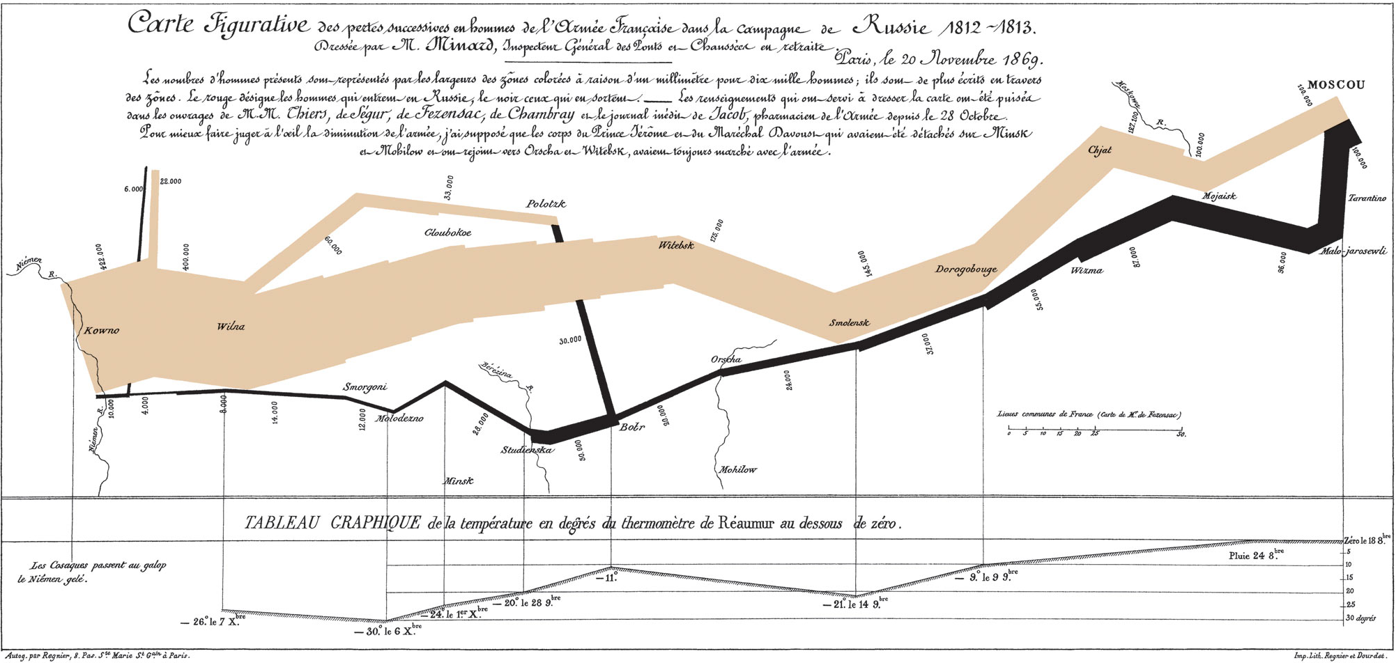
The article mentions two data visualization designers, Joseph Minard's and Nigel Holmes who I personally like a lot, just like modernism meets postmodernism, one is almost the ultimate objective and information presentation, and the other is almost just presenting the data on a comic book of his own. Joseph Minard pursues the form and function of the chart, and his rationalism becomes aesthetics. But what's interesting is that when I saw Nigel Holmes's chart, I just read more information quickly. It contains the designer's understanding of the content of the article, as well as a large number of symbols outside the data.
My background is sculpture, one of the most asked questions is what material are you working with. I have a hard time trying to explain to others that sculpture has long been beyond the discipline of material creation. In fact, most schools no longer have different majors for fine arts. It is precisely because when we need to present a complete concept/narrative, the material or the medium are always change based on projects. I think this problem is equally valid in Data Visualization. Why do we need to use charts/diagram as an independent design form, and do we have to bear the limitations of this medium itself? Of course, as a part of participating in the existing production chain, I can understand its limitation. However, when we discuss how to present information better as a theory, we should probably include more elements.