A table arranges data using grids (rows and columns). It is sometimes called a matrix, a data table or a data grid. It is one of the most commonly and widely used data visualization types.
A Little History
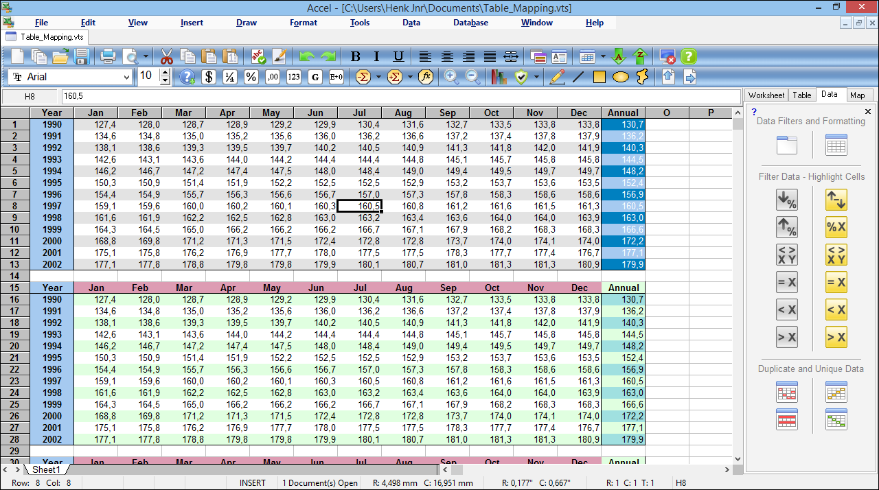
Spreadsheets (interactive data table applications) first came about in the late 70's.
However, our civilization has used tables to represent and organize information much longer than we might think.
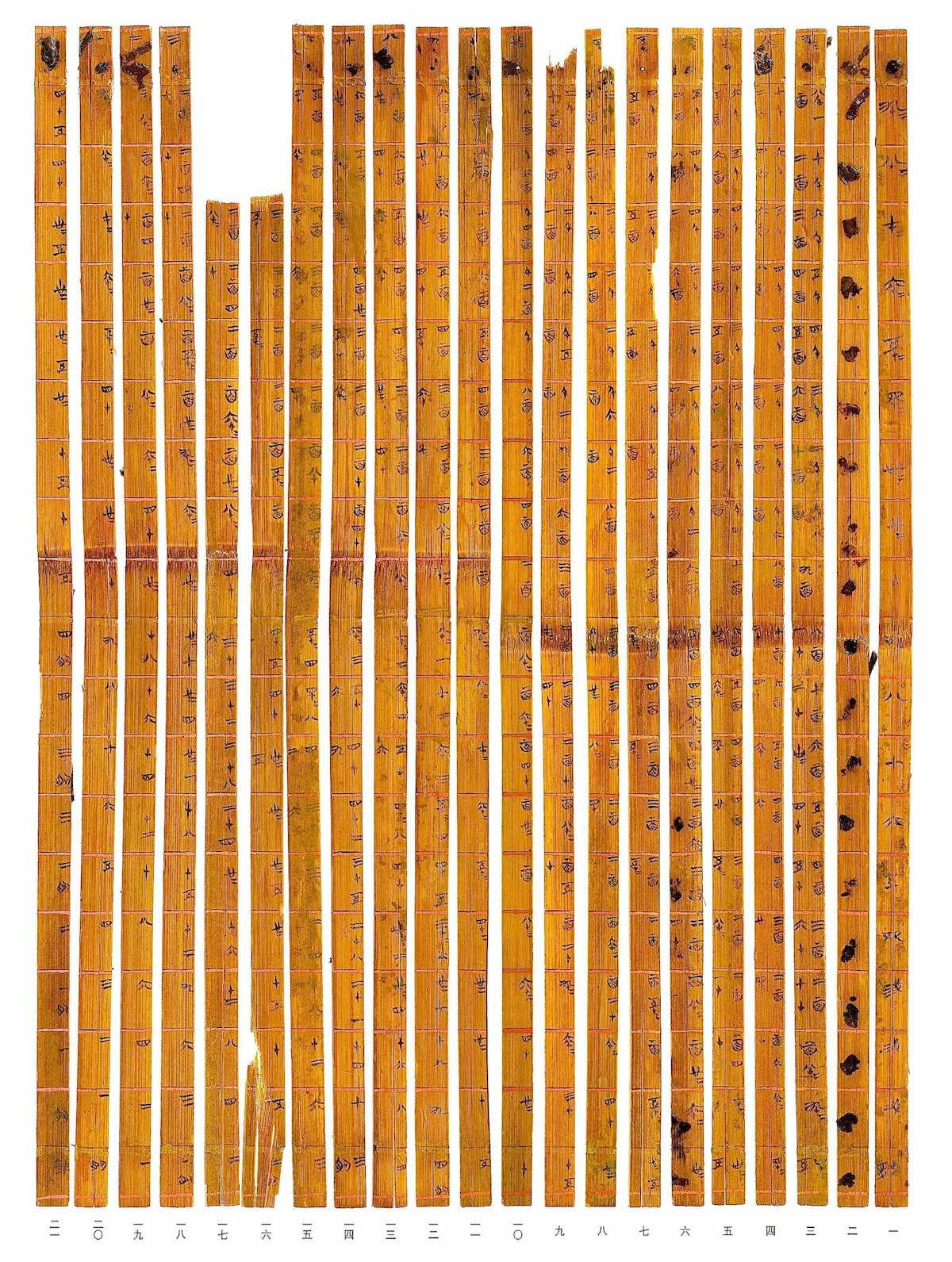
Src: Tsinghua-multiplication Table)
Strengths
A table is an efficient way to display comparative data on categorical items. Using a table, it is easy to examine pairs of related measurements (e.g., quarterly sales of two ice cream shops observed over 5 years).
According to data visualization expert Stephen Few, it is advantageous to use a table when:
- Looking up individual values (e.g. Company employee databases)
- Comparing individual values but not entire series of values to one another.
- Precise values are required. (Numerical values such as GDP or discrete identification such as country names)
- The quantitative information to be communicated involves more than one unit of measure. (e.g. Athlete (name) - Height (cm) - Weight (kg) - ZipCode - Country of Origin)
- Both summary and detail values are included (A category can be divided into sub-categories)
** ( ) includes my interpretations about his points.
Because of its efficiency, tables are widely used in communication, research, statistics, and data analysis.
Some well-known uses of tables are
- A table of contents
- A product comparison chart (advertising, retails)
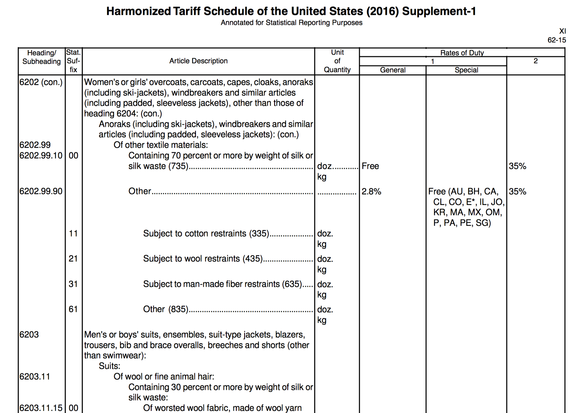
- A multiplication table
- A periodic table
- Databases: csv, spreadsheets
Limitations / Weaknesses:
- If there are too many rows or columns, it is hard to perceive the values in the tabular representation.
- It is not easy to represent hierarchical data in a table. For example, if we intend to display the relationship among multiple members of an extended family, it will be clearer to show the family tree by using nodes.
- Additionally, a table mainly displays text-based information, hence it loses its chance to communicate with a wider audience who may not recognize the numeric or nominal values.
Pre-Processing
- Even though a table is a great format to display many different categorical items at once, we should selectively curate categories and parameters to make the comparison more relevant and focused. (Data Reduction)
- If data is(are) collected from multiple sources, units of measurement need to be converted for an easier comparison. For example, the average height of different nations (US, Korea, Sweden etc) can be expressed in feet and inches, or meters and centimeters. The combined data table should show them in the same unit of measurement. (Data Integration + Transformation)
- Long decimal digits and large numbers may not always be ideal. Numbers should be formatted in a way that is easy for data consumers to digest (e.g: 20.6878993% -> 20.69%, $1,000,000 ->$1M)
- The most important pre-processing will be to verify the credibility of data, before rushing into use them. Numbers can numb people. Are they really trustworthy?
Mapping
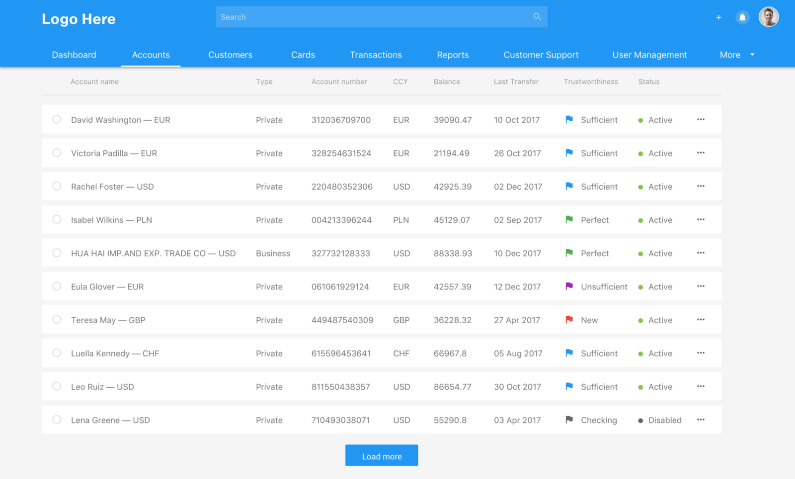
A table is composed of rows and columns. Conventionally, the top row displays categories, and the leftmost column lists items/objects to compare.
Where the rows and columns intersect, cells are created. Each cell is to contain a value (most commonly numerical and nominal), which shows the mapped relationship between the header(category) in the top row and the distinct item on the leftmost column.
When there is a single cell that needs special attention from the rest of the table cells, it is helpful to use a distinctive color and text size.
In addition, a good table needs a proper title that explains the relationship between the rows and columns. The correct language will come from correctly mapping the data.
Bad Examples

2) Confusing use of colors: our eyes tend to follow the colored items. However, it is not clear if the colored cells represent more important categories.
3) Question: Was a table was the right visualization type for this type of data? It is hard to grasp any meaningful difference between numbers given in this table. Difference between 0.0900% and 0.0901% might mean a very important factor for stakeholders, but it is hard to recognize the difference if you are just observers. What could be an alternative visualization?
Src: http://www.marciebraden.com/table-design-tips-for-presentations/

2) Question: When there are no discerning values among the majority of compared items (the shared attributes from the row 6 to 21), should we still use a table?
3) Question: How can we emphasize differences and effectively advertise the services for this kind of product information
Src: Invoice Machine Pricing table / Tips for designing terrific tables
1) Too much information is contained
2) Hierarchical alignment of texts. Is that easy to read?
Src: Matthew Strom - Design Better Data Tables
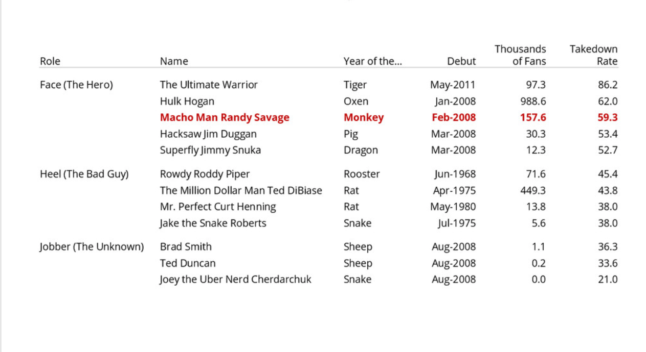
Good Examples
2) The use of simple visual icons in the data cell adds readiblity of the ordinal variables.
3) Good use of white space and minimal gridlines.
Src: Data tables best practices
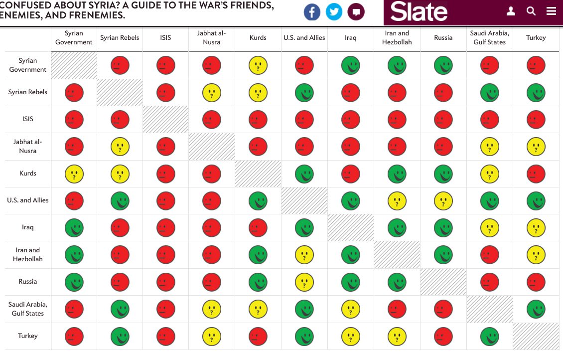
1) The complicated relationships are simplified into 3 categories (enemies, it's complicated, friends) explained by using easy-to recognize icons.
2) A little too concise? Perhaps. To complement its simplicity, the table allows readers to access a bit more detailed report on the "relationship status" upon clicking on each face.
3) The title is clear and inviting
Src: Slate - Syrian Conflict Relationships Explained
1) Good Readibility - Text Alignment, Typography, Reduced Redundancies 2) Simple way to emphasize what needs more attention