This is a collective research project providing examples and discussion of the basic building blocks of visual data representation.
Line Graphs
- They are used to convey a relationship between two variables, such as change over time of a particular characteristic.
- They are useful for demonstrating things like income increase over time, temperature increase with energy increase, ect..
- Data could be integers, fractions, percentages, ect.. however, the x axis must be ordered.
- The x axis is the independent variable and the y axis is the dependent variable (that changes according to x).
- The x-axis can be categorical, but the y- axis is always numerical data.
- You can have single and multiple lines graphs as well as stacked area graphs.
- Multiple line graphs are used to demonstrate a relationship with several categories.
- Stacked area graphs are also used to convey multiple variables over an interval, but they use whole numbers. The other difference here is that area charts convey volume as well.
How to plot a Line Graph
- Start with a table with your variables side by side in two columns.
- Decide on an interval or scale for your axis.
- Label your axis. Time is along the horizontal x-axis. The other values are along the vertical y-axis. Both axis need to use the same numerical system and measurements being used.
- Add your data as points on the graph corresponding to the x and y coordinates.
- Connect the dots to create the "line" graph.
- Include a key and title for your graph.
Good Examples of Line Graphs
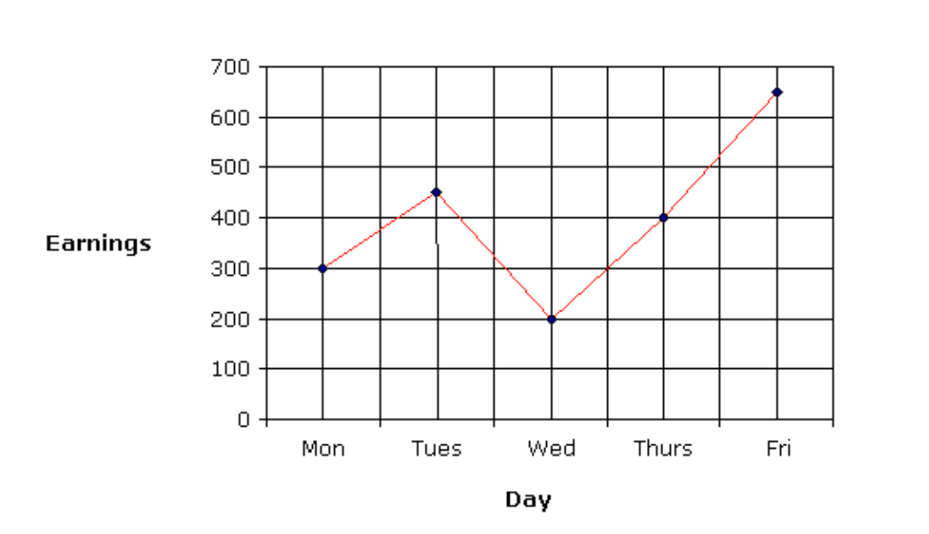
- Less is sometimes more! A simple example of a line graph demonstrating the relationship between two variables clearly. Source: https://www.onlinemathlearning.com/line-graphs.html
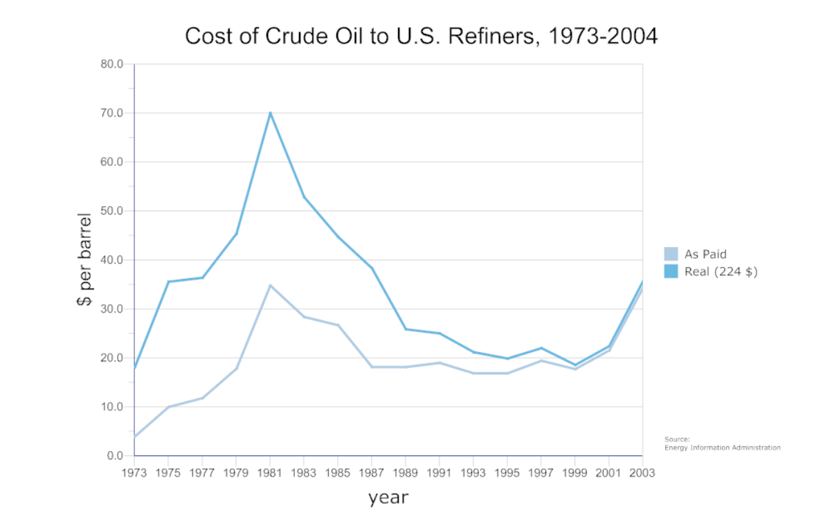
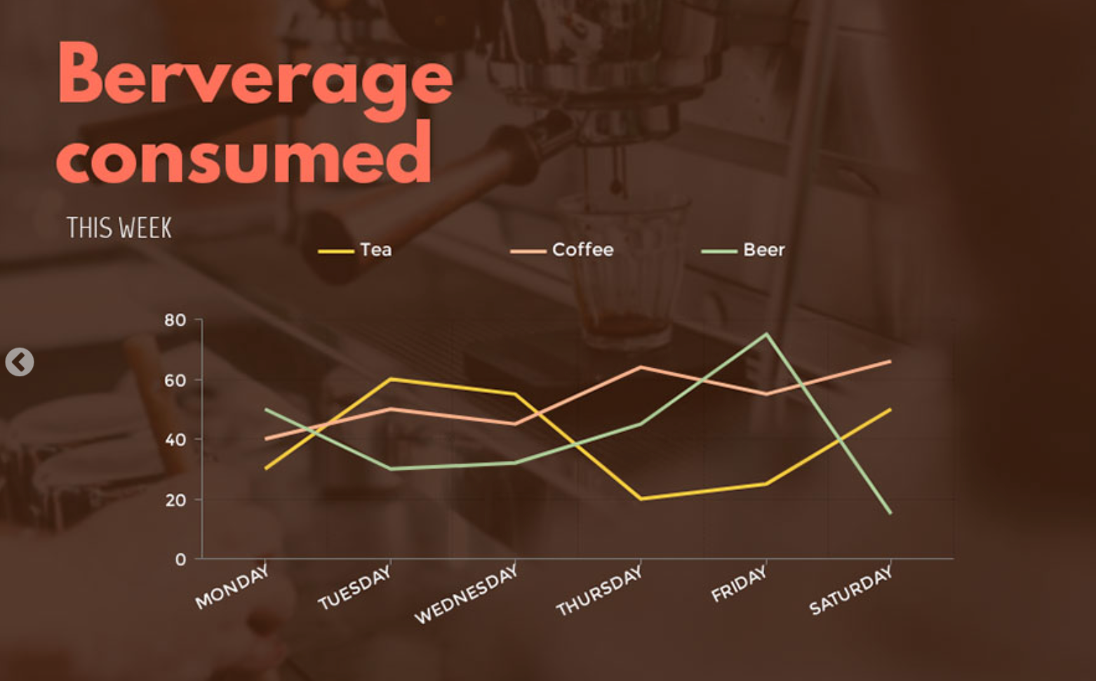
- Multiline graph showing two categories of the relationship between time and cost of crude oil to US refiners. This shows how line graphs, although simple, are powerful in expressing politically and economically important data.

- This is another multiline graph that utilizes design a bit more. Here we see the categories are differiated not just by color, but by texture as well.
Bad Examples of Line Graphs
Although line graphs seem easy and simple to make, we will explore some poorly designed and misleading uses of them.
- This is a bad example of a line graph because it has two y-axis when these should be two completely unrelated variables on seperate graphs.
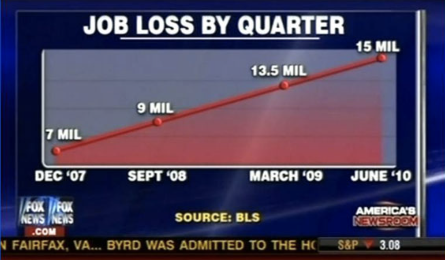
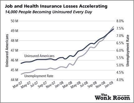
- This graph on the other hand, has no y-axis at all. The intervals are not equidestant. The title purposefully misleads; it shows the number of unemployed not the change in employement at each time interval.
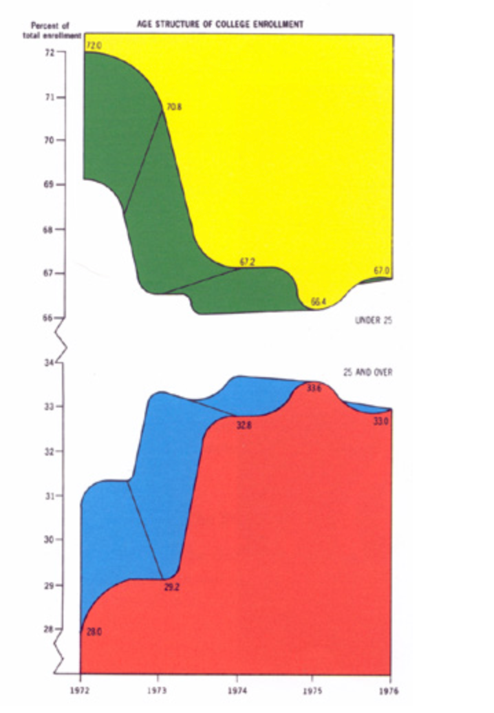
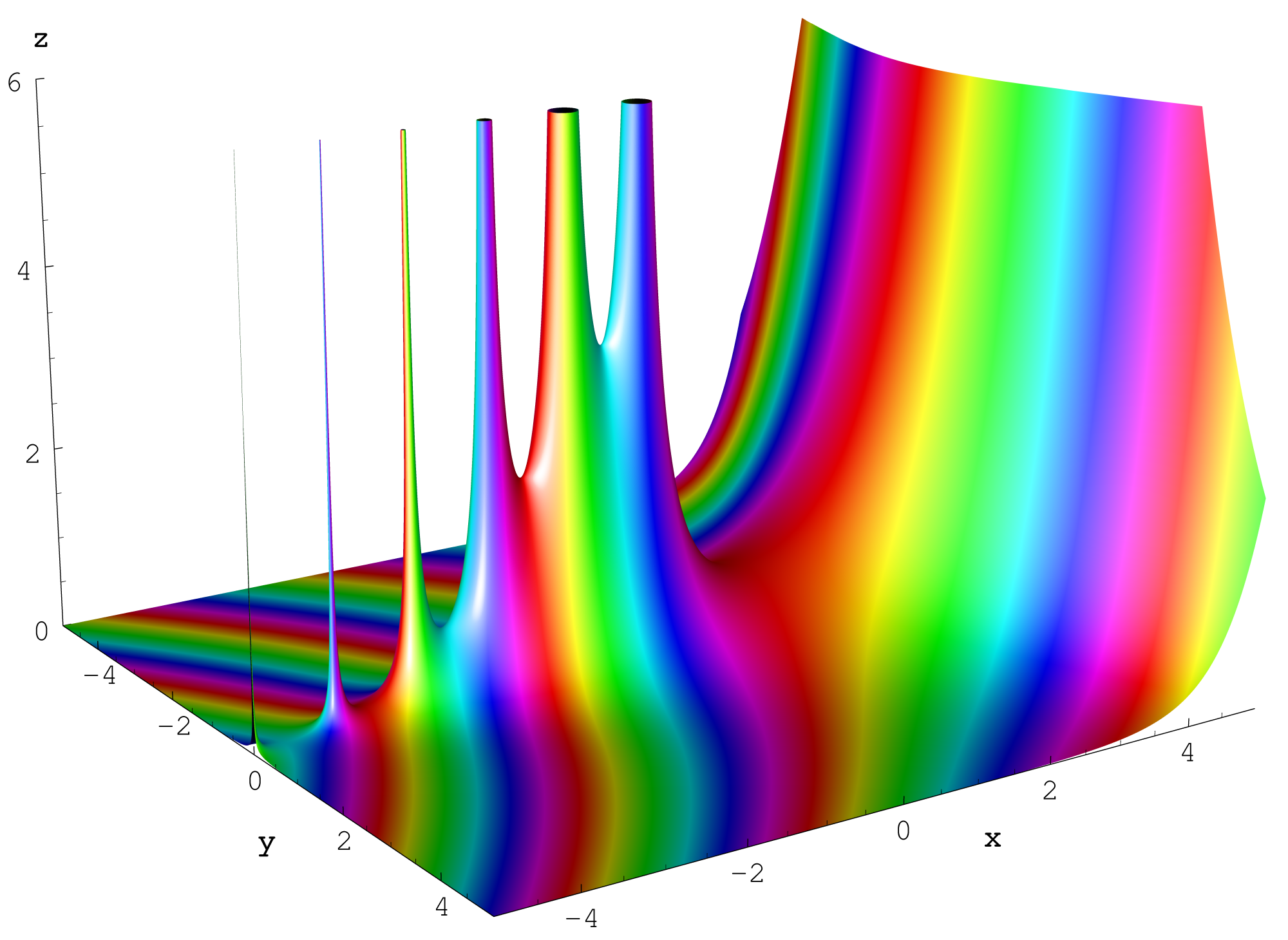
- This is a stacked area chart that is poorly designed by... Edward Tufte! The top section is flipped, the y-axis is broken twice,m the graph is in 3D for no relevent reason, there are only 4 data points being conveying, and the colors are not aesthetically pleasing. The graph is unnecessarily hard to read.
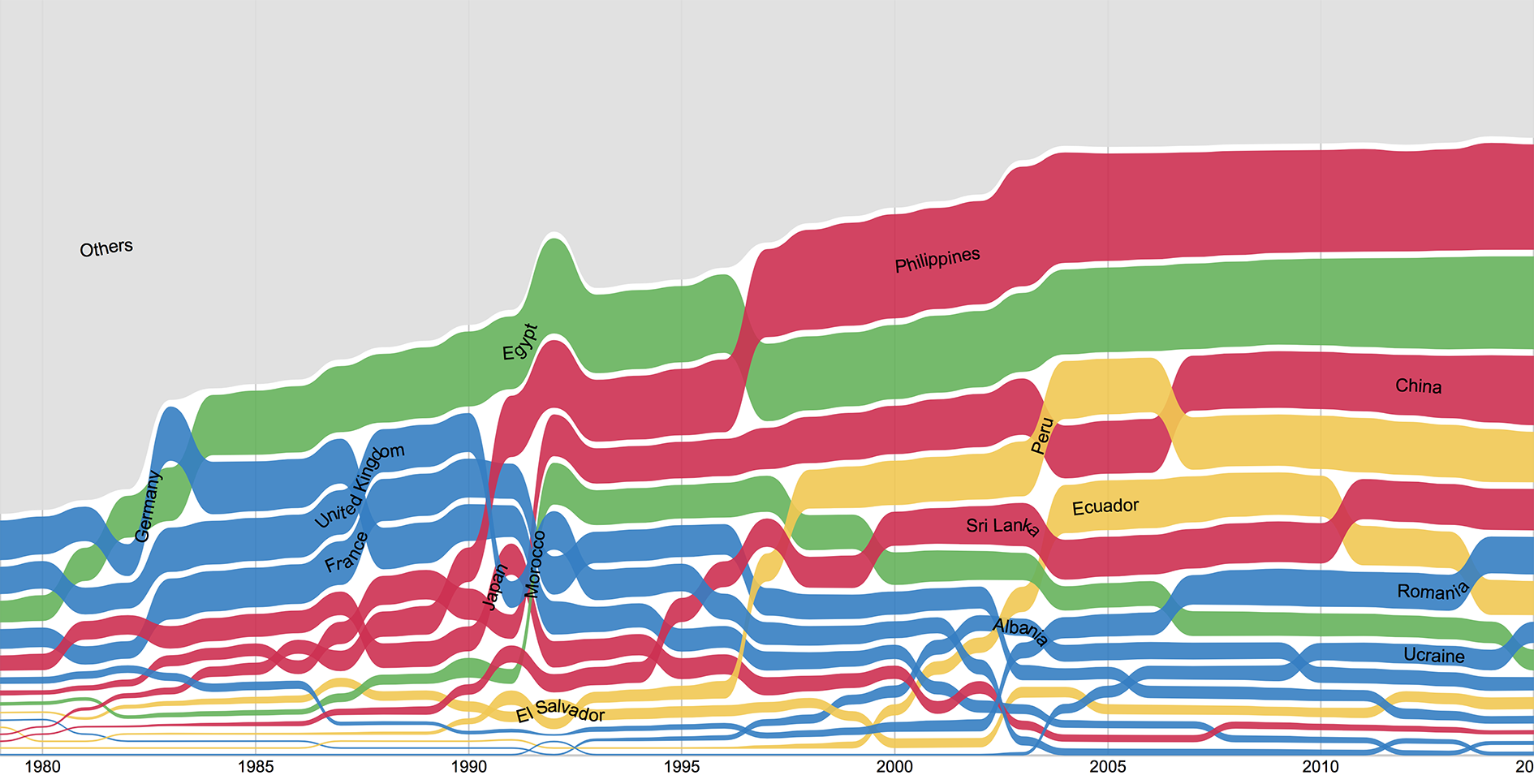
Sankey Diagram
Sankey diagrams are a specific type of flow diagram, in which the width of the arrows is shown proportionally to the flow quantity.
History
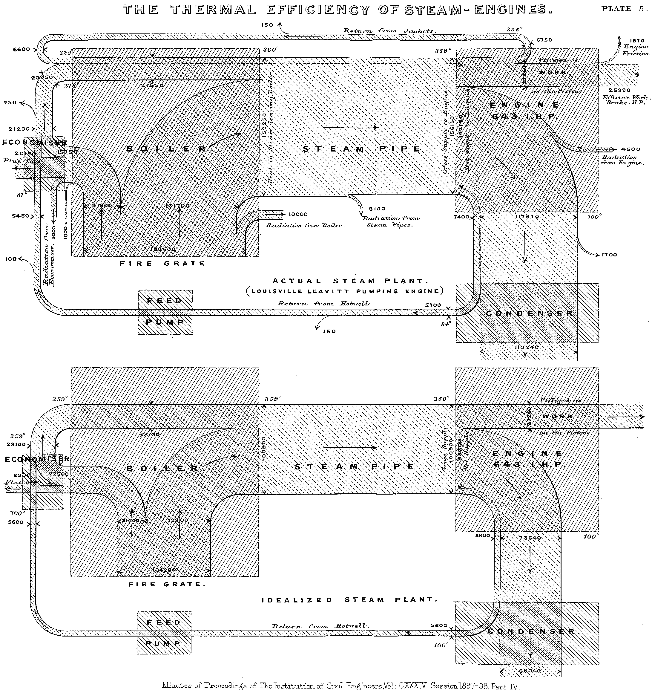
Created in 1898 by Captain Matthew Henry Phineas Riall Sankey, who used this type of diagram to demonstrate the energy efficiency of a steam engine.
Popular Uses
Sankey diagrams are often used in fields of science, especially physics. They are used to represent energy inputs, useful output, and wasted output. Examples can be found across major worldwide energy organizations using the US Department of Energy and the International Energy Agency.
Pre Processing Requirements & mapping data
All of the data is categorized, starting with (usually one) category that encompasses all others. This category is then broken down into subcategories, and then into additional subcategories, for as many times as is needed to end up with individual items.
Therefore in order to create the chart, both the csategories and associated subcategories need to be know. The sum of the totals of all of the individual items must match the total of the associated category.
The main category will usually take up around 3/4 of the diagram height as a block of color on the left hand side. The diagram is read from left to right and at each breakdown into a sub cageory the block is split into additional colors with the size of the block being in relation to the % of the previous overarching category. Once the main cateory has split, there is space left between the subcategories to help differentiate them. This process is repeated for the additional subcategories.
Three bad Examples
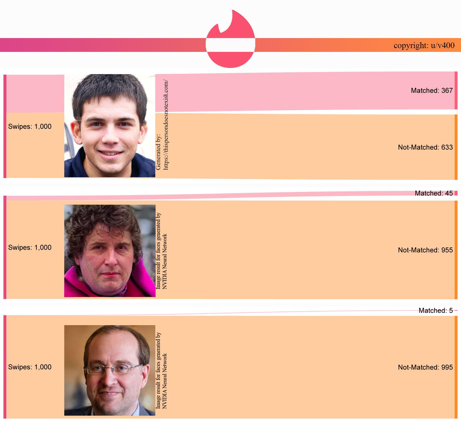
The main intended use of Sankey diagrams is to coney flow, be it the flow of energy, money or anything else.
While this example does not convey the flow of anything, it does correctly break down a starting total of 'swipes', however this is only broken into two categories. While there is no rule to say that Sankeys diagrams cannot be used with two categories, this information could have been displayed in a clearer manner through a bar chart.
In addition to this, Sankeys diagrams are rarely used in comparison with each other.
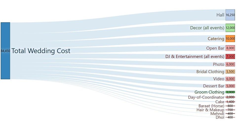
This example could be considered to be showing the flow of money from the total wedding fund, but there are no subcategories between the total and the individual topics making no real use of the unique properties of a Sankey diagram. This could have easily and clearly been represented in multiple other options including a bar chart, or a simple pie chart.
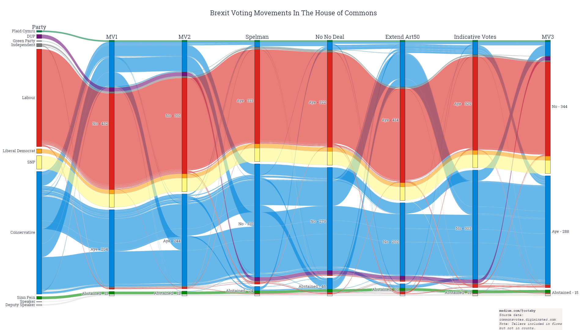
This example looks impressive and be based on an interesting dataset, but the flow of information cannot be followed easily and the flow of each line unnecessarily jumps up and down the vertical axis. Similar to the example above, this also does not have any sub categories between the start and end points and does not convey and form of flow.
Three Good Examples

This example from the Swiss Info Platform does lack mutliple categories, but clearly demonstrates the complex topic of the flow of asylum seekers from their home county to Europe. The interactive diagram both highlights the individual flow path and adds the number of asylym seekers as a total number and percentage of people originating from that country.
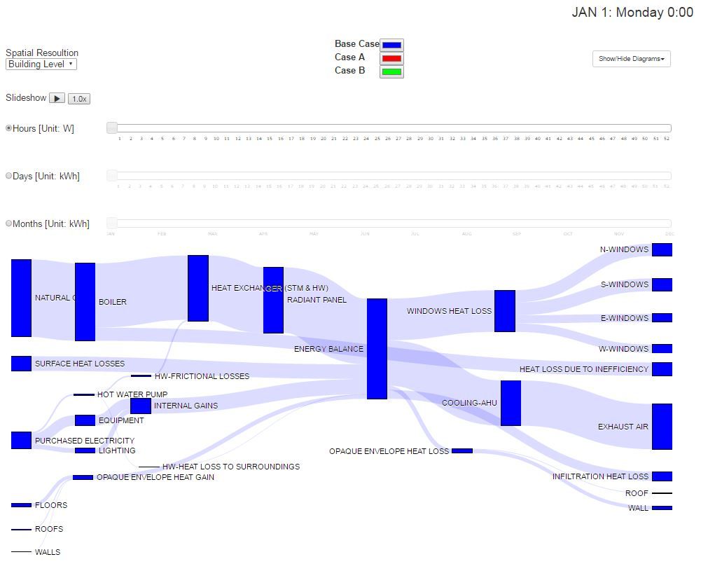
This example from Carleton University does lack specific values on the diagram, however they are not a necessity for the intended outcome. The diagram clearly shows the flow and loss of heat within a building and the diagram adapts based on the users selection of 'energy efficient' aspects.
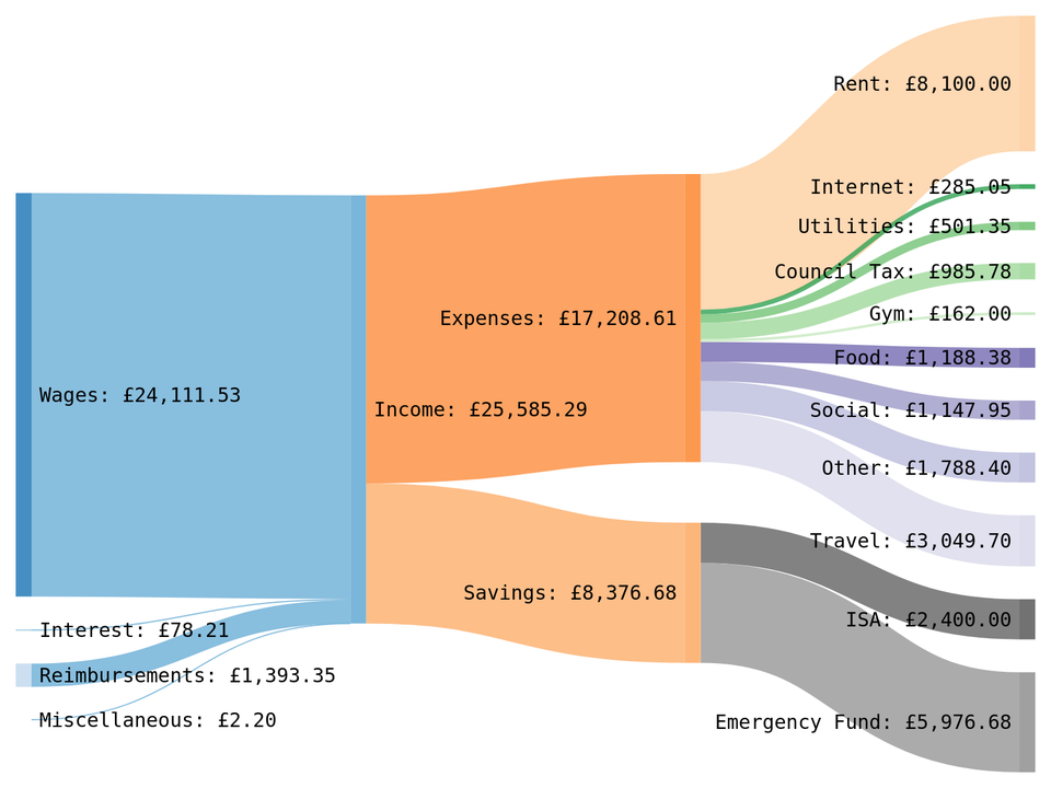
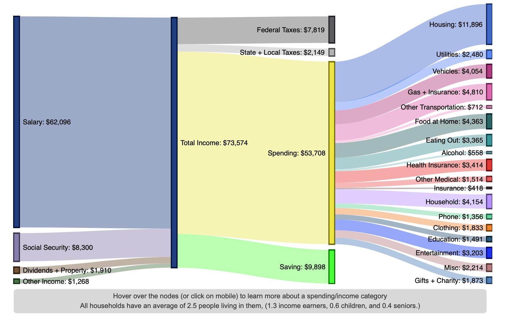
A simple yet clear example of a growing use of Sankey diagrams, which is to display the flow of money. This example demonstrates that multiple sources can come togther before being split into sub categories. The addition of clear labels and values makes the diagram easy to follow.
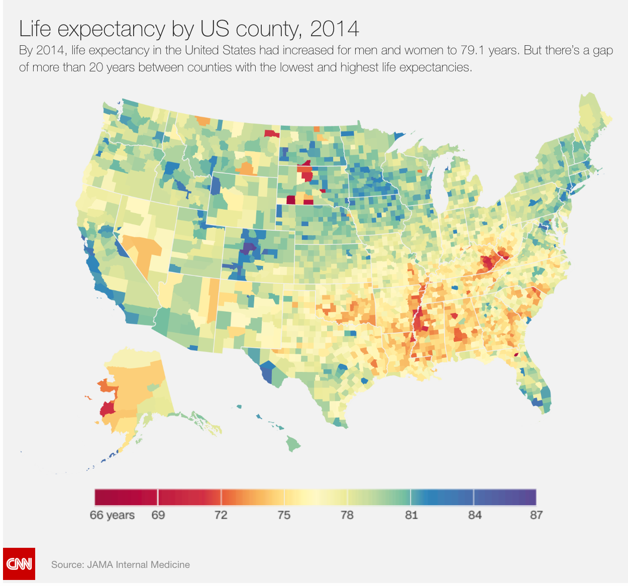
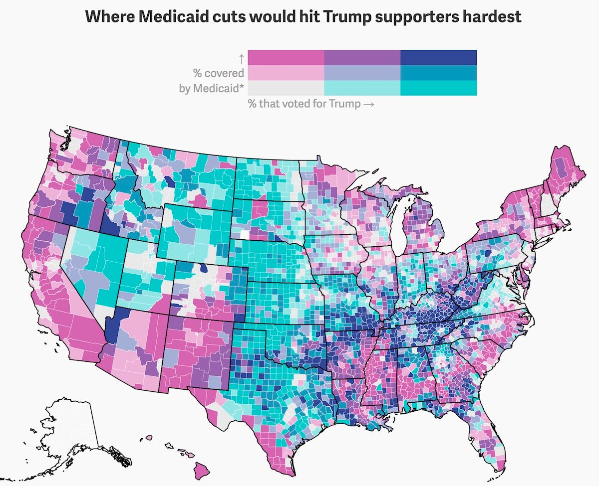
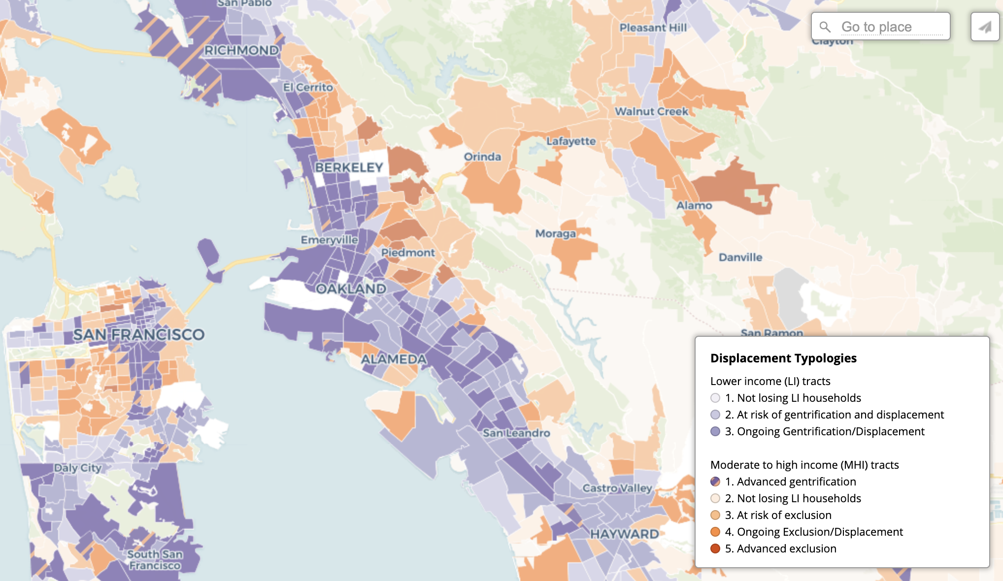
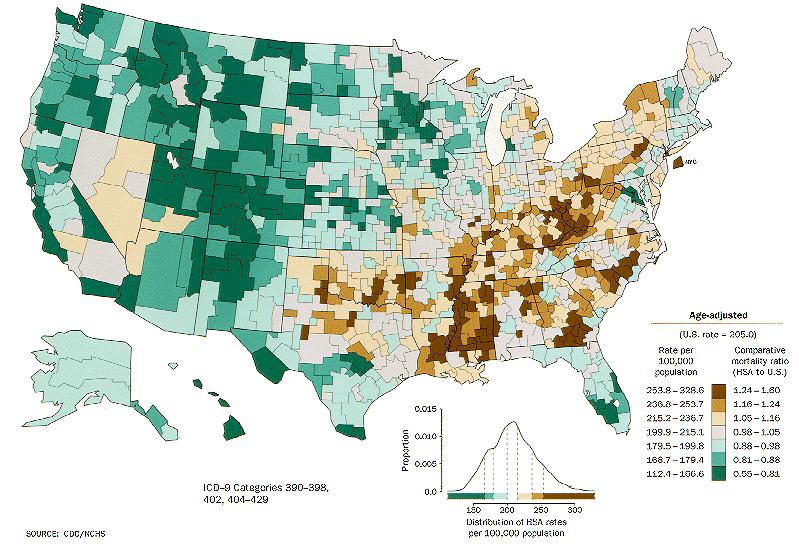
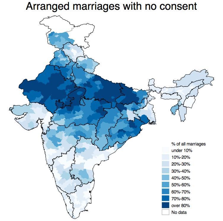
Choropleth Map
Choropleth maps depict variations in spatial data by shading geographic areas according to a statistical measure. They make use of a gradient of hue, value, and texture, and often follow pre-defined geographic boundaries such as census tracts, cities, states, or countries.
Values
The choropleth map can represent various values including percentages, percentiles, rates, integers , and fractions by grouping these values into graduated categories (from small to large etc.).
Pre-processing
Raw data must be linked spatially to areas on a map, and categorized into brackets or organized using break points. Common groupings include equal intervals, quantiles, jenks, and natural breaks.
Mapping
Choropleth maps utilize a gradient of colors, values or patterns to represent the spectrum of values across an area for a given variable. An increase in the statistical value of measure is reflected by a proportionate change in value or texture of the fill in the geographic area of the map.
Good Examples
CNN - Life Expectancy
Quartz - Donald Trump's "mean, mean mean" health care bill is meanest to his most crucial voters (Bivariate choropleth map)
Urban Displacement Project - Displacement Typologies in the Bay Area
Bad Examples
Too many patterns - Map of the US state populations using country flags with comparable population size

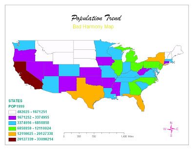
Non-intuitive color scheme - Population of the US by State
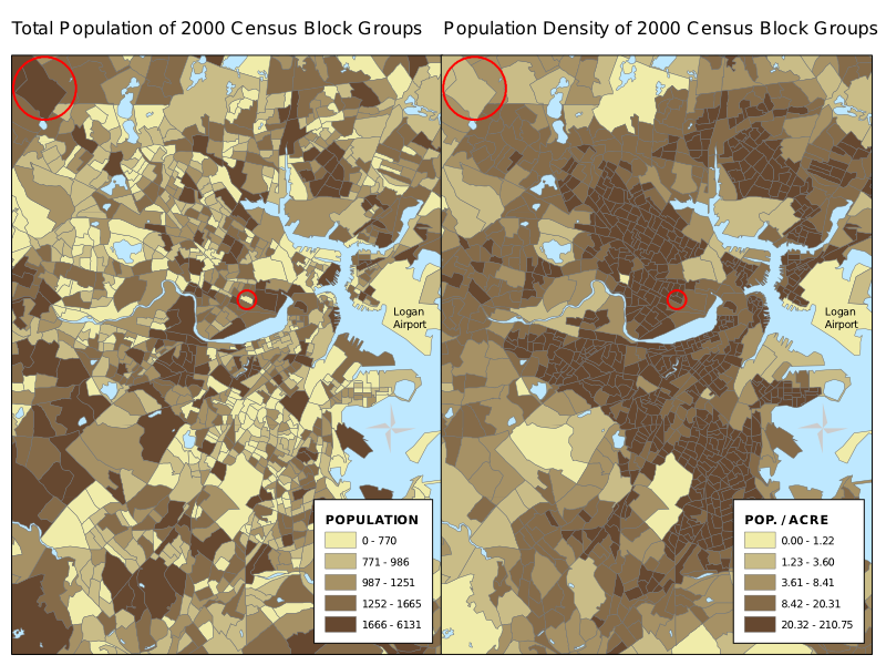
Misleading due to lack of normalization - population by census block group
References:
https://en.wikipedia.org/wiki/Choropleth_map
choropleth map | Society of American Archivists
Society of American Archivists
Scatter Plot
What’s scatter plot?
Scatter plot is a type of diagram using Cartesian coordinates to display values for typically two variables for a set of data. It shows the correlation between variables. In two dimensions, it uses dots to represent the values obtained for two different variables, one plotted along the x-axis and the other along y-axis.
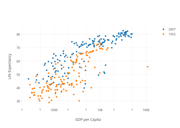
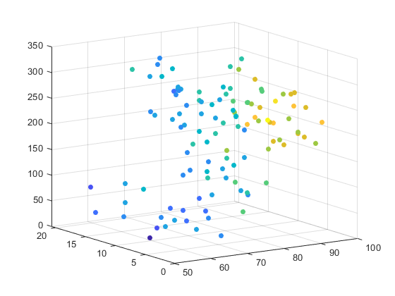
However, scatter plot is not limited to two variables only, it can be extended to more variables if you want to add in more dimensions. Additionally, if the dot itself is coded in terms of size color and shape, one or two additional variable can be displayed when it's needed.
Pre-processing
A scatter plot can be used either when one continuous variable that is under the control and the other depends on it or when both continuous variables are independent. Before we dive into the data sets, we need to figure out dependency relationship, then assign the variable value to each axis. Also we need to sort through paired combinations of each data point before hand.
Mapping
The correlation between data sets are converted into positions of data points. Pattern of dots slopes indicates the type of correlation which can be positive, negative or null.
Good Use Cases
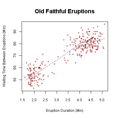
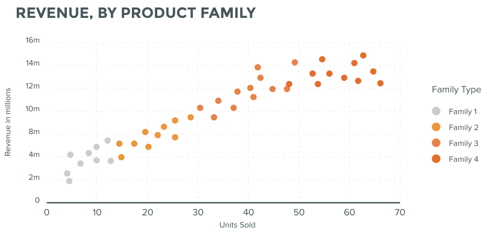
1/ This scatter plot shows the waiting time between eruptions and the duration of the eruption for the Old Faithful Geyser in Yellowstone National Park. From the plot there are two clusters of data points which might suggests that there are two types of eruptions: short-wait-short-duration, and long-wait-long-duration.
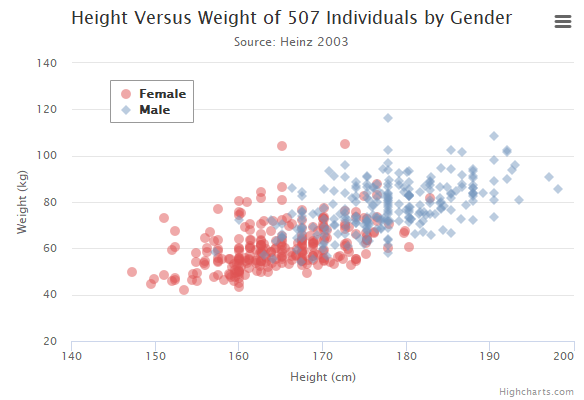
2/ This scatter plot indicates the correlation between people's weight and height among different genders, the transparency of dot can reveal the concentration level at certain area.
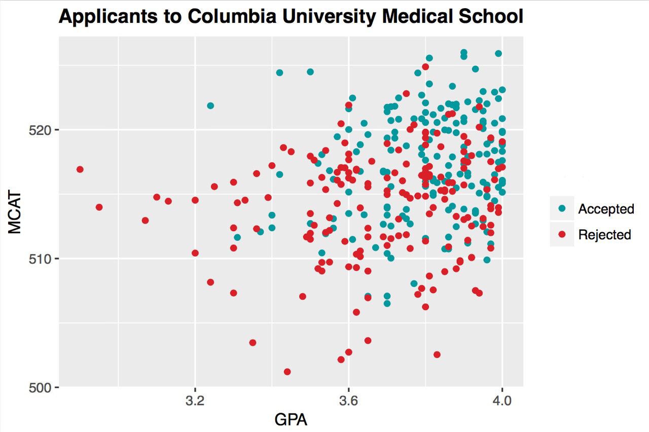
3/ This is a scatter plot of applicants who are either accepted or rejected by Columbia University Medical School. Two variables here are GPA and MCAT, what we can learn from this graph is that 1) Most applicants have a GPA between 3.6~ 4.0 and MCAT between 510 ~ 520. 2)people who have a high GPA and high MCAT is more likely to be accepted...
Bad Use Cases
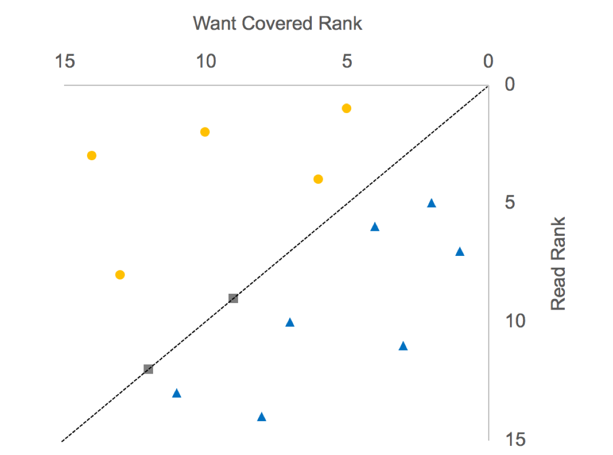
1/ The two sets of ranks are basically uncorrelated, as the regression line is almost flat. The analyst tried to"rescue" the data in the following way: draw the 45-degree line, and color the points above the diagonal blue, and those below the diagonal orange. Color the points on the line gray.
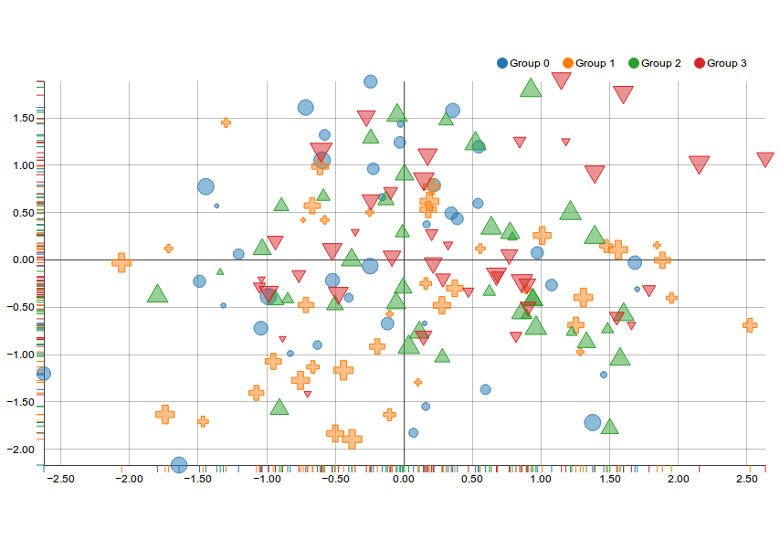
2/ This scatter plots is visually too complex, a lot of visual elements are piling up inside this diagram, the dot itself contains three variables already: color, size and shape. It's hard to digest all the information at once without reading the legend.
3/ The color choices are too close to each other which might cause confusion for certain readers such as people who are color-blind.
References:
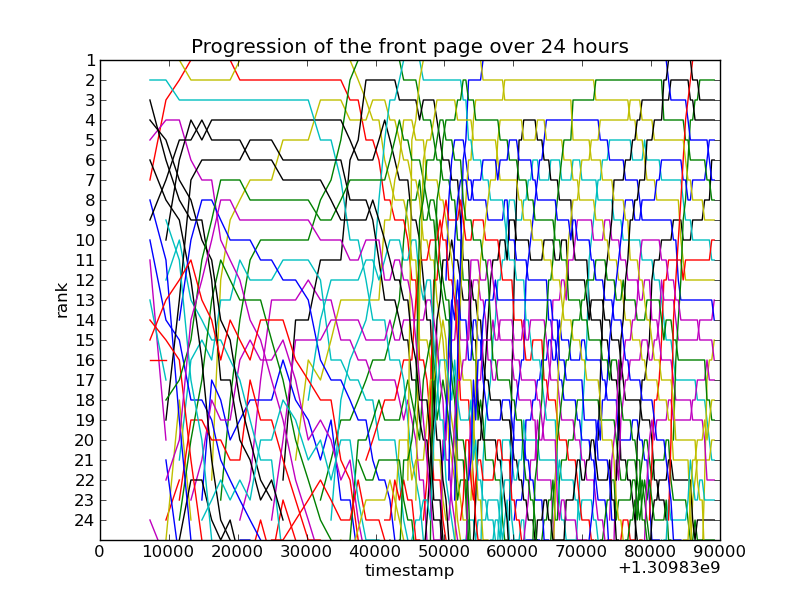
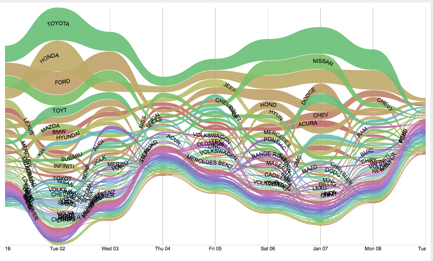
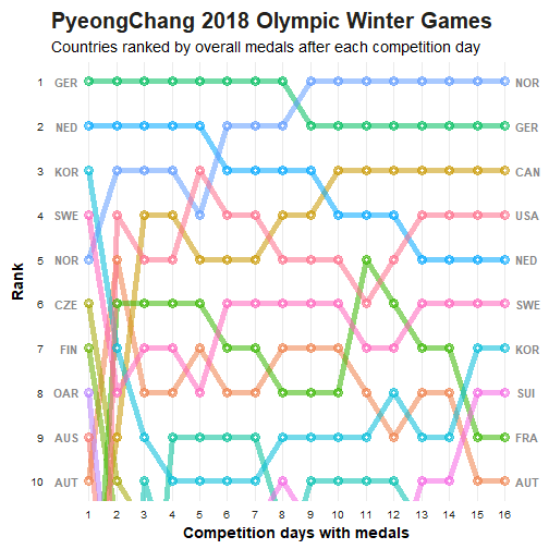
https://en.wikipedia.org/wiki/Scatter_plot https://seaborn.pydata.org/generated/seaborn.scatterplot.html https://chartio.com/learn/dashboards-and-charts/what-is-a-scatter-plot/ https://towardsdatascience.com/everything-you-need-to-know-about-scatter-plots-for-data-visualisation-924144c0bc5Bump Chart!
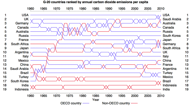
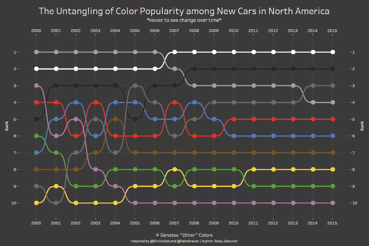
Bump charts offer viewers a concept of ranking by comparing values of similar entities over time or place. Line, Area, and Stream graphs are close in composition to bump charts, with the main difference being each line represents an entity within a certain category, and the comparitive value (ranking) is the goal of the expression. Each line can also show the volume of the entity's data, as you can see in the example below. The values represented are quantitative/numerical, usually in interger form, but could possibly show percentages or fractions in other situations.
Pre-processing is involved in this graph type. Totals need to be calculated at defined time intervals, and those are then associated to each entity and then related to the totals of other entities in the same category, giving us a ranking at each interval. As lines cross eachother along the graph, it would define a change in ranking between two entities.
There are many things going on within the mapping and resultant display of this graph. Entities are being compared to one another, their values dynamically display on the Y-axis, and all of this is realted to the context of time on the X-axis. It is important to be mindful of the amount of entities you choose to analyze becasue, as you can see in the poor chart examples, the information can be lost in too many colors or overlapping lines. Also, the relative thickness of the line needs to be thoughtfully chosen and scaled.
Good examples:
Not so great examples:
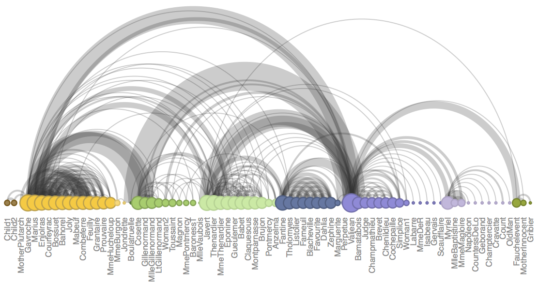
Arc Diagram
- Description
Arc diagrams are two dimensional informative network graph. It constitutes of two elements i.e. node and links.
1.1. Nodes
Nodes represents the entities of the data. It is presented in a single line usually on a horizontal axis. Further information or details can be translated into the nodes by manipulating the radius of the nodes.
1.2. Links
Arcs are used as links intended to show relationships between the nodes. Variations of wide arcs or arc line-width can be used to add details such as type or frequency of connection between entities.
2. Aspects
2.1. Advantage
Arc Diagrams are ideal for visualizing networks, connections between different entities of information and the study the distribution of the connections.
2.2. Disadvantage
Arc diagrams are not ideal to show the exact structure or connection between the nodes.
Increase in number of links might make the diagram over cluttered to fetch precise connections and structure of the entities.
3. Examples
Good Examples
3.1. Visualizing the Papers of Thomas Jefferson
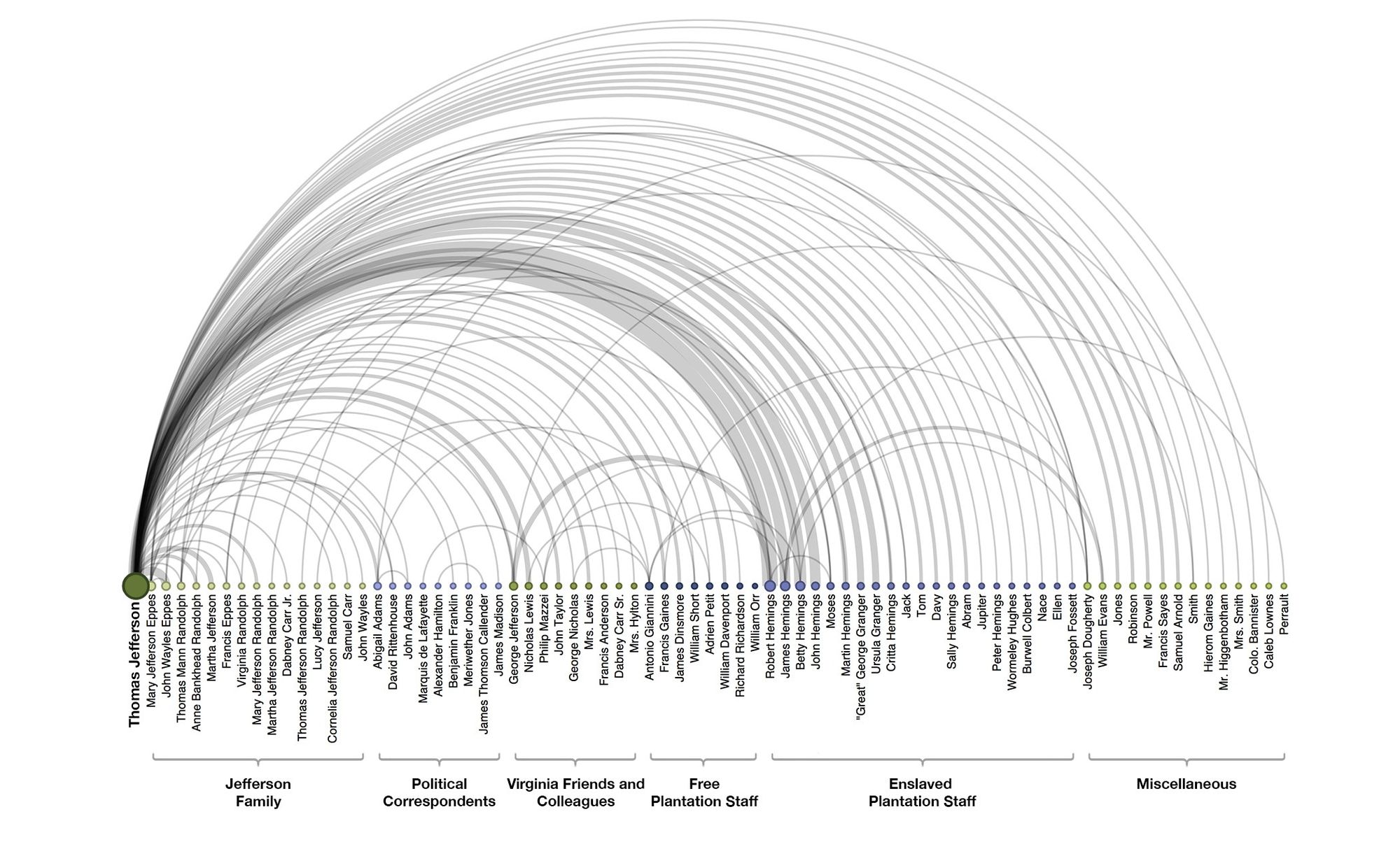
Observations:
a. It clearly conveys interlinks between Thomas Jefferson and other fellow characters.
b. The nodes are characterized into different groups to understand the background of the entity.
c. The width of arc indicates relative frequency of correspondence.
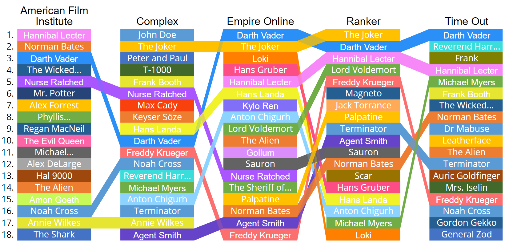
3.2. Character Co-occurrence in the Chapters of Victor Hugo’s classic novel Les Misérables
Observations:
a. Each character is connected by an arc if they appear together in the same chapter; the wider the arc, the more the characters appeared in chapters together.
b. The ordering (and colour) of the nodes identify groups of characters that appear in the novel together.
c. The diameter of the node signifies the frequency of appearance of the character.
Bad Examples
3.3. Text Analysis of the Holy Scriptures
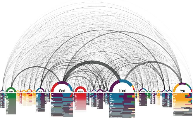
Observations:
a. Diverse methods of visualization including the arc diagram are adapted to translate complex information.
b. The nodes in random order makes the network of the link more complex. Hence, it might be difficult to perceive the network of the connections.
3.4. Bible Cross-References
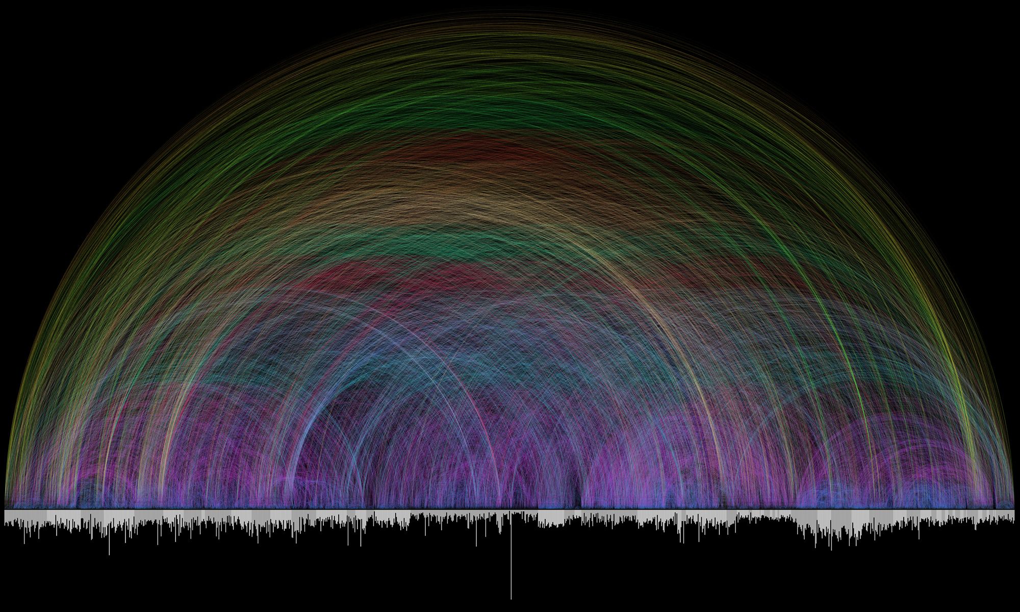
Observations:
a. The bar graph that runs along the bottom represents all of the chapters in the Bible.
b. The length of each bar denotes the number of verses in the chapter.
c. Each of the 63,779 cross references found in the Bible is depicted by a single arc - the color corresponds to the distance between the two chapters.
d. The diagram gives an in-depth information regarding the cross references; however, the information is too complex to comprehend. Due to overlap in the links a lot of connections seems to be blurred.
Tree Map
Intro to Tree Maps
- Tree maps usually represent a hierarchical structure of a large amount of data in the form of the size of rectangles and color scale. It provides a clear view of the complexity of the data and the comparison among different types of data. However, it is not useful to find out the details of each type of data, because numbers and names take too much space to fit into each rectangle. It is also very difficult to see the exact percentage of each category.
- Pre-processing
- Choose colors for each level.
- Determine the size of each level.
- Numerical values are converted into sizes and colors.
Good use case of Tree Maps
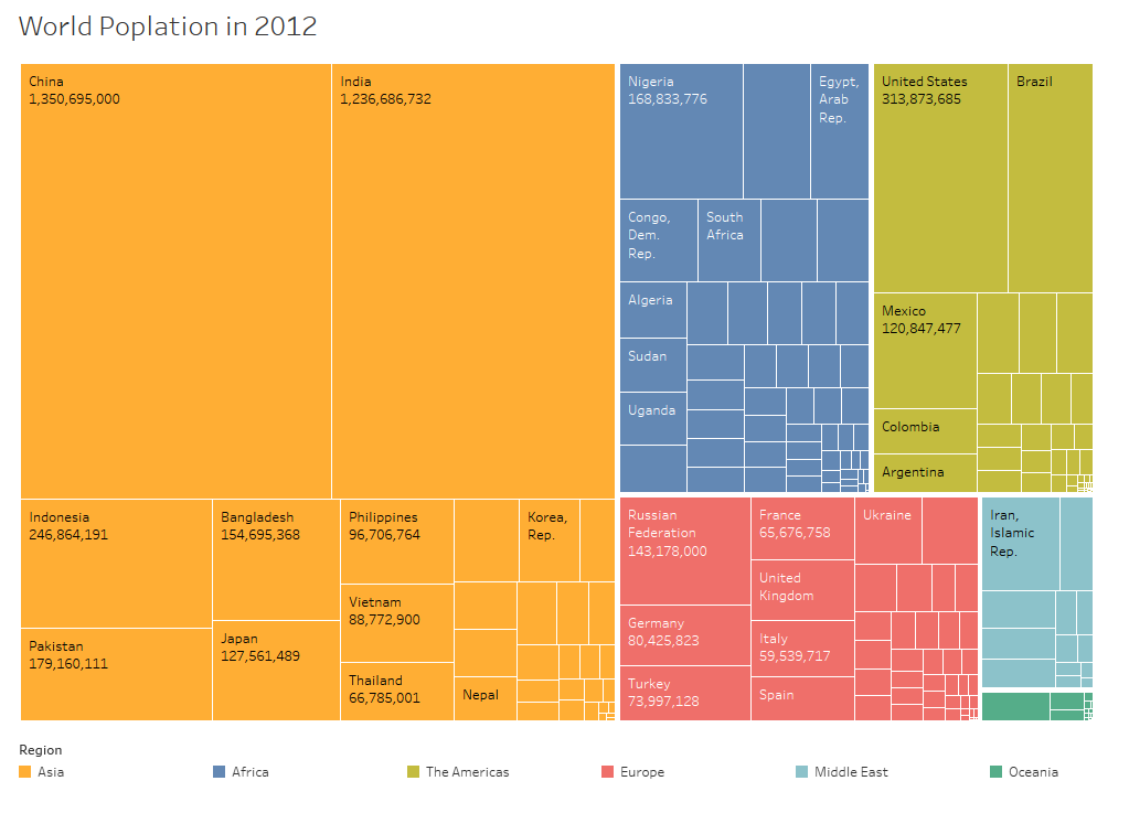
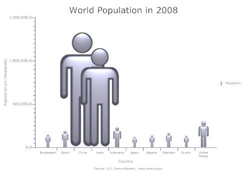
The diagram above shows country names and population of the countries. With the tree map, it is easy to discover which countries has the largest population.
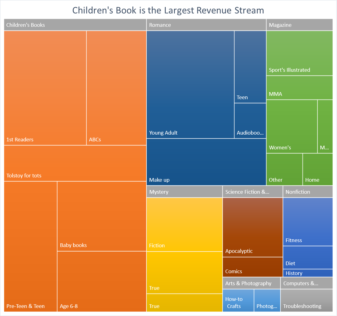
The diagram above clearly shows the types of book that brings the largest revenue with the use of the tree maps and the distribution of the audience.
Bad use of Tree Maps
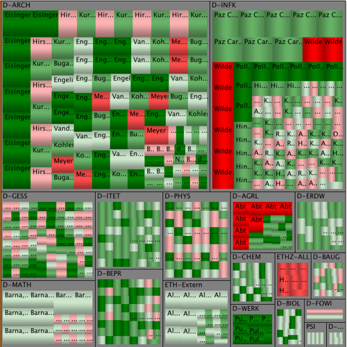
It is difficult to see the hierarchy on the picture above due to the sizes of different categories are similar.
Visual Diff
What is Visual Diff:
A Visual Diff compares and shows differences between rendered text documents. It is definetely useful when we want to keep the progress updated and track the certain changes been made.
Some typical examples exists in linux system. Imagine that as a programmer, It is pretty common to work on the same project. With the visual diff tools, it is easy for us to see the differences that each of the team member made. Since "Nothing is final on the internet, where every single article can be changed to update facts, add images, fix errors, and more."
How to Use it(pre-processing):
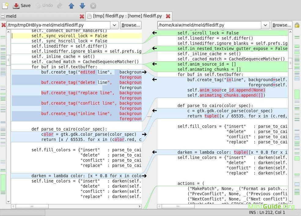
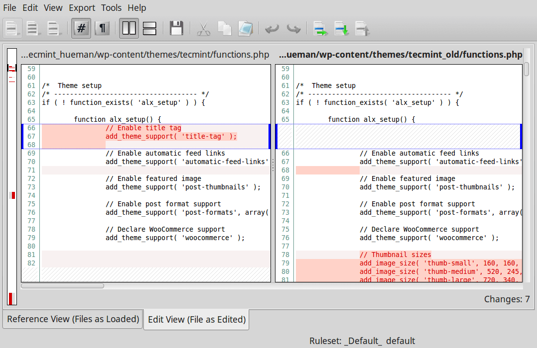
While it is a powerful tool, the result is ctualy difficult to interpret. I actually found many instructions about how to read a comparasion text after being represented by visual diff. For example the tool called Meld is a GUI - based tool that being used by many programmers to do visual comparison and merging. "Meld helps you review code changes and understand patches," the official website says. "It might even help you to figure out what is going on in that merge you keep avoiding."
Generally peole can do File comparison, Directory comparison and Version control view. Speaking of File comparison, users select the files awaiting for compare. If we observe closely, the bar in the screenshot above contains some coloured blocks. These blocks are designed to give people an overview of all of the differences between the two files. "Each coloured block represents a section that is inserted, deleted, changed or in conflict between your files, depending on the block's colour used," the official documentation explains.
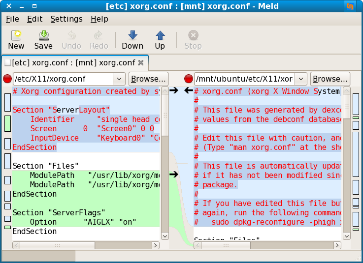
Like any other software tool, there are certain things that Meld can't do. The official website lists at-least one of them: "When Meld shows differences between files, it shows both files as they would appear in a normal text editor. It does not insert additional lines so that the left and right sides of a particular change are the same size. There is no option to do this.".
What is the current options of Visual Diff tools?
XXdiff
XXdiff is a free, powerful file and directory comparator and merge tool that runs on Unix like operating systems such as Linux, Solaris, HP/UX, IRIX, DEC Tru64. One limitation of XXdiff is its lack of support for unicode files and inline editing of diff files.
DiffMerge
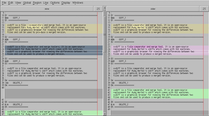
In terms of showing the differences, I feel like sometimes the lines are sort of redundant and confusing. You have to review the whole page and link the two ends of the lines together. What if it just shows in a parallel way?
Here comes the DiffMerge. It is a cross-platform GUI application for comparing and merging files. It has two functionality engines, the Diff engine which shows the difference between two files, which supports intra-line highlighting and editing and a Merge engine which outputs the changed lines in a horizontal level.
Other diff visualizations:
Another type of diff visualization is graph diff’ing, often used in graph views of assembly code. I wonder if it has some sort of zoom capability . You can either see the whole file at a large level or scroll into particular sections that are signified as different. Also I am wondering if people can see a grid of size comparison to where you are, this could be a colour coded area to see people are zooming into different areas, and the other different areas are over there in relation.
Conclusion:
I am wondering if there has a method that you can see the whole file at a large level and then you can scroll into particular sections that are signified as different. Also you can see a grid of size comparison to where you are, this could be a colour coded area to see people are zooming into different areas, and the other different areas are over there in relation.
Refering back to the research I have done about VisualDiff tools. I alwasys prefer Straightforward Visualization — Let the reader interpret or direct with annotation. Whatever method designers choose, the key is to focus specifically on the differences. So instead of just visualizing your files, you also want to visualize how people created the diffs, which in the end, may matters a lot to the programmers or users. Hopefully, a number of "visual" diff utilities have been developed over the years.
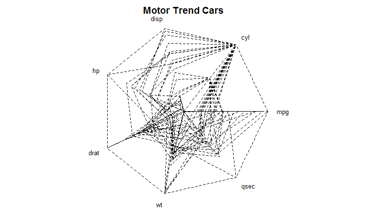
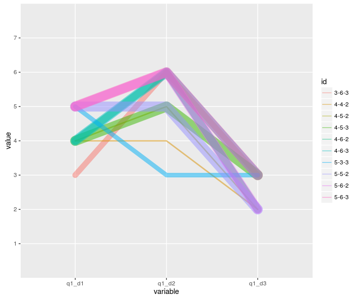
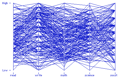
Parallel & Radial Coordinates // Star Plots
Values Represented:
Multivariate, numerical data. These visualization tools allow comparison between many variables together to be able to see the relationships between them and bring visibility to outliers. For example, you may want to compare the specs of a specific product from multiple brands.
The plots can easily become cluttered and difficult to read. Bw strategic on the axes (or rays in a star plot) you choose to include and offer a way to isolate information if possible. For star plots, separating the lines by at least 30 degrees from each other is best, and avoid layering them on one radar chart.
Pre-Processing:
Consider the specific axes to include, and what axes order makes sense for the reader to best understand the data, or to best communicate specific patterns. For parallel coordinates, the axes can hold different types of values. Star plots variables are typically normalized.
Mapping:
Parallel Coordinates: Each variable has its own axis and axes are parallel to each other. The values are plotted as a series of lines that connect across all the axes. Each line is a collection of points. The axes can have different values from each other.
Radial Coordinates: one axis runs in a circle, while the other extends radially out from the center. The values are plotted along the these axes.
Star Plots: Each data record is shown as a star-shape, allowing one ray for each variable. The ray is proportional to the value of the variable. The ends of the rays are connected with lines.
Good Examples:
Poor Examples:
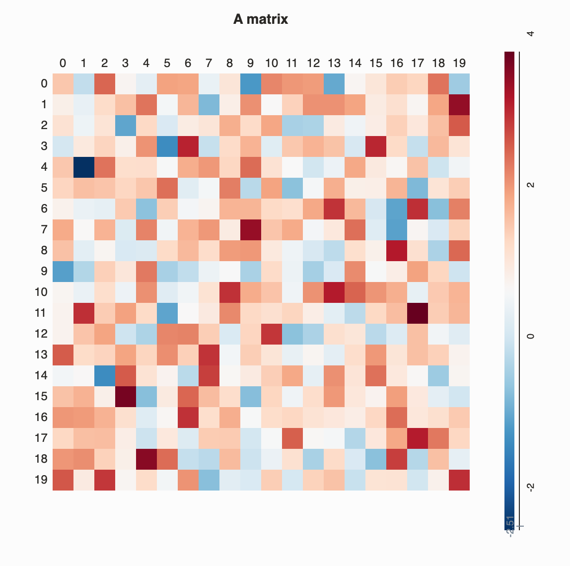
Matrix and Half Matrix
Is a graphical technique that can simultaneously explore the associations between thousands of subjects, variables, and their interactions, without needing to first reduce the dimensions of the data. Matrix visualization involves permuting the rows and columns of the raw data matrix using suitable seriation (reordering) algorithms, together with the corresponding proximity matrices.The permuted raw data matrix and two proximity matrices are then displayed as matrix maps via suitable color spectra, and the subject clusters, variable groups, and interactions embedded in the dataset can be extracted visually.
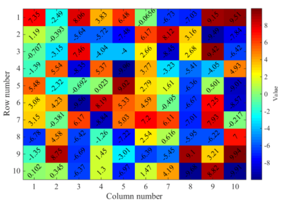
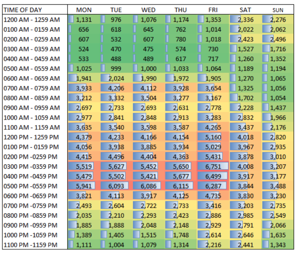
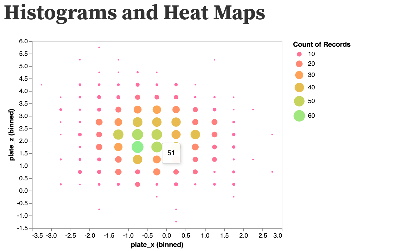
Heat Map
Heat maps are a type of visualization to show data density. They are particularly helpful when you have a lot of (e.g., tens of thousands of) data points and are mainly interested in their overall distribution. Technically, in a heat map, data points are aggregated locally and mapped to colors (either gradient or quantile), so that we can make better sense of the density of the data from the colors while still being able to see and use the map.
Values it Represents
Essentially, a Heat Map counts the amount of variables in a scale of an area. So it can represent various values including fractions, integers, percentages.
Sorts of Comparisons
Enables:
The benefit of Heat Maps is that visually encoding quantitative data with color using small area marks is very compact, so they are good for providing overviews with high information density.
A Heat Map represents the density discrepancies of dots based on maps, matrix or even just an interface, such as clicks on a webpage. It enables audience to perceive density of points independently of the zoom factor.
Discourages:
The limit of Heat Maps is area marks of a single pixel, for a dense heat map showing one million items. Only a small number of different levels of the quantitative attribute can be distinguishable, because of the limits on color perception in small noncontiguous regions.
How to Make a Heat Map
- Scale the data
- Cluster the data
Mapping
Encode a single quantitative value attribute with color.
Examples
Good Examples
- It uses carefully designed color schemes and visualization strategies. The color schemes were designed so that one color does not visually dominate the others. Bright reds and yellows are nowhere to be found. Fully saturated colors are avoided in favor of slightly muted colors. It enables you to see variations in the data without being biased by visual artifacts that can result from poor color choices.
- Peak crashes during the after- school pickup hours through the drive home commute hours M-F, with highest crash volumes on Friday during such periods.
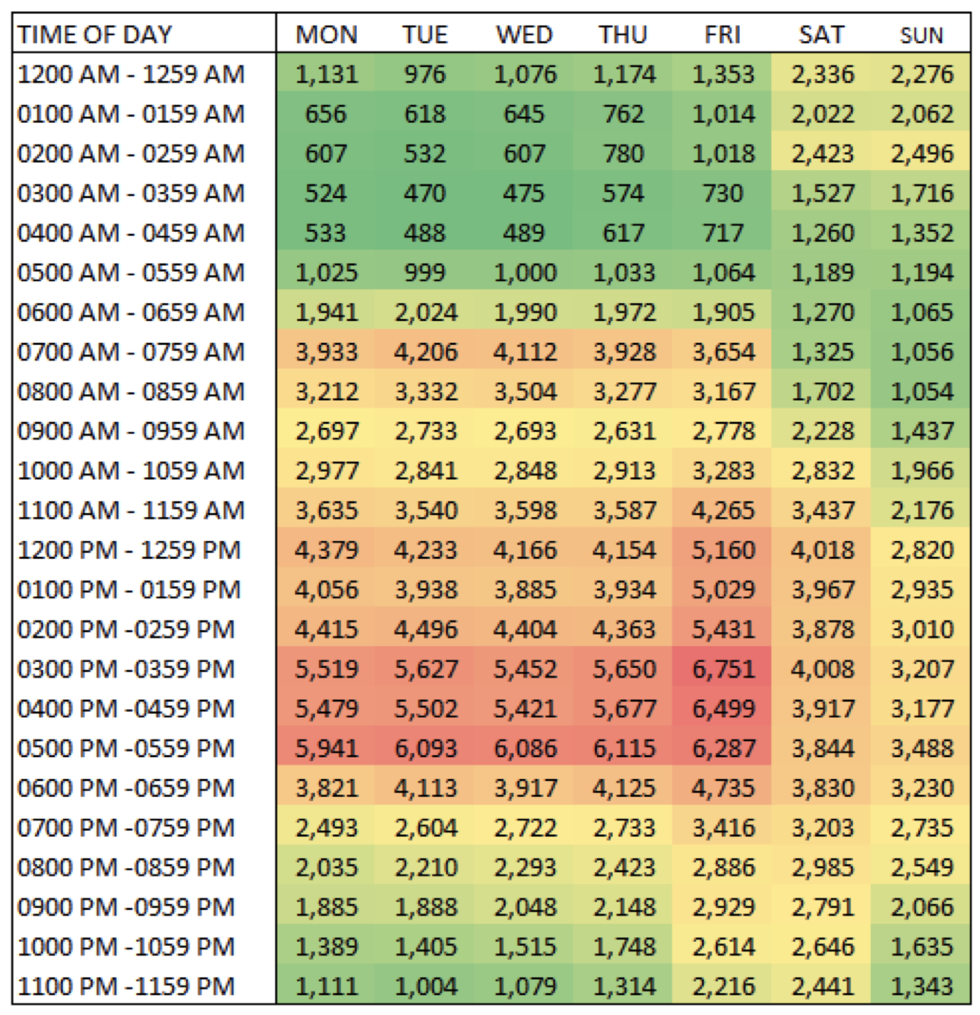
Some heat maps use mini-bars in the crosstab cells to convey magnitude.
- A Heat Map provides a compact summary of a quantitative value attribute with 2D matrix alignment by two key attributes and small area marks colored with a diverging colormap.
Bad Examples
- The legend is confusing for many reasons.
There are three different kinds of ranges here: two “less than” signs, three numerical ranges like 5-10, and then one “plus” sign. That variety of how the numbers are displayed can make it hard to understand.
And there's overlap, too: is 10 percent in the 5-10 range or 10-15? More useful ranges would be something like 0-4.9, 5-9.9, and so on. Less than 5 percent would technically include less than 0 percent, too.
And finally, the note says the data is in thousands, but then lists percent.
- Poor color scale. Values do not encompass entire range. Inconsistent data range. Order of legend is a mess.
- The choice of colors is plain ugly and very tough on eyes. A softer shades of the same colors could deliver the same information with better aesthetics.
References:
- Tamara Munzner. Visualization Analysis and Design. A K Peters Visualization Series, CRC Press, 2014.
- https://en.wikipedia.org/wiki/Heat_map
- Effective Use of Heat Maps - MSKTC
- When Maps Lie
- Drawing and Interpreting Heatmaps
- https://appsource.microsoft.com/en-us/product/power-bi-visuals/WA104381072?tab=Overview
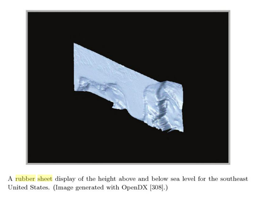
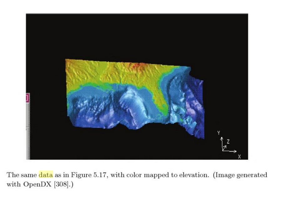
Rubber Sheet
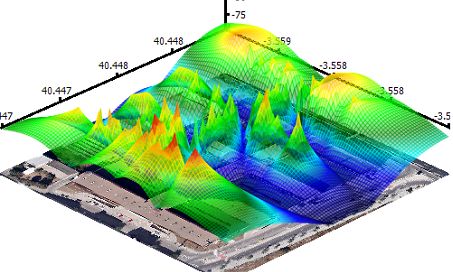
- Sometimes it is also be called "3D heat map".
- It usually be used for geo-related information lay out.
- Except the 2D map, it can also holding at least two kinds of informations, which can be presented by heights and colors.
- Rubber Sheet also usually be compared with isosurfaces, which have similar features. They always are used in visualizing temperature, weather and Ocean current.
- This visualization method usually be used to making physical model.
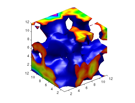
(An isosurface is a three-dimensional analog of an isoline. It is a surface that represents points of a constant value (e.g. pressure, temperature, velocity, density) within a volume of space; in other words, it is a level set of a continuous function whose domain is 3D-space.)
Good Examples
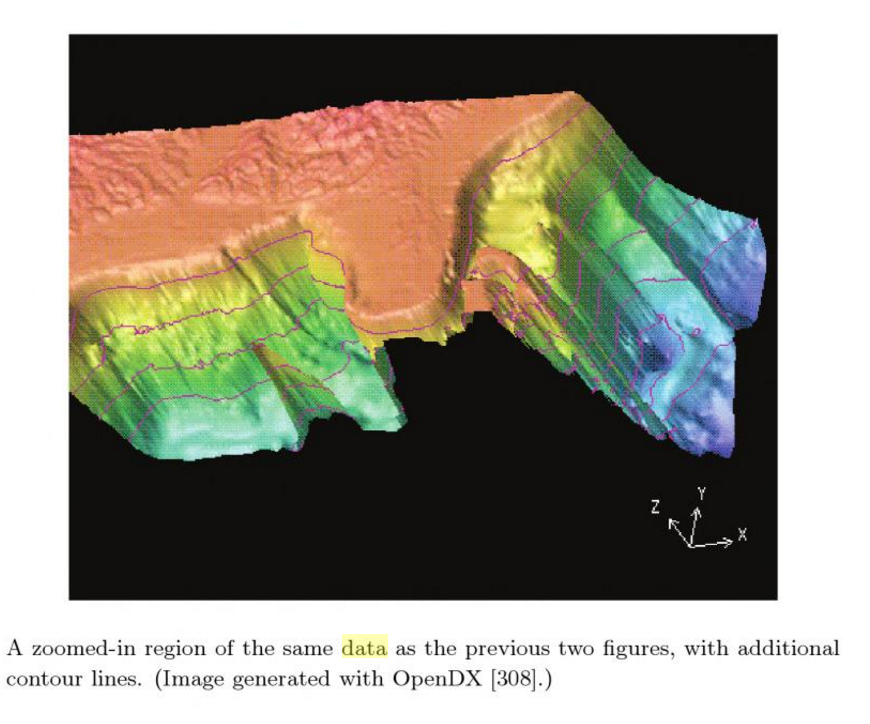
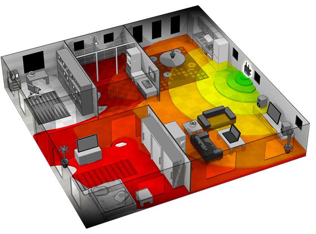
3D heat map be used to visualize Wifi signal strength. This example can be use for mapping Wifi signal strength in the space with multiple routers.
Physical Visualization Models
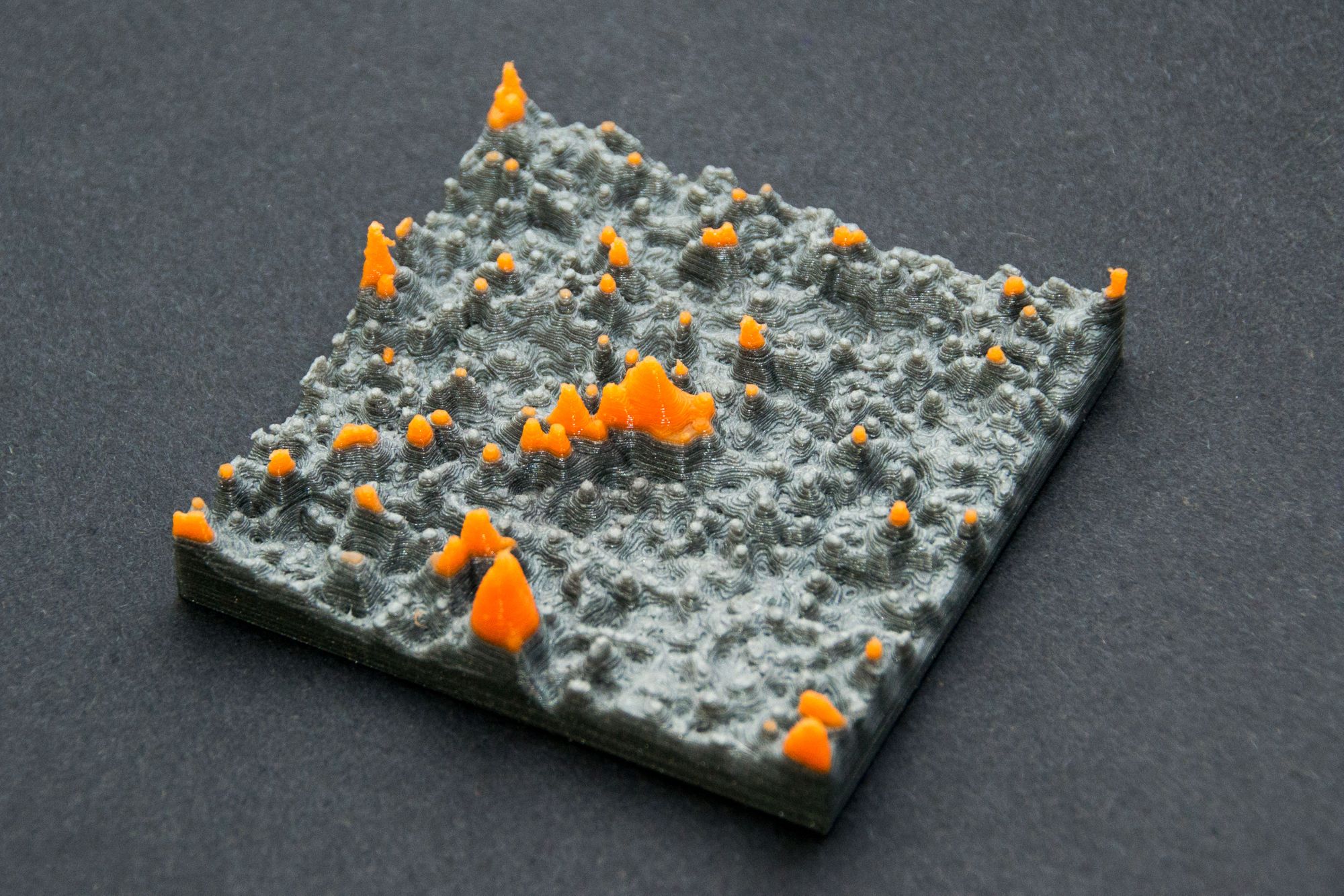
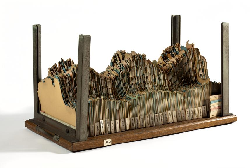
A 3D chart made out of a jagged cardboard for each year representing generated electricity and demand over time.
Bad Examples
This a combination of surface plot and heat map, where the surface height represents the amplitude of the function, and the color represents the phase angle. By the color seems just like rainbow colors which provides no useful information.
Reference:
https://ldld.samizdat.cc/2016/rubber-sheet/
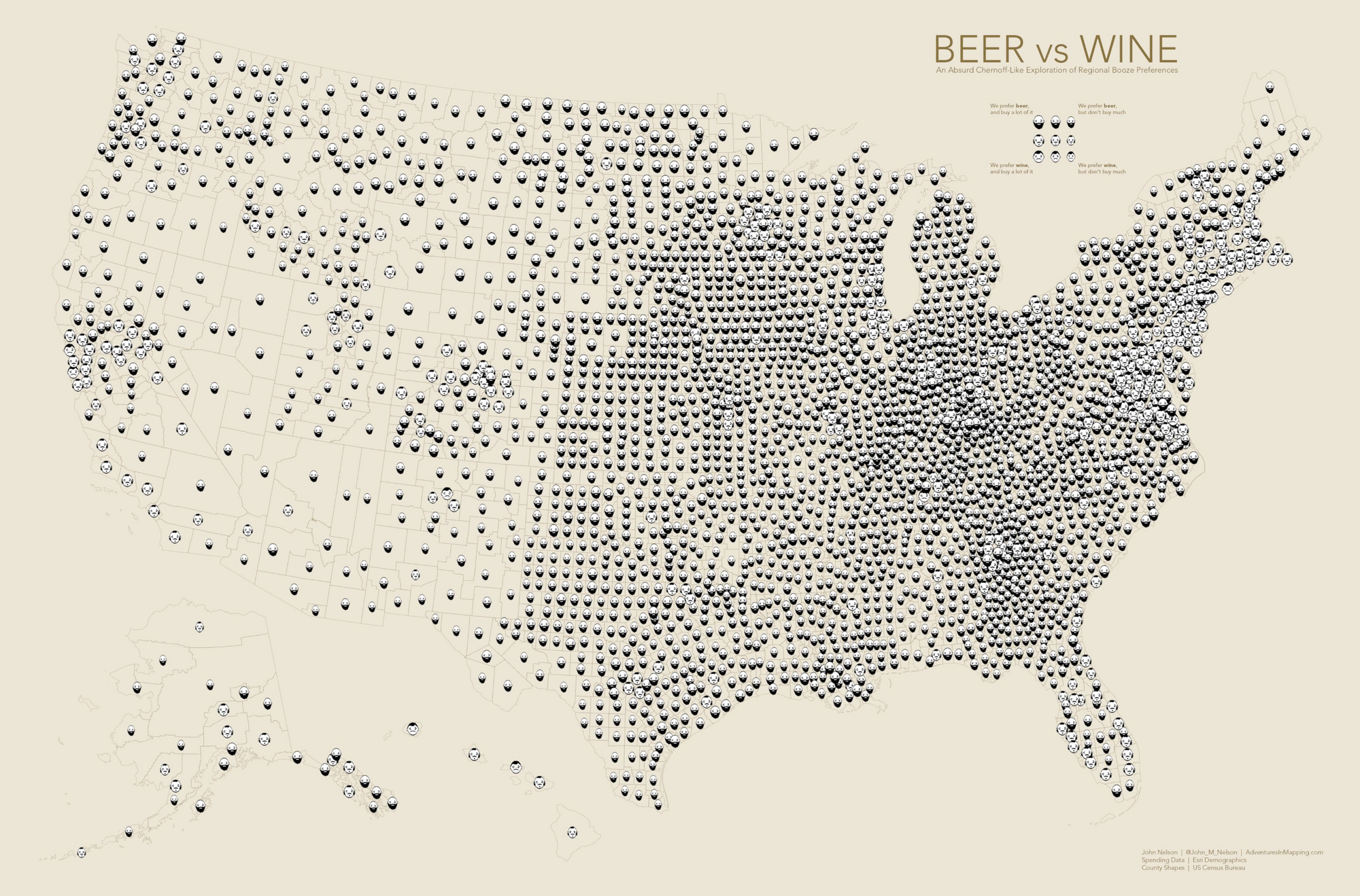
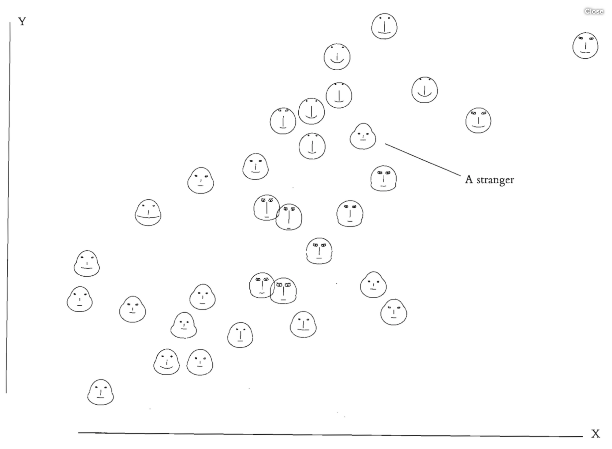
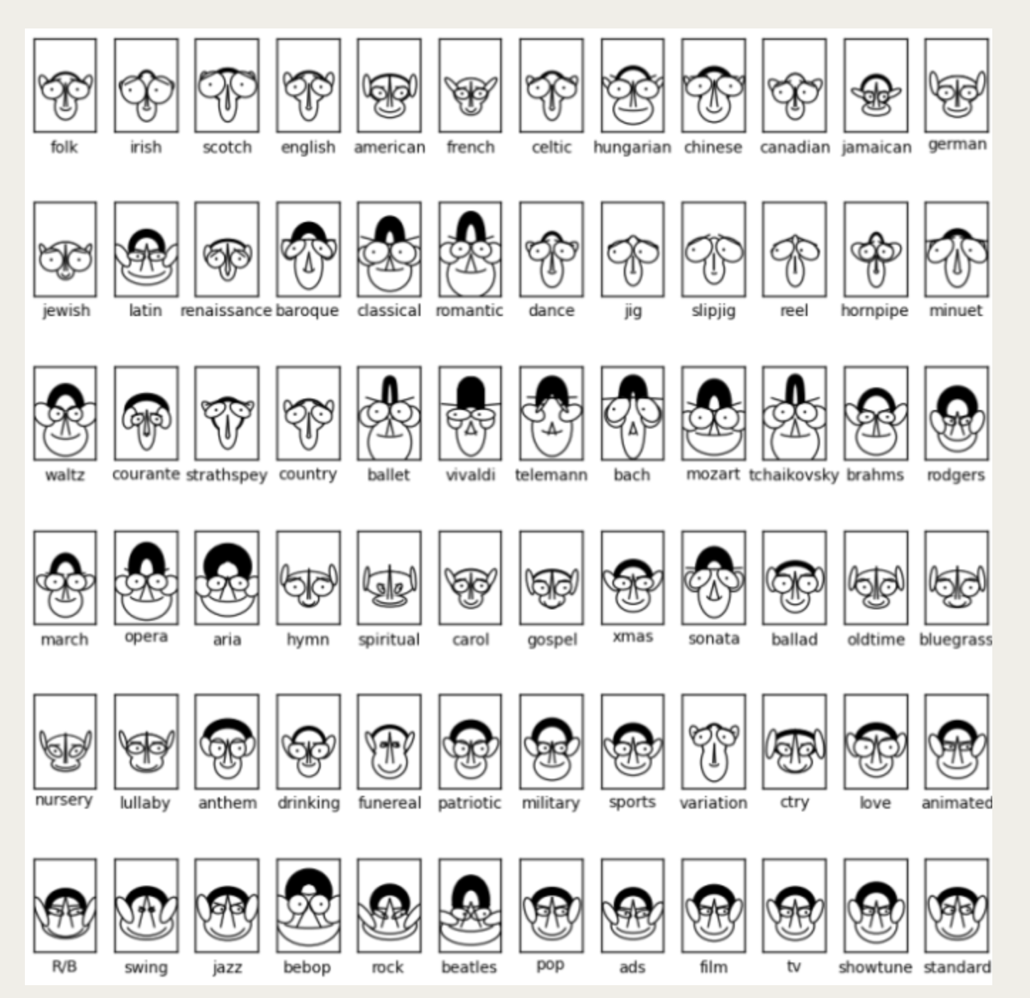
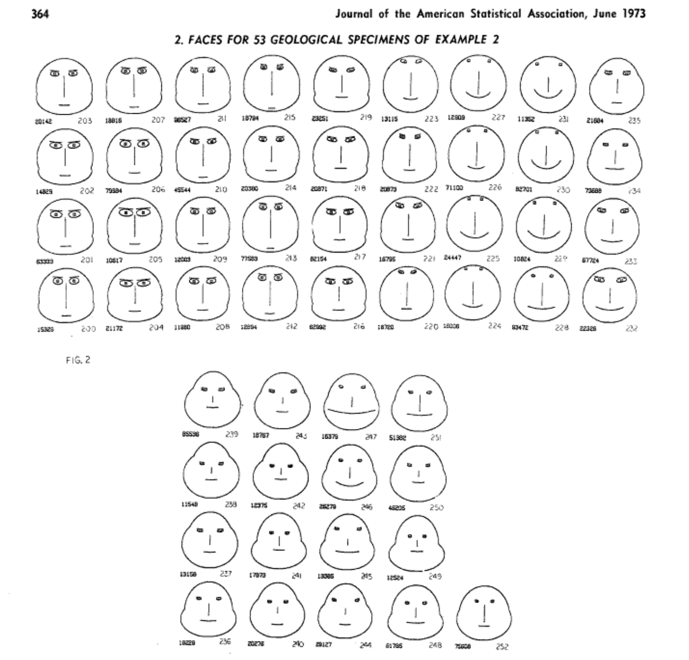
Chernoff Faces
About
The chernoff faces method (invented by Hermann Chernoff in 1973) can be used to visualize multi-dimensional values. Thus instead of a visualizing a single value and its expressions, multiple different values can be displayed and/or researched.
As the name implies, the method uses the human face and its different elements, such as mouth, nose, eyes, eyebrows, and maps different values to it. In order to do so, the values first have to be normalized.
The conceptional idea behind it takes advantage of the human capability in »reading« faces. Changes of or differences in facial expressions can easily be detected. Therefore this visualizing method is useful in order to detect extreme values respectively similarity of values of one dataset. At the same time the prior mentioned advantage of the method is its disadvantage: People tend to interpret and associate emotions and meanings to faces automatically. A sad mouth for example is automatiically interpreted as something »bad«, even if the attached data is something totally different.
Examples
Bad Examples
Good Examples
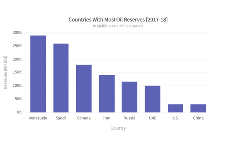
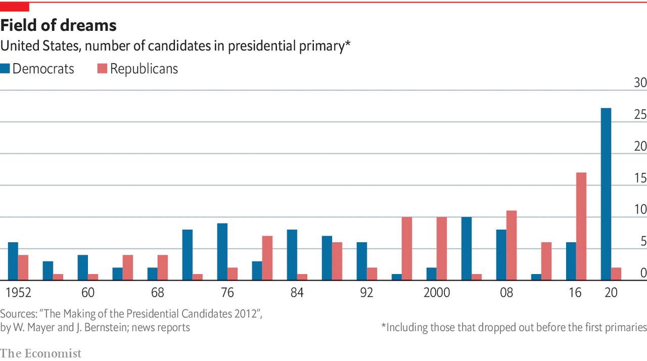
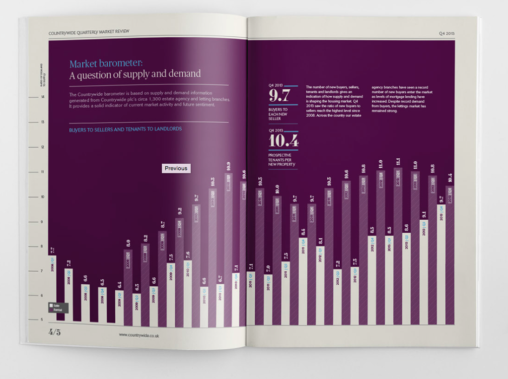
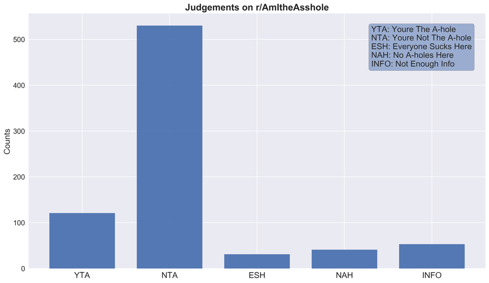
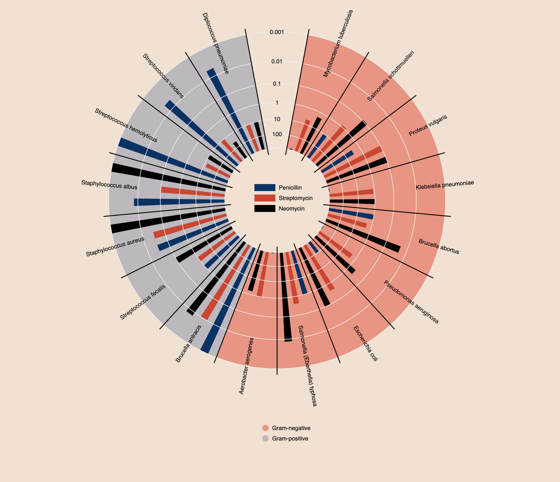
Bar Chart
The bar chart (Invented by William Playfair) is tool used to visually represent categorical data. Categorical data is derived from qualitative data and parsed into discrete groups (Ex. Month of Year, Country of Origin). This form of visualization lends itself best for comparison between categories of data. The bar chart is different from a histogram which uses bars to graphically represent the frequency of quantitative data.
Pre-processing that needs to occur between the raw data and the resultant chart consists of ensuring the data is parsed into proper groups and considering the axes. There are two axes in a bar chart the x axis and the y axis. One axis shows the categories being compared, and the other axis represents a distinct value.
The bars are rectangular shapes that are proportional in height or length to the value they represent, as bar charts can be either horizontally or vertically aligned. The bars need to be the same width and there is proportional space between each bar. Colour is used to represent the categories. Multiple colours can be used for comparison purposes or to represent sub-categories.
Good examples
Not the best examples
Box Plot
Definition
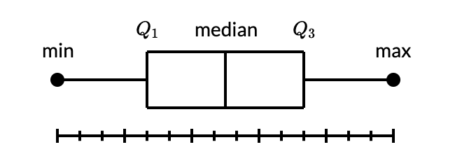
- A box and whisker plot—also called a box plot—displays the five-number summary of a set of data. The five-number summary is the minimum, first quartile, median, third quartile, and maximum.
- In a box plot, we draw a box from the first quartile to the third quartile. A vertical line goes through the box at the median. The whiskers go from each quartile to the minimum or maximum.
Description
- The lines extending parallel from the boxes are known as the “whiskers”, which are used to indicate variability outside the upper and lower quartiles. Outliers are sometimes plotted as individual dots that are in-line with whiskers. Box Plots can be drawn either vertically or horizontally.
- Although Box Plots may seem primitive in comparison to a Histogram or Density Plot, they have the advantage of taking up less space, which is useful when comparing distributions between many groups or datasets.
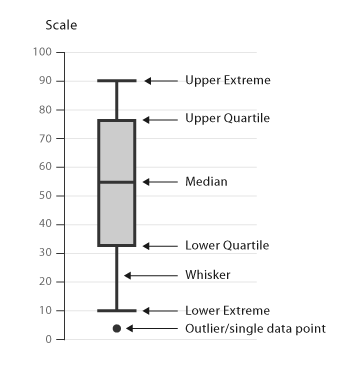
Term and Formula
- Interquartile Range (IQR)
- Minium = Q1 - 1.5*IQR
- Maximum = Q3 + 1.5*IQR
Use
- The box plot allows quick graphical examination of one or more data sets.
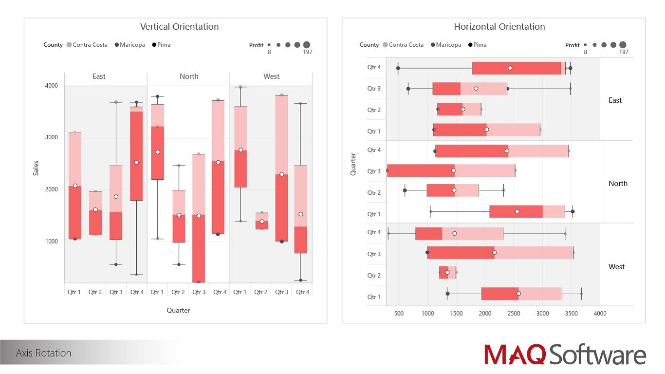
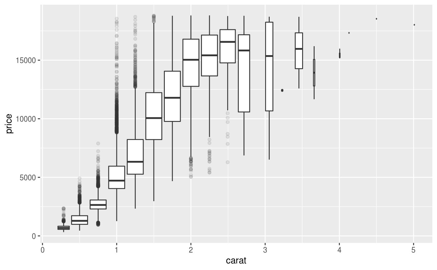
Example
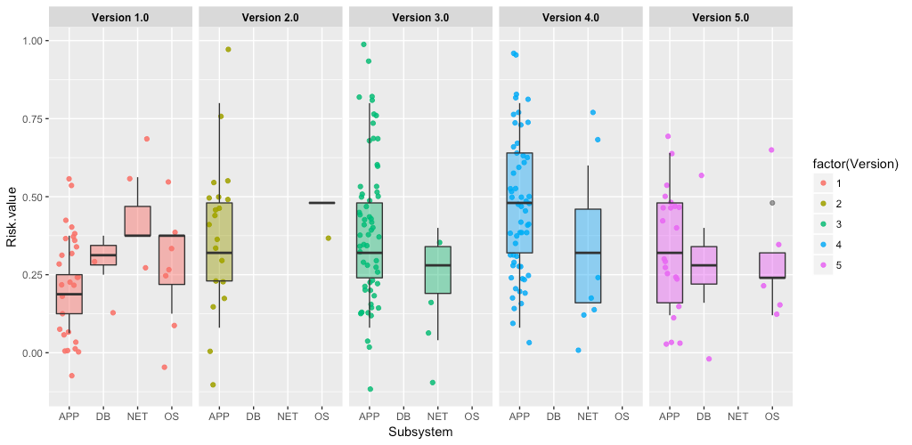
Good Design
Bad Design
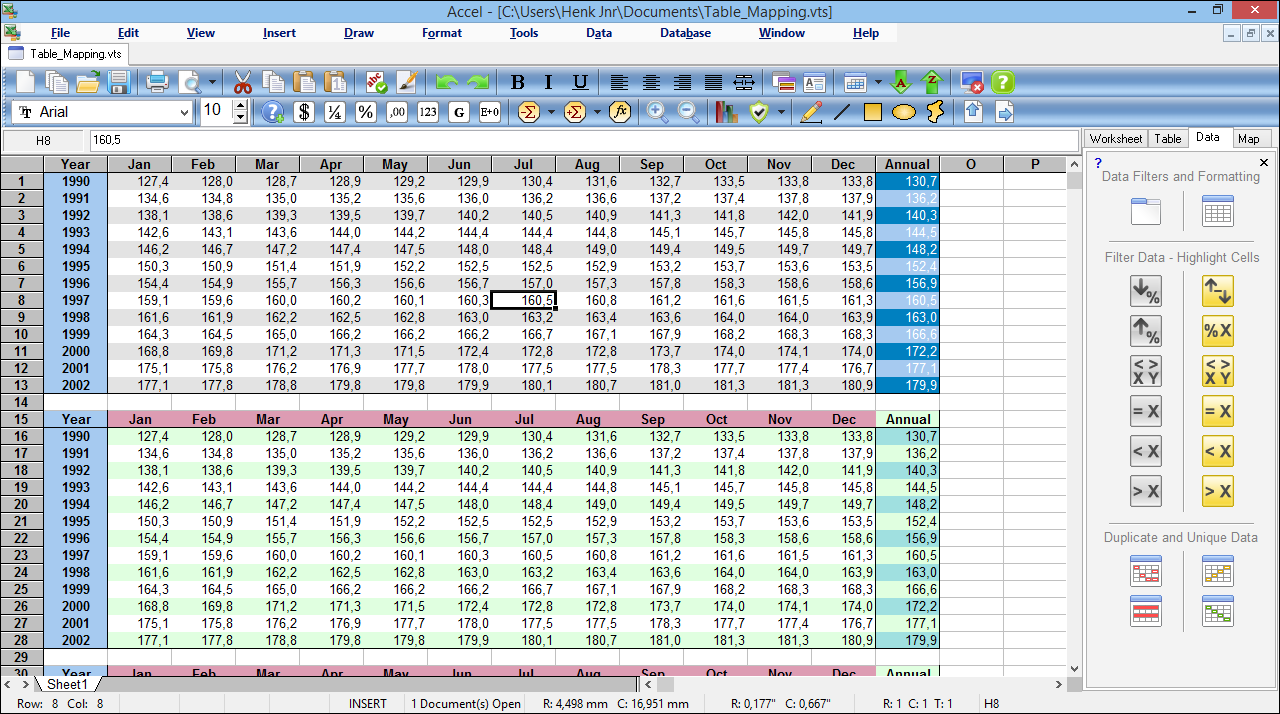
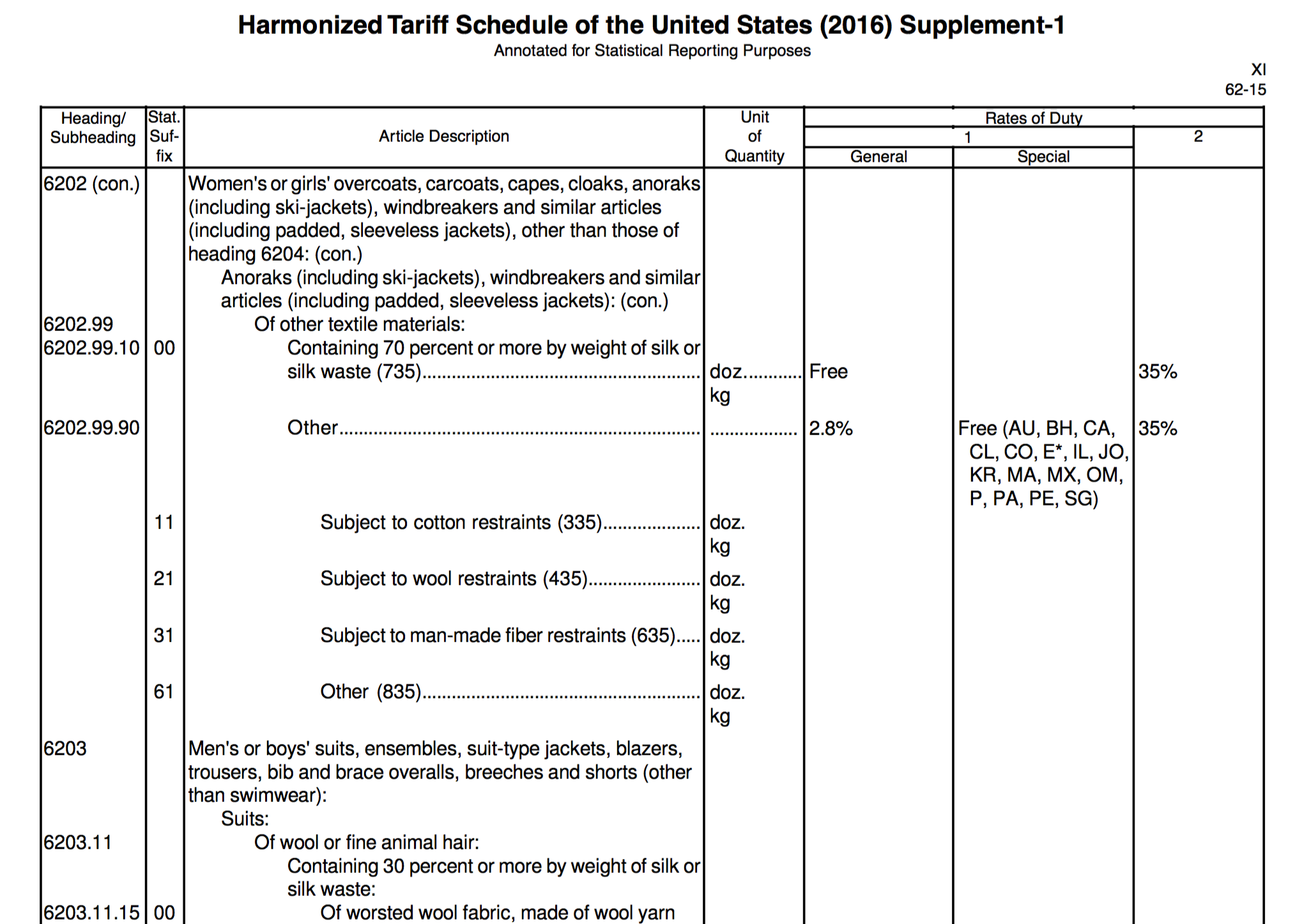
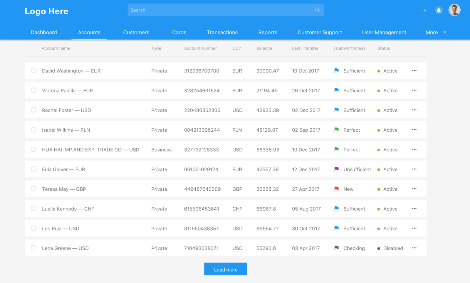
Table
A table arranges data using grids (rows and columns). It is sometimes called a matrix, a data table or a data grid. It is one of the most commonly and widely used data visualization types.
A Little History
Spreadsheets (interactive data table applications) first came about in the late 70's.
However, our civilization has used tables to represent and organize information much longer than we might think.
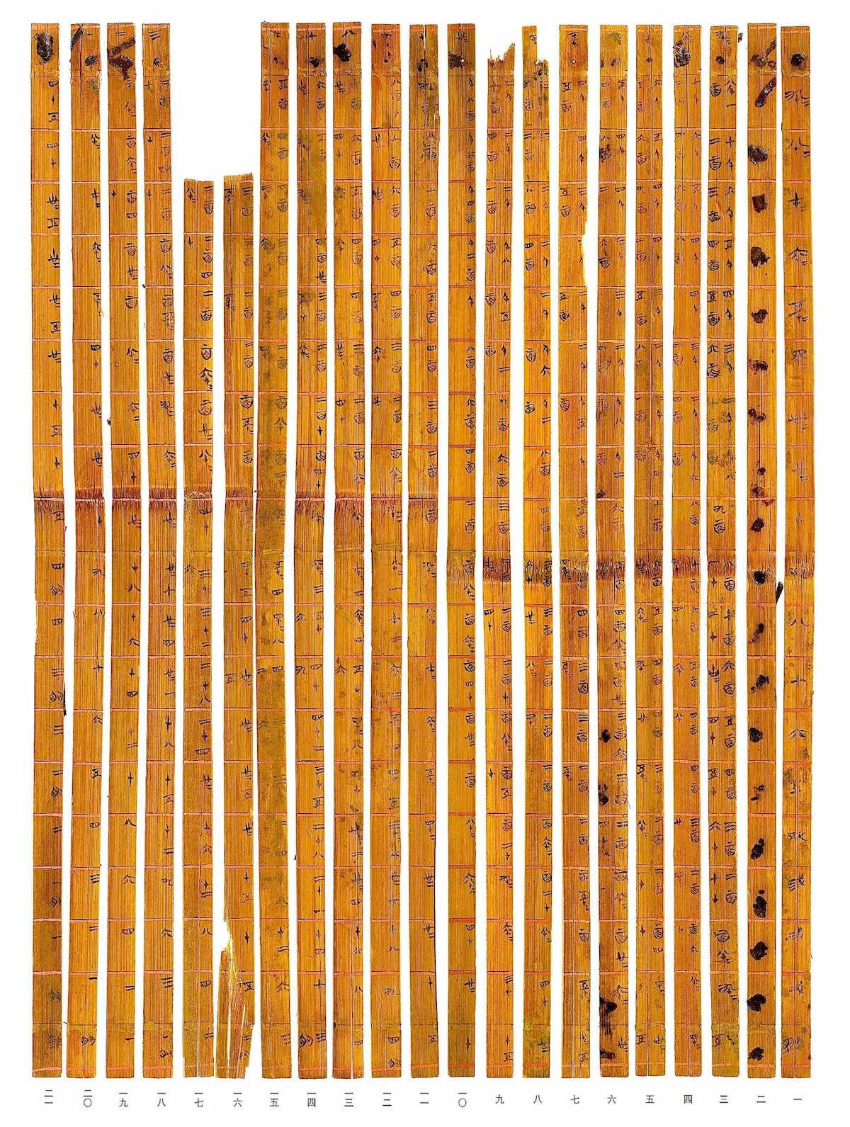
Src: Tsinghua-multiplication Table)
Strengths
A table is an efficient way to display comparative data on categorical items. Using a table, it is easy to examine pairs of related measurements (e.g., quarterly sales of two ice cream shops observed over 5 years).
According to data visualization expert Stephen Few, it is advantageous to use a table when:
- Looking up individual values (e.g. Company employee databases)
- Comparing individual values but not entire series of values to one another.
- Precise values are required. (Numerical values such as GDP or discrete identification such as country names)
- The quantitative information to be communicated involves more than one unit of measure. (e.g. Athlete (name) - Height (cm) - Weight (kg) - ZipCode - Country of Origin)
- Both summary and detail values are included (A category can be divided into sub-categories)
** ( ) includes my interpretations about his points.
Because of its efficiency, tables are widely used in communication, research, statistics, and data analysis.
Some well-known uses of tables are
- A table of contents
- A product comparison chart (advertising, retails)
- A multiplication table
- A periodic table
- Databases: csv, spreadsheets
Limitations / Weaknesses:
- If there are too many rows or columns, it is hard to perceive the values in the tabular representation.
- It is not easy to represent hierarchical data in a table. For example, if we intend to display the relationship among multiple members of an extended family, it will be clearer to show the family tree by using nodes.
- Additionally, a table mainly displays text-based information, hence it loses its chance to communicate with a wider audience who may not recognize the numeric or nominal values.
Pre-Processing
- Even though a table is a great format to display many different categorical items at once, we should selectively curate categories and parameters to make the comparison more relevant and focused. (Data Reduction)
- If data is(are) collected from multiple sources, units of measurement need to be converted for an easier comparison. For example, the average height of different nations (US, Korea, Sweden etc) can be expressed in feet and inches, or meters and centimeters. The combined data table should show them in the same unit of measurement. (Data Integration + Transformation)
- Long decimal digits and large numbers may not always be ideal. Numbers should be formatted in a way that is easy for data consumers to digest (e.g: 20.6878993% -> 20.69%, $1,000,000 ->$1M)
- The most important pre-processing will be to verify the credibility of data, before rushing into use them. Numbers can numb people. Are they really trustworthy?
Mapping
A table is composed of rows and columns. Conventionally, the top row displays categories, and the leftmost column lists items/objects to compare.
Where the rows and columns intersect, cells are created. Each cell is to contain a value (most commonly numerical and nominal), which shows the mapped relationship between the header(category) in the top row and the distinct item on the leftmost column.
When there is a single cell that needs special attention from the rest of the table cells, it is helpful to use a distinctive color and text size.
In addition, a good table needs a proper title that explains the relationship between the rows and columns. The correct language will come from correctly mapping the data.
Bad Examples

2) Confusing use of colors: our eyes tend to follow the colored items. However, it is not clear if the colored cells represent more important categories.
3) Question: Was a table was the right visualization type for this type of data? It is hard to grasp any meaningful difference between numbers given in this table. Difference between 0.0900% and 0.0901% might mean a very important factor for stakeholders, but it is hard to recognize the difference if you are just observers. What could be an alternative visualization?
Src: http://www.marciebraden.com/table-design-tips-for-presentations/

2) Question: When there are no discerning values among the majority of compared items (the shared attributes from the row 6 to 21), should we still use a table?
3) Question: How can we emphasize differences and effectively advertise the services for this kind of product information
Src: Invoice Machine Pricing table / Tips for designing terrific tables
1) Too much information is contained
2) Hierarchical alignment of texts. Is that easy to read?
Src: Matthew Strom - Design Better Data Tables
Good Examples
2) The use of simple visual icons in the data cell adds readiblity of the ordinal variables.
3) Good use of white space and minimal gridlines.
Src: Data tables best practices
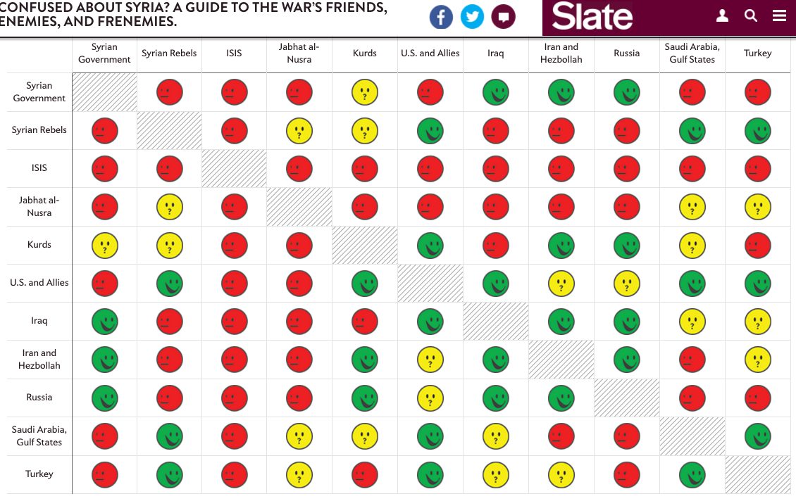
1) The complicated relationships are simplified into 3 categories (enemies, it's complicated, friends) explained by using easy-to recognize icons.
2) A little too concise? Perhaps. To complement its simplicity, the table allows readers to access a bit more detailed report on the "relationship status" upon clicking on each face.
3) The title is clear and inviting
Src: Slate - Syrian Conflict Relationships Explained
1) Good Readibility - Text Alignment, Typography, Reduced Redundancies 2) Simple way to emphasize what needs more attention
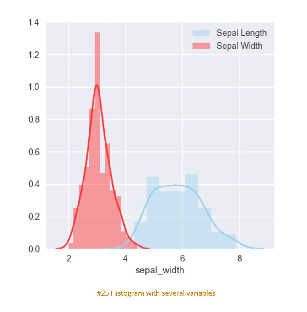
Histograms
Definition
The word histogram comes from the Greek 'histos', meaning "anything that stands upright", and 'gram', which means chart or graph (source: NCSS Statistical Software, Etymology online). The term was coined by Karl Peterson in 1895.
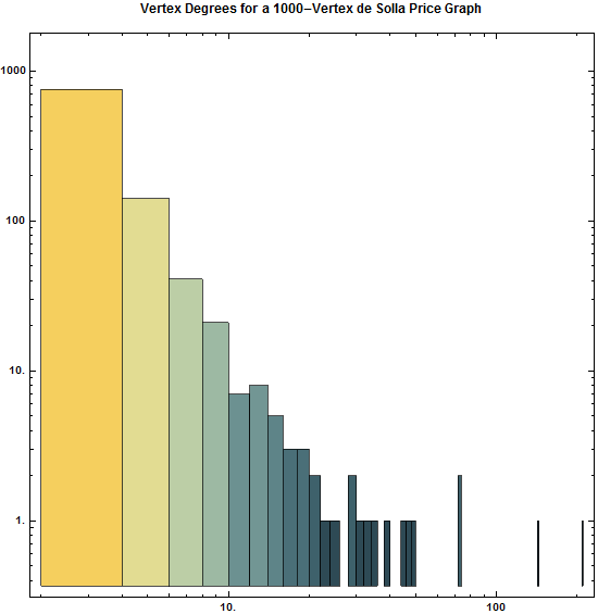
Histograms are accurate representations of continuous, numerical data on a singular axis. A histogram is a visualization of the frequency distribution in which the vertical axis represents the count (frequency) and the horizontal axis represents the possible range of the data values.
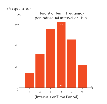
Each bar in a histogram represents the frequency of scores within the intervals (also known as bins). Histograms help estimate where values are concentrated, what the extremes are and whether there are any gaps or unusual values. The bins are the main differentiator from a bar chart: a histogram can only plot the frequency of score occurrences whereas a bar chart can plot many other kinds of data. Histograms can also be normalized to display relative frequencies, which will quickly show how often data occur in relation to other data. Histograms are useful for:
- Comparing data within intervals
- Showing data over time
- Displaying and analyzing distribution
- Finding patterns across ranges
Creation
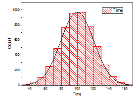
The bars produced in histograms are used to represent the shape of the distribution of data and as such are used to perform communicate business and math analysis. Bar shapes can vary in height or width, as long as the groups are defined in a way that clearly communicates any relevant patterns. Creating a histogram can be straightforward if the data is grouped correctly. It is important to try filtering the data several times to explore relevant patterns.
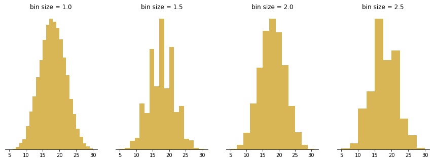
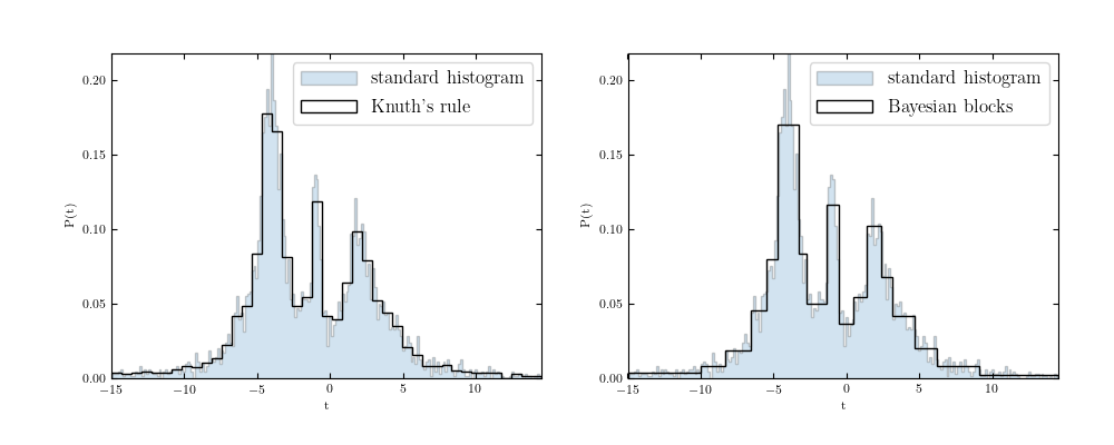
Several methods have been developed for optimizing data bins in creating histograms. Bayesian blocks, shown below, is a dynamic histogramming method utilizing probability density functions to program bin widths.
Histograms don't have to remain vertical; radial histograms, polar histogram and angle histograms are useful for examining peaks and identifying abnormalities in distribution from a similar starting point.
Analysis
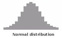
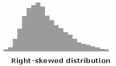
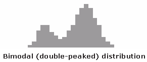
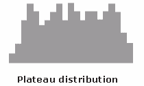
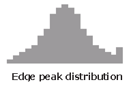
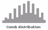
With the right bins, analyzing a histogram can be one of the quickest ways to communicate patterns across a data set. As histograms examine frequencies rather than other kinds of data, it is easier to tell if a distribution has any irregularities within it. Here are some examples of what different distributions might look like in a histogram and what they mean:
Creative Histograms
The following histograms expand on histogramming methodology to convey more data, as clearly as a classic histogram.
- Comprehensible bins
- Shows an obvious pattern
- Quickly identifies spikes in frequency
- Well labelled
- Clear differentiators
- Displays data within frequency
- Uses multiple retinal variables without confusing the reader (at least n sample data)
- Combines several data sets across frequency
- Clear labeling
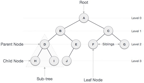
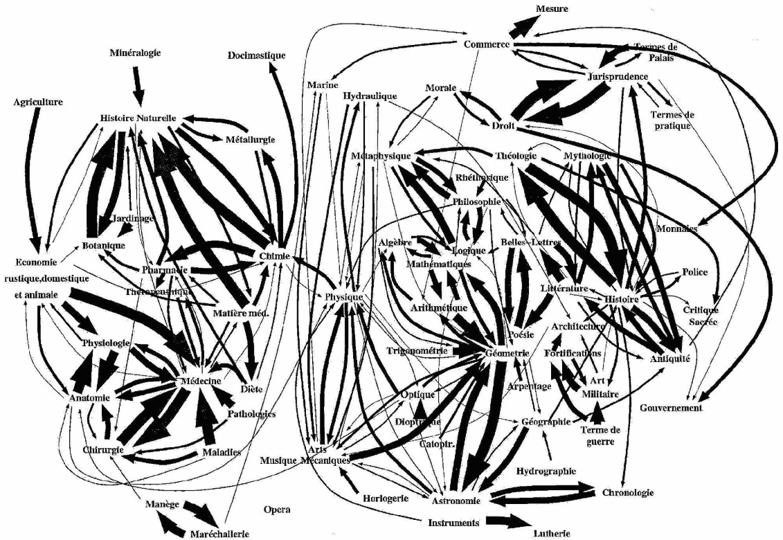
Trees & Graphs

Though the tree and the graph are related, they are not equivalent. Let's get a sense of some history and background.
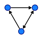
Both the tree and the graph are non-linear data structures, the main difference as seen below in Fig. 1 is that a tree (on the left*) follows hierarchically ordered data connected by lines or branches with one root node, and the graph (on the right*) is a structure representing a network with less order, which can also connect back on itself.
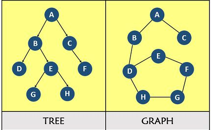
Let's dig into each of them.
History of The Tree
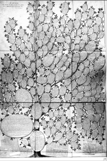
Throughout history tree structures have been used to represent an order of hierarchy, from bloodlines to mapping the world's knowledge. Many attempts by early scientists and philosophers to map a hierarchy of human knowledge can be seen below as knowledge trees from the 16th and 18th centuries.
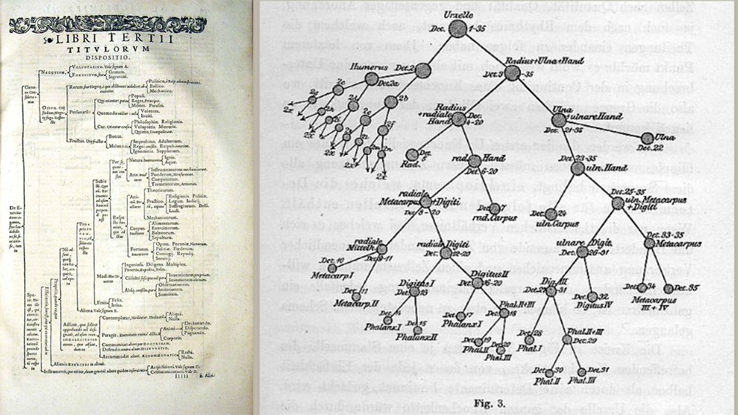
The Anatomy of a Tree
The tree structures have a main root node with branches stemming from the base. Illustrated below you can see the relationship of the root node to the parent and child nodes as we progress downward each level of the hierarchy. A few clear examples follow.
1).
Use in Search
When structuring data, tree representations can be used in many ways. Below you will see a sample of an Optimal Binary Search method using a tree structure.
2).
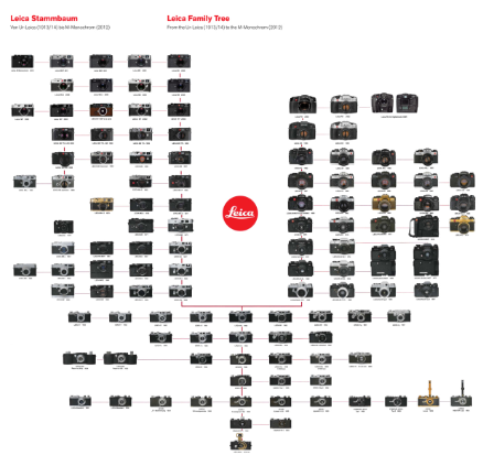
Tracing a Hierarchy
Here's an interested use of a tree structure used in advertising to display the evolution of Leica camera models from 1914 to 2011. The "family tree" of cameras was sold as a lot at a Christie's auction.
3).
Difficult to Decipher Examples
In many cases, trees are used conceptually but don't quite capture the relationship or hierarchy of data--so many times they don't capture the associations when looking at them. In several cases it's a matter of labeling and ordering the relationships for the reader to understand. Here are a few poor examples / or difficult to decipher tree structures below.
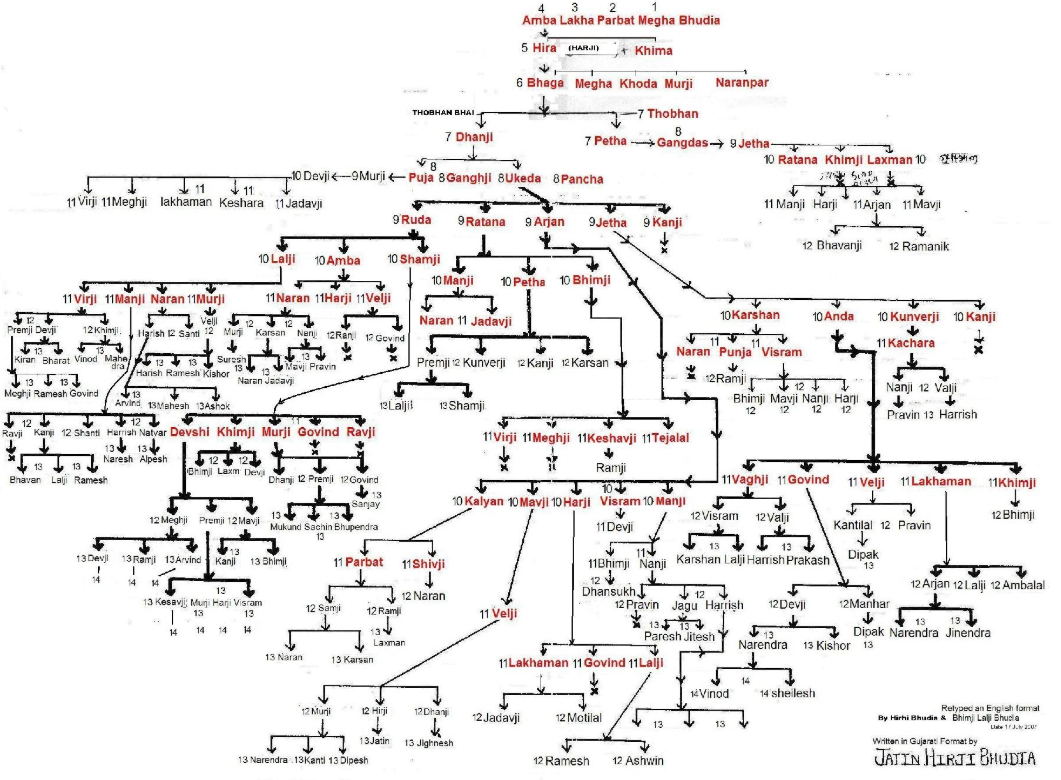
1) Kinship Family Tree diagram. *(We have to be both an electrical engineer and an Anthropologist to understand what's happening here). The use of shape here also reduces the clarity of hierarchy.
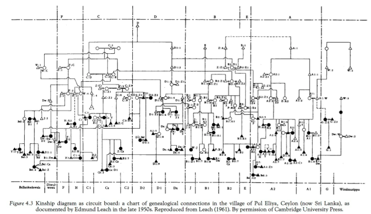
2) Kinship charts- Again, highly encoded and specialized knowledge required. Also has no single root node, and appears as though 1,2,3,and 4 are on the same level to start.
3) Essai d'une distribution généalogique des sciences et des arts principaux" by Christian Friedrich Wilhelm Roth (1769). Perhaps it's just a matter of information overload and the difficulty of telling one branch from another on the tree. "Spatial discord" from orientation comes to mind--though it is also beautiful and information-rich.
The Graph
Graphs can take many forms, but ultimately they are non-linear structures which are composed of nodes (or vertices in Blue below) and edges (made up of the arrows).
Essentially we are looking at a network of connected nodes. Here is a simple small-sized version.
A History
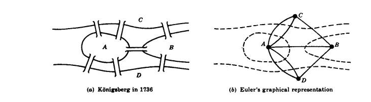
The beginnings of the branch of mathematics called Graph Theory (as well as Topology), seems to have appeared after 1736 when the mathematician Leonhard Euler proved the Königsberg Bridge Problem to not be possible.
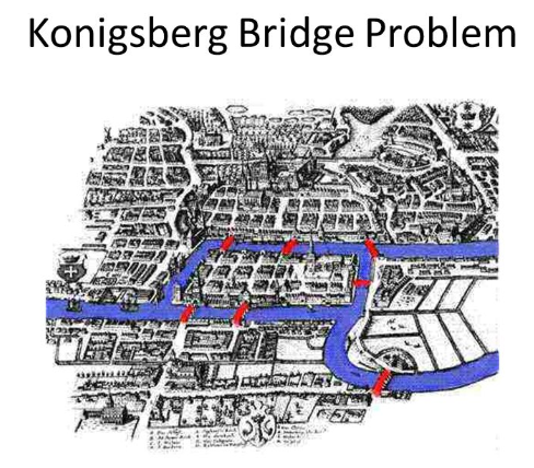
Briefly the problem was to walk over all of the seven bridges in the Prussian city of Königsberg only once. Euler came up with the following representation (b) to prove that is wasn't possible.
Graphs Used Today
There are many types of graphs used today (i.e. directed, undirected, cyclic, acyclic, and weighted to name a few). Each has its own composition and inter-relatedness. Use cases might include visualizing or calculating travel routes, road links, distances covered, aircraft flight paths, personal or professional networks, as well as many other scenarios. The use of position, color, and size seem to be important.
Let's take a look at some real world representations of graphs.
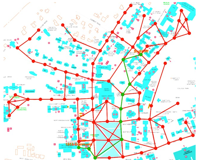
1) Here we see a route that is mapped out in green as the quickest way between two points using a graph. Here the use of color allows us to see the path immediately (as long as one doesn't have red/green color blindness).
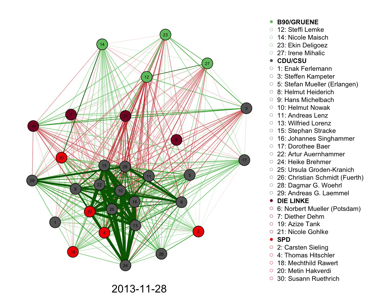
2) A more complicated graph measuring votes and connections in German parliament over time. Color informs the connections alongside the legend.
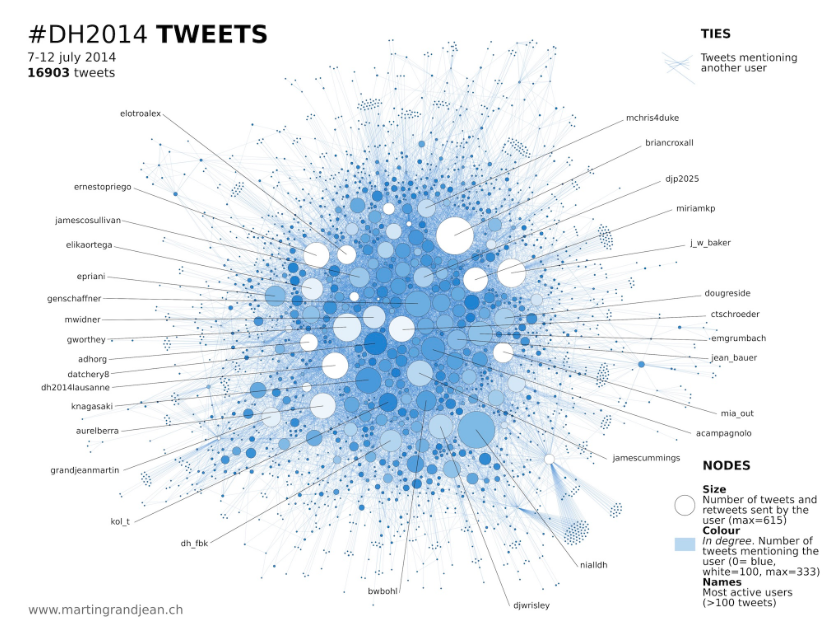
3)Following a network, volume, and authorship of tweets using a graph. Size and color used in each node.
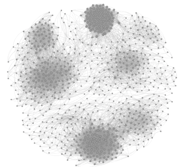
Some Difficult to Decipher Graphs
1) Here we see no labeling or legend indicating the relationship between colors of the nodes. Positioning and disconnected nodes remains difficult to create meaning.
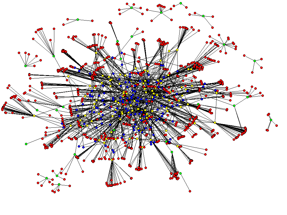
2) The use of thickness of arrows(possibly texture and size, and the meaning represented by each arrow) adds to the confusion of this knowledge graph. Not to mention the groupings, orientation, and positioning.
3) The lack of labels and use of grayscale makes it a poor representation to intuit anything about the graph below. The clustering however is effective, but no insight can be gathered about the relationship of the clusters again without a legend.
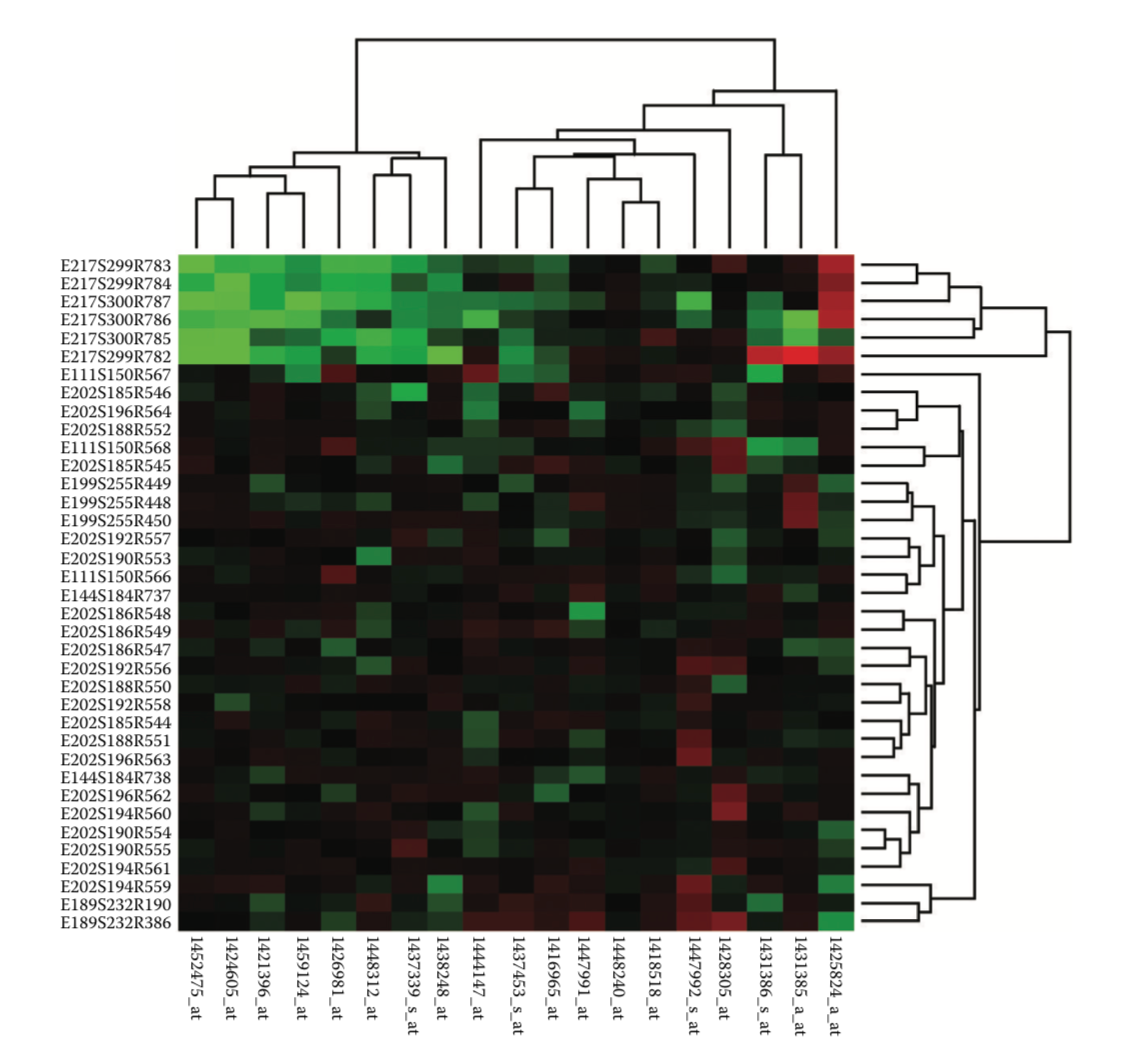
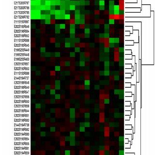
Dendrogram
What is it?
-Showing relationship among entities through hierarchy.
-Showing simliarity among entities by the physical distance within the graphic.
- doesn't seem like a graphics. more like a table or some... something like another series of text set.
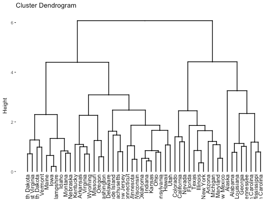
Does it require you to do pre-process the raw data?
Of course. I believe all the data visualization tools require this... (I'm not sure though.)
It demands a huge amount of work in advance to visualizing it. Because you have to have a deeper understanding of the relationship among single entities such as how much are they close/similar to one another, what seats on top of the entities in terms of hieararchy... stuff like this. Just by collecting and sorting the data is never enough.
The downside of this analysis is it doesn't seem to convey numerical analysis well. It focuses more on the relationship and hierarchy among entities.
Examples
Bad ones-1

first,
hard to read.
The X-axis shows what are the entities and the distance between individual entities tells you how similar and strongly related among entities. Since the single object in the axis are very packed, it is hard to read the information as well as it is even hard to read what it is.
Good ones-1

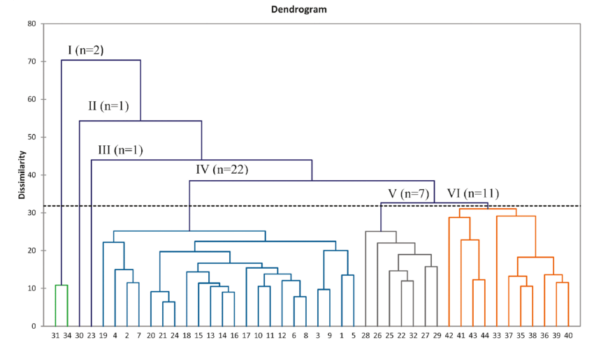
This dendrogram solves the issue on the above bad example. It groups four sub groups which tell you that entities in one color zone have similarities. And also individual entities have font color and branch colors as well. It enhances readability.
It could have been better if it tells you what X axis tells you about. The Y axis is Height. And it is shown on the visualization tool while X axis has no information about what X axis is. However, still it seems like a good example.
Bad Ones -2
Hierarchy doesn't seem intuitive. I believe people's intrinsic sense of hierarchy is top-down, not in a horizontal way. Therefore, as a dendrogram, horizontal layout isn't a good idea. The coloration of entities are confusing too. Readers might expect proximity among related entities while it has scattered entities with one color.
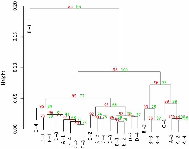
Good Ones -2
Hierarchy and relationship is easy to read. Additional information/ note on each pivotal point helps to understand the data handled in the graph. The proximity among entities are easy to read and color variation depending on its sub groups are clear enough.
Bad Ones -3
Additional notes on its anchor points are hard to read and too many information sits on the branch points. It confuses reader that it's hard to understand which data are main things to be understood. The size of notes and main entities are same as one another which leads to misunderstanding that color-coded information is more important information. In addition, B-1 entity on the upper left corner seems off context.
Good ones -3
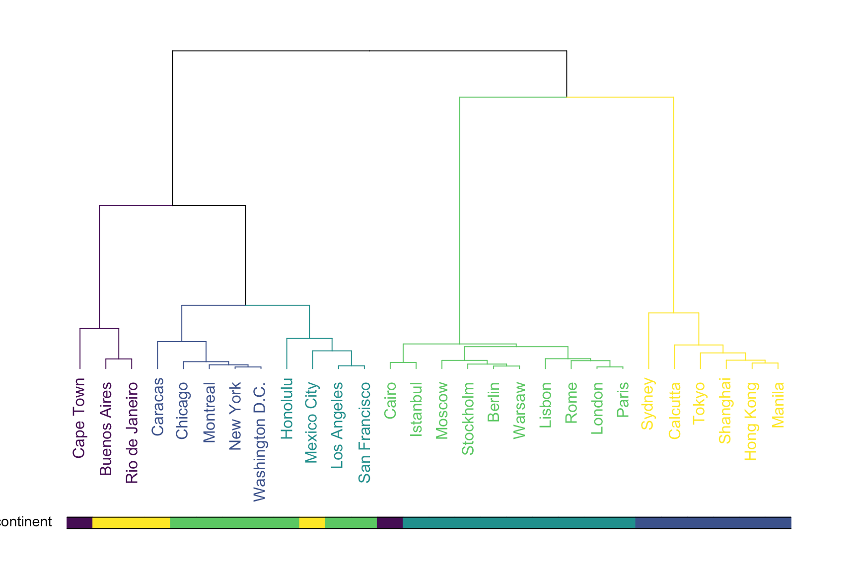
It's an improved version of the above bad example. The additional graphics below plays a helpful role in the graph. it becomes a legend for color code of entities in the graph so readers could easily understand the logic for sub grouping and refer back to the legend to identify what colors are meaning in the graph.
Permutation Matrix
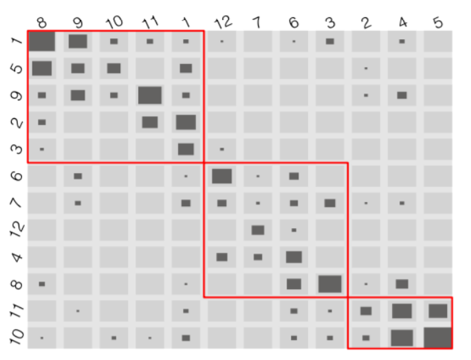
Permutation matrices are sortable charts used to explore patterns and correlations in multi-dimensional re-orderable data.
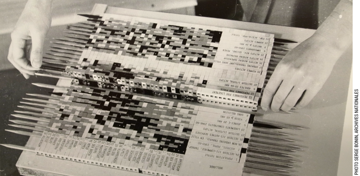
Jacques Bertin knew that interaction is at the heart of exploring hidden relationships in data. Before modern computers existed, Bertin constructed physical wooden matrices (called "Dominos") to explore data. The re-orderable matrices were made through collecting data and encoding it for different ranges, firstly on paper, then on wood. The matrix was then assembled and reordered with a laborious manual method to reveal patterns and groups. Photographs of the results were then used in scientific publications. (see here)
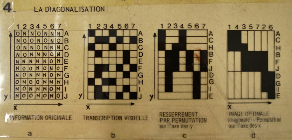
Suitable data sets included variables that do not rely on order; i.e. data that isn't sequential. The method of using permutation matrices consist of converting raw numerical data into appropriate ranges and then associating each of these ranges to corresponding identifying shapes, sizes and/or colour mappings; for example numerical data is mapped to different different sizes of circles or squares and hues of colour. The most optimal mapping is for "true" or "false" variables, where a matrix cell is "white" for "false" and "black" for "true" (or vice versa).
Each of the identifiers are then placed into a matrix that is sorted and/or grouped into categories of cells with visual likeness, which effectively groups data that has corresponding ranges.
Below is given some examples of good implementations of the method:
Below is given some implementations that shows the limitations of the method.
Physical Maps
Introduction
Physical mapping is a visualization displaying a precise relative positioning of physical elements to each other in space. Physical elements can represent landforms and terrain, but also imaginary boundaries and measurement systems like borders, zip codes, or longitude and latitude. The physical map is a dynamic form of visualization, lending itself to a wide variety of representations and data types, all with the common constraint of displaying their relative locations in physical space.
Due to the level of abstraction and scale associated with physical maps, they often require significant interpretation by the end user. Many maps are presented with a legend, which is a key that enables the user to see what a symbol, texture, or color's meaning is supposed to be. Physical mapping also requires precise proportions, which, before the invention of longitude and latitude, meant that many maps often over- or under-estimated the relative placement and sizes of landmasses, oceans, or other physical elements.
Limiting Examples
Early maps are difficult for modern users to parse, due to their lacking of features which we today take for granted. In the above example, the orientation is top-eastward, and all our maps are oriented top-north. Secondarily, there is no specification of the actual, physical form of the landmasses or bodies of water between them, resulting in a very simple geometric form. However, it is possible that the map's design is meant to be more evocative than accurate.
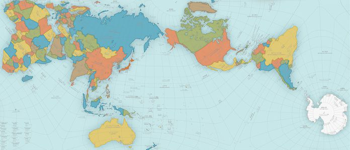
The most common world map uses what is termed a Mercator projection, which makes sure all parallels of latitude have the same length as the equator, allowing for more accurate measurement of distances on the map from north to south. However, it suffers from slight distortion of longitudinal meridians, meaning that it is still not "perfectly proportionally" representing the physical distance between any two east-west points.
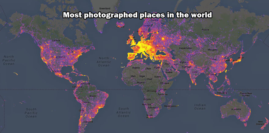
Interesting and Useful Examples
Survey Plot
Popularized in the "Table Lens" project from Xerox PARC [Rao and Card, 1994], these resemble series of bar graphs that can be sorted independently.