Poor Form
Read Healy's introductory chapter from Data Visualization for Social Science:
Use the tag “R1” when you post your assessment of the reading and the questions raised.
Poor Form
Read Healy's introductory chapter from Data Visualization for Social Science:
Use the tag “R1” when you post your assessment of the reading and the questions raised.
The introductory chapter of Data Visualization for Social Science by Kieran Healy highlights visual, statistical and physiological elements that affect poor form in data visualization. Healy defines these three pillars as aesthetic, substantive and perceptual, and “…while often found together, [they] are distinct from one another” (Healy, 2018). Aesthetic missteps are frequently correlated to poor taste or visual complexity.
Substantive elements reflect how the data is presented. Cherry picking through the data or shifting the axis starting point can lead to misrepresenting the information. Healy builds a case study off of the infographic in the 2016 article by The New York Times, “How Stable Are Democracies? ‘Warning Signs Are Flashing Red’”. What I found fascinating about the case study was that the infographic seems to represent if the respondents believe democracy is important (a Yes or No question), while the survey question was actually based off of a 10-point scale. The shortened axis dramatized the information and is a misleading representation of the data.
Perceptual elements relate to how a viewer processes and recognizes what they are looking at. Healy writes, “perception is not a simple matter of direct visual inputs producing straightforward mental representations of their content. Rather, our visual system is tuned to accomplish some tasks very well, and this comes at a cost in other ways” (Healy, 2018).
I agreed with Healy’s theory on aesthetic and substantive poor form in data visualization, but I found the perceptual elements challenging to grasp as many of them are beyond our conscious control. I would be curious to see how other classmates understood the perceptual elements and what are best practices to make data visualizations that limit perceptual missteps?
The Chapter “Looking at data” seems to live up to its goal to discuss why some visualizations are better than others. It refers to practical theories and effectively illustrates how we perceive data-related graphics through the use of examples.
The chapter seems effective in extending the concepts of visual perception into new areas and also to help recall prior encounters with optical illusions; more importantly how these relate to data visualization techniques. For example; how humans see contrast and grouping becomes evident through highlighting phenomena that hides in plain sight. It is easy to recall how a computer projector shows “black” on a white screen using light purely with contrast.
It makes me wonder how we could “model” or “quantify” what our eyes/brain does to processing strict formal data-related shapes presented on human technology (print and screen), when the eye-brain system might actually be optimized for natural visual processing of natural environments.
An effective example of human perception is Fig.1.20, which uses a scatter plot on how we perceive randomness and grouping in order to illustrate the gestalt rules. The glow-worm example reminds me of a picture of nesting cormorants; where each bird is a pecking distance away from the other.

Another aspect that the chapter conveys is the sense that there are many aspects that, when not implemented correctly, can make a visualization ineffective, bad or even unintentionally dishonest. This is slightly disconcerting, but in a good way and reminds me of a quote from Picasso: “Learn the rules like a professional, so that you can break them like an artist.” That is not to say that one should have the aim of breaking artistic rules, but rather that it would be beneficial to be cognizant of mistakes that can be avoided.
In this chapter Kieran Healy has grouped bad visualization figures mainly into three categories: aesthetic (visual), substantive (contents) and perceptual (psychological perception).
He points out that for most visually bad visualizations, it’s not as efficient as other because of duplicated labels and pointless effects. I strongly agree with this opinion, if viewers can be easily distracted by unnecessary design features and having a hard time to interpret the data, then visualization itself has lost its initial intention already. Jon Maeda once said in his book Laws of Simplicity that ‘the simplest way to achieve simplicity is through thoughtful reduction’. It seems to be applicable in any type of design, in the Figure 1.4 do we really need the shadow and three dimensional effects here? Does it enforce the data presentation and makes it clearer or better? If we ask ourselves more questions like these maybe then we can have better decision on what’s necessary or not.
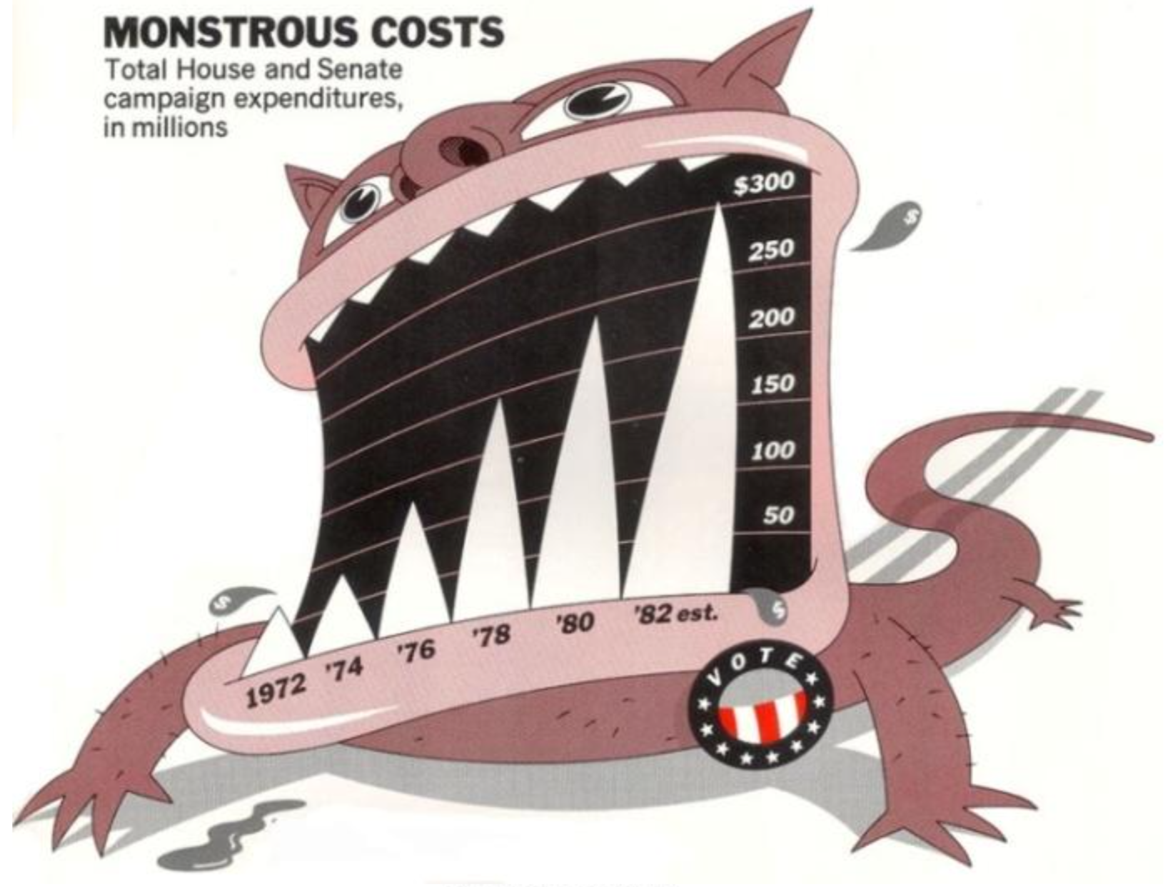
However it’s hard to find the balance between ‘too much’ and ‘too little’. Just like the example Kieran Healy gave us: the minimalist version from Tufte’s own work proved to be the most cognitively difficult for viewers to interpret. We can’t determine if one design is appropriate or not just by itself, for most circumstances we have to place it into its context. `Monstrous Costs’ by Nigel Holmes might be a little ‘too comic’ in some ways but it would fit into a tabloid than a formal news report and vice versa.
About substantively misrepresented visualizations, different angles of looking at the same dataset would produce various interpretations, such as the choice of which type of graph we are using, what’s plotting along x and y axises etc all would affect the ultimate information. How can we prevent ‘taking a part for the whole’ to happen?
The introductory chapter of Data Visualization for Social Science by Kieran Healy points out three essential values for visualizing data: aesthetics, data quality, and human perception. The importance of aesthetics and data quality look very obvious for me, but I did not realize why perception would cause bad visualization until I read this chapter. Sometimes, when we focus on delivering one information through the graph, we may ignore other information that leads to confusion in some extend. For instance, a stacked bar chart could show the overall trend of a dataset, but it makes it harder to know the trend of each category. Besides the sample figure Kieran Healy shows in the chapter, I also made this mistake while working on sketches for Major Studio 1 project.
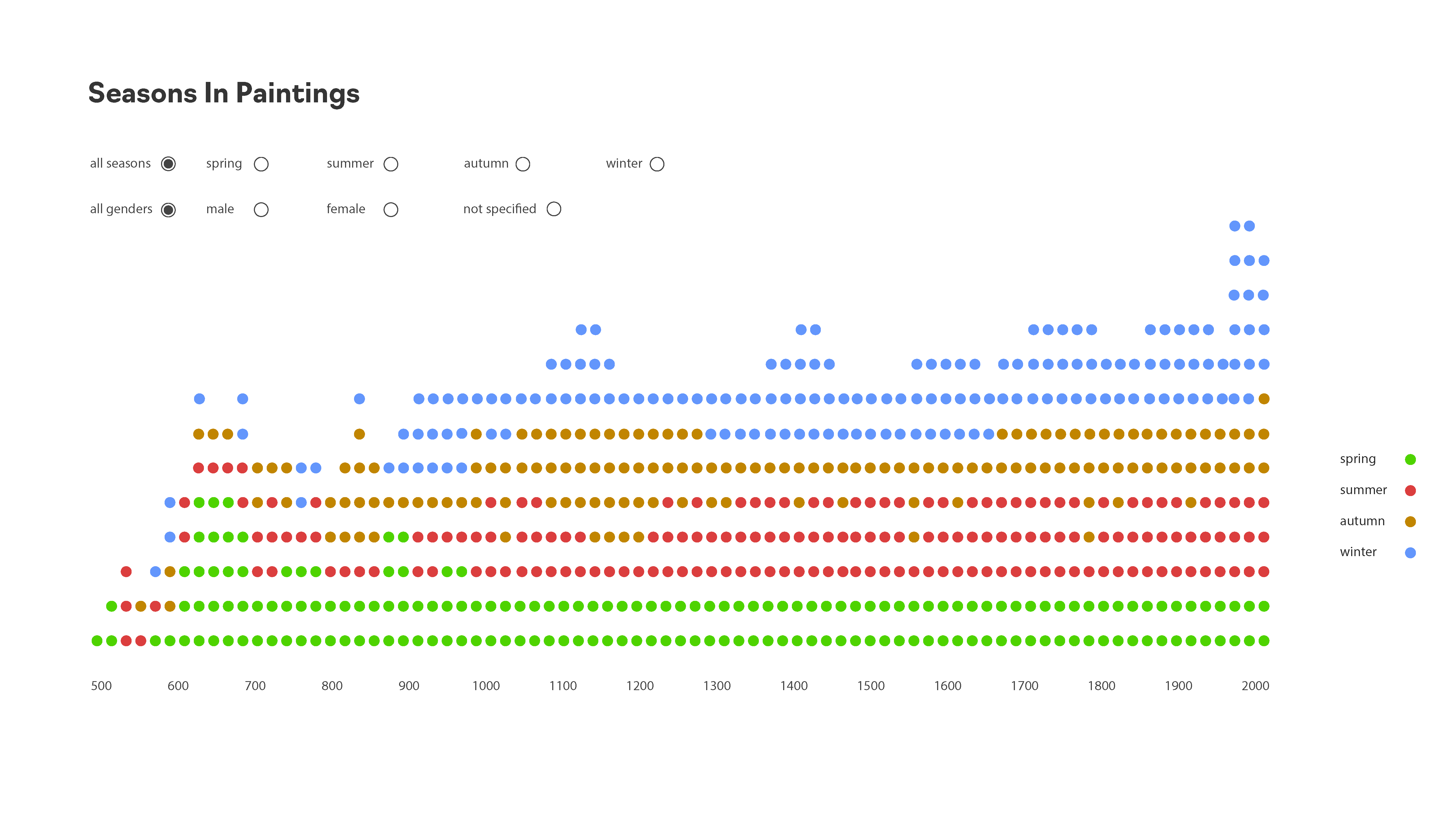
In the example above, I intended to present the over-time trend of paintings in all seasons and the number of paintings of each category in each year. But it is not efficient to present the over-time pattern of a certain category.
In order to avoid confusion or mistakes due to the visual perception, Kieran Healy points out three ideas that we need to keep in mind. Firstly, our eyes could be tricked when edges, contrasts and colors are presented in different forms. Secondly, deliberately popping out the data from what they are surrounded by would make it easy to see. This strategy could be achieved by distinguishing colors, shapes, sizes, angles, etc. It is interesting to note that popping out colors is more efficient than popping out shapes. Thirdly, our perception always leads use to look for structure no matter if there is based on proximity, similarity, connection, continuity, closure, figure and ground, and common fate.
This chapter highlights many interesting points we need to be cautious besides technical skills while visualizing data. I completely agree with Kieran Healy's idea about considering the results not just technically but also physiologically since our audience are human beings. With the background of UX designer, I think it it very critical to bring the idea of user experience into data visualization.
My question from this chapter:
This chapter presented a sprawling thesis on the qualities that make some visualizations better than others. The recurring theme of each examination of that question is that "graphs as meant to be looked at by someone": Healy calls for a great deal of empathy for the audience of visualizations, taking into account how human perception interacts with shapes, colors (chrominance and luminance), depth, and angles. This was a sound mediation on a set of principles that Healy organized around the aesthetic, the substantive and the perceptual, and it was a sobering reflection on the fact that even tasteful, well-constructed graphics can mislead us.
A great example of this was the controversy of Yacha Mounk's "Democracy in Decline" small multiples chart: though elegant and seemingly succinct in delivering a persuasive hypothesis (that a decline in the belief in democracy was becoming more pervasive among youth in Western societies), the chart was misleading because the data was presented as a longitudinal study, rather than the contemporary responses of people born in different decades. These sorts of pitfalls (deliberate or unintentional) can be easy to miss at first blush, but the impact of them once revealed can be quite severe, in terms of loss of credibility. Episodes like these also serve to bring some humility back to the field, as they reveal that simpler, more familiar types of visualizations can often be more effective and less misleading than more ambitious/ sophisticated attempts at conveying information.
I appreciated this reading because of the way it explores this dialectical tension that can sometimes exist between truth and beauty; two concordant objectives of Data Visualization.
As an analogue to Healy's three cardinal points, I found a parallel framework for assessing (mostly) good data visualization in Alberto Cairo's "The Truthful Art". On page 128, he posits in the words of Enrico Bertini, that a successful one has these qualities:
Healy's approach is a bit more lemmatic it its treatment of the success criteria, but I think that both systems arrive at the same conclusions; it gives the user of the visualization a great degree of freedom and autonomy to inspect the facts being presented by limiting as many barriers to comprehension as possible, while providing a pleasant experience as they gain an insight or apply it for some practical use.
One point that I would contend with in this reading was Healy's statement on the example he gave for the arguments for zero baselines.
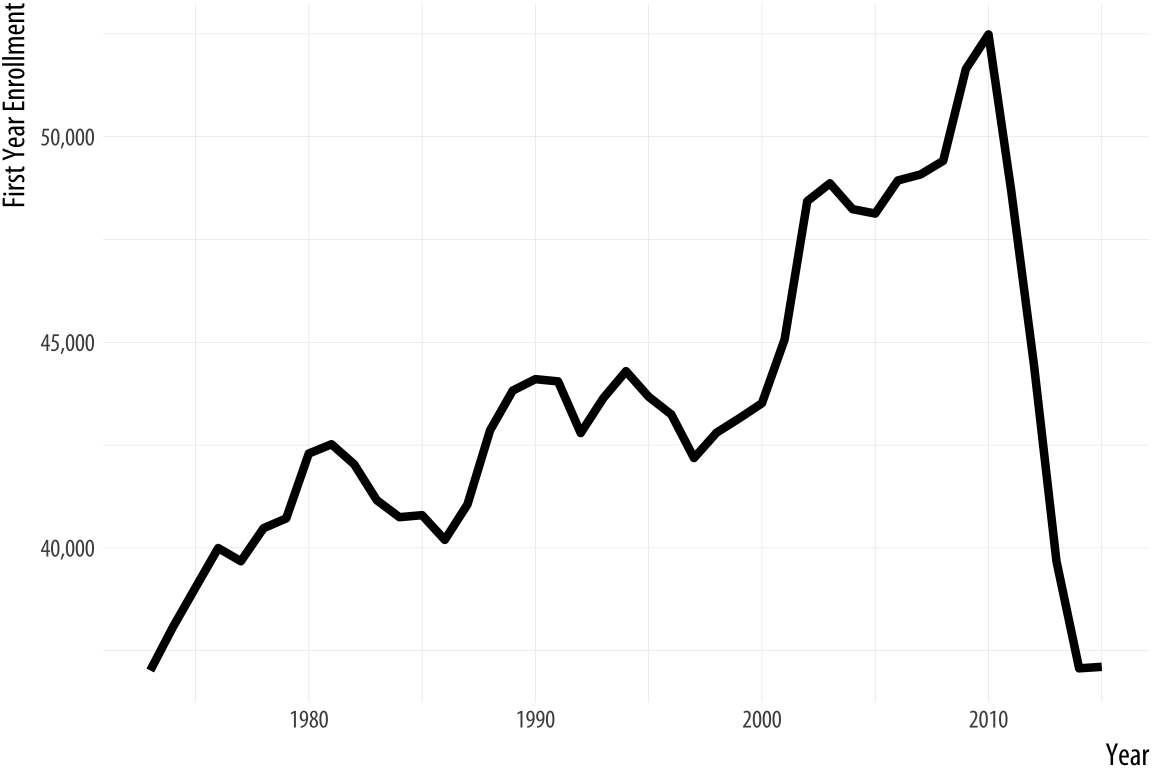
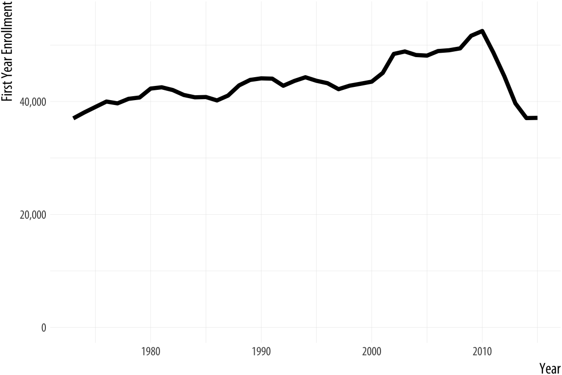
The decline in law school enrollments does look (and I would agree that it -is- substantive) after 2010 (it dropped to levels not seen since the 1970s). Healy asserts that "The chart with the zero baseline, meanwhile, does not add much additional information beyond reminding you, at the cost of wasting some space, that 35,000 is a number quite a lot larger than zero." I would counter argue that having the zero baseline might serve to help the person looking at the trend realize that there was a simply a "market correction" to the average of ~35k per year after 2010 (contextually, perhaps because that period marked the height of the Global Financial Crisis, and made law school a less attractive career path due to its high investment cost and low perceived payoff). My editorializing on that aside, I think that this is one case where the larger picture does matter a bit more than optimizing for space. Sometimes the point of data visualization is not to shock/ wow the audience, but to bring them back to sobriety.
To end, one of my favorite examples of "poor form" comes from Fox News. It also happens to be a 3-D pie chart (the most eligible to win first place in any parade of horribles in data visualization to be sure)
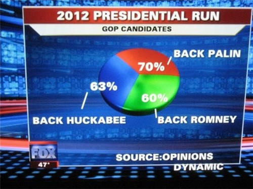
The violations speak for themselves.
I have always wondered about the role human perception plays in a user synthesizing data visualizations. Up to what point does subjectiveness overpower objectiveness in the human brain? I think that there can never be a definitive answer with data visualization, but there is a certain level of foundational visual structure that most people would agree is most effective. I like how the author visits this concept and dives into some of the visual building blocks of perception.
One of the important takeaways for the piece was to understand all components of a visualization and how they work with one another. The visual aspects are important, but don’t work without good data and a good story, and vice versa. To create this balance, you try to have the visuals reflect the data as accurately as possible, removing any superfluous, non-data driven aesthetics. However, I found the case of the monstrous data bar chart to be very interesting because, although it was overly graphic, it helped users/readers remember the bar chart much better than a plain one. So there seem to be certain circumstances that can allow for exceptions to the visual guidelines in data visualization.
I really enjoyed reading about human perception and the different visual cues are eyes look out for, like edges, contrasts, orientations, and the ways to highlight these through specific displays. Furthermore, the part of Gestalt inferences was incredibly interesting and, in a different way, offers an understanding of human perception having to do with assumed connectivity and similarity in visualizations.
It is not just bad visuals but bad data and bad perception that can harm the effectiveness of a visualization. I would ask my peers which would be the most significant variable to get right in data visualizations? Also which Gestalt inference is the most convincing to you?
The author uses the example of Holme’s “Monstrous Costs” chart as an embellished chart with junk that is memorable but not easier to interpret. I disagree with her statement. I think she forgets to mention the aspect of relatability and interpretation. A chart like the “Monstrous Cost” using a monster graphic to convey a certain emotion (how crazy the large cost is) is not an example of junkchart. The illustration itself might not convey numerical data, but there is data, in the abstract form, being conveyed. I also think that charts that effectively use illustrations like this are for sure easier (and faster!) to read as well.
Bad data and data perception issues talk a lot about how visualizations can be a powerful tool to kind of “lie” to people and push forth a certain narrative that you want. This is addressed again in honesty and good judgment. The author talks about how axis make charts misleading, whether deliberate or not, but also how certain axis can be used to mislead on certain charts, and not on others. These concepts remind me a lot of the problems addressed in How to Lie with Statistics on data misinterpretation. In the chapter, the Whiz Graph, the author talks about how manipulating axis and misrepresenting ranges is a way to force trends you want, which is unethical since the trends may not even exist.
I think these concepts are so important, especially for graphics that are data-driven and used to sway real life decision-making. As data visualization developers we both have a responsibility to not partake in these practices, and watch out for them for ourselves.
Overall I really loved the article. The author does a great job in covering the most important aspects of creating visualizations, from how shapes and colors are interpreted, to misrepresentation of data and what goes into decision making when choosing how to represent data. It was super informative and clear.
Interested to hear what my classmates focused on in this piece. It coveres a wide range of topics, and for me visual misrepresentation as a way to manipulate stories has always been an interest.
The visualization of data is for making interpretation more intuitive. However, this is not the only reason for the method. More often than that, the difficulty of decoding data that the visualization possesses in it could vary, such as an academic data analysis which is not geared to the general non-professional public. Therefore, according to the reading, the essesnce of data visualization can be said re-processing data set to drive to the certain goal considering the nature of data visualization, which is needing those interprete it.
Taking the intent of visualization into consideration, there is two more agendas coming up. First is the methodology. Sometimes the goal of visualization is to make things memorized by reader. In that case the common belief that the simpler the data is, the better visualization it is. Often times, extra visuals considered to be a junk is helpful to make a strong mark on readers perception. That's not the only case for extra visual elements. When a visual deliverables is oversimplified, it rather sometimes hinders readers to grasp the data. Pursuing an optimized point where there is no excessive information but having proper amount of visual elements which lead readers to reach to a certain level of easiness is the key for visualization.
Second is the editing of the data set. It could raise the ethical issue. When a data set is processed based on an intent, the possibility of misleading increases accordingly. However, it doesn't mean that honest data is always the right and appropriate way. Being obssesed with the honest quality of data often times makes readers lose the focus on the most noteworthy point of the data. If the point could be highlighted efficiently by editing and cropping out unnecessary parts, the editting is not deemed as a misleading. Rather it is a guidance of data analysis.
Taste changes, the criteria for good and bad design also changed as well. So when comparing with bad data and bad design, bad design is worse.
Speaking of the Data junk issues. The author here claimed that “Viewers do not find them more easily interpretable, but they do remember them more easily and also seem to find them more enjoyable to look at. They also associate them more directly with value judgments, as opposed to just trying to get information across.
When you are facing with redundant data which makes you confused, you would like to see a precise and clear graph that helps you to understand the inner trend of the dataset. Then data visualization is here to help you extrapolate through the dataset.
And sometimes bad taste can have a negative impact on data communicating. there is no proof that the embellishment of data visuals can offer more necessary information. It do contains more information that may show the trend of data, but the simple design of data can also have that kind of outcome.
I should mention about working efficiency, during the experiment, the author claimed that are often more easily recalled than their plainer alternatives .” Even if I admit the positive effect here, does it mean that we should spend more time in embellishing the data to make it more attractive and memorable or we should stick to simple and precise design that have similar effects but we can have more efficiency. No one graph can display the full story that lives in a set of data. When taking in a real world scenario, we always get trapped by a word called KPI. Maybe in that case, working efficiency values more than the interesting design of data.
Personally speaking, I found that design requires professional training , if only a professional designer can use data junk to express data, then does it mean that, for us, it is safer to use the plain and boring design. At least it can offer you essential information, they are not rich, but at least covered the required piece.
In Kieran Healy’s article, he discussed three obvious problems of data visualization tend to be aesthetic, substantive, and perceptual. An understandable graph always can decode dataset, visualize each variable rationally, and build a well communication to people.
The “Monstrous Costs” by Nigel Holmes is an eye-catching graph in graphic design aspect, but it also exposes many unnecessary design features. As Edward Tufte mentioned, “[a wonderful graph should] avoid content-free decoration, including chartjunk” (Tufte, 1983, o.177). The reasons is data visualization is more focus on the functionality (how to decode dataset) rather than draw a beautiful graph. Sometimes, subjective aesthetic sense can make us to create a graphic without the readability of information or data. The goal of data visualization is help people to read and analyze dataset, and we should be aware of any meaningless visual element caused by our bad taste.
In the following discussion, Healy explained how bad data could mislead people even it has a well-designed graph. For example, any two unrelated variables (or does not have a reasonable relationship) on x-axis and y-axis can lead a graph to failure in the beginning. Meanwhile, a good infographic with wrong dataset will pass an inaccurate information to people. Therefore, we should to filtrate all the variables, decide which one could be an effective solution, and it is the same important as our aesthetics.
Between data and aesthetics, perception can affect the way of how to visualize data on the psychological level. In the section 1.2.3., Healy gave us an example by the recent version of Microsoft Excel, the 3-D bar chart expressed its aesthetics and limited redundant decorations at the same time. The whole visual system follows the rule of how human read, analyze, and understand data by their minds. As the deeper discussion, our visual perception is built on three elements which are edge, contrast, and color. On one hand, those elements brought more possibilities and options to represent a bigger dataset visually. However, it could make people to misunderstand data as well.
In my opinion, the only standard of data visualization is not existing because we all have different ways of thinking. A high valued graph is based the previous experience, and its design depends on each scenario and who will be the user.
Petit Response 1:
Before reading Look at data by Kieran Healy, I was getting curious about how ”colors” in data visualization were to set to function where the change of which is often executed in codes or provided as a pre-defined color palette these days. Personally, 1.3.1 Edges, contrasts and colors among this chapter shed some light on me regarding this subject.
It is rather easy to use a line of code to change a color’s attributes, mapping it to the change of a variable. However, this type of “numerical” mapping does not guarantee the same level of change in our visual perception. While working on the “clock” assignment, I realized not each and every alpha change yielded a same degree of difference. I also noticed that some colors showed more variance than others. I was glad to learn how this phenomenon was explained in a clear language of science and how we could retain perceptual uniformity within a certain colorspace, in this chapter.
However, while describing sciences and observations on visual perception, Healy also says the following, which I'd like to question.
“Different color spaces have been defined and standardized in ways….. Our decisions about color will focus more on when and how it should be used.”
Can we really say that color spaces have been defined and that our job does not expand there? I reckon that the perspectives in social science and data visualization must differ. Healy clearly leaves it up to somebody else. Then, this can be a task for me and my peers. I’d like to understand different color spaces’ psychological and emotional effect more clearly, before taking the science as proven and using colorspaces without giving enough suspicions.
Petit Response 2:
Despite its confusing graphics (bad taste!), Nigel Holmes’s “Monstrous Costs” somehow became a more memorable representation of data, compared to other charts following conventional routes. It was successful, perhaps because human beings are emotional, susceptible to creativity and novelty. A proven theory cannot always explain a new phenomenon.
Have something to say. Be honest with data. Think clearly about graphs. Use elements that work for people and data. After that, we’ll have to find a way to make the delivery of information creative and memorable enough. In this information overloaded era where a lot of things seemed to be already given as a science, it is ever more important to set our goals (in the data visualization) to understand human psychology and their perceptual limits and find a way to reach them in each specific context. I want that to be one of the messages I took from this reading.
I appreciate the language and tone used throughout Healey’s introductory chapter from ‘Data Visualization for Social Science’. Each discussion topic is well defined and supported with references while not hindering the reader by the use of overtly technical language.
The separation of aesthetic (bad taste), substantive (bad data) and perceptual issues (bad perception) is extremely useful. The topic of both substantive and perceptual issues in particular have personally been my biggest considerations when entering the world of data visualization. While creating beautiful work and finding the hidden story within data is of course a key goal, I am always concerned that my choices in visualization method may in fact tell the wrong story, and the consequences this may have. The continuation of this topic in the honesty and good judgment section shows that there is not a ‘one rule fits all’ approach, but that simple considerations such as the inclusion of a zero baseline can sometimes help to keep us honest.
The advice of ‘simplify, simplify’ encourages me to think backwards in my design process. So often I have found myself considering what additions I can make improve my visualizations to make them more appealing or to make them stand out; however in Healey argues that I should be considering what my graph can do without and what may be hindering the users interpretation and understand of the data. I feel that this would certainly be an interesting and useful focus point in relation to the classes latest time-based designs.
Many of the points that Healey make could be considered simply common sense; however, there are so many individual and solid questions and considerations such as why use ‘an area to represent a length?’ that the paper would be useful in reflecting on almost any visualization creation process. Personally, I would love to see these questions extracted into a checklist form to be used more readily when creating my own future designs. Healey does however still challenge my own assumptions and practices. The example that stood out to me is that of color. I often use color as a way to distinguish between different values and I would have (previously) said that this is a more effective method than a monochrome approach. The examples by Ware (2008) clearly show how wrong this assumption can be and also made me reflect on how a monochrome design may also negate some of issues surrounding the many different forms of color blindness; potentially making my designs more accessible.
Overall, the paper was personally a lot of ‘food for thought’ and something that I hope to refer back to when creating future designs.
The author begins by providing sound advice for creating data visualizations. Specific points that I took away include: one of the first considerations is determining who the audience is - what may work for a group of experts will likely be different than what would work for a general audience. Another point of advice would be to get into the habit of thinking about the relationship between the structure of your data and the perceptual features of your graphics - this being a practice that will help guide the designer as they develop good taste-based judgments. There are many factors discussed throughout this chapter that are essential to consider and make educated decisions on when making a data visualization.
I found it helpful how the author divided this chapter into sections relating to different aspects of visual design, vs. throwing a variety of examples at the reader at once. What I found especially interesting is the perception section and how color can easily lead to misrepresenting data. When creating visualizations, the designer is responsible for deeply considering many factors and making deliberate design decisions throughout. It can be easy to arbitrarily choose design elements, colors, layout, but in the end, every element is contributing to how the data is being communicated and how it will be perceived.
The chapter is an important reminder than data visualization isn't the end-all be-all with communicating. It can be confusing and misleading, even to the person interpreting the data and creating the visualization. It is important to use good taste, but we also need to focus on making better use of the data we have, communicate it appropriately with cautiously selected visual tools, and to ultimately glean new information. I'm curious to hear from my peers what they envision their process to be when approaching a new project from start to finish. I see there being a need for taking time to complete a fair amount of preliminary research relating to the tools you will use and the context of the message your communicating prior to laying out anything visual.
Kierann Healy’s chapter »Looking at Data« is a helpful and profound base which helps to familiarize with the fundamentals of Data Visualization. Especially Healy’s clear structure and classification into 3 categories is an important support to get an overview; from which one can dive deeper into more details and relations.
Healy says a good respectively bad data visualization depends on mainly three factors; Bad Taste, Bad Data and Bad Perception. Most importantly though is, that Healy draws ethical conclusions from these three factors, which the creator of visualizations at least needs to keep in mind.
However I am wondering why Healy, while giving a very broad and important approach towards data visualization in general, is referring only to a very small selection of tools (e.g., ggplot). It feels out of place to mention specific tools in such an general explanation towards an ethical approach to data visualization, as this approach is or should be valid even when creating a visualization with crayons and paper. A tool itself should never set the boundaries of how a visualisation will look eventually.
Furthermore Healy’s classficiations seem quiete technical. What I am missing is a more cultural classification of visual representation, not only limited to technical conditions, for example if a color is readable or if a certain visualization takes advantage of a certain gestalt rule.
Lets take Otto Neurath’s work for example. He did not only invent a new way of visualizing quantities which are easy to decipher, but also started thinking a lot about visual representations of cultural conditions. His pictogrammes of workers looked different from the pictogrammes of elite people. These are also important factors inherent in a visualiation and needs to be mentioned.
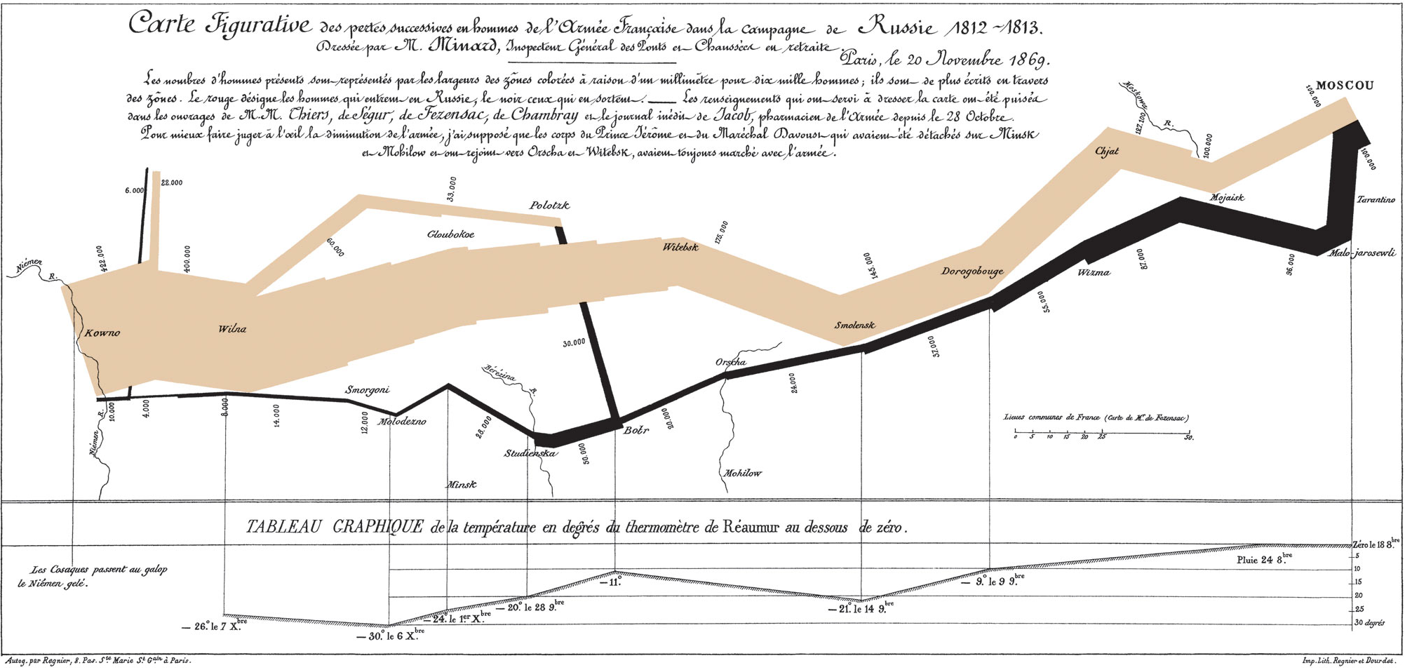
Last but not least a lot of sources about Data Visualization mention the stunning work of Minard. I was wondering if the real database of this visualization is gathered somewhere. Tufte only gathered the different sources, but I cant find a database with all the actual figures.
What you see is not always what you get.
I must admit, Kieran Healy is a decent salesman. We begin the chapter “Look at data” at the top of his sales funnel with the exclamation that some data visualizations are better than others -- and before long we’re deep in his guidebook for learning the R programming language and ggplot. Well done.
For those who are fortunate to have sight and the necessary mental faculties, it’s reasonable to suggest there is a spectrum of quality to visualizations which span from brilliant to complete rubbish. Even between these extremes we run the risk of dwelling in the misleading middle, according to Healy:
“In your everyday work you will be in little danger of producing either a “Monstrous Costs” or a “Napoleon’s Retreat”. You are much more likely to make a good-looking, well-designed figure that misleads people because you have used it to display some bad data.”
Healy explores why differences exist in quality by deconstructing visualizations through the lenses of aesthetics, substance, and the fallibility of human perception.
We’re brought on a journey from the foundational ideas of Edward Tufte’s chart junk and data-to-ink ratios to poorly executed 3D charts, “pop out”, and optical illusions. We’re expected to be struck by the research of Bateman et al. (2010) and Anderson et al. (2011), which suggests that highly embellished charts are more easily recalled than their simplified counterparts, and that Tufte’s own data-to-ink ratio was the hardest boxplot to interpret despite its minimalism. Frankly, it’s not surprising considering the fallibility of human perception.
The research on human perception and vision science (Ware, Munzer, Adelson, Bach) provides us with a baseline of how we may be deceived by contrast, brightness, and edge detection to name a few. What you see is not always what you get, and our vision systems and related processing wetware of pattern matching can be quite complex and contradictory. The idea of gestalt rules -- whereby we search for structure in random places, and sometimes fill things in where they may not exist speaks to the complexity of observation. In the end, it matters a great deal who the audience is. Our job is not merely to share meaningful insights through data, but to consider the variables which may lead our audience astray, whether these are conscious or not.
Questions:
Healy’s chapter on ‘badness’ focuses on the graphic choices that visualizers make when presenting data. He describes the three types of graphical issues: aesthetic, substantive, and perceptual, and explores how each can lead to misinterpretation at best and manipulation at worst. Healy also warns that addressing one or two of these challenges does not remove the danger of misleading a viewer or misleading yourself when interpreting a graphic representation of data. He proceeds to expand on specific examples of graphical issues including choice of data point being graphed, scale of axes, color and size of symbols, as well as general patterns of human visual perception (hue, value, contrast etc.).
I agree with Healy’s point that we should be thoughtful about the choices we make when designing visualizations. I felt like this reading was particularly relevant as we become more comfortable working with D3 and p5, because we are no longer held by the constraints that are put on us by more structured/prescriptive visualization tools such as excel, tableau, google maps etc. I’m curious to hear what my peers think about the ethics of data visualization design choices in the non-profit and research/advocacy space.
Having worked in this space previously, I found that much of the data we presented was very intentional depending on our audience or the argument we wanted to make. Though academic spaces have standards like peer-review processes and IRB (internal review board) approval, I still felt like so much of our research was skewed based on our own biases and hypotheses. This also makes me think about the emergence of data driven journalism and advocacy work that depends heavily on various visualization methods. Do we think that ethics of data viz should be addressed through general peer feedback and accountability, or through more structured processes of review? Who holds the responsibility for ethics in these spaces when roles such as “researcher”, “data visualizer”, and “journalist” are kept separate?
How to visualize data ?
There are absolute no methods to technically critique a method of visualization. However, after visualizing data for centuries now; we can discuss the rule of thumb which makes the data more accessible and readable. The author of the article attempts to explain the idea of these rules by critically examining some not so great examples of info-graphics.
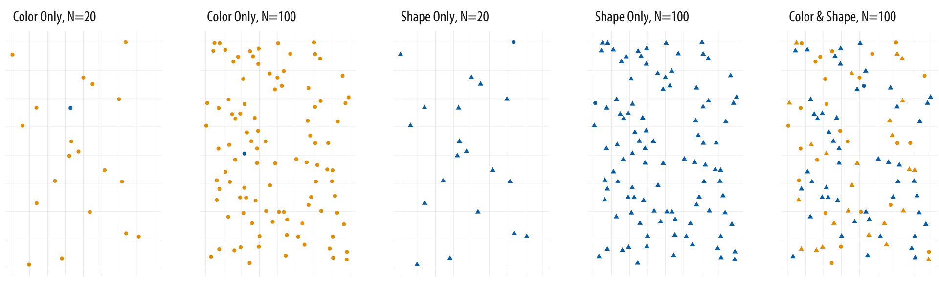
It helps a designer to create guidelines for each element of design. The examples explains in gist the importance of appropriate information, color palettes, composition principles, dimensions, placements and shapes. The example below sums up an important discussion of a thought process of designer in understanding and deciding the presentation method i.e. to use color or shape as a design element.
The references to the literature like The Visual Display of Quantitative Information(1983) by Edward R. Tufte gives the viewer perspective from different critiques of the visualization world. It also almost touches the concept of cognition in the visualization as it discusses the impact of the audience in comprehending information to have deeper impact rather than just an information to explore and forget. The balance of appropriate information is one of the most difficult decision. A balance between incomplete information and excess information.
However, the most important takeaway is the learning of 'artist's' judgement of an appropriate call for the design. Personally, I think each individual has their own taste of aesthetics. But literature like this article assists in developing taste and improving an overall understanding for avoiding mistakes previously done.
Reading Response of the article http://socviz.co/lookatdata.html
When I saw such an article detailing how to visualize data in science, I can't help but wonder, do we really need such a dogma about design? How does data visualization balance between science and art?
If these are two questions we have to answer, they are simple and obvious. It depends on what scene we going to use those graphics, perhaps as a stand-alone project (poster, design or art project), we can ignore part of the objectivity and readability. However, if it is a diagram of a magazine article, we may need to match a familiar design form of data visualization to meet the habit of quick reading.
But maybe we already have enough tools to complete the need to quickly make charts, they have become a design "symbol" that everyone is familiar with. Designers who design data visualization tools only need to put in more customized designs. So, what is the purpose of data visualization as a separate profession?
The article mentions two data visualization designers, Joseph Minard's and Nigel Holmes who I personally like a lot, just like modernism meets postmodernism, one is almost the ultimate objective and information presentation, and the other is almost just presenting the data on a comic book of his own. Joseph Minard pursues the form and function of the chart, and his rationalism becomes aesthetics. But what's interesting is that when I saw Nigel Holmes's chart, I just read more information quickly. It contains the designer's understanding of the content of the article, as well as a large number of symbols outside the data.
My background is sculpture, one of the most asked questions is what material are you working with. I have a hard time trying to explain to others that sculpture has long been beyond the discipline of material creation. In fact, most schools no longer have different majors for fine arts. It is precisely because when we need to present a complete concept/narrative, the material or the medium are always change based on projects. I think this problem is equally valid in Data Visualization. Why do we need to use charts/diagram as an independent design form, and do we have to bear the limitations of this medium itself? Of course, as a part of participating in the existing production chain, I can understand its limitation. However, when we discuss how to present information better as a theory, we should probably include more elements.
One of the last sections on "Problems of Honesty and Good Judgment" resonated with my experience in the working world. Oftentimes, misleading or difficult to understand graphs are included for the exact purpose of misleading or misdirecting an analyst away from topics that companies do not want people like myself (a credit analyst) to focus on. I say this because almost every company in the world produces a stacked bar graph with contributions from major operating segments colored differently - some mitigate the confusion by adding a legend for the colors and putting the percentages in the graph. But others just had a legend, or just had a pie chart, and would find other ways to make it difficult to compare the information to anything else by not necessarily using sales, but gross margin, operating margin, or some company-derived measure of profitability ("adjusted" EBITDA).
It seems like there are really two main categories of mistakes that we can make as data visualizers. The first is stylistic, and the second relates to the substance of the data being displayed. The stylistic errors are clutter/redundancy, incorrect visual dimensions (the overuse of 3-D for 2-D graphs seems to be a major problem), and perceptual uniformity, and "pre-attentivity." Of these, I think the perceptual uniformity is the hardest to get right. Preattentive visual elements can be used to emphasize or de-emphasize something of interest. Stylistic can bleed into substantive through its emphasis or by adding superfluous elements clearly meant to persuade rather than to simply elucidate.
The substantive errors appear to be ones of omission and distortion (the "important to live in a democracy" is a good example).
The coming era of rich data and ubiquitous interfaces disrupts the way information is conventionally conveyed. As a result, I think one of the critical issues in the field of information is how to build better connections between people and information and thus help people interact with high-quality information in a satisfying manner.
Many designer are trying to make visualization very fancy and complicated and to show their techniques. I think this is a common myth in the field of design.
Good taste might make things look better, but what we really need is to make better use of the data we have, or get new information and plot that instead.
And in my opinion, making visualization perceived better matters most.
Visualizations encode numbers in lines, shapes, and colors. That means that our interpretation of these encodings is partly conditional on how we perceive geometric shapes and relationships generally.
The key task of visuzalition is to convey information effectively and efficiently, is to better interpret data, elaborate ideas, and share narratives. Therefore, to some extent, I think that 'good taste' and 'good data' are the prerequisites for 'good perception'. Visualization not only demonstrates information in an elaborate way, but also requires designers to gain a comprehensive understanding of human behavior and cognition, to use scientific design methods to organize the representation of information, and to help people understand, explore, and gain insight into information.
For one thing, this requires visualization designers to use marks and channels correctly and appropriately and maintain adequate restraint at the same time to avoid excessive decorative embellishments of charts. For another, to further achieve human-computer coordination and contribute more effectively to the vision of human information connection, user research and usability testing in the field of user experience design also could be introduced into the design process of visualization, especially when your visualization lives on an interactive website. It's important to make sure that the information audience received, decoded and perceived is highly consistent with what you want to convey.
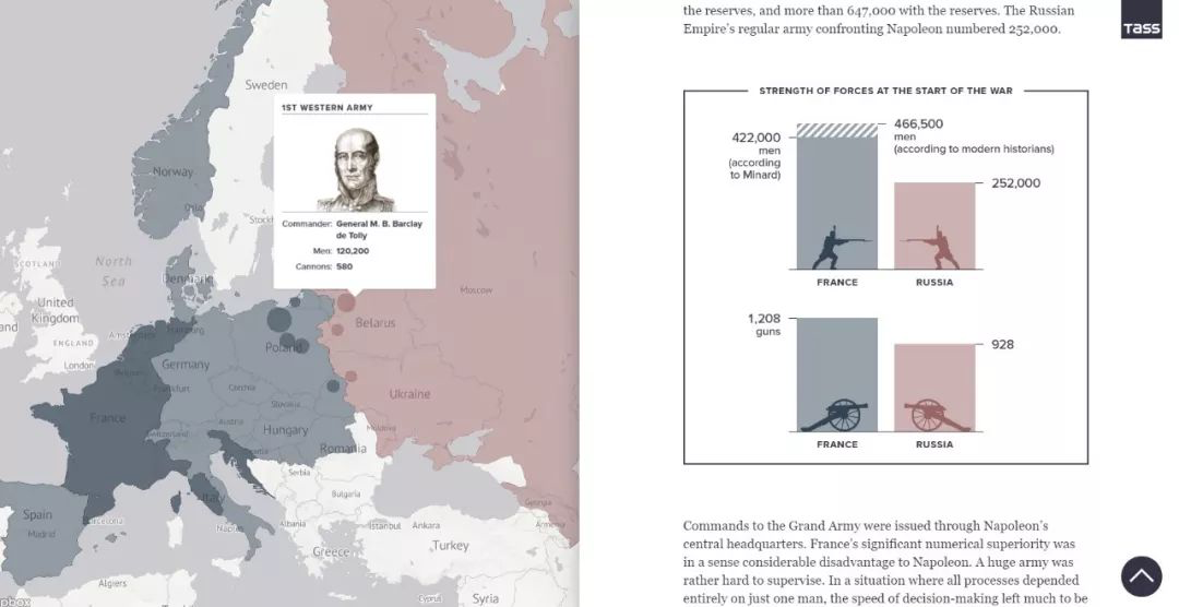
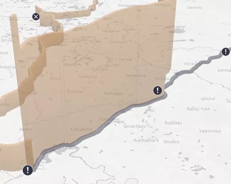
Minard’s visualization of Napoleon’s retreat from Moscow is a classic work of visualization and wins widely acclaim with its informative information design. I just wonder is there any suspicion of overrating and any flaw of this work.
And by the way, I am going to share a dynamic edition of this work <1812:WHEN NAPOLEON VENTURED EAST> presented by TASS.