The introductory chapter of Data Visualization for Social Science by Kieran Healy points out three essential values for visualizing data: aesthetics, data quality, and human perception. The importance of aesthetics and data quality look very obvious for me, but I did not realize why perception would cause bad visualization until I read this chapter. Sometimes, when we focus on delivering one information through the graph, we may ignore other information that leads to confusion in some extend. For instance, a stacked bar chart could show the overall trend of a dataset, but it makes it harder to know the trend of each category. Besides the sample figure Kieran Healy shows in the chapter, I also made this mistake while working on sketches for Major Studio 1 project.
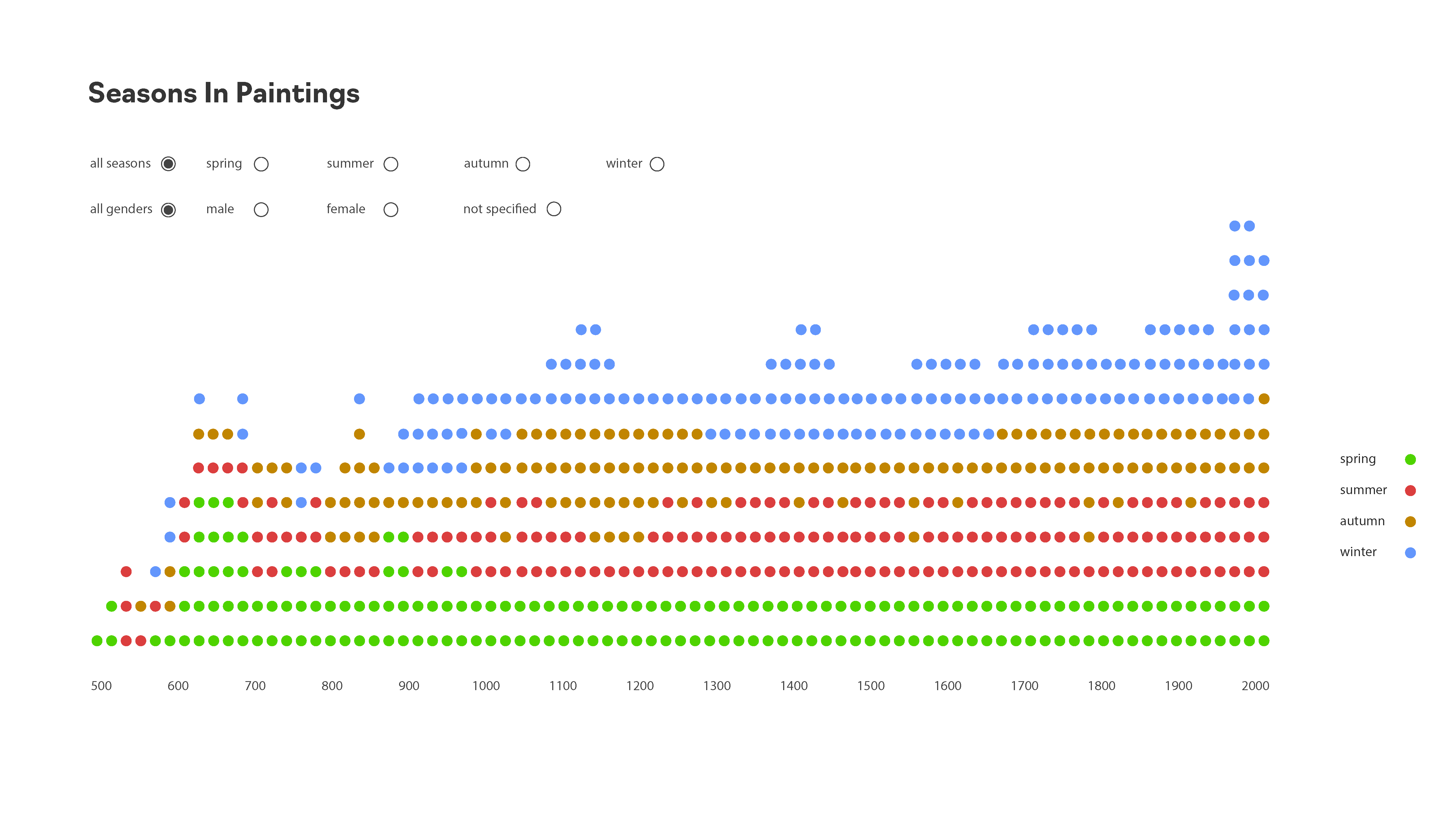
In the example above, I intended to present the over-time trend of paintings in all seasons and the number of paintings of each category in each year. But it is not efficient to present the over-time pattern of a certain category.
In order to avoid confusion or mistakes due to the visual perception, Kieran Healy points out three ideas that we need to keep in mind. Firstly, our eyes could be tricked when edges, contrasts and colors are presented in different forms. Secondly, deliberately popping out the data from what they are surrounded by would make it easy to see. This strategy could be achieved by distinguishing colors, shapes, sizes, angles, etc. It is interesting to note that popping out colors is more efficient than popping out shapes. Thirdly, our perception always leads use to look for structure no matter if there is based on proximity, similarity, connection, continuity, closure, figure and ground, and common fate.
This chapter highlights many interesting points we need to be cautious besides technical skills while visualizing data. I completely agree with Kieran Healy's idea about considering the results not just technically but also physiologically since our audience are human beings. With the background of UX designer, I think it it very critical to bring the idea of user experience into data visualization.
My question from this chapter:
- What are some resources we can learn more about visual perception besides the points mentioned in this article?
- What's the balance of data and decorative embellishments?