What I took to be the ‘message’ of the piece
The coming era of rich data and ubiquitous interfaces disrupts the way information is conventionally conveyed. As a result, I think one of the critical issues in the field of information is how to build better connections between people and information and thus help people interact with high-quality information in a satisfying manner.
Many designer are trying to make visualization very fancy and complicated and to show their techniques. I think this is a common myth in the field of design.
Good taste might make things look better, but what we really need is to make better use of the data we have, or get new information and plot that instead.
And in my opinion, making visualization perceived better matters most.
Visualizations encode numbers in lines, shapes, and colors. That means that our interpretation of these encodings is partly conditional on how we perceive geometric shapes and relationships generally.
The key task of visuzalition is to convey information effectively and efficiently, is to better interpret data, elaborate ideas, and share narratives. Therefore, to some extent, I think that 'good taste' and 'good data' are the prerequisites for 'good perception'. Visualization not only demonstrates information in an elaborate way, but also requires designers to gain a comprehensive understanding of human behavior and cognition, to use scientific design methods to organize the representation of information, and to help people understand, explore, and gain insight into information.
For one thing, this requires visualization designers to use marks and channels correctly and appropriately and maintain adequate restraint at the same time to avoid excessive decorative embellishments of charts. For another, to further achieve human-computer coordination and contribute more effectively to the vision of human information connection, user research and usability testing in the field of user experience design also could be introduced into the design process of visualization, especially when your visualization lives on an interactive website. It's important to make sure that the information audience received, decoded and perceived is highly consistent with what you want to convey.
What you agreed or disagreed with
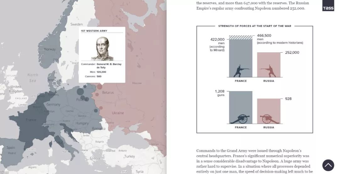
Minard’s visualization of Napoleon’s retreat from Moscow is a classic work of visualization and wins widely acclaim with its informative information design. I just wonder is there any suspicion of overrating and any flaw of this work.
And by the way, I am going to share a dynamic edition of this work <1812:WHEN NAPOLEON VENTURED EAST> presented by TASS.