In the chapter of Graphesis titled “Visualizing Interpretation”, Joanna Drucker continues to draw connections between the disparate origins of data visualization, from the modern calendars’ ancient roots in Babylonia, to its current hybrid uses in digital contexts. The earliest information visualizations are also the conventions of the field, with origins in record keeping, and observation. That may sound like rather dry work, but considering the breadth of “things” that can be observed and monitored (things: medical, herbal, astrological, alchemical, cabalistic practice, anatomy, astronomy, etc.), it allows our field to be inherently multidisciplinary and representative of a more holistic view of our society and environment.
Drucker states that there are two types of visualizations: those that are static representations of well-known information like a bar chart, and those that are knowledge generators - objects that create new information with their use. Throughout the beginning of the chapter, she also outlines the various forms of visualization based on differing parameters, including:
Graphical Format
- map
- table
- timeline
- tree bar chart
- network diagram
Intellectual purpose or function
mapping
navigating
record keeping
calculation
The type of content they express
qualitative
spatial
temporal
quantitative
interpretive
The way they structure meaning
analogy
connection
comparison
using nodes/lines
vectors
columns
bi & multi-variate axes
point of view systems, etc.
Disciplinary Origins
bar diagrams from statistics
trees from genealogy
Maps from exploration
flow charts from hierarchy in corporations or electrical circuits
The challenge she’s says, is to “develop a terminology for the rhetorical iconography of graphical forms that is grounded in the features of specialized relations, such as hierarchy, juxtaposition, and proximity.” In other words, there is still no agreed upon set of symbols that can adequately represent uncertainty. The trick is to treat them as complex systems, and to reinterpret the values to include non-linearity which is inherent in the human experience.
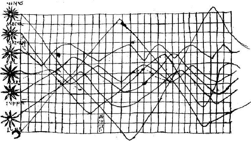
In her treatment on timekeeping she covers a lot of ground, weaving in the history of the earliest available graphs which includes one of my favorite images, the earliest known chart of planetary movements from the 10th century translation of Macrobius’ Commentarii in Somnium Scipionis ("Commentary on the Dream of Scipio”) Macrobius’s commentary included an exploration of the nature of dreams based on the Greek dream-theory of Artemidorus from the second century AD. This is an incredible example of visualizing uncertainty: the natural inclination to graph the observation of the heavens which was referenced in a 10th century essay on dream theory! Interestingly, graph paper as it is commonly known did not appear for some 800 years after this drawing!!
Drucker goes on to discuss visualizing uncertainty and the opportunities for humanistic capta visualization. Phenomenology is the study of the human experience (s) and consciousness. In its most basic form, phenomenology attempts to create conditions for the objective study of topics usually regarded as subjective: consciousness and the “objects” of these experiences such as judgements, perceptions, and emotions. While it seeks to be scientific, phenomenology is not an attempt to study consciousness from the perspective of a psychiatrist, etc. It is a philosophical movement that seeks to determine the essential properties and structures of experience through research. To this end, phenomenologists prefer to gather "capta", or conscious experience, rather than traditional data. Capta represents what is seen, thought and felt. Capta, according to phenomenologists, is the 'data of the conscious experience’.
If All Data is Capta, this means that we have to reconsider everything we think we know. Drucker reminds us that nations, genders, and populations are ambiguous. We need to acknowledge that our borders are porous and we can no longer force people into convenient little boxes. Those boxes are not stable, reliable, 'a priori’ data; they are subject to change and will be interpreted through the reality of lived experience. Drucker states:
“Data pass themselves off as mere descriptions of a priori conditions. Rendering observation as if it were the same as the phenomena observed, collapses the critical distance between the phenomenal world and its interpretation, undoing the concept of interpretation on which humanistic knowledge production is based. We know this. But we seem ready and eager to suspend critical judgment in a rush to visualization. At the very least, humanists beginning to play at the intersection of statistics and graphics ought to take a detour through the substantial discussions of the sociology of knowledge and its critical discussion of realist models of data gathering. At best, we need to take on the challenge of developing graphical expressions rooted in and appropriate to interpretive activity.” (p. 126)
Drucker is strongly encouraging us to reconsider our role as visualizers in order to embrace a humanistic approach - recognizing the interpretive nature of knowledge. She asks us to lean into the expression of ambiguity as we integrate human experience into data reproduction. She encourages this even if it ruffles the feathers of data visualization purists (I imagine Edward Tufte had some tough words for her), so clearly this is an urgent matter.
Personally, I love that she challenges us to accept the human element in data collection and within the interpretation and expression of data. She understands that doing this undercuts the very notion that data is = a stable, unchangeable fact. And as one of those pesky people with a million intersectional identities and a penchant for deconstruction, this call to arms (so-to-speak) is a breath of fresh air.