- Presentations
- Andrew on Amanda Cox
- Aaditi on Oliver Byrne
- Christian on William Playfair
- Final Project
- Individual meetings & in-class work
Assignment
- Presentations
- Dan on Mike Bostock
- Mikaela on Jennifer Daniel
- Adrian on Tufte’s Visual Display of Quantitative Information
- Mio on Visual Explanations
- Final Project
- Look over sketches in small groups
- Discussion of Drucker’s I’ing V. colon-colon V’ing I.
Assignment
Assignment
- Reading #4 from Graphesis
- Post your response with the tag ‘R4’ before the start of class
- Presentations by Dan & Mikaela and Adrian & Mio
- Presentations
- Candice on Jer Thorp/O.C.R.
- Batool on Tufte’s Envisioning Information
- Anh on Catalogtree
- D'hanna on Tufte’s Envisioning Information
- Final Project
- Show & tell/discussion of potential topics
- Exercise 3
- Individual meetings & in-class working session
Assignment
- Exercise 3
- Finish up your project for next week’s crit
- Final Project
- Select three of your ideas and develop them further by identifying all the necessary data sources and sketching the graphical approach you'll be taking.
- Write up a 1-page proposal for each as described in the assignment and combine them into a single PDF.
- Exercise 3
- Look over initial sketches and evaluate next steps
Assignment
- Exercise 3
- Explore the direction selected in class and prototype the different component views that will make up your final visualization
- Read up on the various ways to add interactivity to your p5 sketch in the Beyond the canvas tutorial and the
create* functions (for sliders, buttons, etc.) in the p5.dom library and begin experimenting with them
- Final Project
- Document your ten ideas and five potential data sources in the text files in your
process folder.
- Presentations by Candice & Batool and Anh & D'hanna
- Presentations by Simone and Caitlyn & Christian
- Reading #3 from Graphesis
Assignment
Assignment
- Reading #3 from Graphesis
- Post your response and additional research with the tag ‘R3’ before the start of class
- Presentations by Mikaela & Simone and Caitlyn & Christian
- Exercise 2
- Small group meetings and in-class work session
Assignment
- Choose one of your three directions to develop and create a completed version of it
- Using either the external data source you collected or a dataset collected by one of your classmates incorporate at least one additional variable into your representation beyond the original set of CSVs in the repository
- As always, feel free to bring in multiple variants if different options for how to solve a design problem/represent the data occur to you
- Presentations
- Felix on Otto Neurath
- Janice on Stamen
D’hana on Tufte’s Envisioning Information- Daniel on Charles Joseph Minard
- Reading #2 on the use of color for quantitative & qualitative values
Assignment
- Exercise 2
- Add sketches to process subdirectory and describe each of your three concepts (as well as your external data source) in the
readme file.
Assignment
- Reading #2 on the Subtleties of Color
- Post your response with the tag ‘R2’ before the start of class
- Presentations by Felix & Janice and D'hana & Daniel
- Presentations
- Zui on Ben Fry/Fathom
- Brad on Tufte’s Beautiful Information
- Suzanna on W.E.B. Du Bois
- Karen on Otto Neurath
- Reading #1 on the various types of ‘badness’ in data visualization
- Exercise 1: critique and offer directions for further development
Assignment
- Incorporate the class’s feedback on your initial clock concept and return with three completed variants on the 26th:
- one that develops the initial concept further without fundamentally rethinking it
- one that either adds additional 'components' from the time object to the visualization or removes them
- one that visualizes at least 1 component of time and 1 component of the date
- Conclude our Catalog & Classify discussion
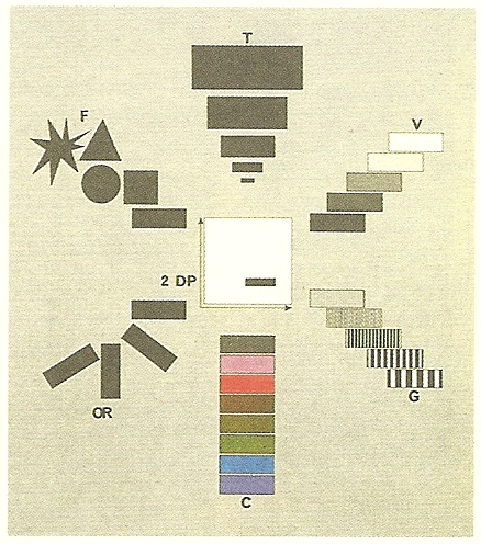
- A quick primer on Retinal Variables
- Begin Excercise #1: Right Twice a Day
- First step: log into your GitHub account and leave a comment in this thread to get read/write access to the course repository.
- Next: Go to the top-level of the repo and click the big green button to ‘Clone or Download’, then select ‘Open in Desktop’ in the popup.
- Finally: locate the folder with your name in the
students/ subdirectory. Be sure that every file & folder you add or modify lives within here. Also, do not touch anything in the lib subdir — it’s a symlink to files shared by all students.
Assignment
- Complete your first draft of Exercise 1 (including your sketches & ideas in the
process subdirectory) and push your commits to github before class. - Read the three essays on ‘badness’ in information graphics. For every reading assignment, you will be expected to post a short (250–500 word) write-up summarizing what you took to be the ‘message’ of the piece, what you agreed or disagreed with, and what you’d be curious to hear your peers’ opinions about. Be sure to add the tag "R1" to your post by clicking on the gear icon at the top of the screen and don’t forget to Publish your draft.
- Assessment of student skills, levels, and interests
- What do you want to learn in this class?
- What sorts of data/information graphics work have you done previously?
- Any coding experience?
- Stats?
- Introduction to course goals and expectations
- Intro talk
- Select Presentation topics
- Exercise: Catalog & Classify
- Create and publish a new post with your visualization type as its title. Assign it the tag “Catalog & Classify” in the gear menu.
- Describe your chosen visualization type in terms of the kinds of values it represents (e.g., fractions, integers, percentages, etc.) and the sorts of comparisons it enables or discourages.
- Explain what forms of ‘pre-processing’ need to occur between the raw data and the ink/pixels in the resultant chart.
- Explain the ‘mapping’ by which numerical/categorical/etc values are converted into positions, sizes, colors, textures, etc.
- Include 3 images apiece to demonstrate ‘good’ and ‘bad’ uses of this visualization type.
- Consult the Ghost Editor Overview to help you format your text & images.
Assignment
- Refine your Catalog entry based on the class discussion and see if you can find additional examples (with an emphasis on the ‘good’ uses of the form). If you didn't get a chance to talk today, we'll return to your visualization type next week.
- Next week we'll have an in-class programming workshop. In preparation for that, please make sure you've got the following installed/set-up:
- a text editor (consider SublimeText, VS Code, or Atom)
- the P5.js environment
- an account at GitHub and a copy of the GitHub Desktop client
- Read the P5.js introductory materials: Getting Started, the Overview, and Color (and take a peek at the Examples section while you're at it).