This is a collective research project providing examples and discussion of the basic building blocks of visual data representation.
Physical Map
Physical maps order elements by physical location, such as latitude and longitude points.
Cartogram types of maps distort reality to convey information. They resize and exaggerate any variable on an attribute value.
Density-equalizing cartograms are your traditional cartograms. In density-equalizing cartograms, map features bulge out a specific variable. Even though it distorts each feature, it remains connected during its creation.
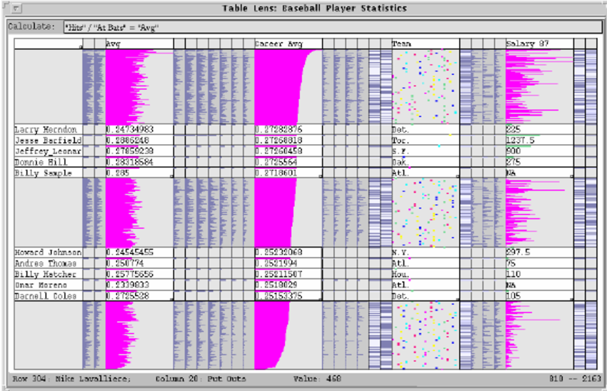
As you can see, it’s easy to get information at only a glance.
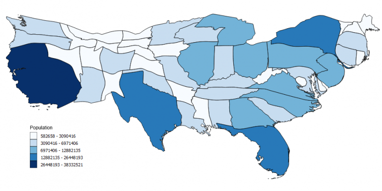
In this map, you can instantly see that a high proportion of population live in California and New York. While states like Montana and North Dakota are smaller proportions.
Disadvantages:
- Must be used with care because knowledge of the actual land area is essential for the reader to make sense of the distorted version shown in the cartogram.
Best Practice:
- Show the actual map before introducing the cartogram
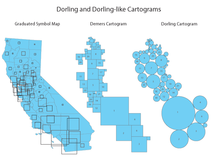
The Dorling Cartogram uses shapes like circles and rectangles to depict area. These types of cartograms make it easy to recognize patterns.
States are substituted with appropriately sized circles to represent clusters of population in the United States. However, the downfall for Dorling Cartograms is that it doesn’t maintain the shape. This means that readers may have difficulty understanding features in the map.
Hexagonal Bins
Hexagonal binning creates a grid in the map with regular hexagons.
Use:
- There are a lot of data points but you do not want to compromise on accuracy
- This map is great for understanding spatial distribution patterns of data
- Spatially aggregating the points into polygon regions to look at groups of data instead of the individual points
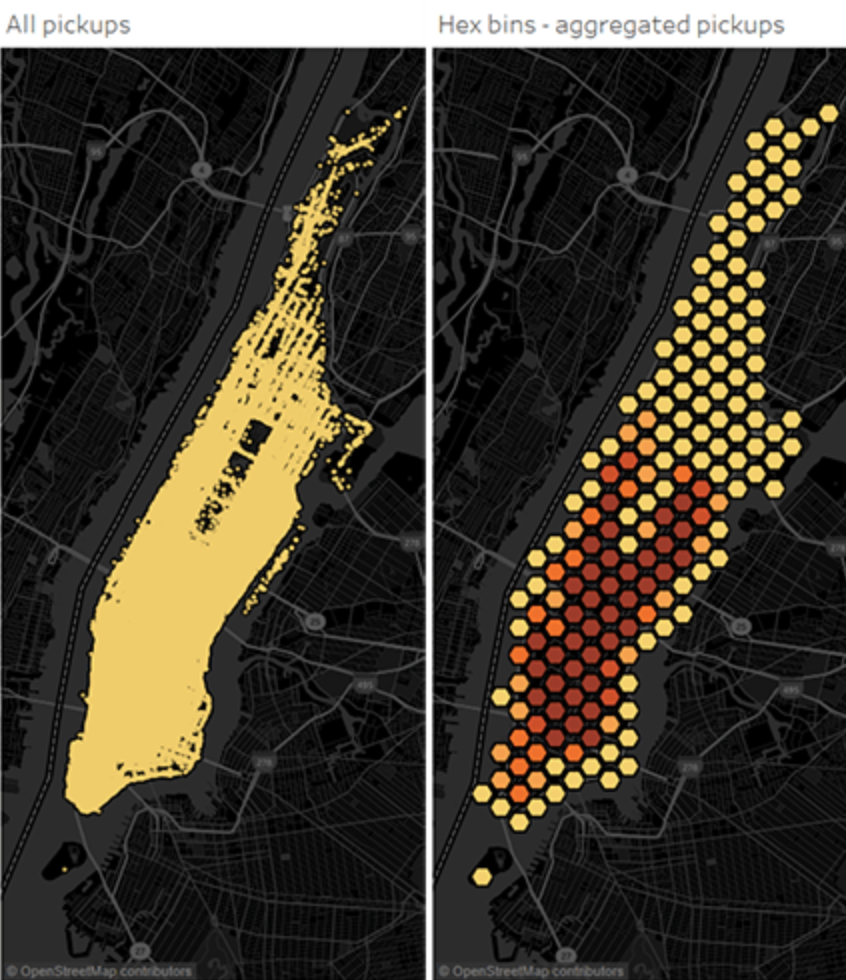
The image below shows the ares in which people hail taxis in NYC. On the left, it is difficult to make sense of patterns because there is not enough space between the individual point marks so that you can clearly see where one cluster of data starts and another ends.
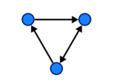
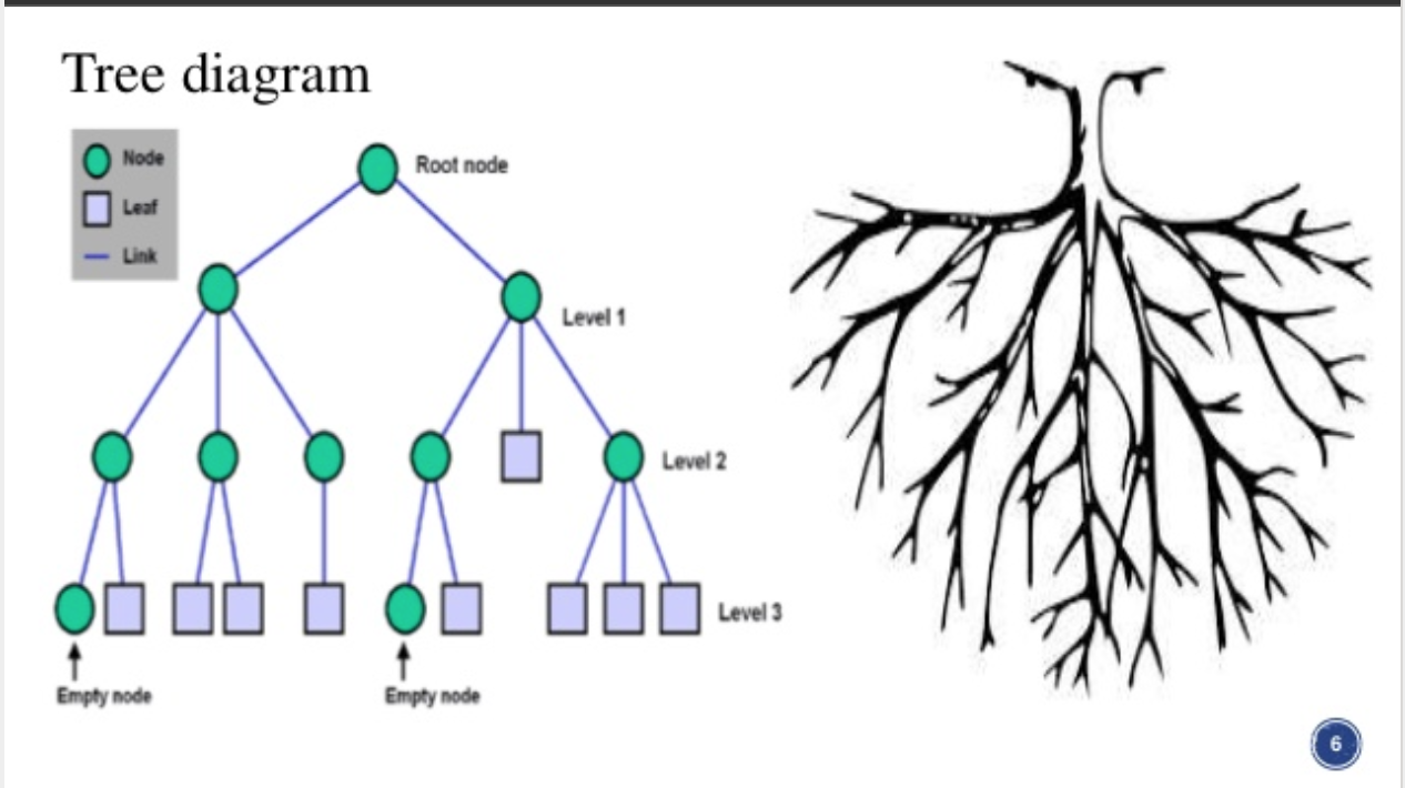
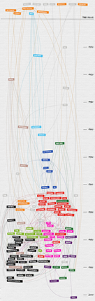
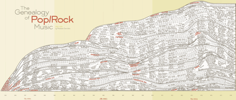
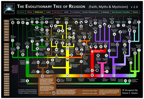
Tree/Graph
A Tree is largely used to show ordered data by connecting lines between those points akin to the branches of a tree. In slight contrast to tree maps, Tree Graphs are a collection of nodes that eliminate the need to display hierarchy when it isn't relevant factor to the data's narrative. Some terminology that is commonly used with these visualizations include: Root, Child, Leaf, Generation, Parent, Siblings, Branch, etc. Technically trees are graphs (and families). So what's the difference?
Graphs
Graphs are trees that include a set of nodes and "edges" which act as links between the nodes. In graphs the nodes can connect back to itself which is a pretty handy tool when algorithms are needed to solve problems online, in business and of course, mathematics.
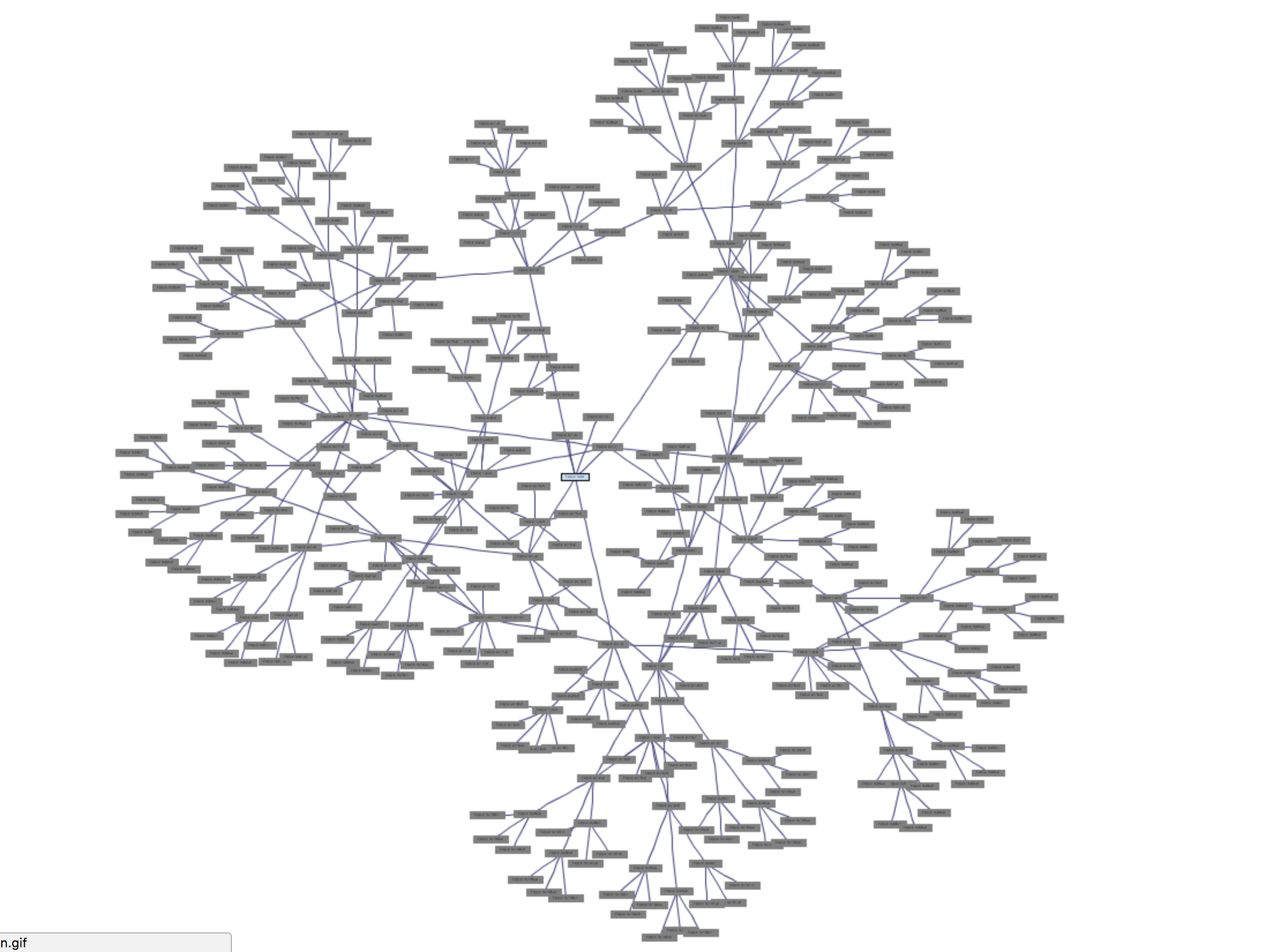
Tree Graph Examples:
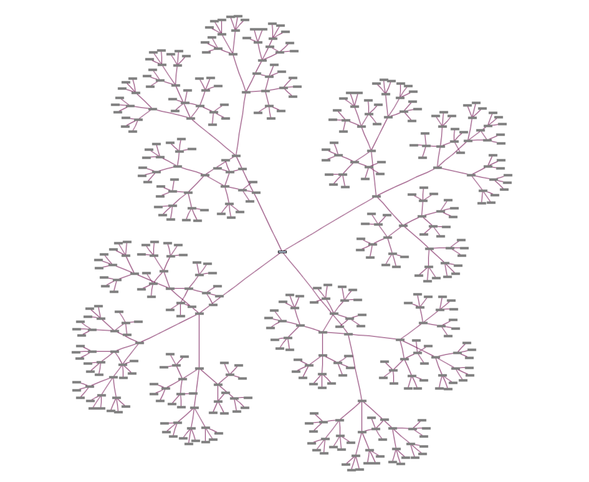
"Generating several different topic trees after one another causes tree topics to superposition. For example, generating a tree with depth 3 and number of child nodes 5 after previous generation results a graph" (Source: http://www.wandora.org/wiki/Tree_graph_generator)
Trees
There are a number of values that this genre of visualization tends to illustrate best, including hierarchy, genealogy, classification, relationships, and organization. The "family" descriptors mentioned above are also used within the organizational structure and logic of computers, discreet mathematics, HTML, and other programming languages.
Tree Examples (for you Rock music enthusiasts):
However, there are certainly instances where it is unclear where hierarchy exists. In the example below you can see the organizational chart from the non-profit where I work. I've been an employee for over five years and I still find this graphic to be unwieldy in it's application. In fact, there isn't enough space in this image to place the continued variety of data that exists about front-line employees; their names and titles have been eliminated for efficiency, at the expense of accuracy and the erasure of information. (Photo deleted on 10/27 for privacy concerns)
Pre-Processing
When considering using this type of graphic, you have to figure out the key question that requires visualization and the kind of data you would like to display. It is clear that information that can display hierarchy and lineage works best with Trees, where as Graphs are more useful when limitations aren't your jam and you need to process a repeated action or send the direction of data in multiple directions, rather than through a top-down hierarchy. The use of bright colors tend to lend well to comprehending the structure and information contained within Trees. In contrast, the use of monotone colors makes it incredibly difficult to find specific data points within the lineage. Additionally, the Trees that use similar shapes, and typefaces are far more difficult to manage visually and therefore conceptually; regardless of the top-down simplicity of the information flow.
Tree Map
This is a map of trees...
...but this is a "tree map"
Everyone loves a good Tree Map - Crypto Currency - https://t.co/5kg2s52ZXx #bitcoin #treemap pic.twitter.com/EOx5mIbo7S
— Ken Nickerson (@kcnickerson) September 29, 2017
What is it?
A tree map displays hierarchical data as a set of nested boxes. Each set of nested boxes can be thought of as a branch of a tree. Like a real tree, some branches simply have a single set of leaves, but some branches have additional branches off of those branches.
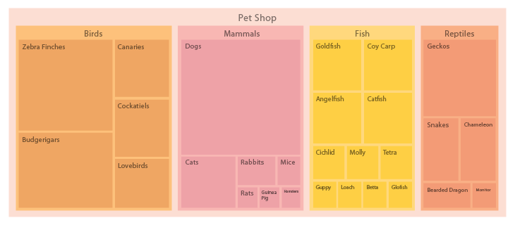
In the simple example below, the Pet Shop is the tree, and Birds, Mammals, Fish, and Reptiles are the branches.
Real Life Usage and Function
A tree map is a great way to show impact through hierarchy within a system and its subgroups. For example, a tree map is a popular visualization for stock market data. In the example below, the market (tree) is broken into major sectors (main branches) and within those main sectors, smaller subsectors (branches of branches), with the atomic component being the boxes (leaves) for each company.
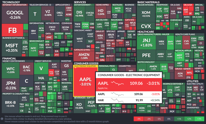
Each box in a tree map can show two different measures: Size and Color
Use of Size
You can see the size of the box indicates the market cap for each company represented proportionally as a percentage of their whole sector. It's clear right away that Apple and Google occupy the largest spaces, which makes sense.
Use of Color
Another variable aside from the size of the groups and subgroups area, is the use of color. In the stock market visualization above, each company is one of seven colors (legend in the bottom right of the graphic) indicating the current change in performance of the stock. We can see apple is down -3.01%, which places it in the poorest performance bucket, using the color red.
Through the use of color in this example, it would be immediately clear when the market was having an up or down day. In the example above, it's clear that Apple's drop in price was not due to market-wide conditions. It stands out among a mostly positive day for the market.
Interactivity
By hovering or clicking on each company, users can see a popover with more details of the performance and size. Additionally, interactivity allows for multiple subgroups to be representing when drilling down into each branch while also reducing clutter.
Click on the link below to interact with this tree map example.
Best Practices
- Don't use too many levels of hierarchy - especially in a static visualization. As a general rule, only go two or three levels (branches) deep – otherwise it will become cluttered and difficult to interpret.
- Use clear labels that add value and not clutter
- Always be conscious of adding space, since it is the main variable. For example don't add space outside the boxes for labels as it distorts the spatial relationship between the individual boxes.
- Use legends for color usage
- Use hover states with basic tooltips to provide additional information in interactive graphics - do not try to cram too much information in the box
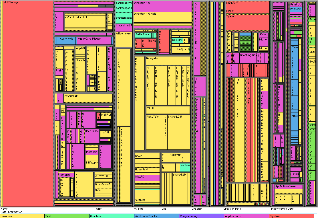
The example below is bad. It's cluttered and difficult to read because the sections and subsections have too many items at the atomic level to be remotely useful in a static graphic.
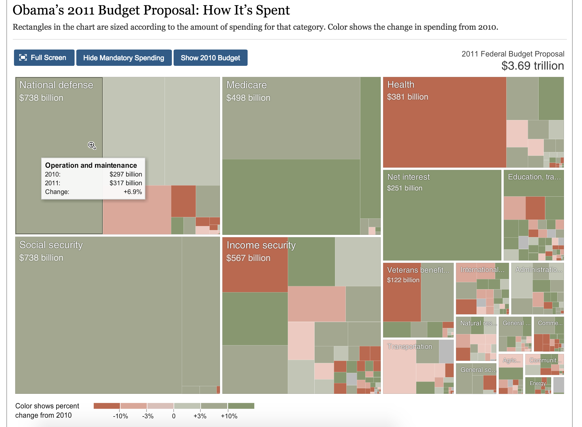
The below example is good. Click on the link in the caption to see the interactive version of this treemap.
Scatter Plot
What is it?
- A scatter plot is a two dimensional chart that uses points or “dots” to represent specific values.
- Scatter plots most commonly have two different values that are represented using the X and Y axis.
- This specific type of chart is best used to show the relationship between the X values and the Y values.
- Instead of simply representing X and Y as values, scatter plots effectively show the correlation between these two variables.
Usages:
- Scatter plots are beneficial to see the correlation between two variables, such as how X is affected when Y is increased.
- It is important to note that while scatter plots have been referred to as “disconnected line graphs”, they do not necessarily have to be linear.
- The example below represents a scatter plot of the average daily high temperatures by month using a non-linear graphing method.
- In some instances, the points on scatter plots may be completely random, showing little to no correlation at all.

- In addition to X and Y, the color, shape and size of the points on a scatter plot can also be seen as variables.
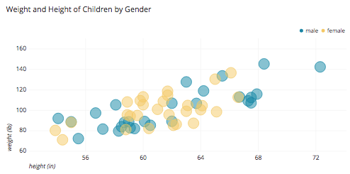
- The example below depicts a scatter plots of the height and weight of children by gender, with height and weight being the X and Y variables.
- The example also uses color as a variable to distinguish between male and female children.
Advantages:
- The many variables within scatter plots, such as color, shape and size, allow data to be categorized within the chart.
- Scatter plots are effective at giving an overview of the correlation between the X and Y variables.
- Within scatter plots, it is easy to find "outliers" as some points are made very obvious if they are not near the rest of the clusters.
- The example below demonstrates how scatter plots can be helpful for quickly finding deviances in data

Disadvantages:
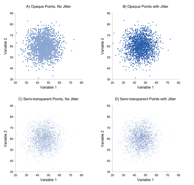
- If scatter plots contain too many points, they encounter "over plotting" problems.
- This occurs when points are placed over top of one another, making the chart difficult to interpret and read.
- However, as evidenced by the example below, transparency can be used as a solution to over plotting
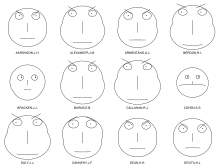
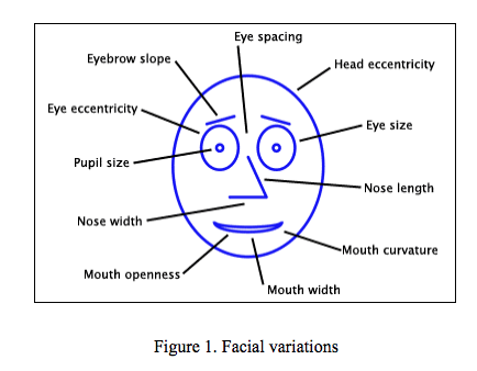
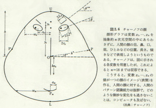
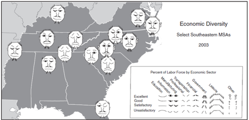
Chernoff Faces
created in 1973 by Herman Chernoff - an applied mathematician
The Chernoff 'faces' (called GLYPHs - a symbol or pictograph) are probably the easiest and possibly the most humanistic way of visualizing data. Its called a 'MULTIVARIATE' (or more than 2 variables ) ANALYSIS. These faces are universal, quick and easy. All children of any country, ethnicity or bias would draw and we as humans, understand this immediately. The kind of value this visualization represents is immediate and read as a mode of human emotion and cultural intelligence:
ANGRY/UNFRIENDLY/OPEN/COMTEMPLATIVE/AMENIABLE(happy).
Some of the DOWNFALLS of this visualization are:
* The data is Totally Interpretive
* What if you're blind or emotionally handicapped (ie: autistic)
* Cultural Understanding (Asian cultures want a 'Serious' Judge; OR some assumption that a 'Serious' Judge is more impartial?)
* It is binary – only shows one set of data that assumes its universality.
* Certain graphical bits on this chart (ie Eyebrows) catch your attention more readily, and can influence you.
* 'Fight or Flight'.
The BEAUTY of this visualization is:
* The Immediacy/Speed
* Not using excess space/ink/clutter
* It runs on an X Y axis – you could see the 'progression' of the representation.
* Not alot of discussion needs to be initiated.
* 'Fight or Flight'.
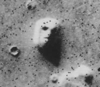
HERES ANOTHER -
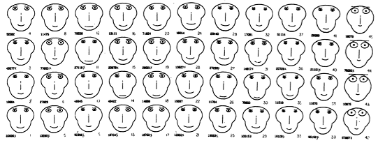
Mapping Faces
This comes from an article called: Mapping Quality of Life with Chernoff Faces. The face is distilled down to shape and line. Distortion of the shapes and the angles of lines determine the 'Mapping'.
https://web.archive.org/web/20041217153643/http://gis.esri.com/library/userconf/educ04/papers/pap5000.pdf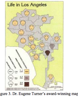
This was interestingly found to be: "In this map, four variables--affluence, unemployment rate, urban stresses, and percentage of white population — are presented by facial elements face shape, mouth curvature, eyebrow slope, and face color, respectively (Figure 3) and identified the head shape/mouth curve/eye shape and eyebrow slopes/color are a reference to how to read the visualization. The award-winning map successfully captured the living conditions in the Los Angeles area. The success of the map was largely due to the use of Chernoff faces as its symbolism. Turner described this map as “probably one of the most interesting maps I’ve created because the expressions evoke an emotional association with the data.”
However, the example ASSUMES cultural norms, and the map doesn't identify distinct areas of Los Angeles.
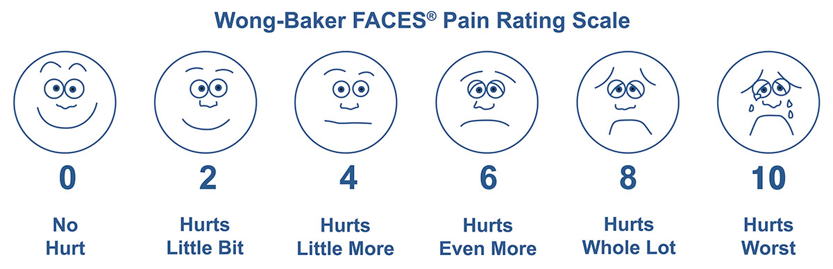
This tool was originally created with children and for children to help them communicate about their pain in a doctors office or hospital. This scale is used around the world with people-ages 3 and older, facilitating communication and improving assessment so pain management can be addressed.
A good representation of 'mapping' that shows its universality.
Problems with Color
Color seems to add a value to the visualization that isn't as easily interpreted as the shape and line valuations. Color (and black and white) can distort the shape/lines.
Other
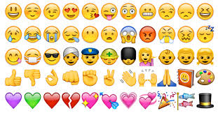
The research also finds something called: Pareidolia (see below)
When you mix up the visual cues, the visualization can become very obscure
This data visualization is the precursor to Emojis.
QUESTIONS
*Are there visual ways to show subtlety of the data quickly?
*Is there a way to introduce a secondary or tertiary sets of data in the same visual presentation format without the visualization getting messy? (don't think so)
*Can you add the use of color ( or glow) without being biased?

bar graph
- bar graph is a graphical way to display data using bars vertically or horizontally in x and y axis.
- usually one axis shows the categories and the other axis shows percentages.
- bar graphs are used for comparison and representing relationship between groups with different data.
bar graph components:
- x and y axis
- name of groups or categories (axis 1)
- numbers (axis 2)
- scale (the range of numbers shown on the graph)
bar graph design elements:
- colors (hues and gradients) to show the differences between the groups
- thickness and size of the bar
example of a bad executed bar graphs:
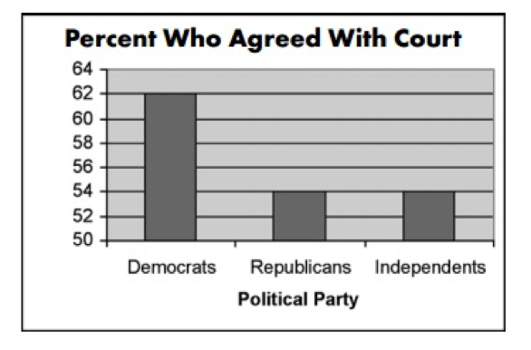
this bar graph is misleading because at first glance you think there's a massive difference between the republicans and democrats who agreed with court, when in fact it's only 14%, but the y axis is showing the range from 50-64, the following example shows how the scale should have been used.
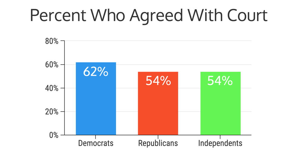
Now this version is better because we actually see the slight difference between the three groups, because the y axis and the bars are now showing the percentages.
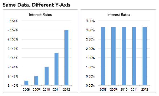
The chart on the left makes you think that the interest rates have increased dramatically in 4 years when in fact it only increased 0.014% as shown on the right graph.
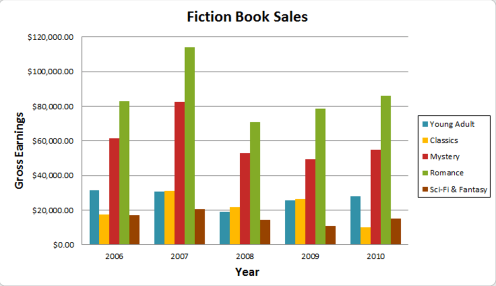
This is a good example of a bar graph because:
- It shows the labels (Gross Earnings, Years)
- Graph key or legend
- Contemporary colors
- Y axis is used correctly
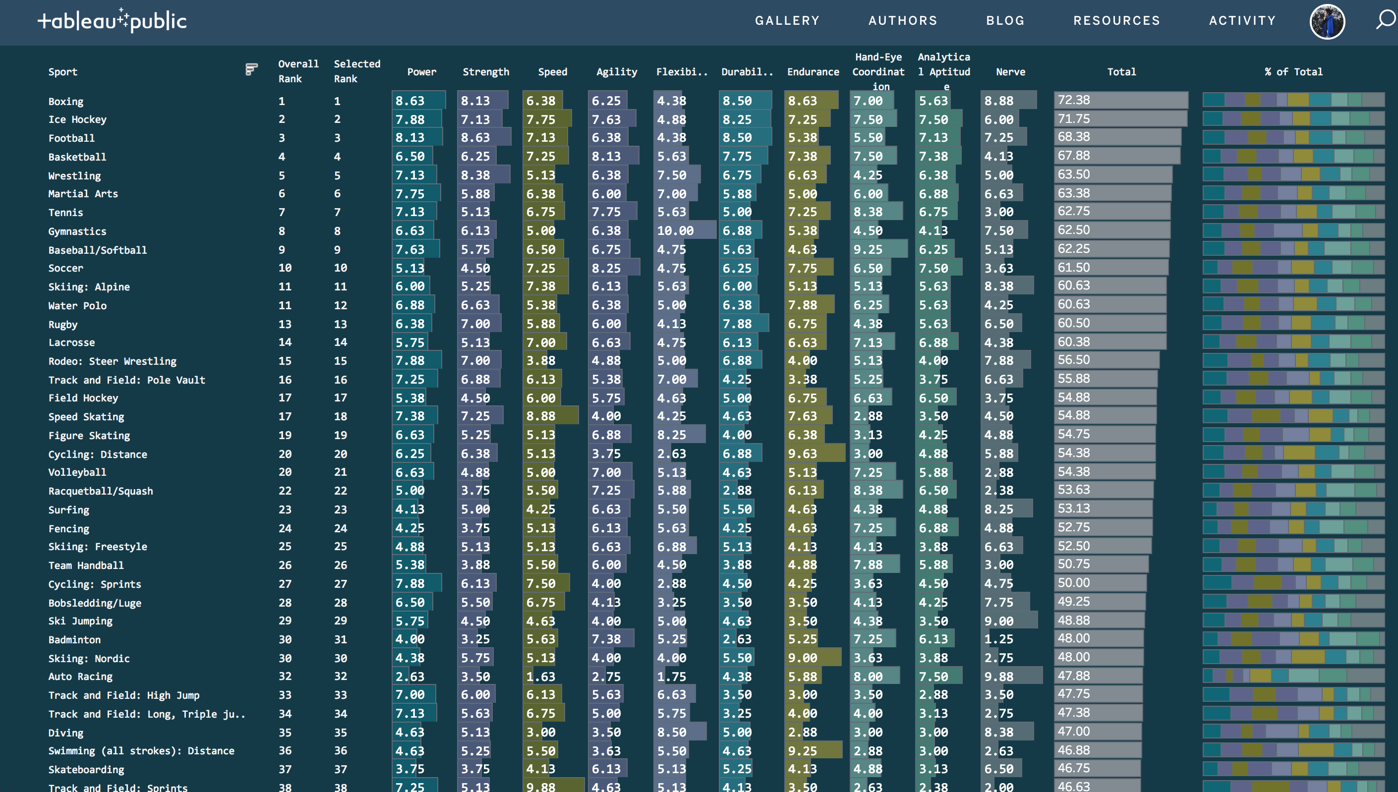
Table Lens Graph
What's Its Purpose?
A survey plot, also known as a side by side bar chart or Table Lens' main purpose is to visualize patterns and outliers in multivariate datasets. In its simplified form, a Table Lens graph is a way to cluster relationships using bars. They are normally sorted independently and interesting patterns may evolve post clustering. From the superficial research done, it seems that academic articles refer to this chart as the Table Lens chart but modern use cases may refer to it as otherwise.
How Do I Read it?
The bars making up the Table Lens graph can be represented by multiple values because the variables are sorted independently. They can be made up of averages, numbers, percentages, ranks, distributions etc.
Stephen Few suggests using a table lens graph when your audience is not familiar with scatter plots. Perhaps he suggests this as a way to better view the correlations between variables.
Pre-Processing
Sorting of the variable column is required in order to find relationships among variables in the Table Lens graph. Table lens graphs are laid out similar to a table with the independent variables going horizontally.
According to an academic article, the process to achieving the Table Lens graph is: 1) Scanning through each variable left-to-right 2) Sorting the columns 3) Scan columns to the right, judging if they are correlated.
Mapping
When researching the Table Lens graph, I did not find any interesting aesthetics choices. Due to the fact that this chart requires a multitude of tiny bars in order to find any relationships within the variables, colours tend to be muted so that the reader can establish a pattern. Table Lens graphs tend to be quite busy as they require multiple independent variables.
Good Use vs Bad Use Cases
Good Use
The graph represented below is a good example of a Table Lens used in the modern day. The colours are quite muted but each colour represents a different independent variable. I also quite like that the labels have been added to each bar in order to process one variable over the other. Again, it's quite hard to grasp the relationship between the bars , so the labels add context.
Bad Use
The graph represented below is a bad example of the Table Lens graph. The data is really busy. As well, there are no labels so it's difficult to distinguish between the variables, not to mention the hot pink colour doesn't help on an already very busy visualization.
Sources used: https://www.perceptualedge.com/images/Effective_Chart_Design.pdf
http://citeseerx.ist.psu.edu/viewdoc/download?doi=10.1.1.22.1565&rep=rep1&type=pdf
Line Charts
| Idiom | Line Charts |
|---|---|
| What: Data | One quantitative value, one ordered attribute |
| How: Encode | Points with connection marks between them |
| Why | Show trend |
| Scale | Hundreds of levels of the ordered attribute |
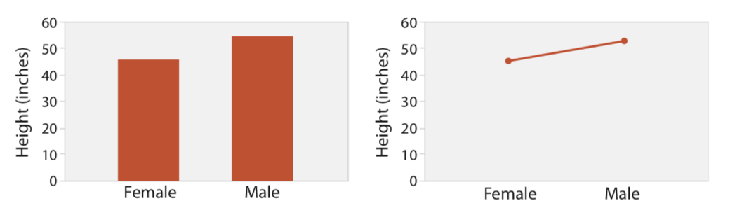
Line charts displays one value attribute and one key attribute in a 2-D space, while showing categorical attribute using colors or shapes. It uses one axis for a quantitative attribute and the other for an ordered (sequential/divergent) attribute.
An important feature of line charts is that they also use connection marks to emphasize the ordering of the items along the key axis by explicitly showing the relationship between one item and the next. Thus, they have a stronger implication of trend relationships, as well as continuity.
Line charts should be used for ordered values but not categorical values. A line chart used for categorical data violates the expressiveness principle, since it visually implies a trend where one cannot exist. This implication is so strong that it can override common knowledge.
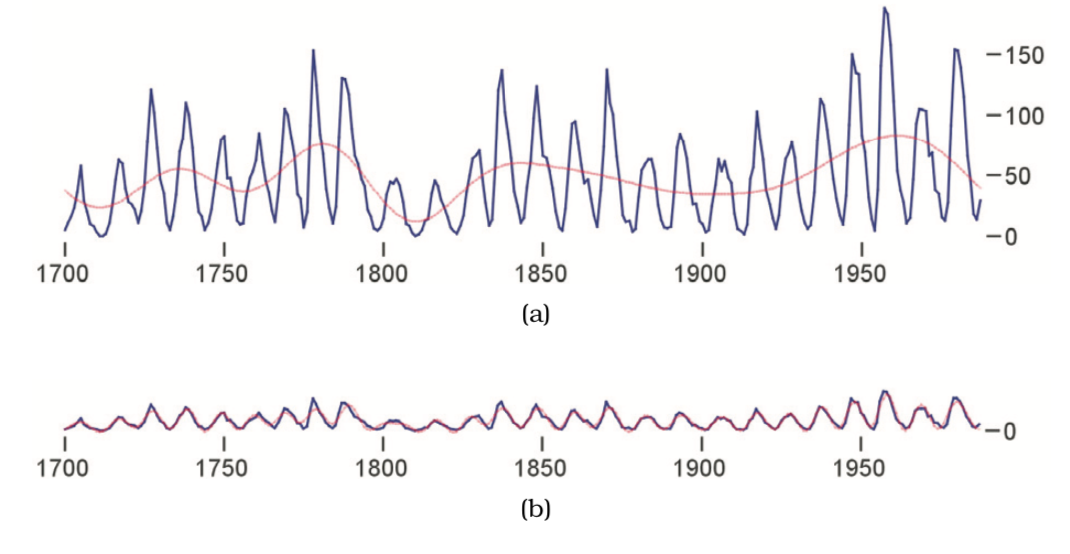
When designing a line chart, an important question to consider is its aspect ratio: the ratio of width to height of the entire plot. While many standard charting packages simply use a square or some other fixed size, in many cases this default choice hides dataset structure. The relevant perceptual principle is that our ability to judge angles is more accurate at exact diagonals than at arbitrary directions.
* Sources: Visualization Analysis and Design, Tamara Munzner, 2014
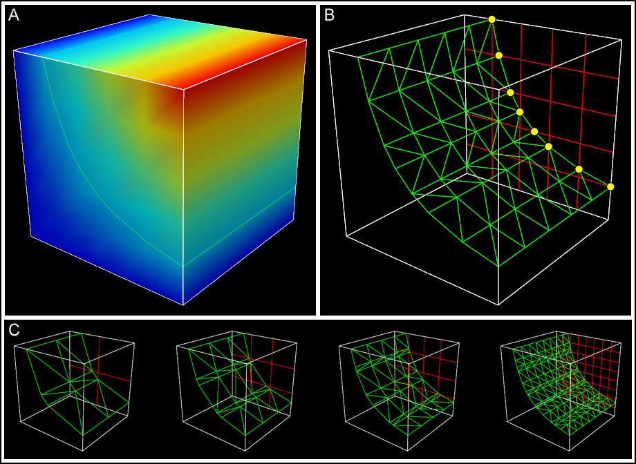
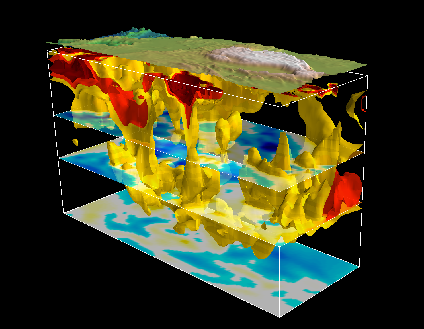
Rubber Sheet and Isosurfaces
Descriptions
Rubber Sheet
https://en.wikipedia.org/wiki/Rubbersheeting
Like a heat map but used to map four or more dimensions through the use of a colored, three dimensional surface.
Isosurfaces
https://en.wikipedia.org/wiki/Isosurface
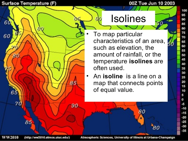
Map of data that resemble topographic maps. An isosurface is a three-dimensional analog of an isoline. It is a surface that represents points of a constant value (e.g. pressure, temperature, velocity, density) within a volume of space; in other words, it is a level set of a continuous function whose domain is 3D-space.
Uses
Good for...
plotting concentration, area, depth, altitude encourages: comparison of height, general landscape. Perhaps most often seen as weather maps. Measuring space is more efficient than measuring color.
Not so good for...
Imprecise. data resolution might influence understanding of numbers. Ambiguity about what colors represent and thresholds. How does resolution of data influence meaning?
Ideas: model economies, temperature, belief/political systems
Function
Why extrude from isoline to isosurface? For greater clarity about value meaning. Adding height and depth might communicate more about value differences than color and numeric valued.
Extruding from isoline to isosurface
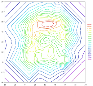
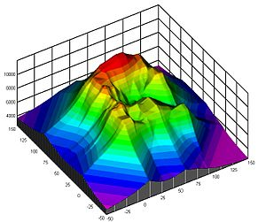
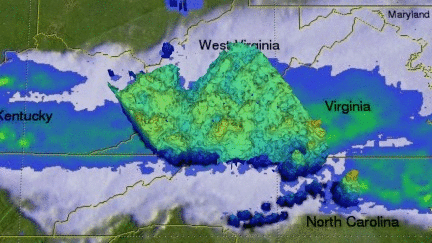
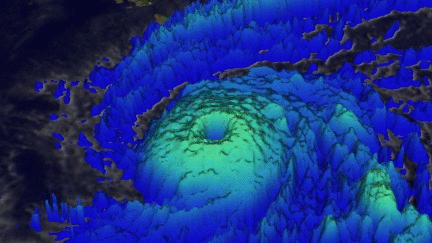
Commonly used to represent weather systems
How does the resolution of data affect our interpretation?
The designer is making decisions about the coarseness of data representation and has enormous power to influence the message. Ex. a map of ethnicities represented in the United States that only has 3 inputs will communicate a very different message than the same map with 10 inputs.

Is Evan Roth's work an isosurface?


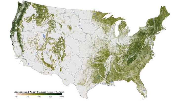
Heat map
A heat map is a representation of data in maps or diagrams in which values (mostly continuous data) are encoded as color in form of a gradient, which can range from two color hues to the use of the full rainbow spectrum.
It is not necessary to have every single point of a heat map representing a distinct value. A hybrid form can also combine points to (geographical, political, logical) areas.
Heat maps are specially useful in scenarios where they can rely on and make use of a commonly established set of conventions in color encoding, for example the most obvious: the representation of temperature in a weather map.
Color
When used in other domains one should consider that color can be a complicated visual encoding for several reasons: There is no intuitively predominant ordering of color hues, cultural conventions in other contexts might override the reading you intended by your color choice and it is a visual property that doesn’t allow for perception of many distinct values (less than 20). Hence color is generally considered to be a better option for categorial visual encoding.
Color (hue) is not naturally ordered in our brains. Brightness (lightness or luminance, sometimes called tint) and intensity (saturation) are, but color itself is not. We have strong social conventions about color, and there is an ordering by wavelength in the physical world, but color does not have a non-negotiable natural ordering built into the brain. – Designing Data Visualizations by Julie Steele, Noah Iliinsky, Chapter 4 (https://www.oreilly.com/library/view/designing-data-visualizations/9781449314774/ch04.html)
Different types (use cases) of heat maps
Weather maps
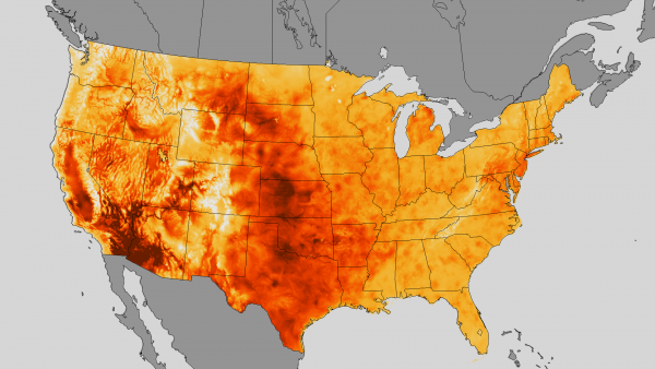
This map represents the distribution of the maximum temperature in the week of July 10 through 19 in 2013 across the US. The scale of 70 °F to 107 °F is encoded in a gradient from grey to dark red. While the choice of grey for the “background” of the map, that is the geographical context of the area that was investigated and is represented, is helpful for focus and avoiding any misleadings, the use of a very light grey for the lowest temperature can cause confusion due to our collective memory of iconic images of volcanoes or furnaces teaching us that the hottest parts of material are the brightest ones.
Variables in this visualization:
- X and y position for the geographical map.
- Temperature is encoded in color.
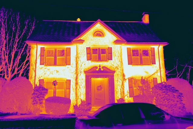
Thermal imaging
Even though thermal imaging or thermography are more related to digital imaging processes I wanted to point out that the translation and scaling of the captured infra-red wavelengths to parts of our visible color spectrum is also a design choice and thus essentially a form of data visualization, too. This example uses the widespread convention of blue indicating cold and a specific convention for thermograms which indicate warm by yellow/white. But there are a lot of examples with different gradients as well.
Web heat maps
are used to visualize which pages of an online service are used or visited most or even more specifically indicate which parts of a page are clicked on or looked at the most (as a result of collected eye-tracking data).
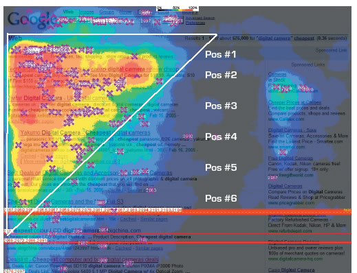
Variables in this visualization:
This map shows the number of clicks encoded in colored areas ranging from bright red to dark blue and finally transparent areas over the original screenshot of a google search result page. Instead of a smooth gradient rendering in this representations the authors opted for discrete borders between different ranges of values. In regard of the color coding I think the use is conventional enough to be intuitively understood. The highlighted triangle and text is more of a gimmick in this case to promote SEO services.
- Screenshot of the google search result page
- X-position on the screen
- Y-position on the screen
- Number of clicks encoded in colored areas
- Added a highlighted area to show “The Golden Triangle” of click
Biology heat maps
visualize arrays of samples and different categories of within each sample. It’s‚ commonly used for gene samples, but other applications are possible:
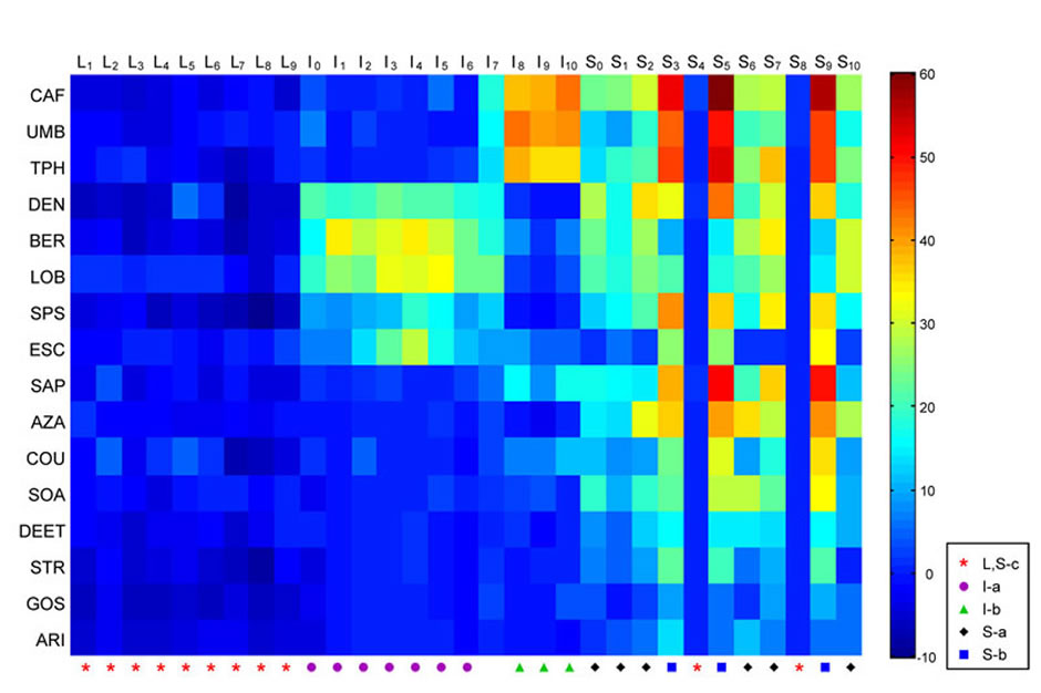
Coding of bitter tastants by a model taste system. The heat map shows the electrophysiological responses elicited by a panel of diverse bitter tastants from the sensilla of a Drosophila taste organ.
Variables visualized in this example (my guess):
This is a representation of an experiment testing the electrophysiological reaction of flies on bitter testing chemicals. As the position in the diagram is not representing spatial information one might argue that it is technically not a map, but it is another example of the use of color hues over a gradient encoding continuous values. Being unfamiliar with the testing method what is peculiar to me is that the scale of reactions ranges from -10 to 60 which leads to the question is 0 is the neutral state, -10 should be considered a mild reaction as well. In this case the absolute neutral value might have been better represented in a completely different color, for example grey.
- Various bitter testants, codified in the position on the y-axis (categorial)
- Samples (actually unspecified moments in time of feeding the substance to the fly), codified in the position on the x-axis
- Another categorization with symbols on the x-axis
- Reaction, codified in the color mapping (-10, 60)
Heatmap-hybrid
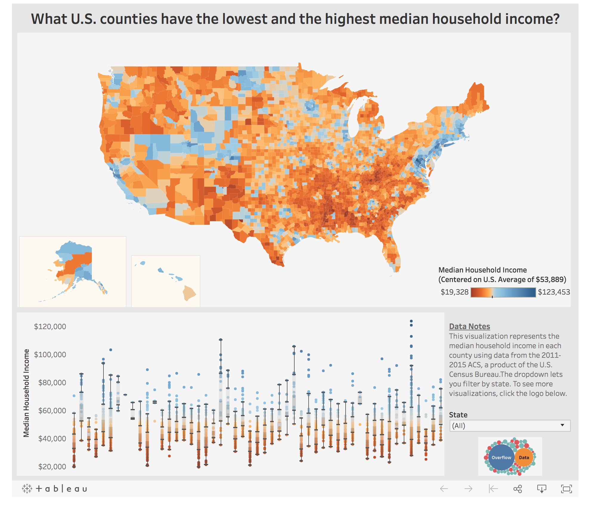
Here’s an example for a heat map with a color gradient encoding the median household income, but instead of assigning every single point in the map a distinct value this visualization combines areas certainly in respect to the data that is available.
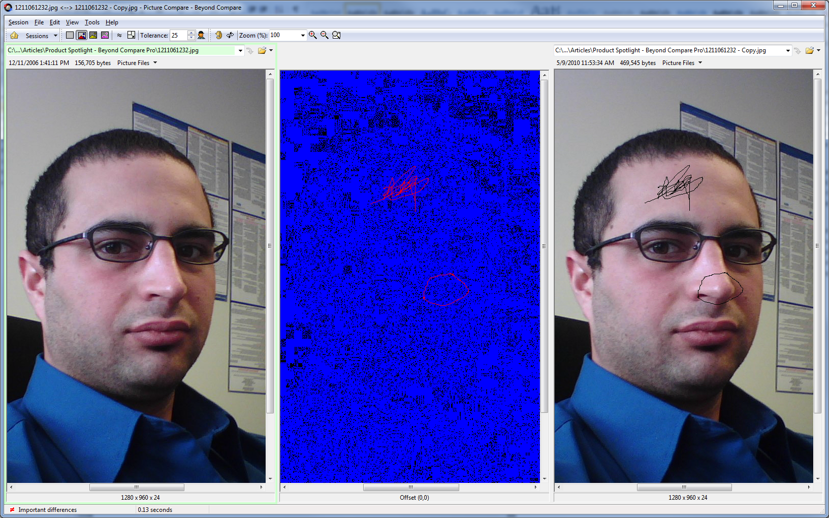
Visual Diff
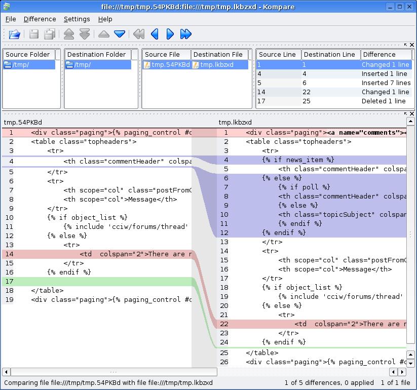
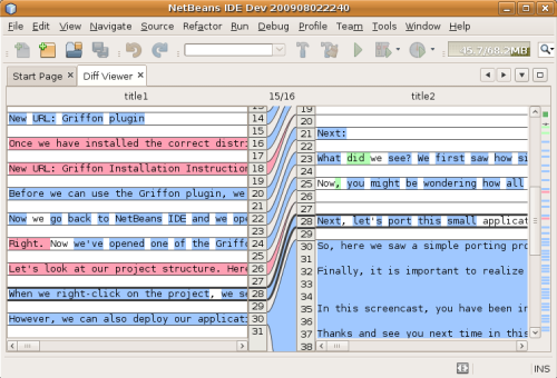
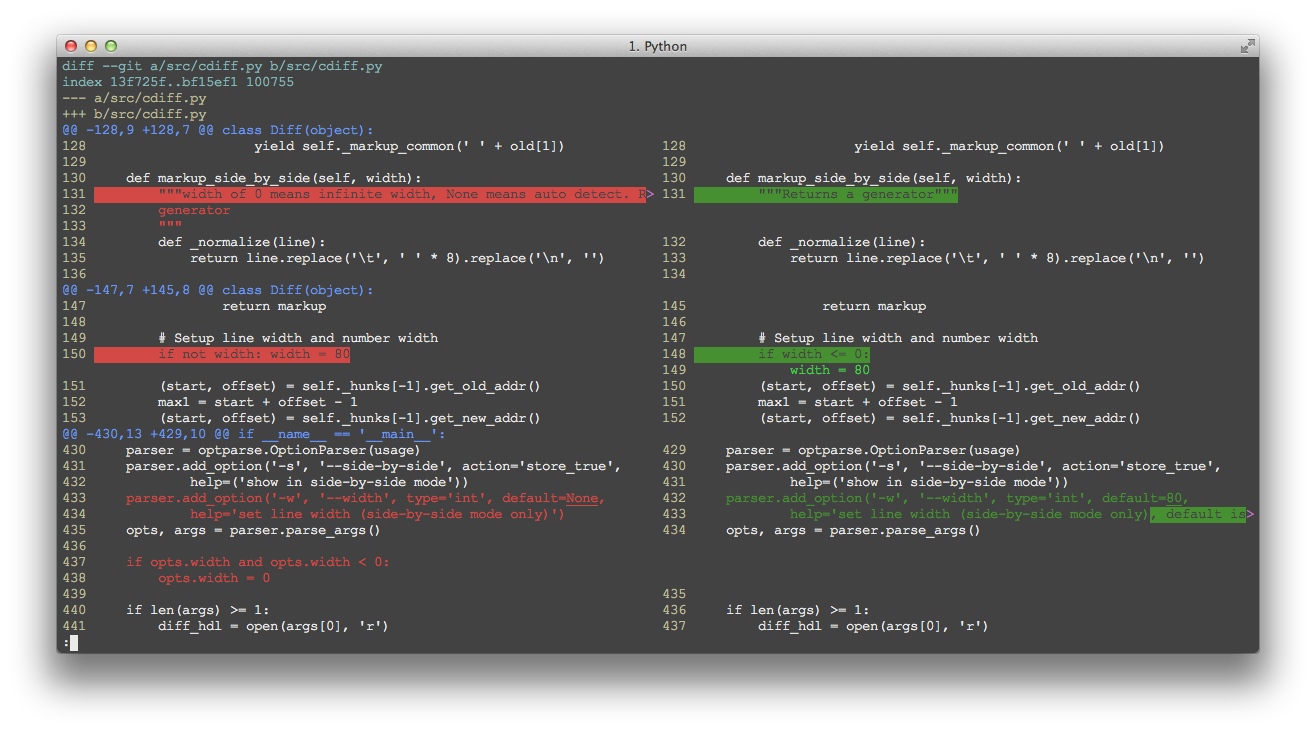
Visual Diff is a differencing representation that shows the difference between two objects(Text documents, pictures, etc). For instance, two columns of text connected by lines to show where changes have been made. or two documents with the color bar on the text which highlights the adding and deleting have been done between the two versions.
This type of visualization is wildly used in information technology like version control system, in order to find out the difference or updating have been made in files.
Way of Mapping
There are various comparison strategies visual diff can use, like gradient, color bar, text, pointer.
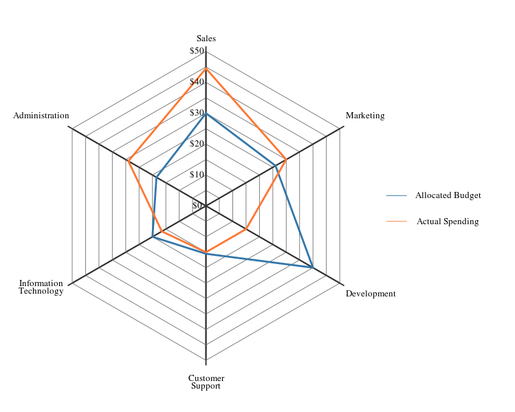
star/radar/spider chart
What
>> arranged radially as equi-angular spokes around a central point
>> the values for adjacent variables in a single series are connected by lines
>> the scale of any variable is represented as it's distance from the centre (making it effortless to find out the outliers)
>> can be used with both Cartesian and polar co-ordinate systems
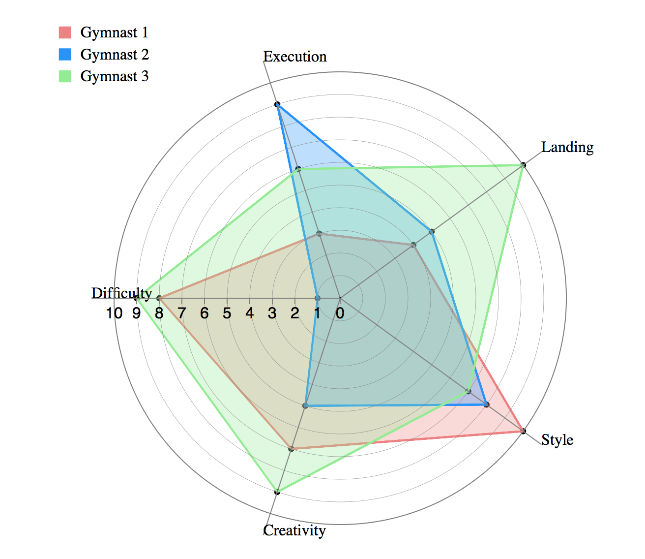
When
>> What variables are dominant for a given observation?
>> Which observations are most similar clusters of observations?
**The quantitative variables and their values represented on the various axes of a radar chart are distinct and unrelated.
>> categories on the x axis in the image above are simply named entities that have no intrinsic order
>> patterns our visual perception can really discern in a data set presented as a radar chart are similarity & extreme outliers
>> comparison between two/more entities based on various variables
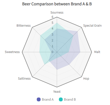
Why
>> performance analysis
>> comparative analysis
>> designed to plot one or more series of values over multiple common quantitative variables by providing an axis for each variable
Weaknesses
>> they are limited to displaying a few variables at a time (practically speaking, no more than 20 ideally or (the web becomes overwhelming)
>> comparing values across access is cumbersome/error-prone and encouraged by this design although not always necessary
>> comparison in radar charts requires conscious thought to mentally project an arc of rotation to map a value from one axis onto another, something we are not particularly adept at
>> Solution? Grid-lines! but they bring in more issues -> they tend to add confusion around axis value, labels, reducing the readability
>> significant occlusion (overlap)
>> the only patterns our visual perception can discern: similarity & extreme outliers.
Better Alternatives
>> parallel coordinate charts
>> small multiples
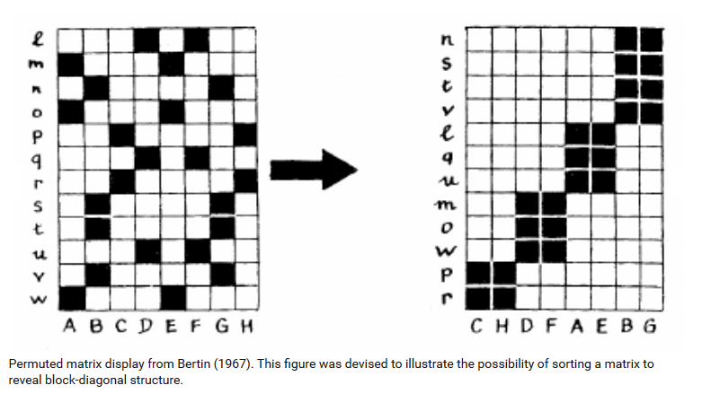
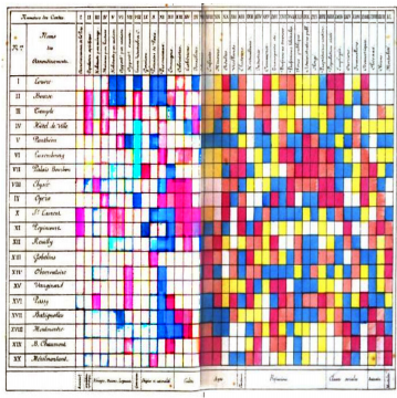
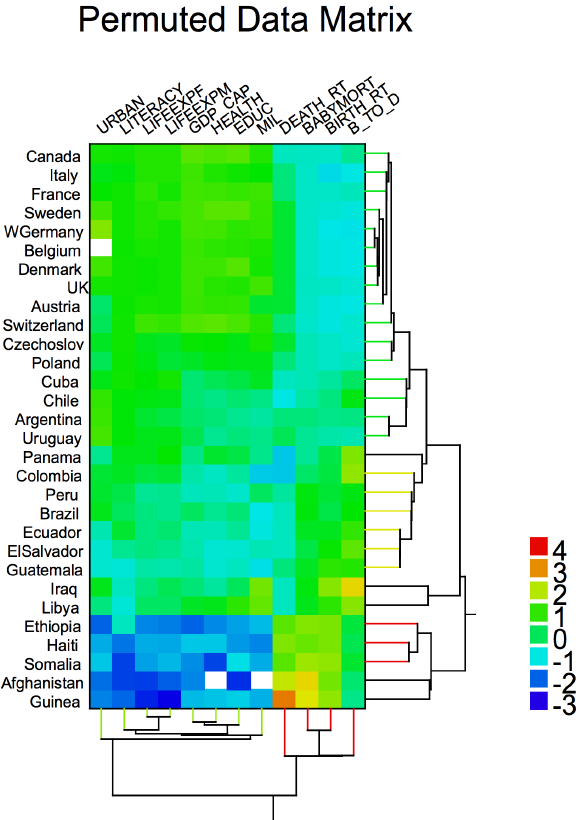
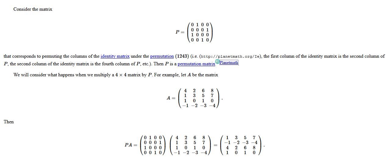
Permutation Matrix
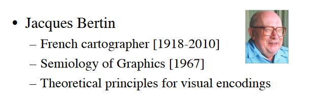
Published by Jacques Bertin 1967. (A nice blog post on Bertin is here.)
 from source
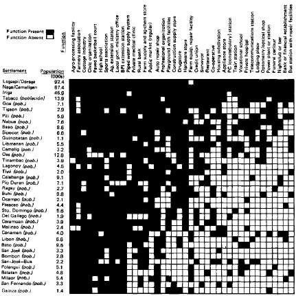
Shipshape Examples
- "Scalogram display from Rondinelli (1980), based on Guttman (1950). Visualization of the settlements in the Bicol River Basin, Phillipines."
- "Shaded matrix display from Loua (1873). This was designed as a summary of 40 separate maps of Paris, showing the characteristics (national origin, professions, age, social classes, etc.) of 20 districts, using a color scale that ranged from white (low) through yellow and blue to red (high)."
- "Cluster heat map from Wilkinson (1994).. Visualization of social statistics (urbanization, literacy, life expectancy for females, GDP, health expenditures, educational expenditures, military expenditures, death rate, infant mortality, birth rate, and ratio of birth to death rate) from a UN survey of world countries."
Classical Example (Perhaps it is just a name collision)
- Classical Permutation Matrix (e.g. below from PlanetMath)
Deficient Examples
Overall, I really couldn't find 'deficient examples' on the web.
Some notes on cases where this type of visualization may not work:
- In respect the theme of the permutation matrix, in some cases (for example time) where the row/column headings are shuffled continuously may not work well in certain instances when an axis continually changes so that it's difficult for the human eye to make a comparison.
- In some cases, for example this link, the visualization may be too dense so that nothing is gained at all from the visualization other to emphasize it's density.
- In addition to #2 above, in the case of sparse data, this overall visualization may not add insights other than emphasize it's sparsity.
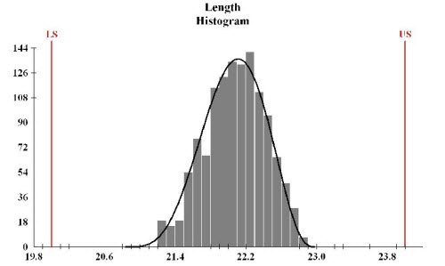
Histogram review
Overview
Histograms are a powerful visualization tool, but are often confused with bar charts and as we will see below many of the bad examples of histograms come from people trying to hack a histogram out of a bar chart.
Histograms are generally used for continuous data sets, where the goal is to understand the distribution of a data set.
The data sets are arranged in bins where a total count of observations in a bin is shown to create the distribution. Depending on the data set, the algorithm to arrange the data in the bins and determining the optimal number of bins given spacial constraints can be relatively complex. While this is a heavy layer of processing, most people rely on existing tools to do this rather than working on first principals. The mapping of data is relatively easy and achieved heavily in the bin selection and population stage, after that apart from axis differences the process is similar to working with a bar chart.
Good Examples
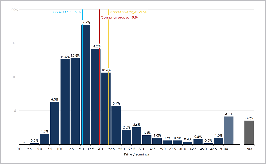
The first example of a good histogram, is something that I've created in the past. There were a number of elements that I was trying to control for in the image, including (1) correct bin labeling (2) summary data presented spatially (3) controlling for the long right tail in the second last bin (4) controlling for N/M data
In the second example of a good histogram, I selected a tiled histogram, that compares alternative histograms, and provides a nice high level comparison across the datasets. Personally, I find tiled histograms to be of high value, especially in a three tile example where focusing on series A and B, and the delta between A and B.
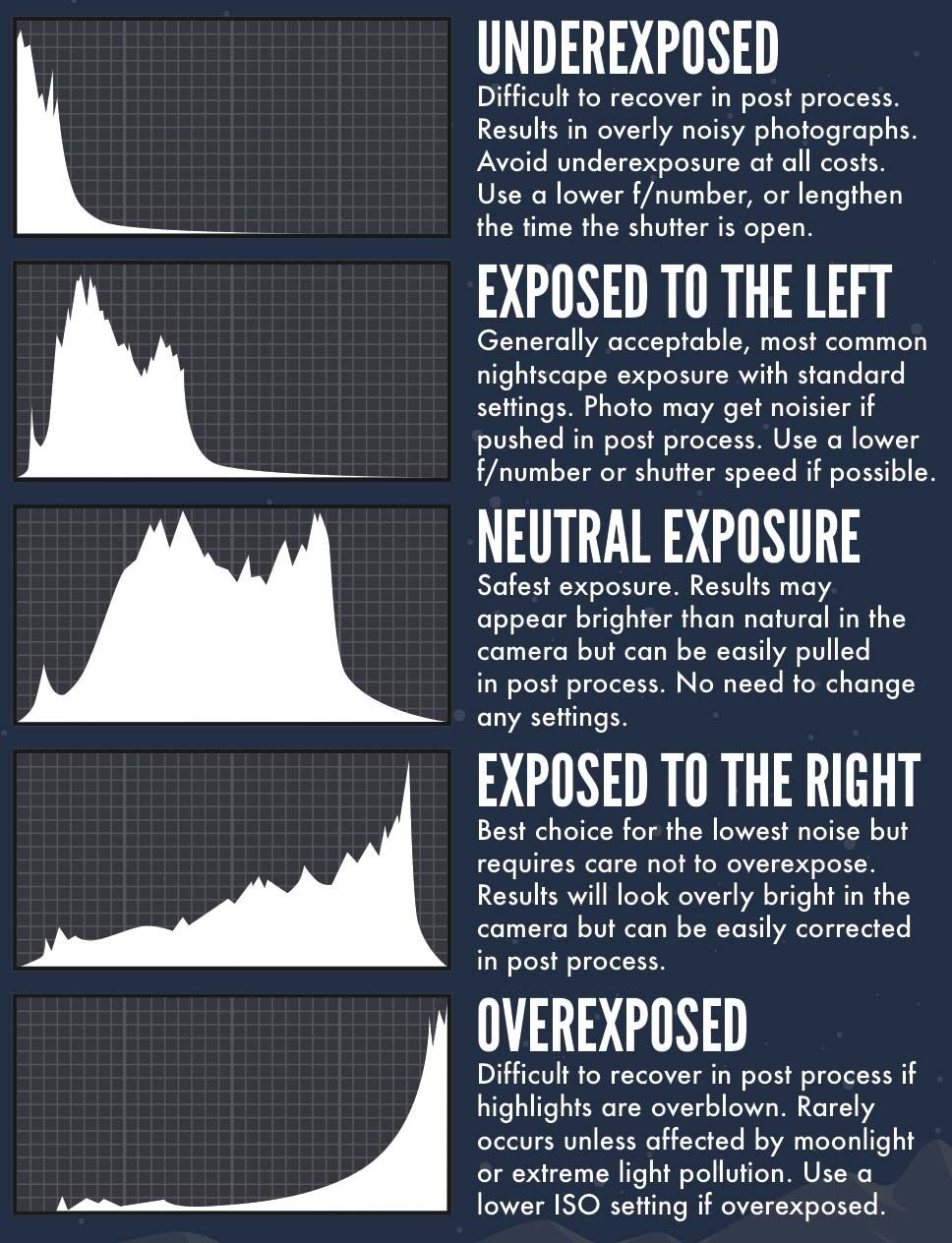
In the final good example I have selected an example of a histogram displaying multiple data series. While there are some design issues, I think the best thing coming away from the chart is the fact that all series are centered at the 0 axis. Often with histograms with multiple series people stack the series which eliminates the ability to examine a data series in its own right. While there are instances that this is interesting to do with I find that people default to stacking when they should be defaulting to the way in which the below chart is displayed
Bad Examples
Perhaps the biggest issue with histograms comes from incorrect bin labeling. This arises mainly from people hacking together histograms in basic charting packages such as Excel and using a bar chart as a means to create a histogram. While on first glance this often works well - on closer inspection it's nearly impossible to interpret what the chart is representing. I previously wrote a short article on this issue that's available on my blog.
In the first sample of a bad histogram displayed below, one of the most common examples of an error with a histogram is shown. As can be seen below the bin axis labels are placed in the middle of the bucket - where the correct labeling should be placed on either side of the bin. In the example below it's exceptionally hard to try and determine what the data is actually saying given the labelling issue. Interestingly, this is how Excel labels histograms
In the second bad example of histogram, an alternative label issue is evident, in this instance the user has tried to hack the labeling using a bar chart label rather than a native histogram. This results in over-labeling on the bin axis. On a more aesthetic front the use of 3-D rendering is exceptionally questionable, and because of the fixed fade area on different length bars causes serious interpretation issues and spatial biases.
In the third bad example, I've focused on a chart that has correct bin labeling, but the number of labels along with the bin sizing diminishes the usefulness of the chart.
table
Not much detailed description is needed when speaking about a table. One of, if not the, purest forms of visualization, a table simply displays data in an organized manner, more specifically, in rows and columns.
With this simplicity comes flexibility in what data is represented. Whether it’s text, numbers, emojis, pictures, audio, the possible data types to display are, essentially, endless. However, the unifying characteristic of all tables containing any data type is the row and column structure, which has one value—i.e, one piece of data—in each cell.
In fact, because there is the option to display multiple data types, comparison can be made between them. More broadly, tables encourage a raw act of comparison—there is little design leading users to any conclusions. Instead, the users themselves are drawing comparisons in the actual rows and columns.
However, little design doesn’t have to mean no design. There are ways to craft engaging tables that represent a story through data for the user to explore, without distracting from the raw data and subsequent comparisons.
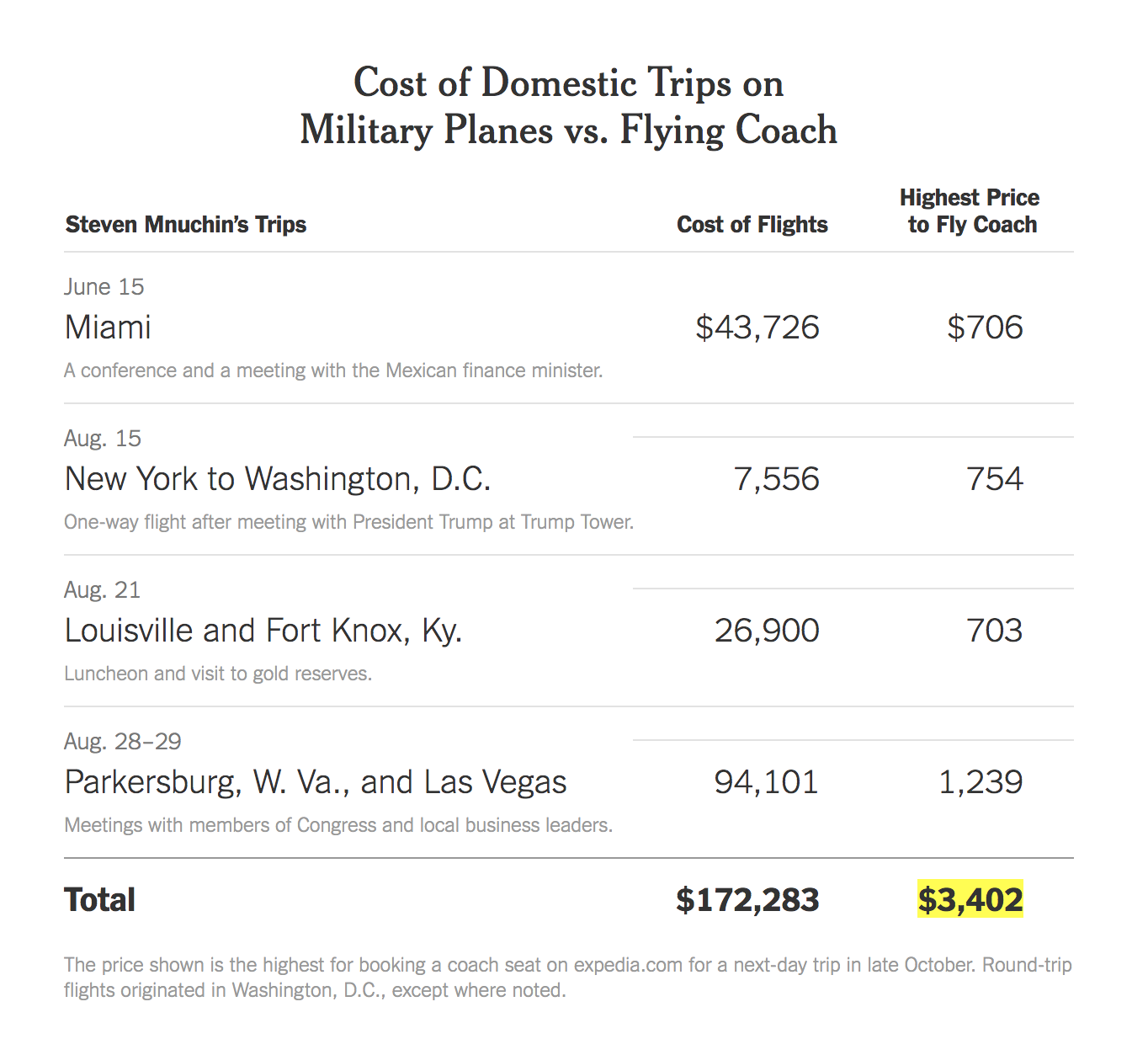
For example, in this interesting article by The New York Times, journalists Katie Rogers and Karen Yourish decided to display data of White House officials’ flight costs with a table. In the table, they used multiple data types: text and numbers. One column represents different trips the official in question took, with accompanying short descriptions. The other columns display the price of flying with a military plane alongside the price of flying coach. Because the differences in prices were startling enough, there was no need to design a visualization past a simple table.
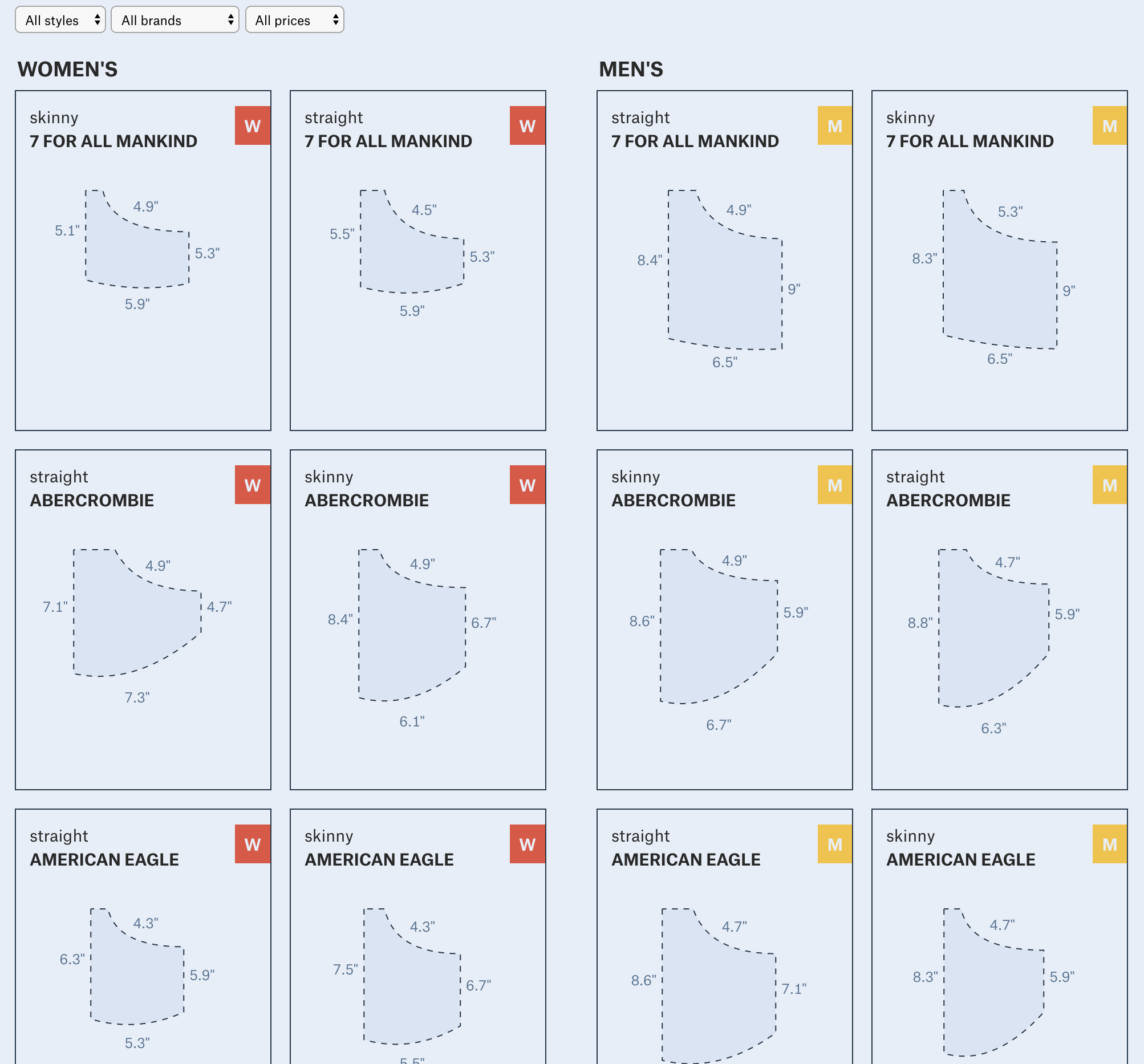
In this example by The Pudding, Journalist-Engineers Amber Thomas and Jan Diehm dove into the data of women’s pockets. They measured the size of pockets on men and women’s jeans, comparing different brands and styles. To visualize this data, they used a combination of images and text in a table format, creating an engaging result for the user to draw conclusions and compare not only men and women’s pockets, but also style and brand as well.
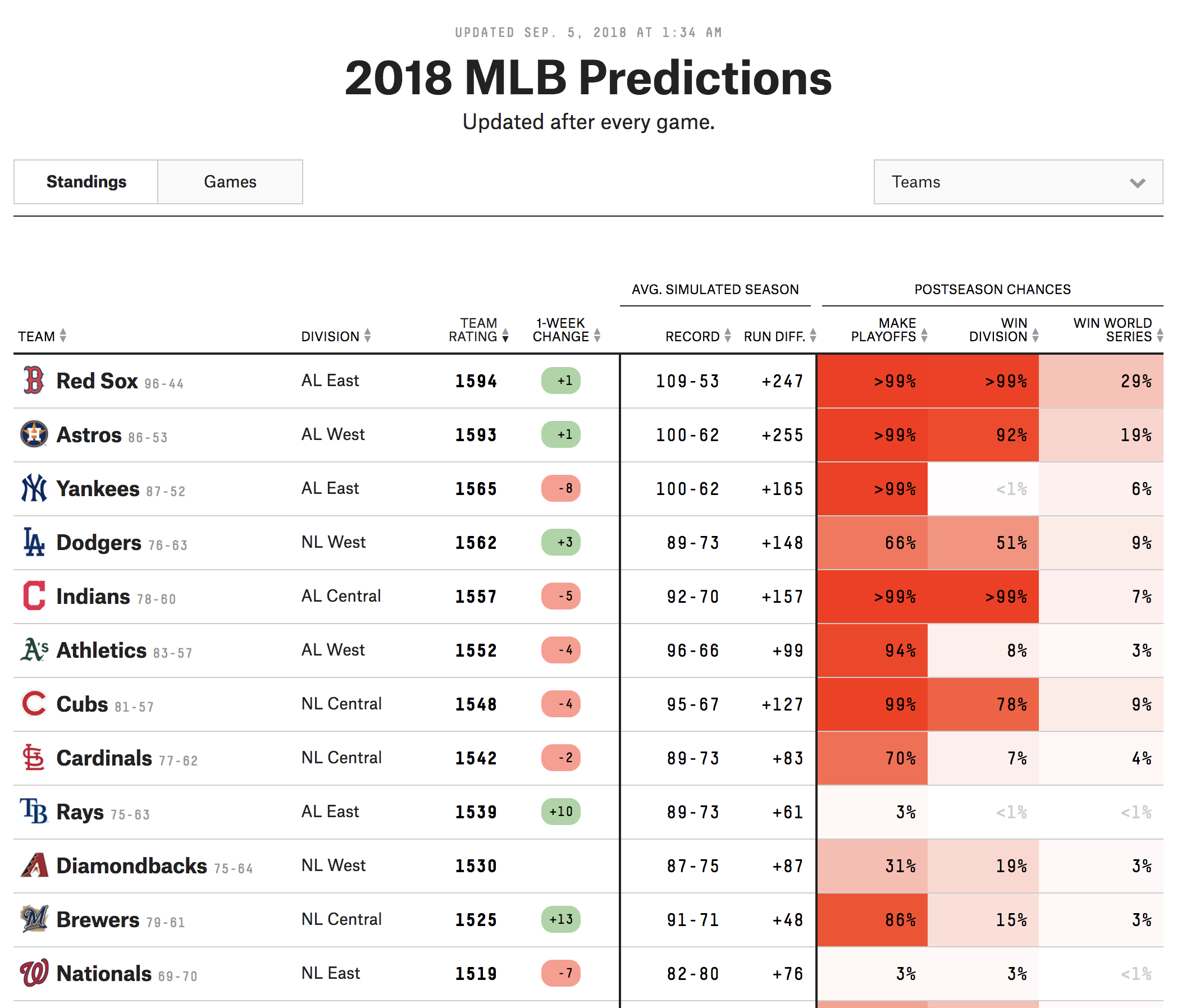
FiveThirtyEight often includes templated visualizations in their articles. In this final nice table example, MLB predictions are displayed through multiple data types (text, images, and numbers). Additionally, the designers incorporated a characteristic of many FiveThirtyEight tables: a heat map-style coloring to columns that represents another dimension of data.
Again, even though tables are simple, there are some guiding principles in crafting them and design techniques that can be incorporated. First, tables should have column and row labels. In this first not-so-great example, there is no label of what each column represents, no indication what “n/a” is referring to, and no title giving context to the data.
While I couldn’t find an image for it, I learned during my undergraduate thesis through a journalism and anthropology instructor that old newspapers, which obviously didn’t have the ability to include interactivity in print, used to print long tables of data, such as of crime records. Even though it was due to resource restrictions, we spoke about how ineffective this technique was because it showed an overwhelming and unnecessary amount of data to readers, leaving them little to no tools to effectively parse through all the information and come to a conclusion.
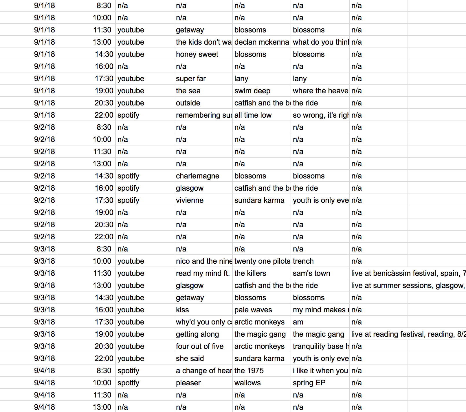
The last example of a less-than-effective table combines some of these previously-discussed points and comes from a homework assignment I did in a machine learning tutorial last semester. It came from training a support vector machine in R. There is a utility to this table—for the researcher training a SVM, it may give them what they need to make decisions about their work. However, if we’re talking about it in the context of my previous examples, where a layperson is reading the table to understand the information it displays, there are some shortcomings. The column labels and title are not descriptive to understand what the data means, and there is potentially more data displayed than is needed to reach a solid conclusion. Additionally, the overall lack of thought in design I believe hurts the story the table is trying to tell.
On the pre-processing end, little work needs to be done between the raw data and the ink/pixels in the resulting table. This is because the table itself houses the raw data. There is the ability to convert the raw data into a form that is more digestible or flows more with the story a designer is trying to tell. For example, with numbers, a designer can choose to present them in decimals or percentages. With pictures, the designer may choose to present them in grayscale. However, these actions are not necessary to create a table visualization. Similarly, no mapping is required when it comes to tables. The data can simply be shown. Again, there is the option to map, such as the heated columns in the FiveThirtyEight example, but it is not a required step in visualizing a table.
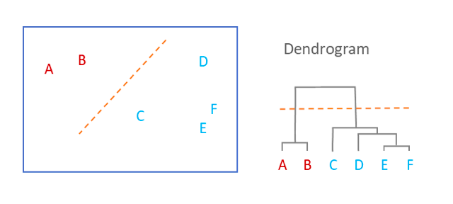
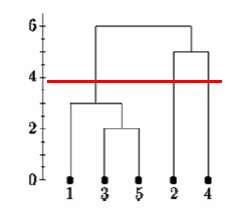
Dendrogram
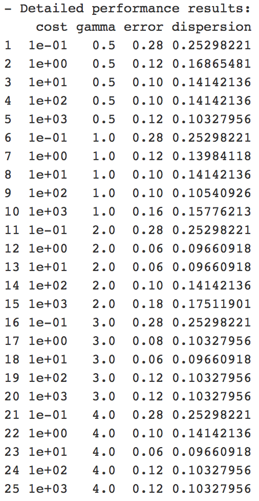
- What is a Dendrogram?
A Dendrogram demonstrates the hierarchical relationship between objects.
We can think of Dendrograms as a way to represents nested clusters.
2. How to read a Dendrogram?
The key is to focus on the height at which any two objects are joined together.
Look at the image above, we see:
- E and F are the closest to each other.
- The cluster of A and B and the cluster of C,D,E and F are the furthest from each other.
3. Applications
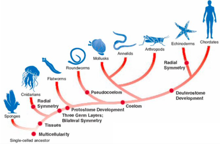
An Animal Classes Dendrogram
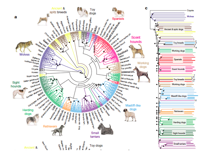
A Dog Breed Dendrogram
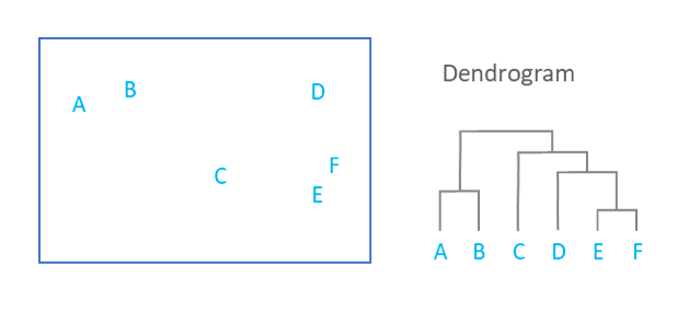
4. Why Dendrogram can be bad?
- It does not accurately show how many clusters there actually are.
If we cut the single linkage tree at the point shown below, we would say that there are two clusters.
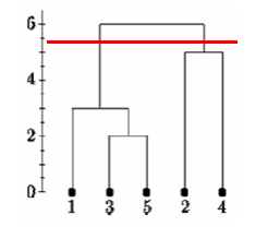
However, if we cut the tree lower we might say that there is one cluster and two singletons.
Matrix & Half Matrix
A matrix is any two dimensional set of numbers, colors, intensities, sized dots or other glyphs. With ‘simple’ matrices, variations along a third or even fourth variable are often represented by color ranges and other types of visual variations between cells on the matrix. Half matrices are usually used for similarities or when two items are being compared against one another. Matrices are useful for illuminating variation and providing handy visual tools for decision-making. Pre-processing is minimal but can include selecting color ranges for heat maps, while mapping can range from simple selection of fonts to glyph designs on to interpolating numeric values for heat map colors.
‘Good Uses’
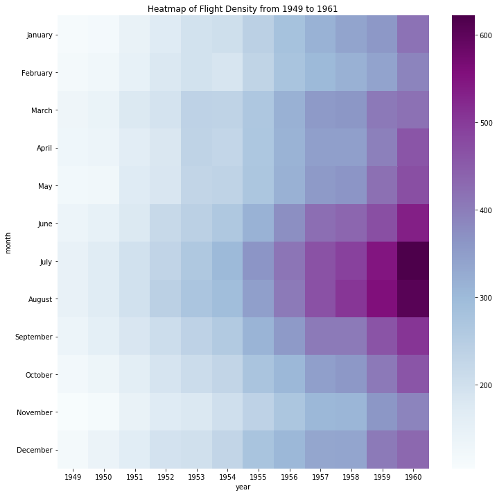
This matrix is a heatmap of flight-passenger density over time on a specific route, with the X axis representing years and the Y axis months. To achieve the ‘heat’ effect a third variable, monthly passenger totals, has been converted into colors, with greater numbers mapped along a range of values. The use of color values effectively enables a comparison of flight density by month and year. The 'raw' data of flight numbers have apparently been converted into the hex color value system.
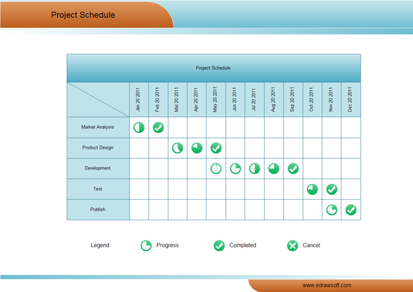
This project management matrix places months on the X axis and stages of business development on the Y axis. Glyphs represent non-numeric values of progress, enabling the viewer to quickly compare which business stage required the most investment of time. In terms of ‘pre-processing’, it’s likely that numerical ‘progress’ values have been assigned to the 360 degrees of the glyph circles, and then 'mapped' onto the circles, while a checkmark indicates completion.
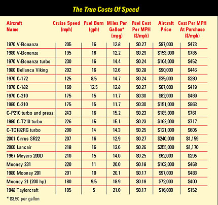
This useful matrix aimed at pilots of small aircraft looks at cost vs speed from a number of different perspectives. The X axis represents variables of speed, fuel efficiency, and cost. The Y axis lists different models of aircraft. As numbers fill the cells, there is only simple ‘mapping’ in terms of font selection and style. However, the raw data must have involved considerable calculation of aircraft performance. This matrix is sophisticated in that it offers pilots tools to find the ‘true’ cost of speed for their own flying distance and budget. Each pilot must decide what ‘works’ for them based on their own flying habits and needs.
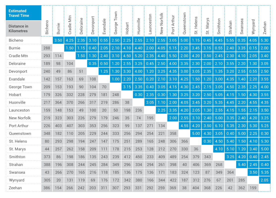
This ‘double’ half matrix for Tasmanian drive travel makes efficient use of available space by devoting one triangle to estimated travel (drive) time and one to distance. Pre-processing was unnecessary and mapping consists only of selecting column and row dimensions, cell colors and fonts.
‘Poor Uses’
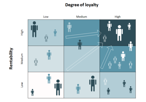
This ‘customer portfolio matrix’ is intended to ‘map the business customer portfolio within marketing research...and visualize the results using the matrix.’ The X axis represents loyalty and the Y profitability defined as ‘rentability.’ The matrix is deceptive and visually ‘noisy’ in three ways. Firstly, it appears to be a color-based heat map, but in fact there is no third variable represented by the lighter/darker shades. Secondly, randomly placed figures accomplish little purpose. Thirdly, arrows (and darker colors) serve no goal aside from visually stating the obvious: that business should increase profitability and customer loyalty.
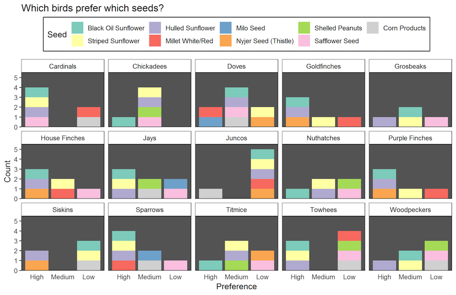
This confusing visualization of birds’ seed preference suffers from organizational and color overload, making it difficult to compare preferences and popularity of seed type. A simpler heat map with bird species on one axis and seed type on the other would have been more effective.
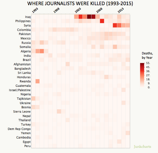
This matrix of journalist deaths assigns year to the X axis and country to the Y axis. The third variable, number of journalists killed, is represented in a red-based heat chart. I feel this matrix is misleading in that, it seems to indicate which country is most dangerous for journalists, but in fact only represents absolute fatality figures in a given year. Instead of absolute deaths, making the third variable a ratio of journalist fatalities/number of journalists in the country would likely change the heat map considerably and give this matrix more relevance.
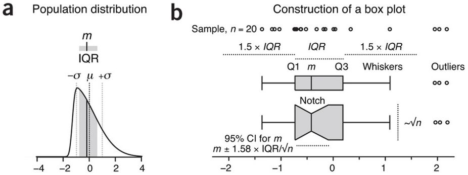
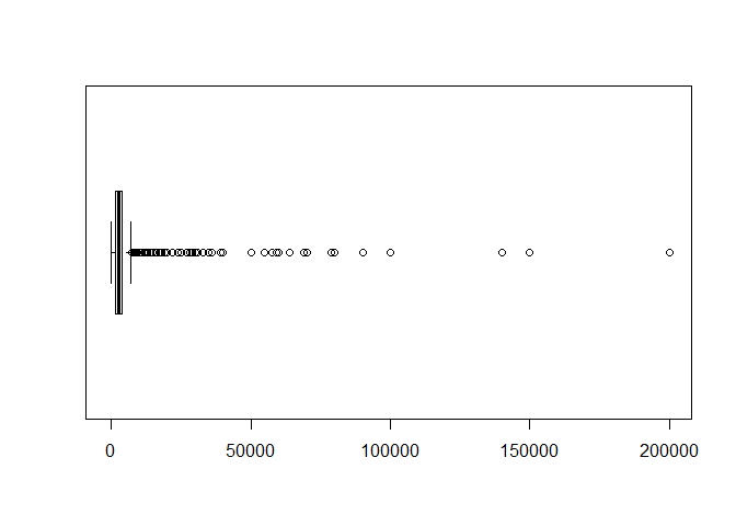
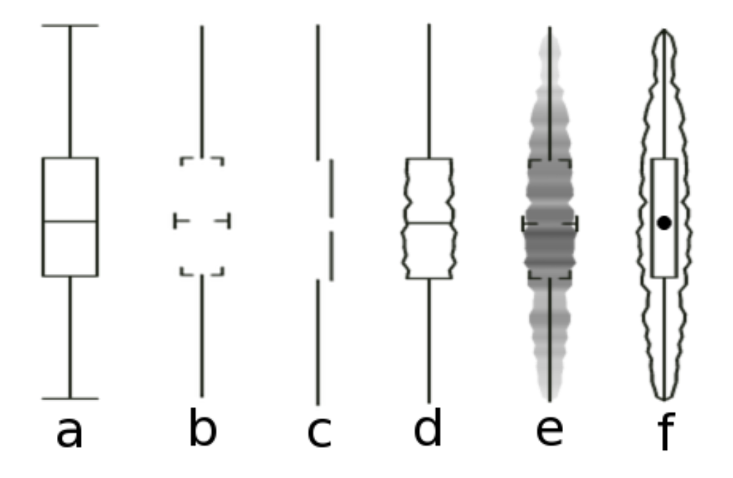
Box Plot
a two dimensional plot featuring a box capped by the 1st and 3rd quartiles, spliced by the median line, and with "whiskers" extending to min and max values
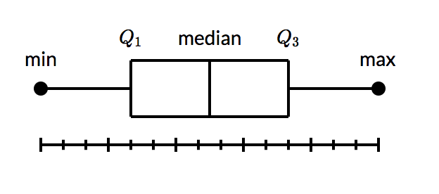
alternatively, if outliers are present (1.5 x IQR), the whiskers may span the least and greatest non outlier range, with outliers as individually denoted dots
advantages: distills large data to 5 points, simple check of symmetry, indicates outliers
disadvantages: less distribution resolution within quartiles
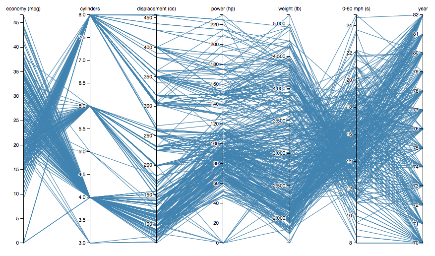
Parallel and Radial Coordinates Plots
This viz-type belongs to the same family as Sankey Diagrams and Radar Charts. The best use cases apply to multi-variate datasets, which require plotting individual data elements across many dimensions.
Basic Properties:
Each of the dimensions corresponds to a vertical axis and each data element is displayed as a series of connected points along the dimensions/axes.
To show a set of points in an n-dimensional space, a backdrop is drawn consisting of n parallel lines, typically vertical and equally spaced. A point in n-dimensional space is represented as a polyline with vertices on the parallel axes; the position of the vertex on the i-th axis corresponds to the i-th coordinate of the point.
The value of parallel coordinates is that certain geometrical properties in high dimensions transform into easily seen 2D patterns. For example, a set of points on a line in n-space transforms to a set of polylines in parallel coordinates all intersecting at n − 1 points.
Famous Example: Jason Davies' Plot of Multiple car marques and their specs
https://bl.ocks.org/jasondavies/raw/1341281/
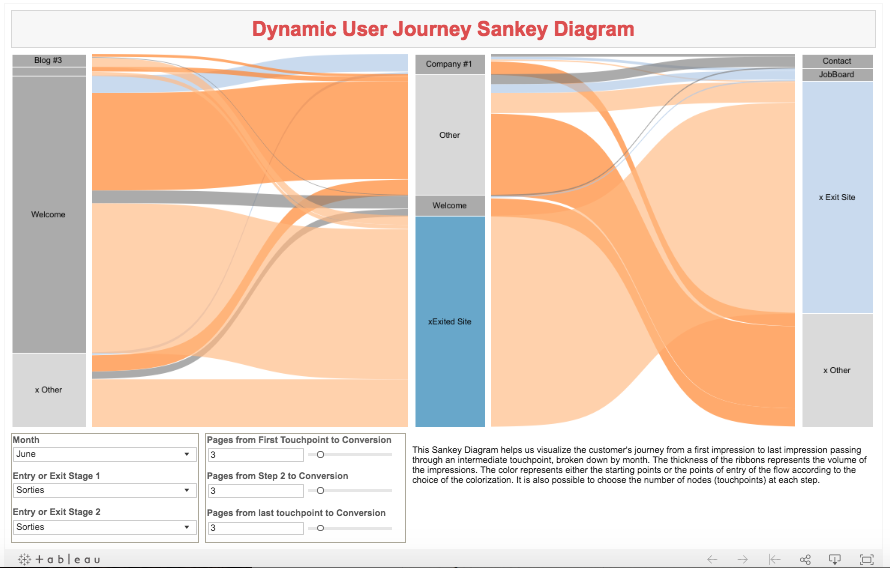
Analogue to the Parallel Coordinates Chart: Sankey Diagrams (Flow and Dimensionality)
Radial (Spider) Chart depicting departmental budget expenditures
Dimensionality- each vertex of the spider web represents a department and the radial plot illustrates the departmental spend relative to adjacent departments in cartesian space.
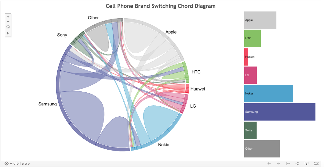
Analogue to Spider chart: The Chord Diagram (Flow and Dimensionality)
https://public.tableau.com/profile/christchild22#!/vizhome/PhoneChord_4/ChordDiagramBarChart
History
Philbert Maurice d'Ocagne introduced the design in 1885. The Parallel coordinates plot was re-popularized by Alfred Inselberg in 1959 and it gained currency in the 1970s as a way to visualize high-dimensional data. These charts are more often found in academic and scientific communities than in business and consumer data visualizations. This isn’t too surprising as parallel coordinate charts can become very dense and difficult to comprehend. Stephen Few has a typical reaction (PDF):
The first time that I saw a parallel coordinates visualization, I almost laughed out loud. My initial impression was "How absurd!" I couldn’t imagine how anyone could make sense of the dense clutter caused by hundreds of overlapping lines. This certainly isn’t a chart that you would present to the board of directors or place on your Web site for the general public. In fact, the strength of parallel coordinates isn’t in their ability to communicate some truth in the data to others, but rather in their ability to bring meaningful multivariate patterns and comparisons to light when used interactively for analysis.
Applications:
Collision avoidance algorithmsfor air traffic control (1987—3 USA patents)
Data mining (USA patent),
Computer vision (USA patent),
Optimization, process control,
More recently in intrusion detection and elsewhere.
Why Use Parallel Plots
help in showing many dimensions, limited only by horizontal space.
Like all good visualizations, parallel coordinates can also show both the forest and the tree. The big picture can be seen in the patterns of lines; individual lines can be highlighted to see detailed performance of specific data element
Benefits:
The order the axes are arranged in can impact the way how the reader understands the data. One reason for this is that the relationships between adjacent variables are easier to perceive, then for non-adjacent variables. So re-ordering the axes can help in discovering patterns or correlations across variables.
Downside:
The downside to Parallel Coordinates Plots, is that they can become over-cluttered and therefore, illegible when they’re very data-dense. The best way to remedy this problem is through interactivity and a technique known as “Brushing”. Brushing highlights a selected line or collection of lines while fading out all the others. This allows you to isolate sections of the plot you’re interested in while filtering out the noise.
Bad Examples: An Extreme Case
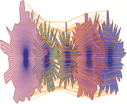
Problems with this:
- Meaningful patterns are obscured in the clutter of lines
- Lack of interactivity to guide the user
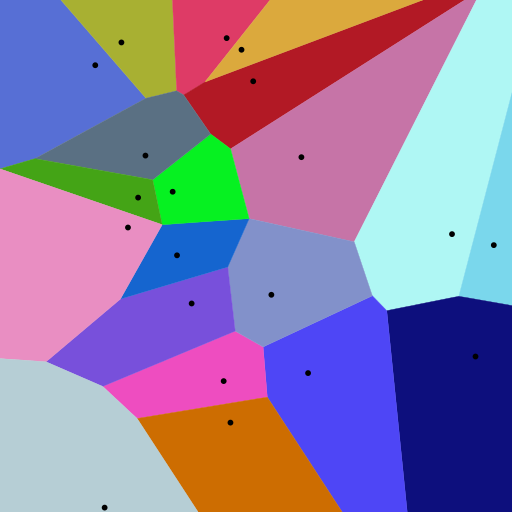
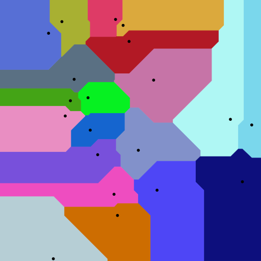
Voronoi Diagrams
Definition
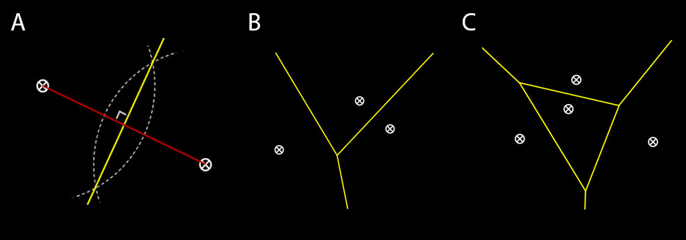
A Voronoi diagram consists of a plane partitioned by a set of n points into convex polygons, such that each polygon contains one generating point and represents the region of points around it that is closer to this generating point than any other.
Basic Properties
- Generators/sites/seeds: finite set of points in a given plane
- Voronoi cells: the region of points in which the distance to a given generator is less than equal to the distance to any other generator
- Voronoi line segments: points in the plane equidistant to two generators
- Voronoi nodes: points equidistant to three or more sites
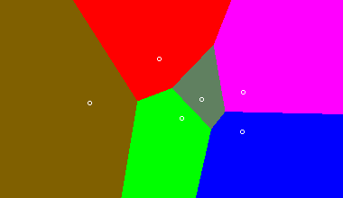
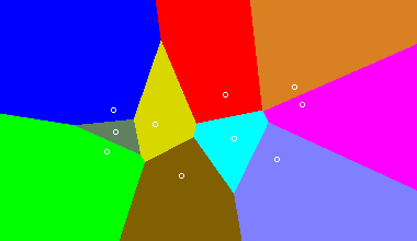
Try making your own Voronoi diagram here. Click to add sites, and see how the polygonal regions change shape.
Optimal Usage
Voronoi diagrams are advantageous in visualizing data that depends on spatial distribution. Its mapping depends on the properties of the plane and constraints in which the set of points exist (i.e. Euclidean, Manhattan, etc)
Origins and Applications
The use of Voronoi diagrams can be traced back to Descartes in 1644, in which he mapped the distribution of matter in the universe. He predicted that matter forms vortices centered at fixed stars (sites).
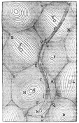
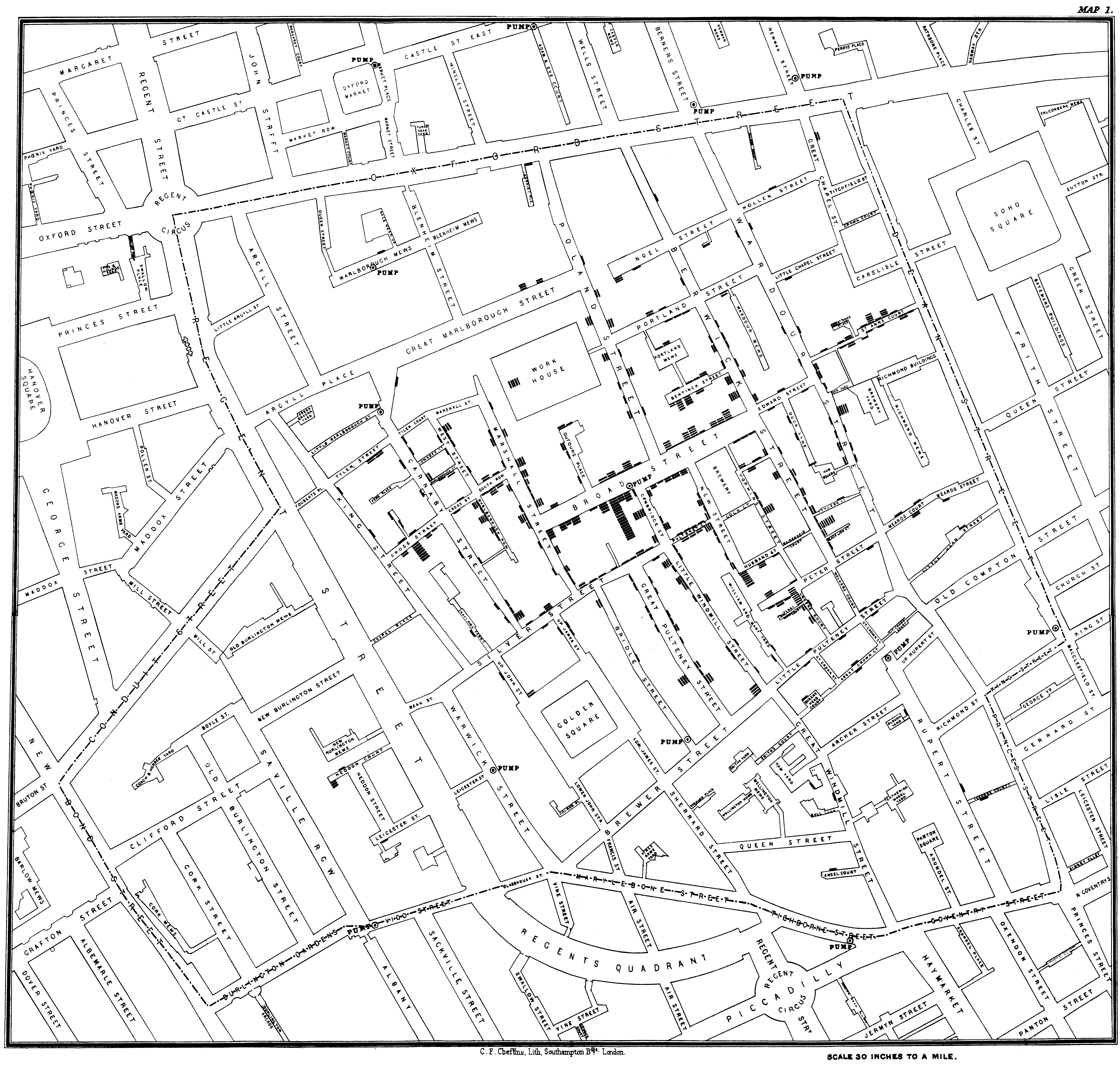
Another seminal use of Voronoi diagrams was demonstrated by Dr. John Snow, during the 1854 London cholera outbreak. Snow theorized that cholera was reproduced in the human body and was spread through contaminated water. London’s water supply system consisted of public wells where people could pump their own water and carry it home. The cholera outbreak in September 1854 centered around the Soho district. In order to investigate the relationship between water contamination and cholera death, Snow mapped all of the public wells in this area along with all of the known cholera deaths. As one can see in his map, the majority of cholera deaths centered around the Broad Street pump. He confirmed that there was an unknown bacterial sample in the water of the Broad Street pump, and had this pump removed; the cholera outbreak subsided shortly after.
Modern Applications
There are a broad range of applications for Voronoi Diagrams. Some examples include:
- Epidemeology (investigate origin and distribution of infectious diseases)
- Biology (model physical constraints of cell growth)
- Ecology (define growth patterns of plants and forests)
- User Interface (best hover state for a given location on screen)
- City Planning (nearest school for a student in given county)
- Robotic/Automatic Navigation (furthest distance from obstacles in a given route)
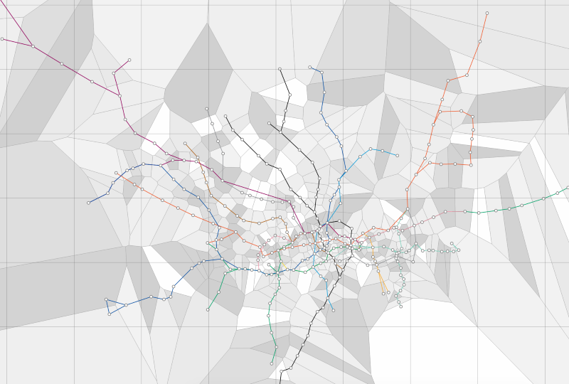
London Tube Map
What is the nearest tube station in any location in London (could be implemented for any major city public transit system)?
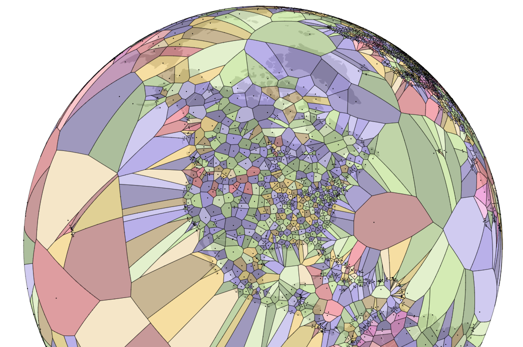
World Airport Map
What is the nearest airport a pilot can go to if an emergency landing is necessary?
Sources and More Explorations
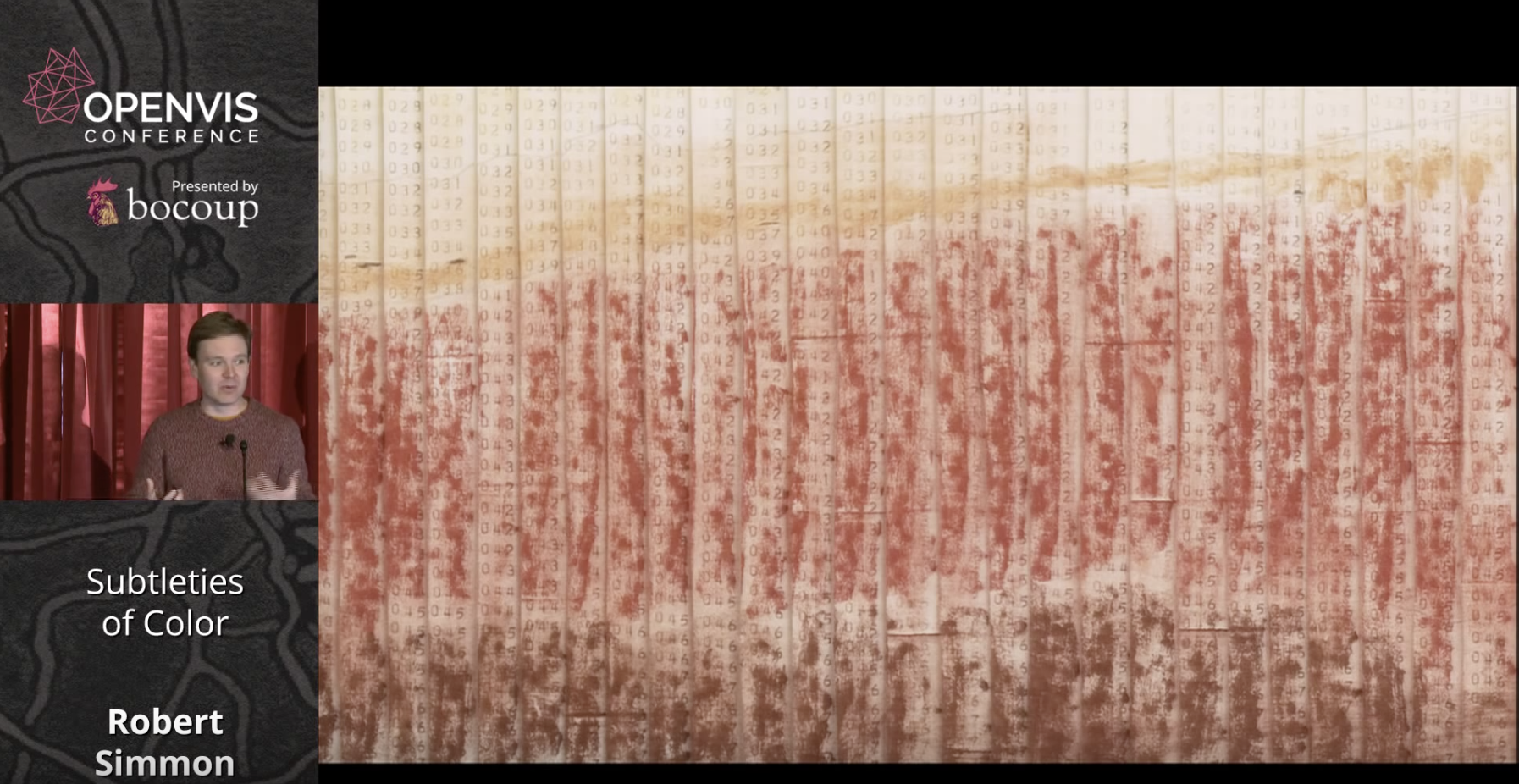
Robert Simmon - Subtleties of Color
A NASA data visualization expert, Simmon explores best practices for color, grounding his presentation in the science of visual perception and visual culture.
Simmon begins by stating that the purpose of data visualization is to illuminate patterns and relationships hidden in numbers. He illustrates this with an early map of Mars' surface that was hand colored in to reflect numbers transmitted by a space probe.
He then goes on to discuss the divergence between the objective reality of colors and the colors that we see as a 'construct of brain processing.' Simmon points out that our vision evolved to 'see the lion hiding in the brush.'
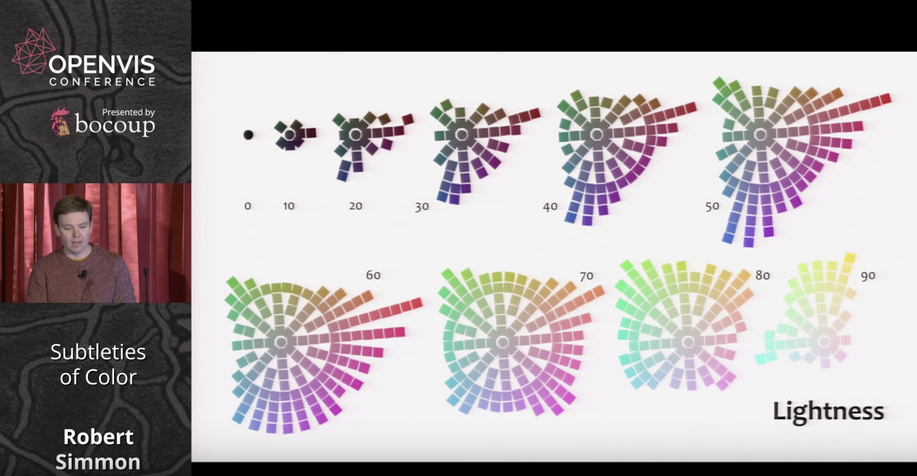
Since color ramps on computer monitors are linear but our response is not, we need a better approximation of visual perception than the RGB scale. While the HSL scale is closer to human perception, this need resulted in the creation of the LCH color scale as per below.
Following his presentation of basic color theory, Simmons next turns to best practices for using colors in data visualization. He refers to the long history of cartography and outlines three types of data that require differing approaches: sequential, divergent, and qualitative.
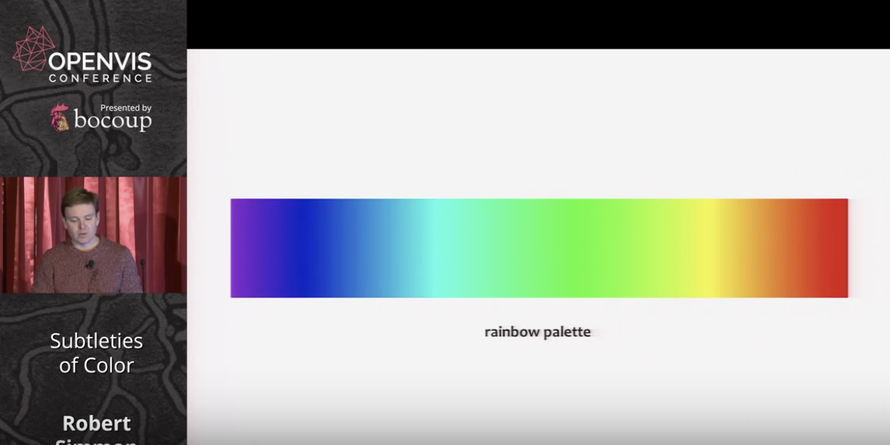
He prefaces his discussion of best practices by referring to the problems inherent with rainbow and grayscale palettes. Simmons says rainbow colors are suitable for divergences, but less so for other types of data. Grayscale is problematic due to surrounding color tones effecting perception of lightness. For an example of the problems inherent to the rainbow palette, the below example shows little difference in green hues, despite the number values being an even progression.
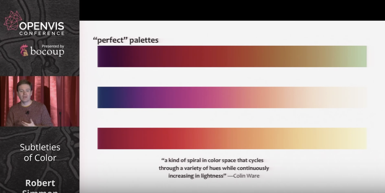
Colin Ware, however, has proposed palettes that cycle through hues and saturation while increasing in lightness. These are useful for sequential data with a progression from low to high values.
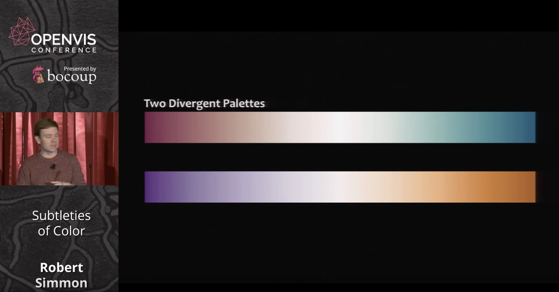
Divergent palettes on the other hand are suitable for cases when emphasizing outliers, as in anomaly data, or profit/loss visualizations.
For qualitative data, such as for example different political parties in a multiparty system, he proposes a rule of thumb called 'magic 7' in which 7 colors are used. This can be extended by plus or minus 2 for 5-9 categories altogether.
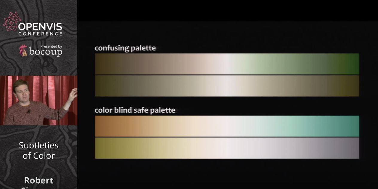
Simmons next discusses issues involving color blindness, presenting safe palettes available online for common green-blue issues.
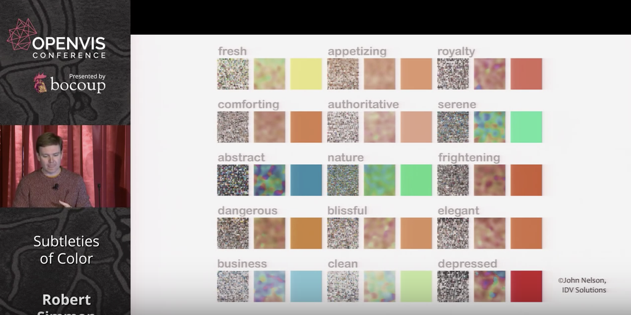
Symantic, emotional and cultural associations of color also need to be considered in visualizing data. He presents as one example the fact that in the west the color red is associated with anxiety and danger whereas in China it's linked with good luck. He also displays a fascinating chart of qualities people associate with different colors.
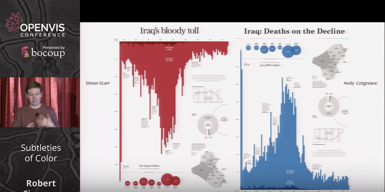
He makes the point about our intuitions regarding color dramatically with two examples of deaths in the Iraq war, one in red and one in blue, conveying rather different messages with the same data.
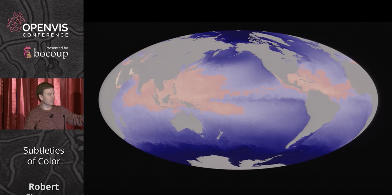
Simmons stresses the usefulness of color in indicating thresholds, or to indicate no data at all, as in a hurricane map of the oceans where gray indicates land.
He ends his presentation by listing available tools, such as the online Color Brewer palettes, and stressing that aesthetics matter to data visualization, because 'creating something attractive is a tool to make our data visualizations more effective.'
Aside from its wealth of useful, evidence-based tips for selecting color, what stood out to me from Simmons' presentation is the divergence between objective color values, and the way they are perceived. This presents challenges that, while cartographers have been solving them intuitively for centuries, have only been understood scientifically quite recently.