A NASA data visualization expert, Simmon explores best practices for color, grounding his presentation in the science of visual perception and visual culture.
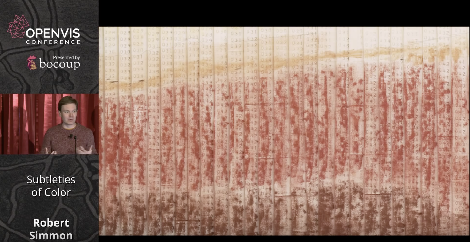
Simmon begins by stating that the purpose of data visualization is to illuminate patterns and relationships hidden in numbers. He illustrates this with an early map of Mars' surface that was hand colored in to reflect numbers transmitted by a space probe.
He then goes on to discuss the divergence between the objective reality of colors and the colors that we see as a 'construct of brain processing.' Simmon points out that our vision evolved to 'see the lion hiding in the brush.'
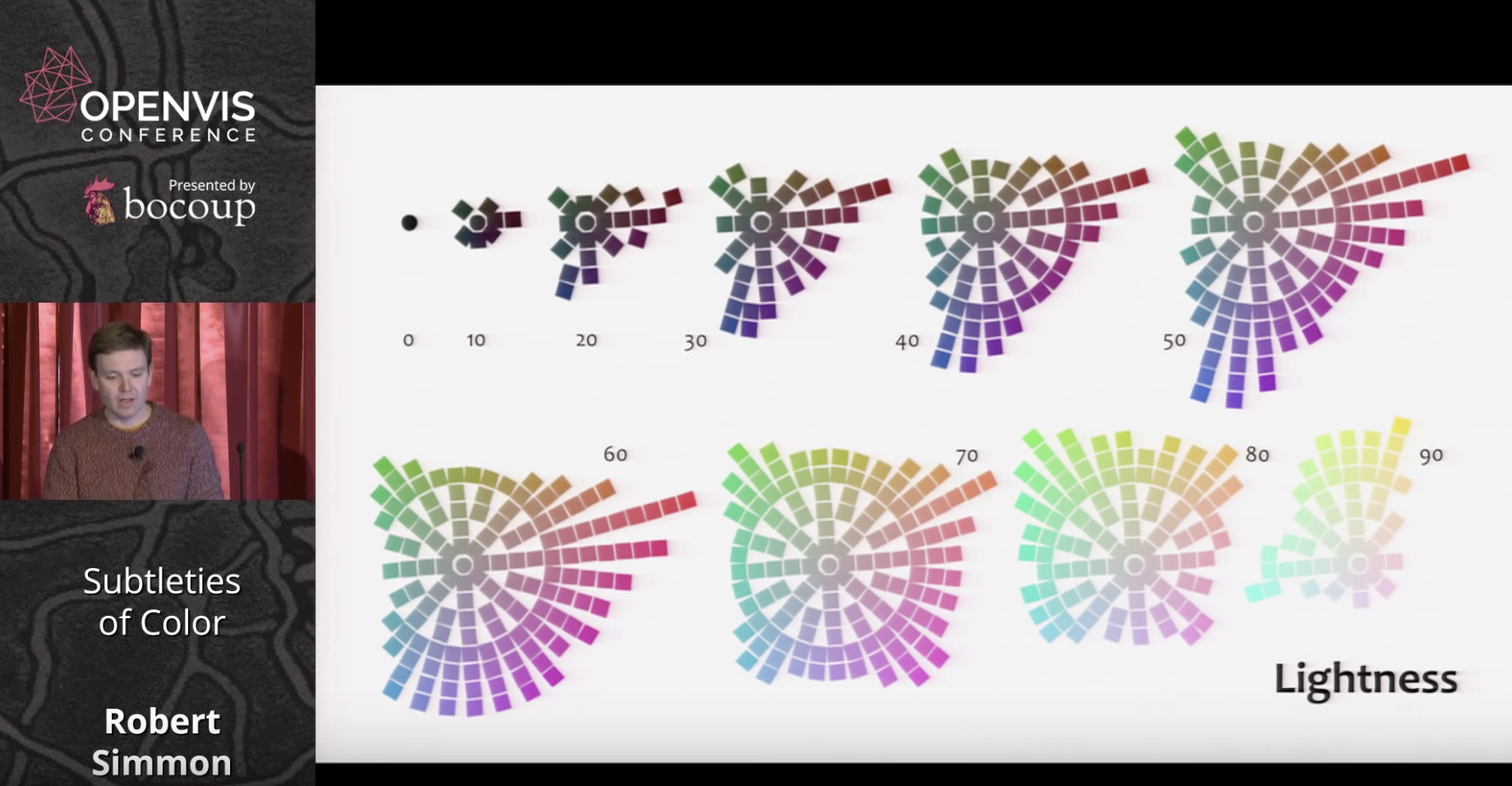
Since color ramps on computer monitors are linear but our response is not, we need a better approximation of visual perception than the RGB scale. While the HSL scale is closer to human perception, this need resulted in the creation of the LCH color scale as per below.
Following his presentation of basic color theory, Simmons next turns to best practices for using colors in data visualization. He refers to the long history of cartography and outlines three types of data that require differing approaches: sequential, divergent, and qualitative.
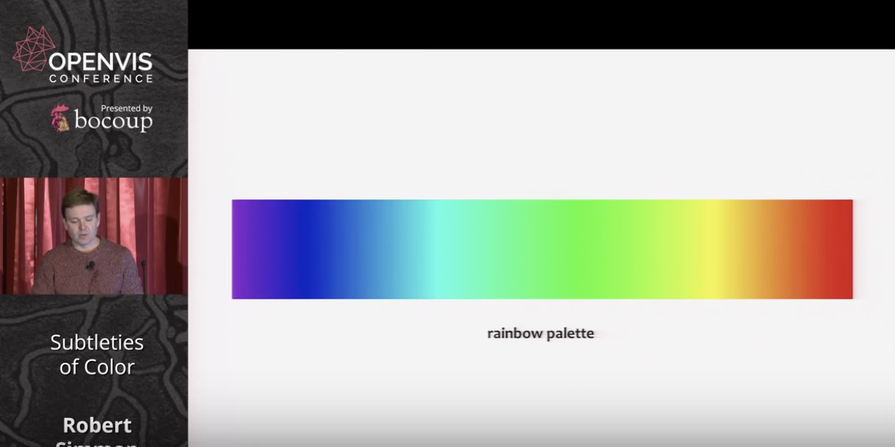
He prefaces his discussion of best practices by referring to the problems inherent with rainbow and grayscale palettes. Simmons says rainbow colors are suitable for divergences, but less so for other types of data. Grayscale is problematic due to surrounding color tones effecting perception of lightness. For an example of the problems inherent to the rainbow palette, the below example shows little difference in green hues, despite the number values being an even progression.
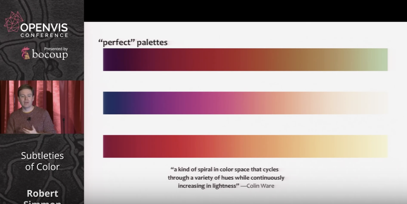
Colin Ware, however, has proposed palettes that cycle through hues and saturation while increasing in lightness. These are useful for sequential data with a progression from low to high values.
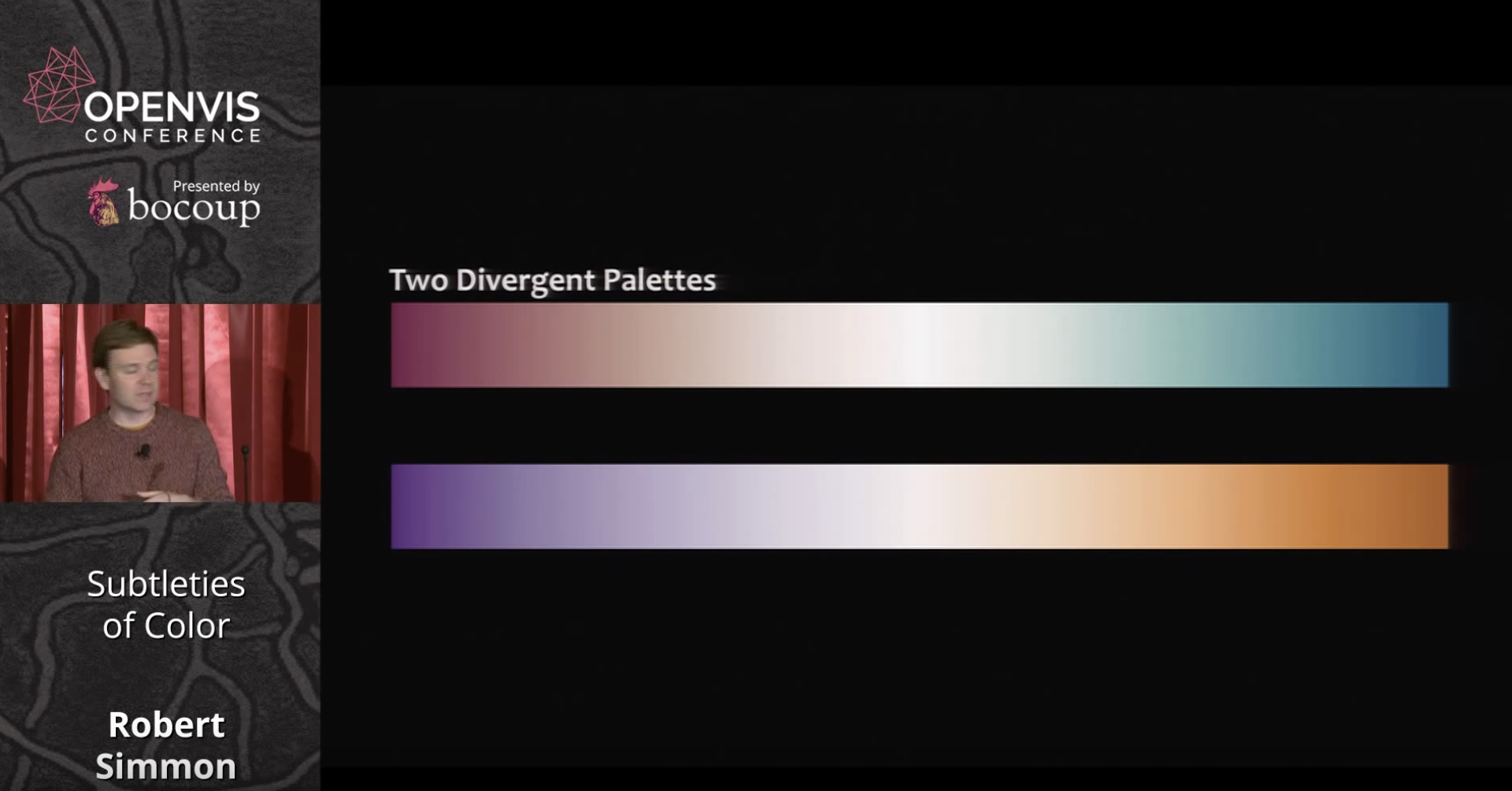
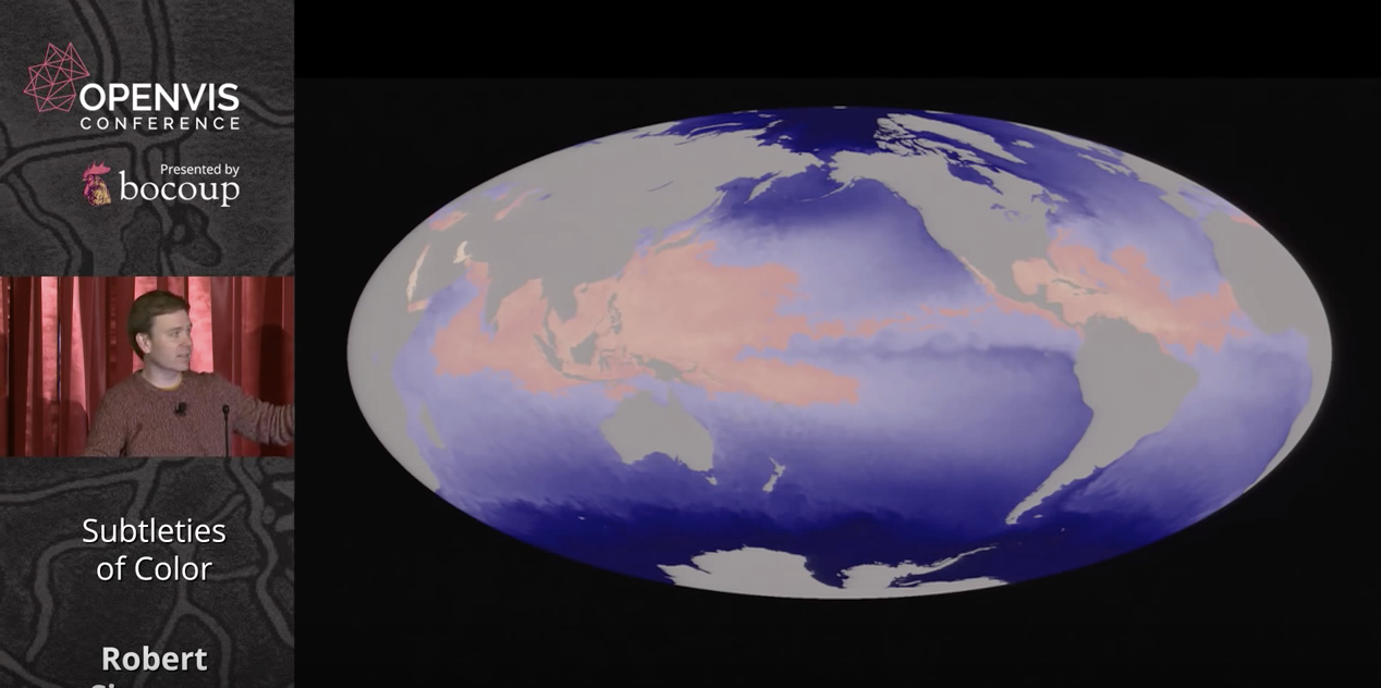
Divergent palettes on the other hand are suitable for cases when emphasizing outliers, as in anomaly data, or profit/loss visualizations.
For qualitative data, such as for example different political parties in a multiparty system, he proposes a rule of thumb called 'magic 7' in which 7 colors are used. This can be extended by plus or minus 2 for 5-9 categories altogether.
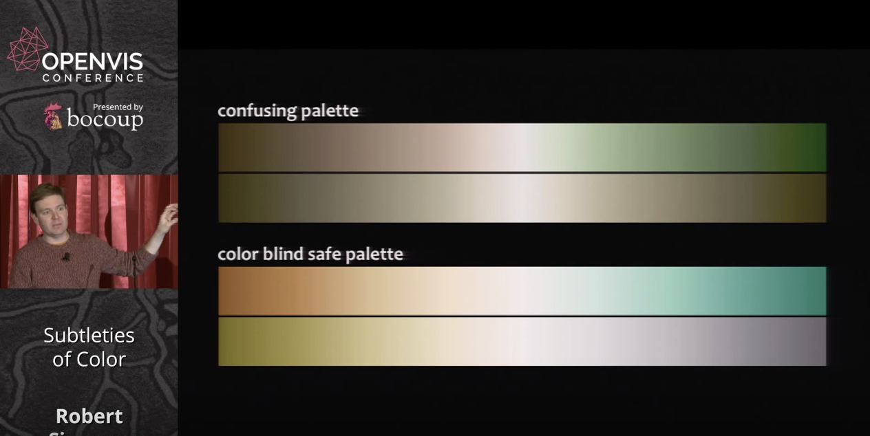
Simmons next discusses issues involving color blindness, presenting safe palettes available online for common green-blue issues.
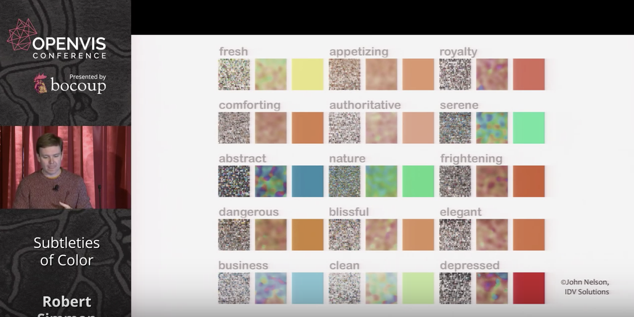
Symantic, emotional and cultural associations of color also need to be considered in visualizing data. He presents as one example the fact that in the west the color red is associated with anxiety and danger whereas in China it's linked with good luck. He also displays a fascinating chart of qualities people associate with different colors.
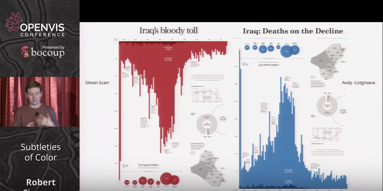
He makes the point about our intuitions regarding color dramatically with two examples of deaths in the Iraq war, one in red and one in blue, conveying rather different messages with the same data.
Simmons stresses the usefulness of color in indicating thresholds, or to indicate no data at all, as in a hurricane map of the oceans where gray indicates land.
He ends his presentation by listing available tools, such as the online Color Brewer palettes, and stressing that aesthetics matter to data visualization, because 'creating something attractive is a tool to make our data visualizations more effective.'
Aside from its wealth of useful, evidence-based tips for selecting color, what stood out to me from Simmons' presentation is the divergence between objective color values, and the way they are perceived. This presents challenges that, while cartographers have been solving them intuitively for centuries, have only been understood scientifically quite recently.