- bar graph is a graphical way to display data using bars vertically or horizontally in x and y axis.
- usually one axis shows the categories and the other axis shows percentages.
- bar graphs are used for comparison and representing relationship between groups with different data.
bar graph components:
- x and y axis
- name of groups or categories (axis 1)
- numbers (axis 2)
- scale (the range of numbers shown on the graph)
bar graph design elements:
- colors (hues and gradients) to show the differences between the groups
- thickness and size of the bar
example of a bad executed bar graphs:
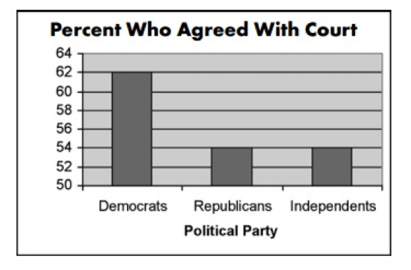
this bar graph is misleading because at first glance you think there's a massive difference between the republicans and democrats who agreed with court, when in fact it's only 14%, but the y axis is showing the range from 50-64, the following example shows how the scale should have been used.
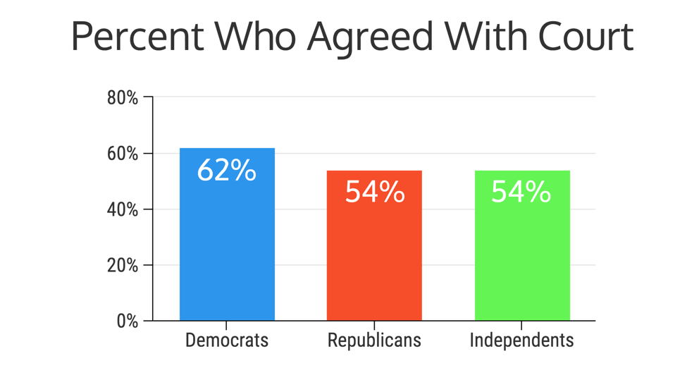
Now this version is better because we actually see the slight difference between the three groups, because the y axis and the bars are now showing the percentages.
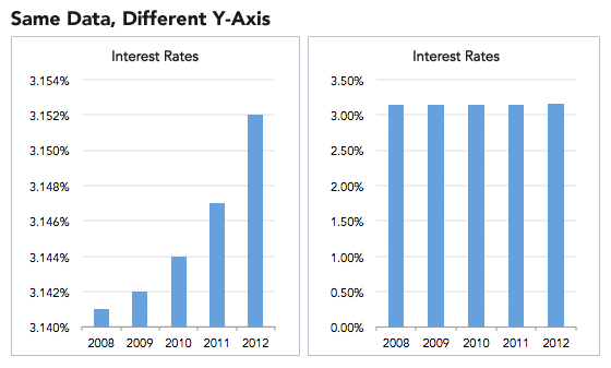
The chart on the left makes you think that the interest rates have increased dramatically in 4 years when in fact it only increased 0.014% as shown on the right graph.
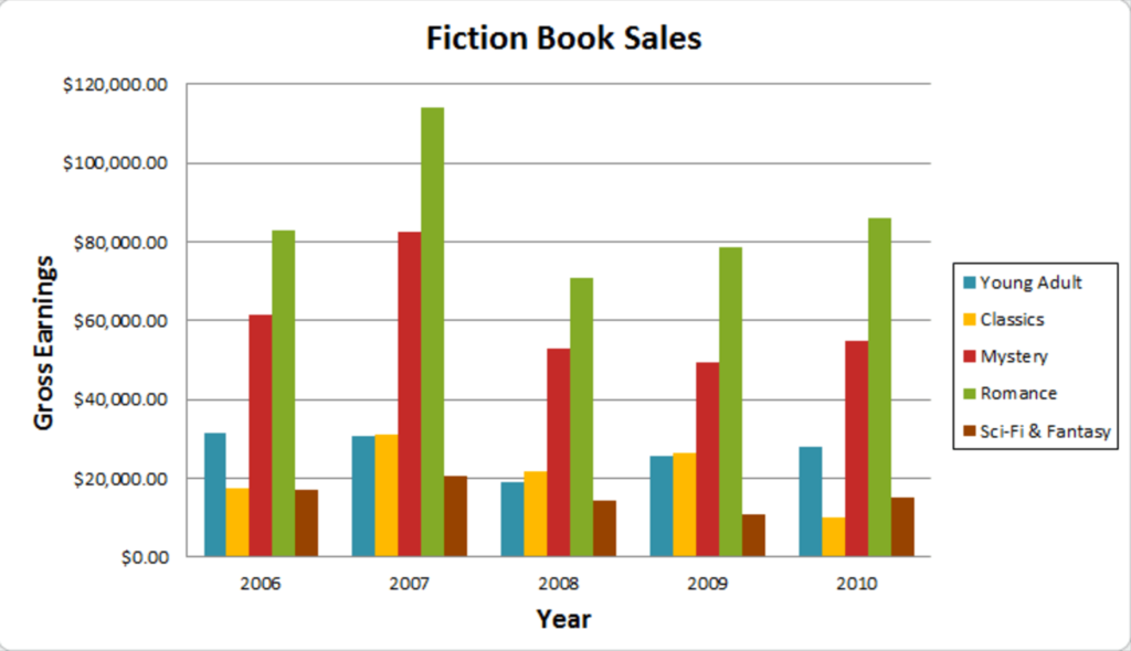
This is a good example of a bar graph because:
- It shows the labels (Gross Earnings, Years)
- Graph key or legend
- Contemporary colors
- Y axis is used correctly