What's Its Purpose?
A survey plot, also known as a side by side bar chart or Table Lens' main purpose is to visualize patterns and outliers in multivariate datasets. In its simplified form, a Table Lens graph is a way to cluster relationships using bars. They are normally sorted independently and interesting patterns may evolve post clustering. From the superficial research done, it seems that academic articles refer to this chart as the Table Lens chart but modern use cases may refer to it as otherwise.
How Do I Read it?
The bars making up the Table Lens graph can be represented by multiple values because the variables are sorted independently. They can be made up of averages, numbers, percentages, ranks, distributions etc.
Stephen Few suggests using a table lens graph when your audience is not familiar with scatter plots. Perhaps he suggests this as a way to better view the correlations between variables.
Pre-Processing
Sorting of the variable column is required in order to find relationships among variables in the Table Lens graph. Table lens graphs are laid out similar to a table with the independent variables going horizontally.
According to an academic article, the process to achieving the Table Lens graph is: 1) Scanning through each variable left-to-right 2) Sorting the columns 3) Scan columns to the right, judging if they are correlated.
Mapping
When researching the Table Lens graph, I did not find any interesting aesthetics choices. Due to the fact that this chart requires a multitude of tiny bars in order to find any relationships within the variables, colours tend to be muted so that the reader can establish a pattern. Table Lens graphs tend to be quite busy as they require multiple independent variables.
Good Use vs Bad Use Cases
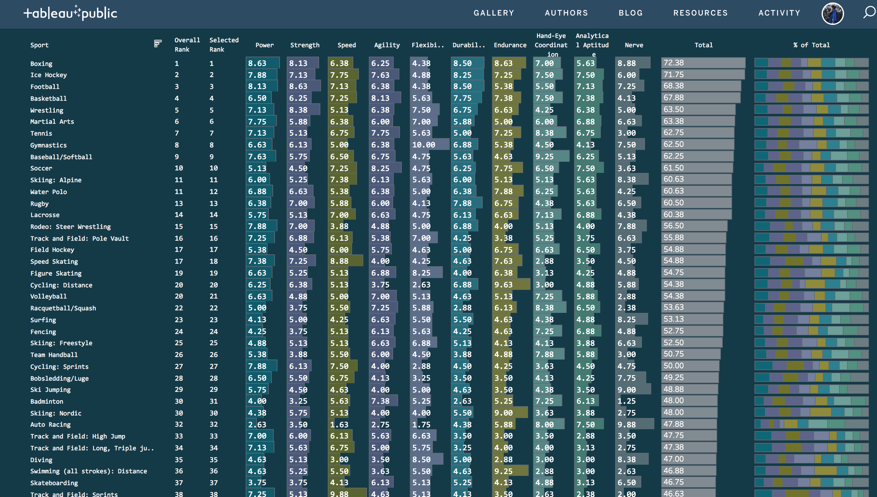
Good Use
The graph represented below is a good example of a Table Lens used in the modern day. The colours are quite muted but each colour represents a different independent variable. I also quite like that the labels have been added to each bar in order to process one variable over the other. Again, it's quite hard to grasp the relationship between the bars , so the labels add context.
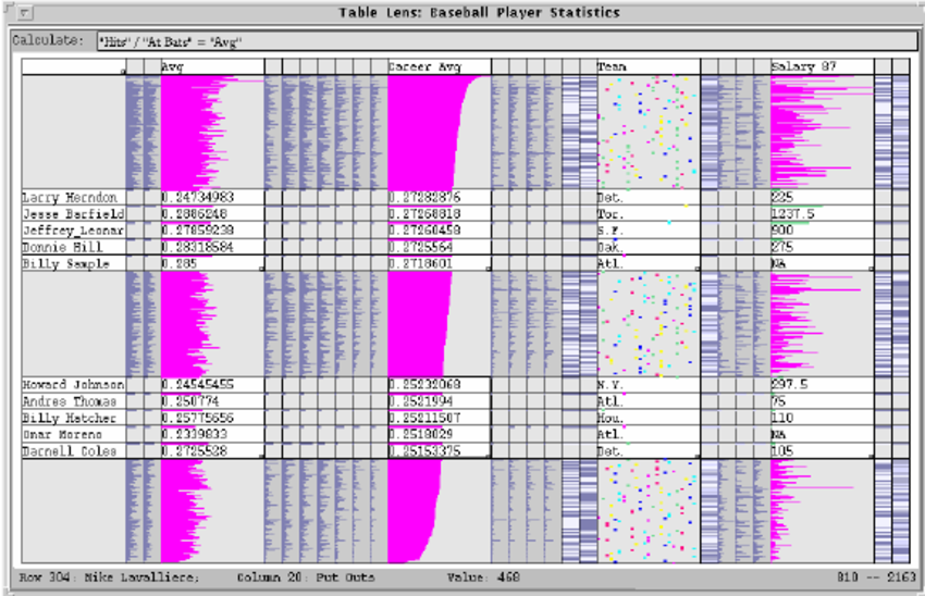
Bad Use
The graph represented below is a bad example of the Table Lens graph. The data is really busy. As well, there are no labels so it's difficult to distinguish between the variables, not to mention the hot pink colour doesn't help on an already very busy visualization.
Sources used: https://www.perceptualedge.com/images/Effective_Chart_Design.pdf
http://citeseerx.ist.psu.edu/viewdoc/download?doi=10.1.1.22.1565&rep=rep1&type=pdf