Overview
Histograms are a powerful visualization tool, but are often confused with bar charts and as we will see below many of the bad examples of histograms come from people trying to hack a histogram out of a bar chart.
Histograms are generally used for continuous data sets, where the goal is to understand the distribution of a data set.
The data sets are arranged in bins where a total count of observations in a bin is shown to create the distribution. Depending on the data set, the algorithm to arrange the data in the bins and determining the optimal number of bins given spacial constraints can be relatively complex. While this is a heavy layer of processing, most people rely on existing tools to do this rather than working on first principals. The mapping of data is relatively easy and achieved heavily in the bin selection and population stage, after that apart from axis differences the process is similar to working with a bar chart.
Good Examples
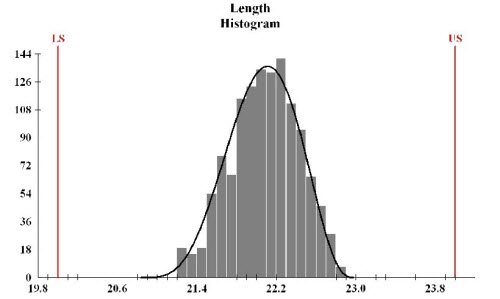
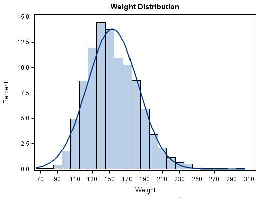
The first example of a good histogram, is something that I've created in the past. There were a number of elements that I was trying to control for in the image, including (1) correct bin labeling (2) summary data presented spatially (3) controlling for the long right tail in the second last bin (4) controlling for N/M data
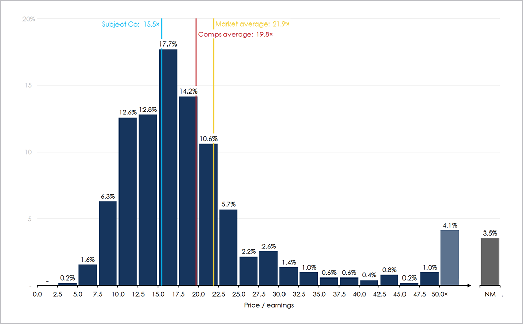
In the second example of a good histogram, I selected a tiled histogram, that compares alternative histograms, and provides a nice high level comparison across the datasets. Personally, I find tiled histograms to be of high value, especially in a three tile example where focusing on series A and B, and the delta between A and B.
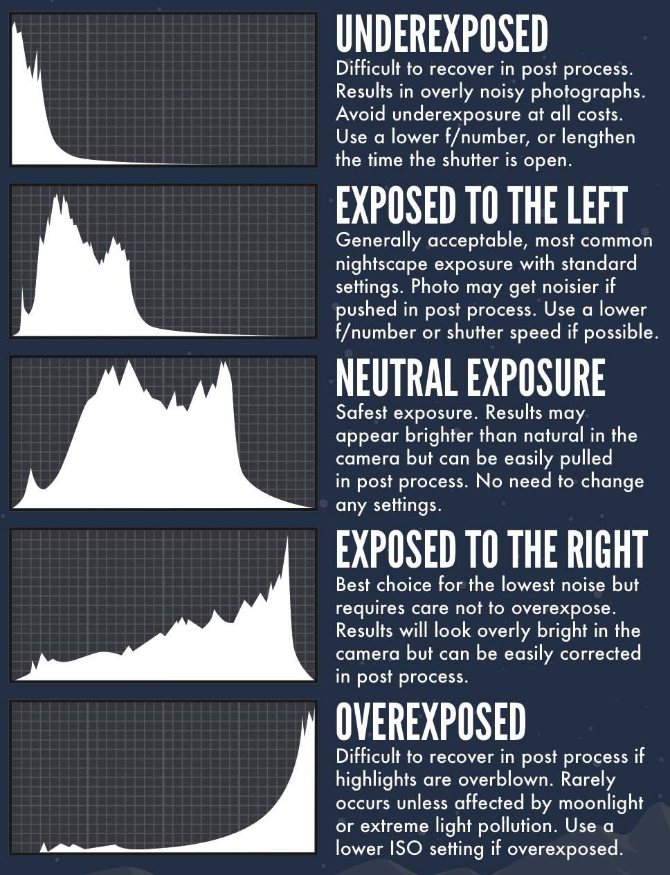
In the final good example I have selected an example of a histogram displaying multiple data series. While there are some design issues, I think the best thing coming away from the chart is the fact that all series are centered at the 0 axis. Often with histograms with multiple series people stack the series which eliminates the ability to examine a data series in its own right. While there are instances that this is interesting to do with I find that people default to stacking when they should be defaulting to the way in which the below chart is displayed
Bad Examples
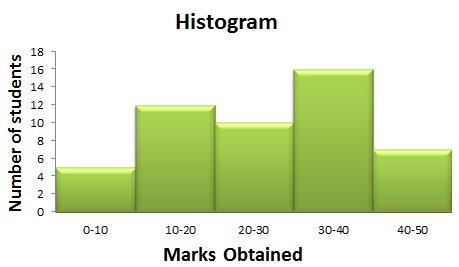
Perhaps the biggest issue with histograms comes from incorrect bin labeling. This arises mainly from people hacking together histograms in basic charting packages such as Excel and using a bar chart as a means to create a histogram. While on first glance this often works well - on closer inspection it's nearly impossible to interpret what the chart is representing. I previously wrote a short article on this issue that's available on my blog.
In the first sample of a bad histogram displayed below, one of the most common examples of an error with a histogram is shown. As can be seen below the bin axis labels are placed in the middle of the bucket - where the correct labeling should be placed on either side of the bin. In the example below it's exceptionally hard to try and determine what the data is actually saying given the labelling issue. Interestingly, this is how Excel labels histograms
In the second bad example of histogram, an alternative label issue is evident, in this instance the user has tried to hack the labeling using a bar chart label rather than a native histogram. This results in over-labeling on the bin axis. On a more aesthetic front the use of 3-D rendering is exceptionally questionable, and because of the fixed fade area on different length bars causes serious interpretation issues and spatial biases.
In the third bad example, I've focused on a chart that has correct bin labeling, but the number of labels along with the bin sizing diminishes the usefulness of the chart.