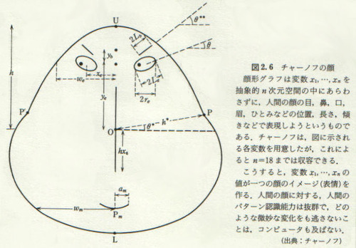
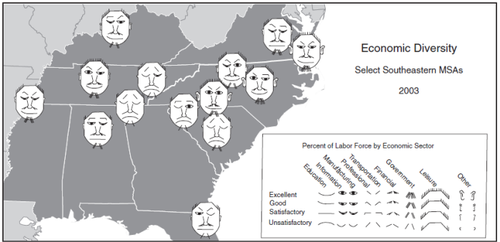
created in 1973 by Herman Chernoff - an applied mathematician
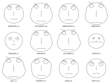
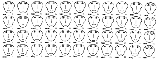
The Chernoff 'faces' (called GLYPHs - a symbol or pictograph) are probably the easiest and possibly the most humanistic way of visualizing data. Its called a 'MULTIVARIATE' (or more than 2 variables ) ANALYSIS. These faces are universal, quick and easy. All children of any country, ethnicity or bias would draw and we as humans, understand this immediately. The kind of value this visualization represents is immediate and read as a mode of human emotion and cultural intelligence:
ANGRY/UNFRIENDLY/OPEN/COMTEMPLATIVE/AMENIABLE(happy).
Some of the DOWNFALLS of this visualization are:
* The data is Totally Interpretive
* What if you're blind or emotionally handicapped (ie: autistic)
* Cultural Understanding (Asian cultures want a 'Serious' Judge; OR some assumption that a 'Serious' Judge is more impartial?)
* It is binary – only shows one set of data that assumes its universality.
* Certain graphical bits on this chart (ie Eyebrows) catch your attention more readily, and can influence you.
* 'Fight or Flight'.
The BEAUTY of this visualization is:
* The Immediacy/Speed
* Not using excess space/ink/clutter
* It runs on an X Y axis – you could see the 'progression' of the representation.
* Not alot of discussion needs to be initiated.
* 'Fight or Flight'.
HERES ANOTHER -
Mapping Faces
This comes from an article called: Mapping Quality of Life with Chernoff Faces. The face is distilled down to shape and line. Distortion of the shapes and the angles of lines determine the 'Mapping'.
https://web.archive.org/web/20041217153643/http://gis.esri.com/library/userconf/educ04/papers/pap5000.pdf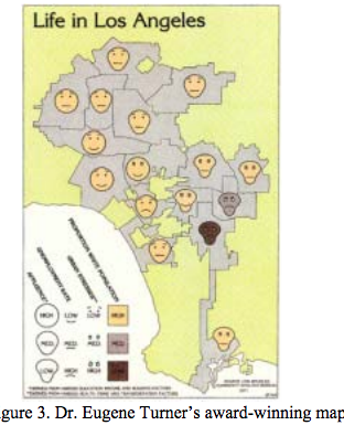
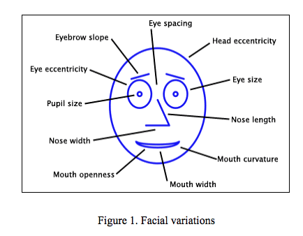
This was interestingly found to be: "In this map, four variables--affluence, unemployment rate, urban stresses, and percentage of white population — are presented by facial elements face shape, mouth curvature, eyebrow slope, and face color, respectively (Figure 3) and identified the head shape/mouth curve/eye shape and eyebrow slopes/color are a reference to how to read the visualization. The award-winning map successfully captured the living conditions in the Los Angeles area. The success of the map was largely due to the use of Chernoff faces as its symbolism. Turner described this map as “probably one of the most interesting maps I’ve created because the expressions evoke an emotional association with the data.”
However, the example ASSUMES cultural norms, and the map doesn't identify distinct areas of Los Angeles.
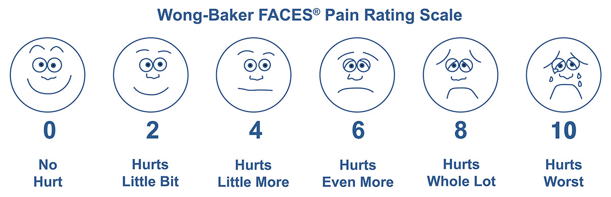
This tool was originally created with children and for children to help them communicate about their pain in a doctors office or hospital. This scale is used around the world with people-ages 3 and older, facilitating communication and improving assessment so pain management can be addressed.
A good representation of 'mapping' that shows its universality.
Problems with Color
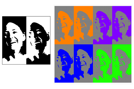
Color seems to add a value to the visualization that isn't as easily interpreted as the shape and line valuations. Color (and black and white) can distort the shape/lines.
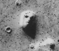
Other
The research also finds something called: Pareidolia (see below)
When you mix up the visual cues, the visualization can become very obscure
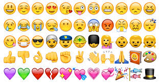
This data visualization is the precursor to Emojis.
QUESTIONS
*Are there visual ways to show subtlety of the data quickly?
*Is there a way to introduce a secondary or tertiary sets of data in the same visual presentation format without the visualization getting messy? (don't think so)
*Can you add the use of color ( or glow) without being biased?