This is a map of trees...
...but this is a "tree map"
Everyone loves a good Tree Map - Crypto Currency - https://t.co/5kg2s52ZXx #bitcoin #treemap pic.twitter.com/EOx5mIbo7S
— Ken Nickerson (@kcnickerson) September 29, 2017
What is it?
A tree map displays hierarchical data as a set of nested boxes. Each set of nested boxes can be thought of as a branch of a tree. Like a real tree, some branches simply have a single set of leaves, but some branches have additional branches off of those branches.
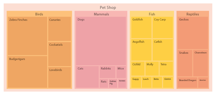
In the simple example below, the Pet Shop is the tree, and Birds, Mammals, Fish, and Reptiles are the branches.
Real Life Usage and Function
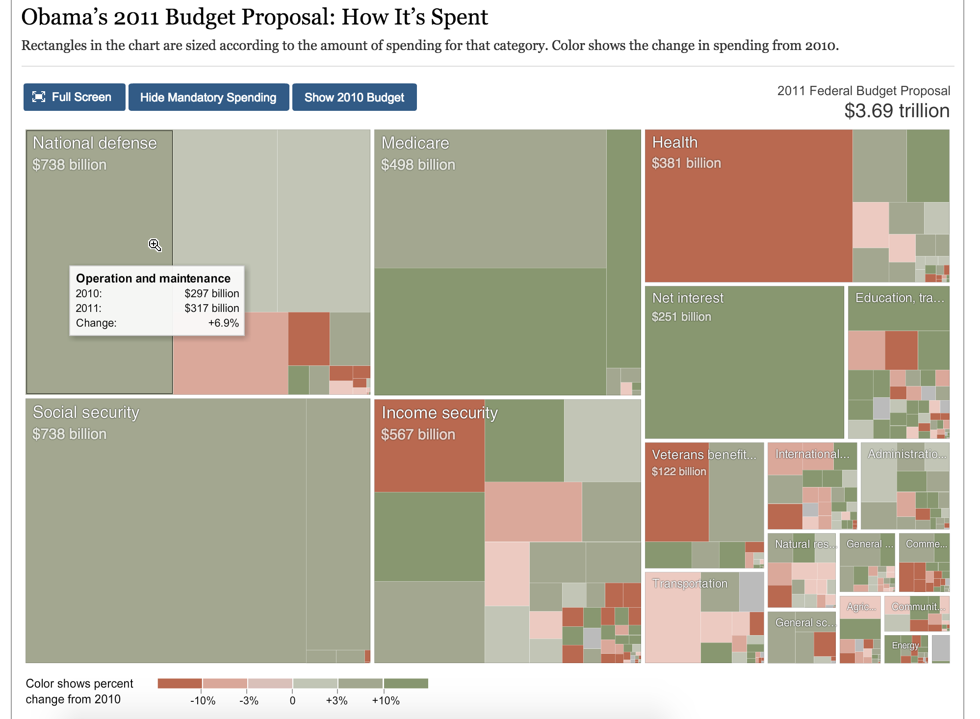
A tree map is a great way to show impact through hierarchy within a system and its subgroups. For example, a tree map is a popular visualization for stock market data. In the example below, the market (tree) is broken into major sectors (main branches) and within those main sectors, smaller subsectors (branches of branches), with the atomic component being the boxes (leaves) for each company.
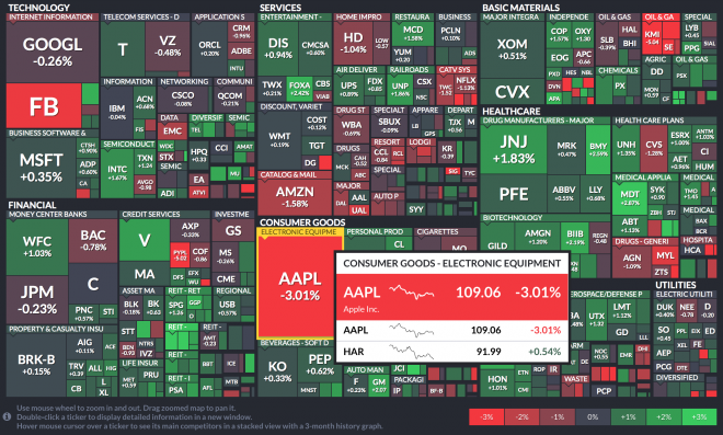
Each box in a tree map can show two different measures: Size and Color
Use of Size
You can see the size of the box indicates the market cap for each company represented proportionally as a percentage of their whole sector. It's clear right away that Apple and Google occupy the largest spaces, which makes sense.
Use of Color
Another variable aside from the size of the groups and subgroups area, is the use of color. In the stock market visualization above, each company is one of seven colors (legend in the bottom right of the graphic) indicating the current change in performance of the stock. We can see apple is down -3.01%, which places it in the poorest performance bucket, using the color red.
Through the use of color in this example, it would be immediately clear when the market was having an up or down day. In the example above, it's clear that Apple's drop in price was not due to market-wide conditions. It stands out among a mostly positive day for the market.
Interactivity
By hovering or clicking on each company, users can see a popover with more details of the performance and size. Additionally, interactivity allows for multiple subgroups to be representing when drilling down into each branch while also reducing clutter.
Click on the link below to interact with this tree map example.
Best Practices
- Don't use too many levels of hierarchy - especially in a static visualization. As a general rule, only go two or three levels (branches) deep – otherwise it will become cluttered and difficult to interpret.
- Use clear labels that add value and not clutter
- Always be conscious of adding space, since it is the main variable. For example don't add space outside the boxes for labels as it distorts the spatial relationship between the individual boxes.
- Use legends for color usage
- Use hover states with basic tooltips to provide additional information in interactive graphics - do not try to cram too much information in the box
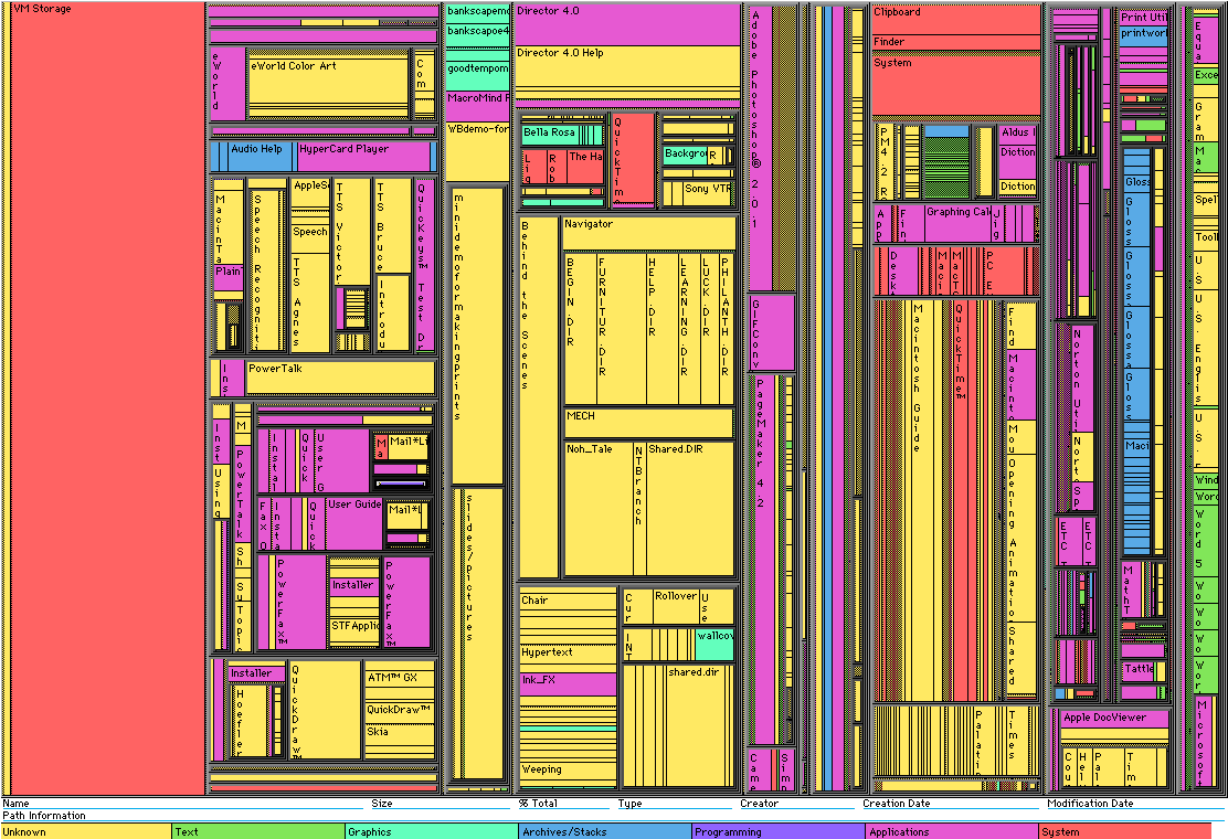
The example below is bad. It's cluttered and difficult to read because the sections and subsections have too many items at the atomic level to be remotely useful in a static graphic.
The below example is good. Click on the link in the caption to see the interactive version of this treemap.