| Idiom | Line Charts |
|---|---|
| What: Data | One quantitative value, one ordered attribute |
| How: Encode | Points with connection marks between them |
| Why | Show trend |
| Scale | Hundreds of levels of the ordered attribute |
Line charts displays one value attribute and one key attribute in a 2-D space, while showing categorical attribute using colors or shapes. It uses one axis for a quantitative attribute and the other for an ordered (sequential/divergent) attribute.
An important feature of line charts is that they also use connection marks to emphasize the ordering of the items along the key axis by explicitly showing the relationship between one item and the next. Thus, they have a stronger implication of trend relationships, as well as continuity.
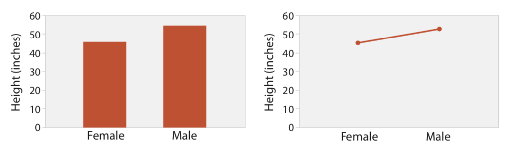
Line charts should be used for ordered values but not categorical values. A line chart used for categorical data violates the expressiveness principle, since it visually implies a trend where one cannot exist. This implication is so strong that it can override common knowledge.
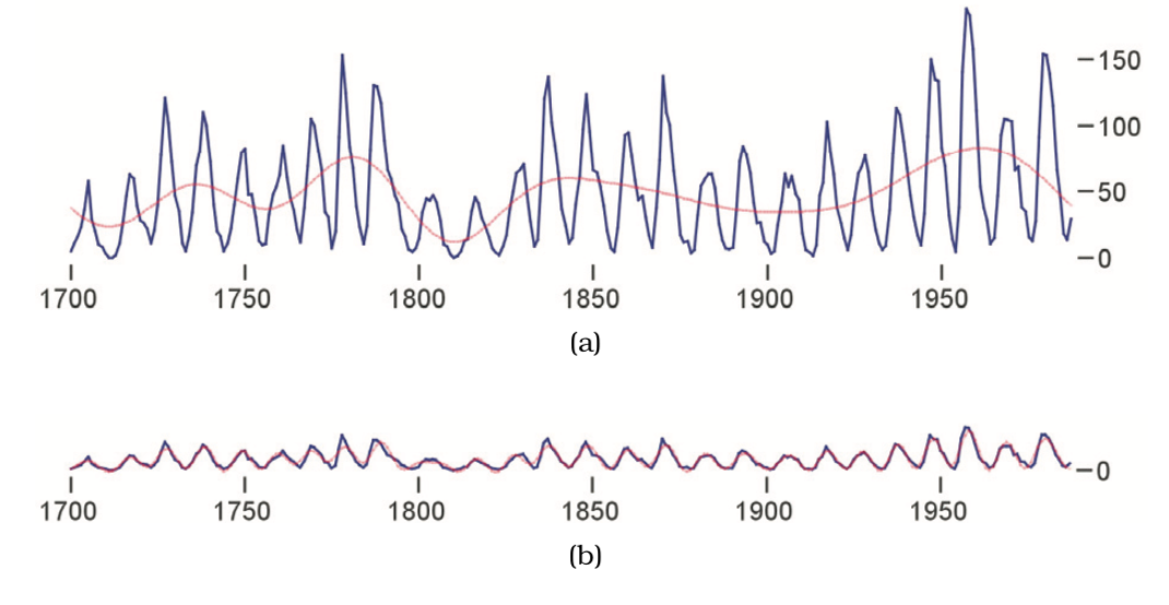
When designing a line chart, an important question to consider is its aspect ratio: the ratio of width to height of the entire plot. While many standard charting packages simply use a square or some other fixed size, in many cases this default choice hides dataset structure. The relevant perceptual principle is that our ability to judge angles is more accurate at exact diagonals than at arbitrary directions.
* Sources: Visualization Analysis and Design, Tamara Munzner, 2014