Not much detailed description is needed when speaking about a table. One of, if not the, purest forms of visualization, a table simply displays data in an organized manner, more specifically, in rows and columns.
With this simplicity comes flexibility in what data is represented. Whether it’s text, numbers, emojis, pictures, audio, the possible data types to display are, essentially, endless. However, the unifying characteristic of all tables containing any data type is the row and column structure, which has one value—i.e, one piece of data—in each cell.
In fact, because there is the option to display multiple data types, comparison can be made between them. More broadly, tables encourage a raw act of comparison—there is little design leading users to any conclusions. Instead, the users themselves are drawing comparisons in the actual rows and columns.
However, little design doesn’t have to mean no design. There are ways to craft engaging tables that represent a story through data for the user to explore, without distracting from the raw data and subsequent comparisons.
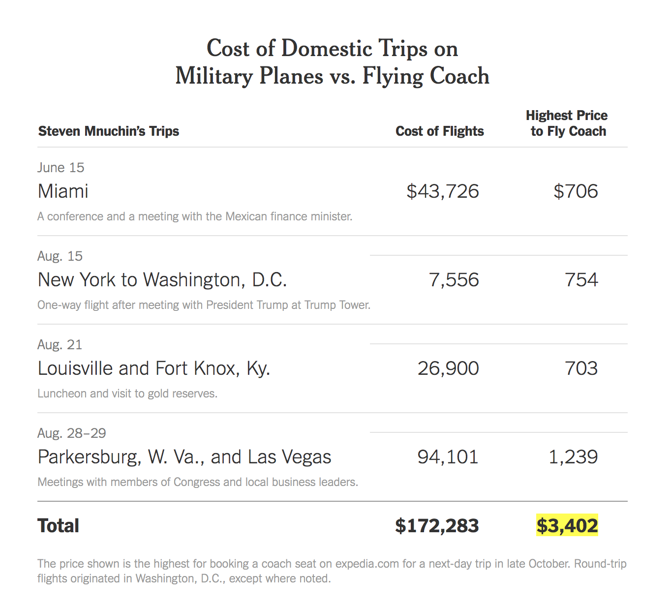
For example, in this interesting article by The New York Times, journalists Katie Rogers and Karen Yourish decided to display data of White House officials’ flight costs with a table. In the table, they used multiple data types: text and numbers. One column represents different trips the official in question took, with accompanying short descriptions. The other columns display the price of flying with a military plane alongside the price of flying coach. Because the differences in prices were startling enough, there was no need to design a visualization past a simple table.
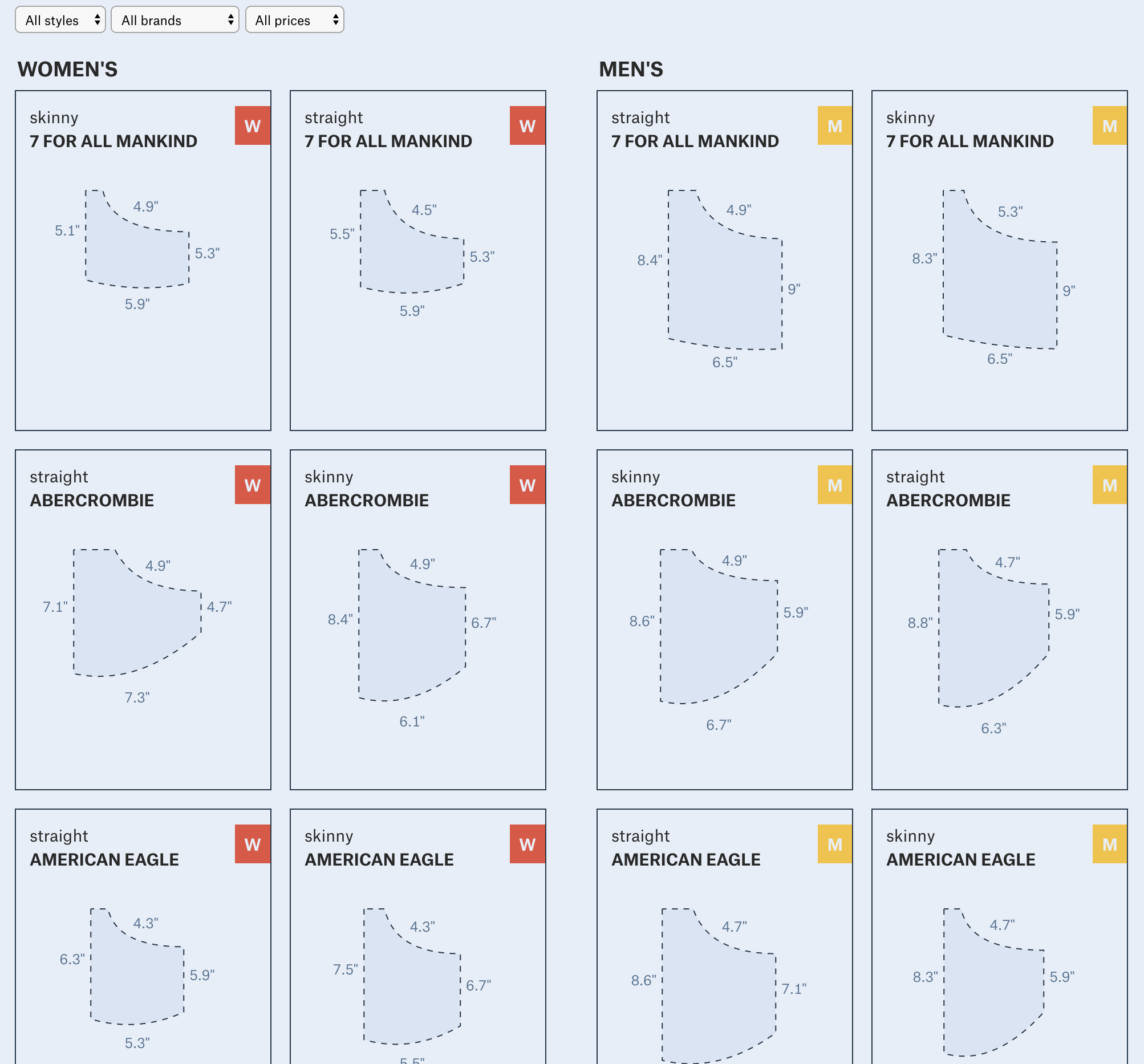
In this example by The Pudding, Journalist-Engineers Amber Thomas and Jan Diehm dove into the data of women’s pockets. They measured the size of pockets on men and women’s jeans, comparing different brands and styles. To visualize this data, they used a combination of images and text in a table format, creating an engaging result for the user to draw conclusions and compare not only men and women’s pockets, but also style and brand as well.
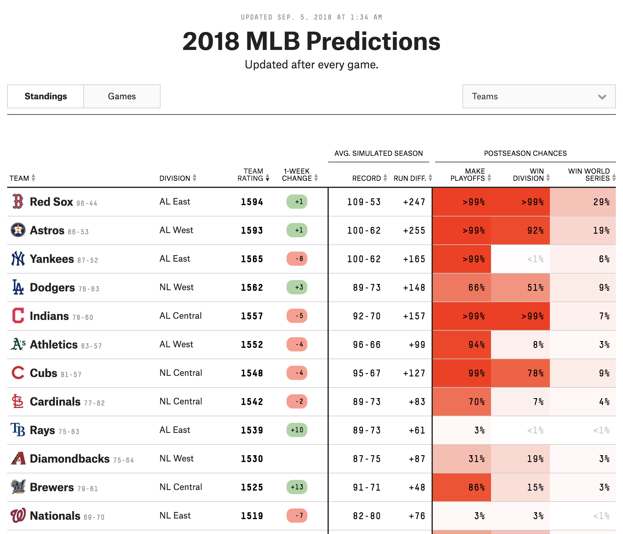
FiveThirtyEight often includes templated visualizations in their articles. In this final nice table example, MLB predictions are displayed through multiple data types (text, images, and numbers). Additionally, the designers incorporated a characteristic of many FiveThirtyEight tables: a heat map-style coloring to columns that represents another dimension of data.
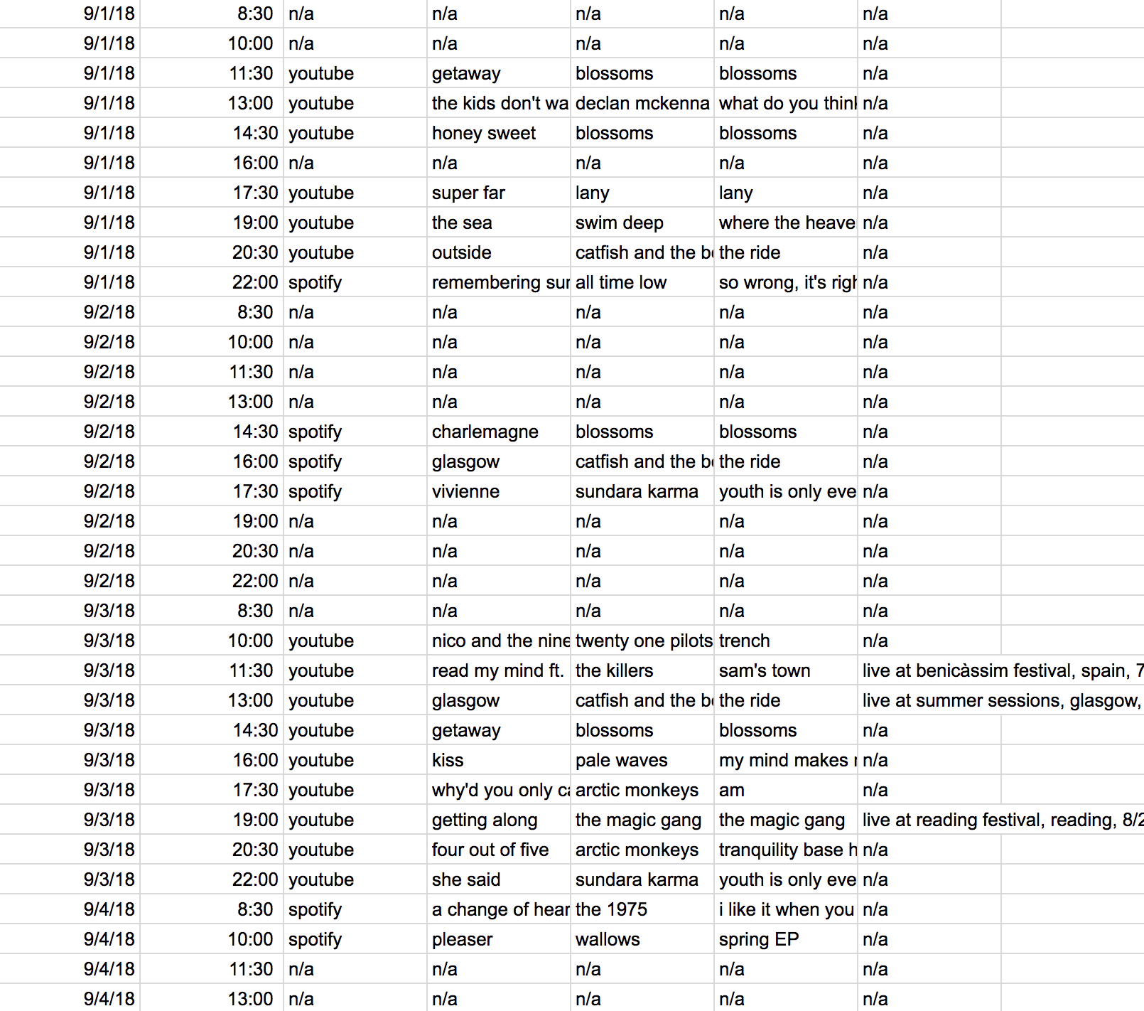
Again, even though tables are simple, there are some guiding principles in crafting them and design techniques that can be incorporated. First, tables should have column and row labels. In this first not-so-great example, there is no label of what each column represents, no indication what “n/a” is referring to, and no title giving context to the data.
While I couldn’t find an image for it, I learned during my undergraduate thesis through a journalism and anthropology instructor that old newspapers, which obviously didn’t have the ability to include interactivity in print, used to print long tables of data, such as of crime records. Even though it was due to resource restrictions, we spoke about how ineffective this technique was because it showed an overwhelming and unnecessary amount of data to readers, leaving them little to no tools to effectively parse through all the information and come to a conclusion.
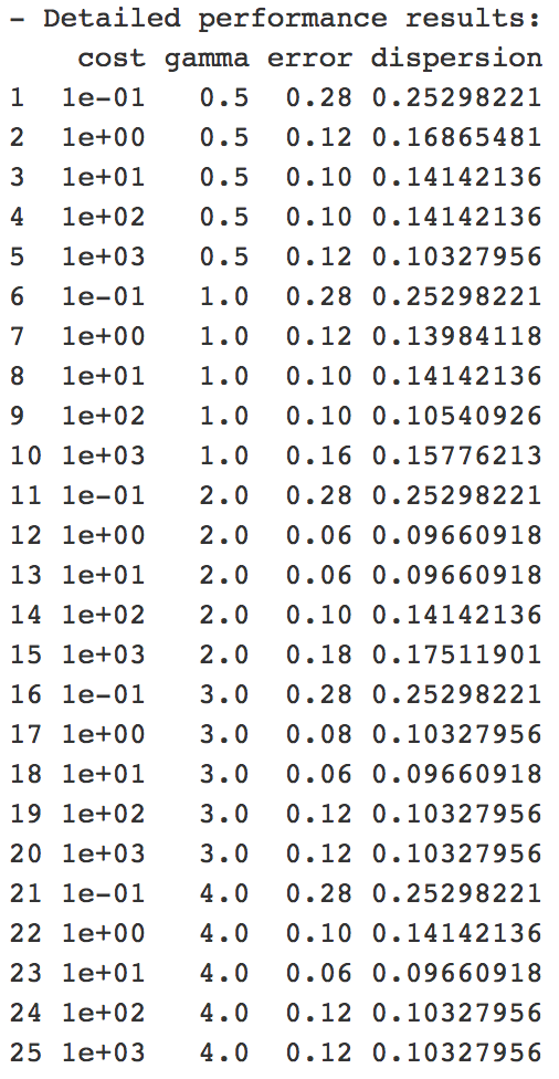
The last example of a less-than-effective table combines some of these previously-discussed points and comes from a homework assignment I did in a machine learning tutorial last semester. It came from training a support vector machine in R. There is a utility to this table—for the researcher training a SVM, it may give them what they need to make decisions about their work. However, if we’re talking about it in the context of my previous examples, where a layperson is reading the table to understand the information it displays, there are some shortcomings. The column labels and title are not descriptive to understand what the data means, and there is potentially more data displayed than is needed to reach a solid conclusion. Additionally, the overall lack of thought in design I believe hurts the story the table is trying to tell.
On the pre-processing end, little work needs to be done between the raw data and the ink/pixels in the resulting table. This is because the table itself houses the raw data. There is the ability to convert the raw data into a form that is more digestible or flows more with the story a designer is trying to tell. For example, with numbers, a designer can choose to present them in decimals or percentages. With pictures, the designer may choose to present them in grayscale. However, these actions are not necessary to create a table visualization. Similarly, no mapping is required when it comes to tables. The data can simply be shown. Again, there is the option to map, such as the heated columns in the FiveThirtyEight example, but it is not a required step in visualizing a table.