A heat map is a representation of data in maps or diagrams in which values (mostly continuous data) are encoded as color in form of a gradient, which can range from two color hues to the use of the full rainbow spectrum.
It is not necessary to have every single point of a heat map representing a distinct value. A hybrid form can also combine points to (geographical, political, logical) areas.
Heat maps are specially useful in scenarios where they can rely on and make use of a commonly established set of conventions in color encoding, for example the most obvious: the representation of temperature in a weather map.
Color
When used in other domains one should consider that color can be a complicated visual encoding for several reasons: There is no intuitively predominant ordering of color hues, cultural conventions in other contexts might override the reading you intended by your color choice and it is a visual property that doesn’t allow for perception of many distinct values (less than 20). Hence color is generally considered to be a better option for categorial visual encoding.
Color (hue) is not naturally ordered in our brains. Brightness (lightness or luminance, sometimes called tint) and intensity (saturation) are, but color itself is not. We have strong social conventions about color, and there is an ordering by wavelength in the physical world, but color does not have a non-negotiable natural ordering built into the brain. – Designing Data Visualizations by Julie Steele, Noah Iliinsky, Chapter 4 (https://www.oreilly.com/library/view/designing-data-visualizations/9781449314774/ch04.html)
Different types (use cases) of heat maps
Weather maps
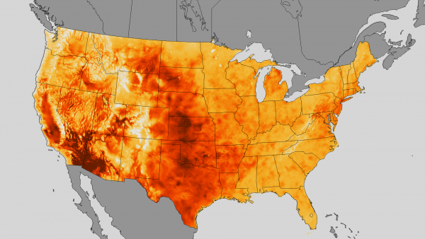
This map represents the distribution of the maximum temperature in the week of July 10 through 19 in 2013 across the US. The scale of 70 °F to 107 °F is encoded in a gradient from grey to dark red. While the choice of grey for the “background” of the map, that is the geographical context of the area that was investigated and is represented, is helpful for focus and avoiding any misleadings, the use of a very light grey for the lowest temperature can cause confusion due to our collective memory of iconic images of volcanoes or furnaces teaching us that the hottest parts of material are the brightest ones.
Variables in this visualization:
- X and y position for the geographical map.
- Temperature is encoded in color.
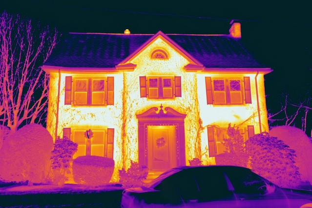
Thermal imaging
Even though thermal imaging or thermography are more related to digital imaging processes I wanted to point out that the translation and scaling of the captured infra-red wavelengths to parts of our visible color spectrum is also a design choice and thus essentially a form of data visualization, too. This example uses the widespread convention of blue indicating cold and a specific convention for thermograms which indicate warm by yellow/white. But there are a lot of examples with different gradients as well.
Web heat maps
are used to visualize which pages of an online service are used or visited most or even more specifically indicate which parts of a page are clicked on or looked at the most (as a result of collected eye-tracking data).
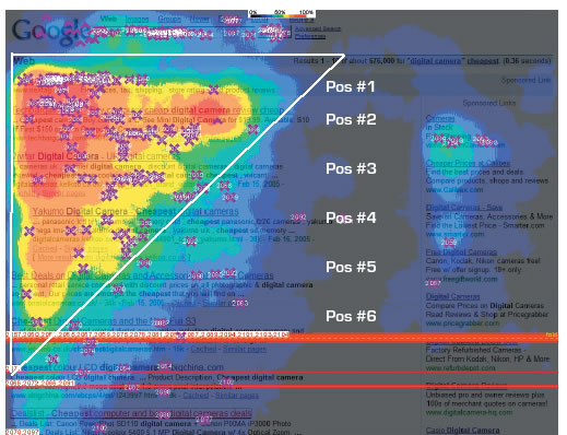
Variables in this visualization:
This map shows the number of clicks encoded in colored areas ranging from bright red to dark blue and finally transparent areas over the original screenshot of a google search result page. Instead of a smooth gradient rendering in this representations the authors opted for discrete borders between different ranges of values. In regard of the color coding I think the use is conventional enough to be intuitively understood. The highlighted triangle and text is more of a gimmick in this case to promote SEO services.
- Screenshot of the google search result page
- X-position on the screen
- Y-position on the screen
- Number of clicks encoded in colored areas
- Added a highlighted area to show “The Golden Triangle” of click
Biology heat maps
visualize arrays of samples and different categories of within each sample. It’s‚ commonly used for gene samples, but other applications are possible:
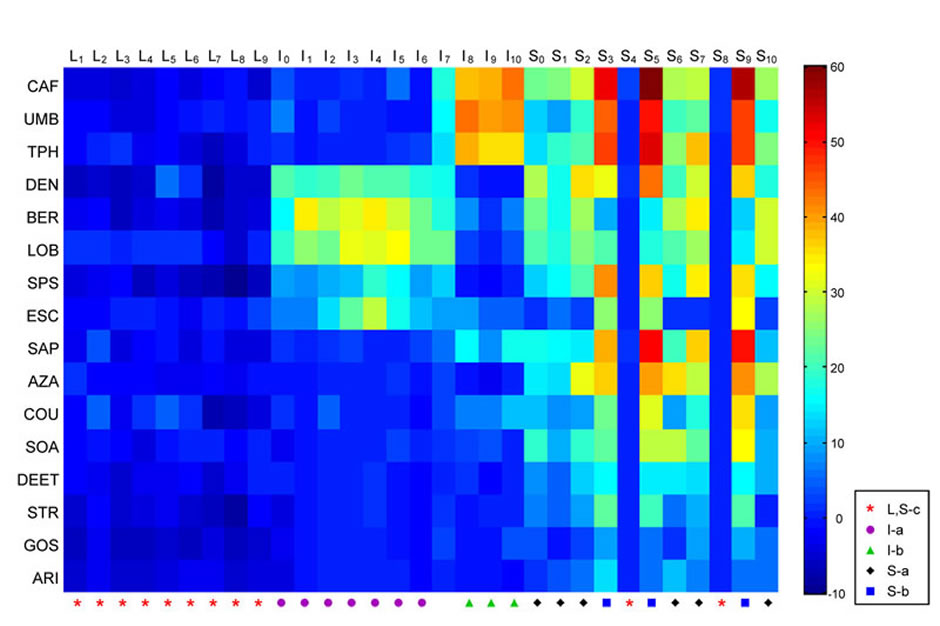
Coding of bitter tastants by a model taste system. The heat map shows the electrophysiological responses elicited by a panel of diverse bitter tastants from the sensilla of a Drosophila taste organ.
Variables visualized in this example (my guess):
This is a representation of an experiment testing the electrophysiological reaction of flies on bitter testing chemicals. As the position in the diagram is not representing spatial information one might argue that it is technically not a map, but it is another example of the use of color hues over a gradient encoding continuous values. Being unfamiliar with the testing method what is peculiar to me is that the scale of reactions ranges from -10 to 60 which leads to the question is 0 is the neutral state, -10 should be considered a mild reaction as well. In this case the absolute neutral value might have been better represented in a completely different color, for example grey.
- Various bitter testants, codified in the position on the y-axis (categorial)
- Samples (actually unspecified moments in time of feeding the substance to the fly), codified in the position on the x-axis
- Another categorization with symbols on the x-axis
- Reaction, codified in the color mapping (-10, 60)
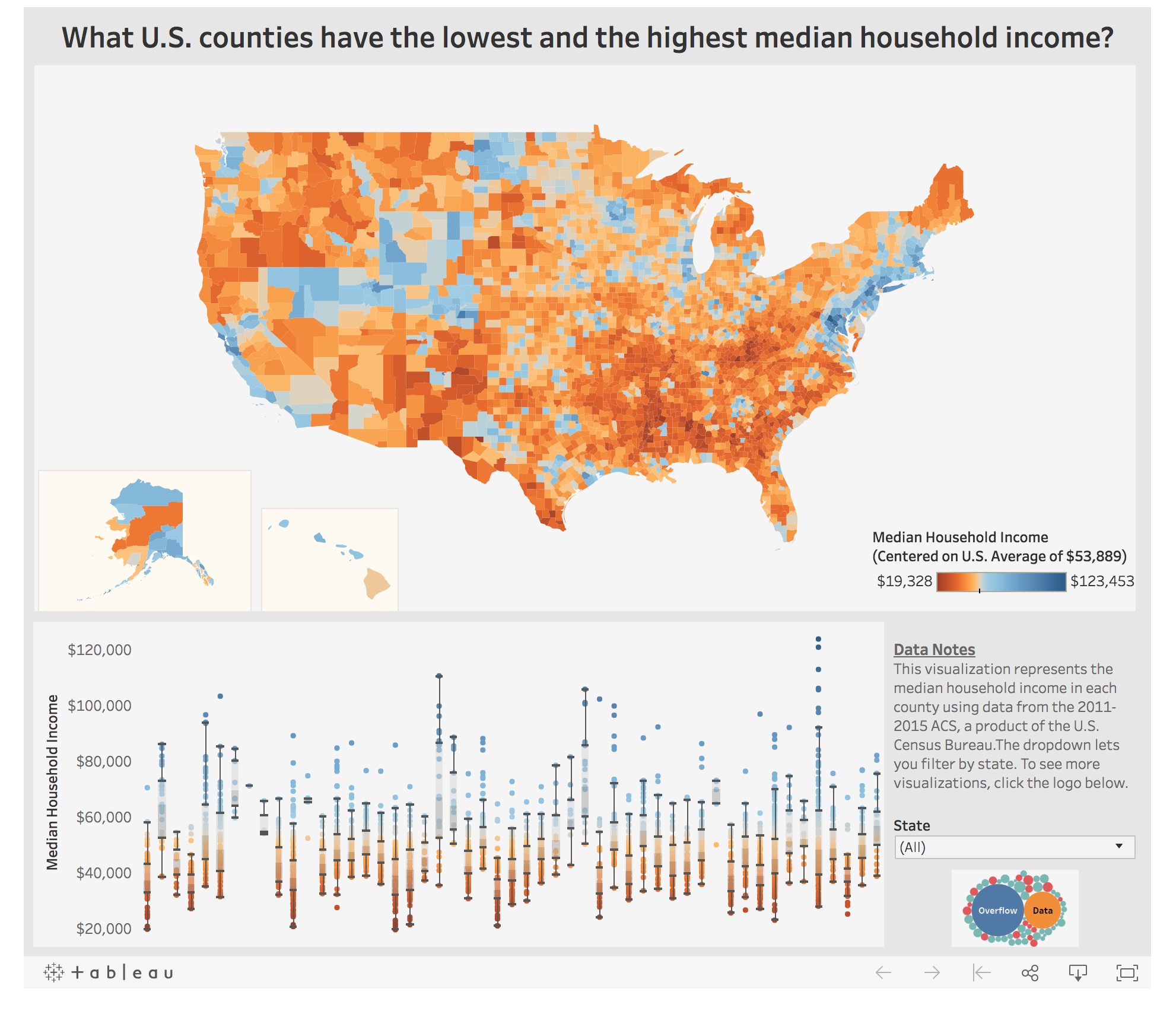
Heatmap-hybrid
Here’s an example for a heat map with a color gradient encoding the median household income, but instead of assigning every single point in the map a distinct value this visualization combines areas certainly in respect to the data that is available.