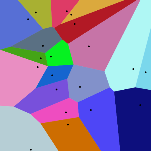
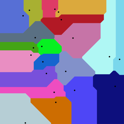
Definition
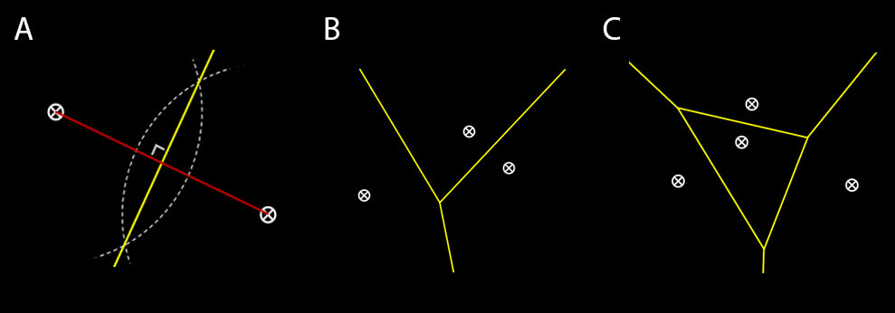
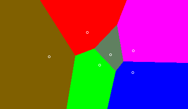
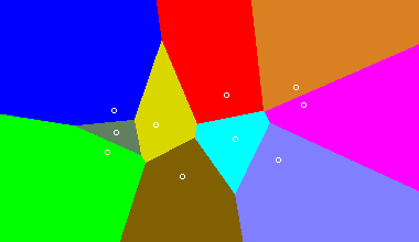
A Voronoi diagram consists of a plane partitioned by a set of n points into convex polygons, such that each polygon contains one generating point and represents the region of points around it that is closer to this generating point than any other.
Basic Properties
- Generators/sites/seeds: finite set of points in a given plane
- Voronoi cells: the region of points in which the distance to a given generator is less than equal to the distance to any other generator
- Voronoi line segments: points in the plane equidistant to two generators
- Voronoi nodes: points equidistant to three or more sites
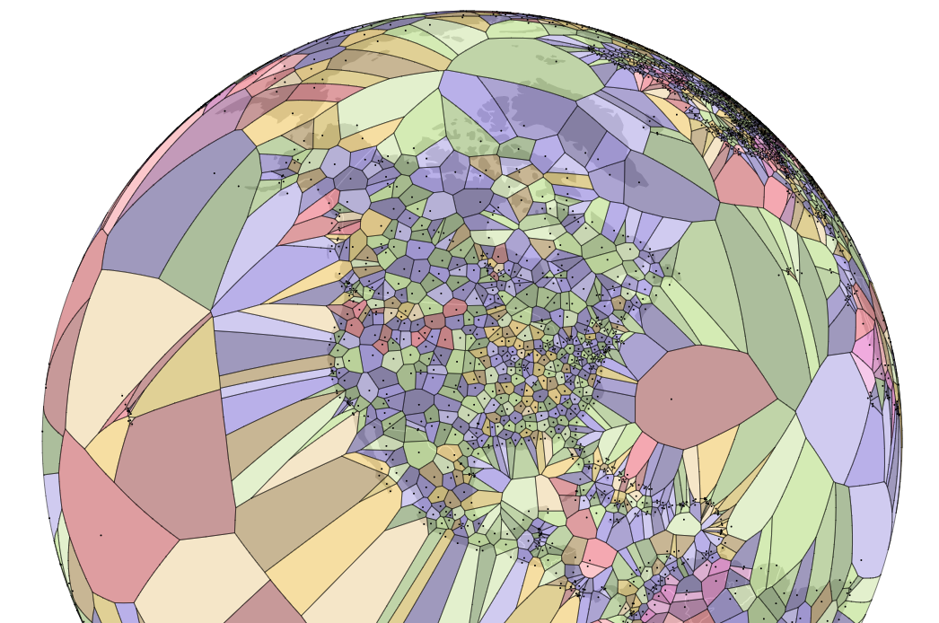
Try making your own Voronoi diagram here. Click to add sites, and see how the polygonal regions change shape.
Optimal Usage
Voronoi diagrams are advantageous in visualizing data that depends on spatial distribution. Its mapping depends on the properties of the plane and constraints in which the set of points exist (i.e. Euclidean, Manhattan, etc)
Origins and Applications
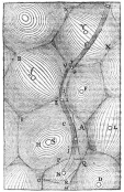
The use of Voronoi diagrams can be traced back to Descartes in 1644, in which he mapped the distribution of matter in the universe. He predicted that matter forms vortices centered at fixed stars (sites).
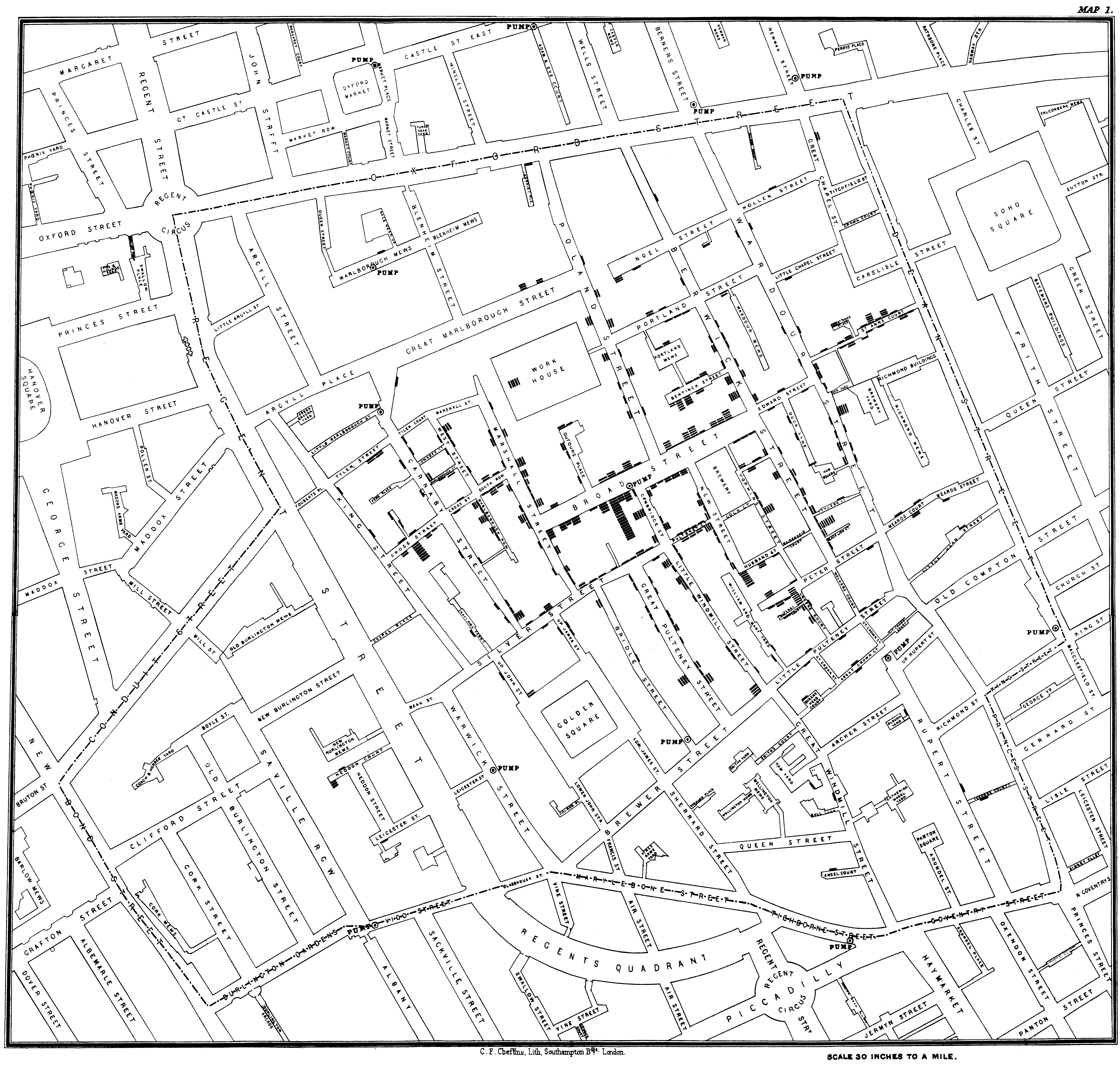
Another seminal use of Voronoi diagrams was demonstrated by Dr. John Snow, during the 1854 London cholera outbreak. Snow theorized that cholera was reproduced in the human body and was spread through contaminated water. London’s water supply system consisted of public wells where people could pump their own water and carry it home. The cholera outbreak in September 1854 centered around the Soho district. In order to investigate the relationship between water contamination and cholera death, Snow mapped all of the public wells in this area along with all of the known cholera deaths. As one can see in his map, the majority of cholera deaths centered around the Broad Street pump. He confirmed that there was an unknown bacterial sample in the water of the Broad Street pump, and had this pump removed; the cholera outbreak subsided shortly after.
Modern Applications
There are a broad range of applications for Voronoi Diagrams. Some examples include:
- Epidemeology (investigate origin and distribution of infectious diseases)
- Biology (model physical constraints of cell growth)
- Ecology (define growth patterns of plants and forests)
- User Interface (best hover state for a given location on screen)
- City Planning (nearest school for a student in given county)
- Robotic/Automatic Navigation (furthest distance from obstacles in a given route)
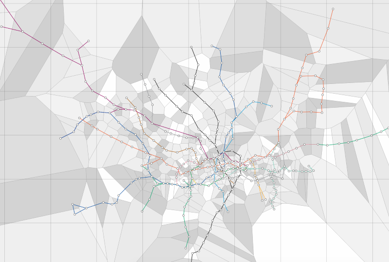
London Tube Map
What is the nearest tube station in any location in London (could be implemented for any major city public transit system)?
World Airport Map
What is the nearest airport a pilot can go to if an emergency landing is necessary?