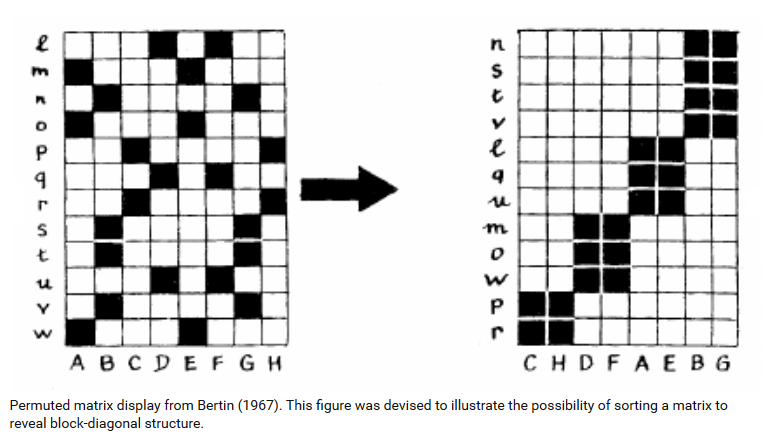
Published by Jacques Bertin 1967. (A nice blog post on Bertin is here.)
 from source
Shipshape Examples
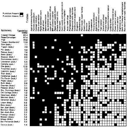
- "Scalogram display from Rondinelli (1980), based on Guttman (1950). Visualization of the settlements in the Bicol River Basin, Phillipines."
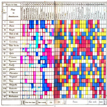
- "Shaded matrix display from Loua (1873). This was designed as a summary of 40 separate maps of Paris, showing the characteristics (national origin, professions, age, social classes, etc.) of 20 districts, using a color scale that ranged from white (low) through yellow and blue to red (high)."
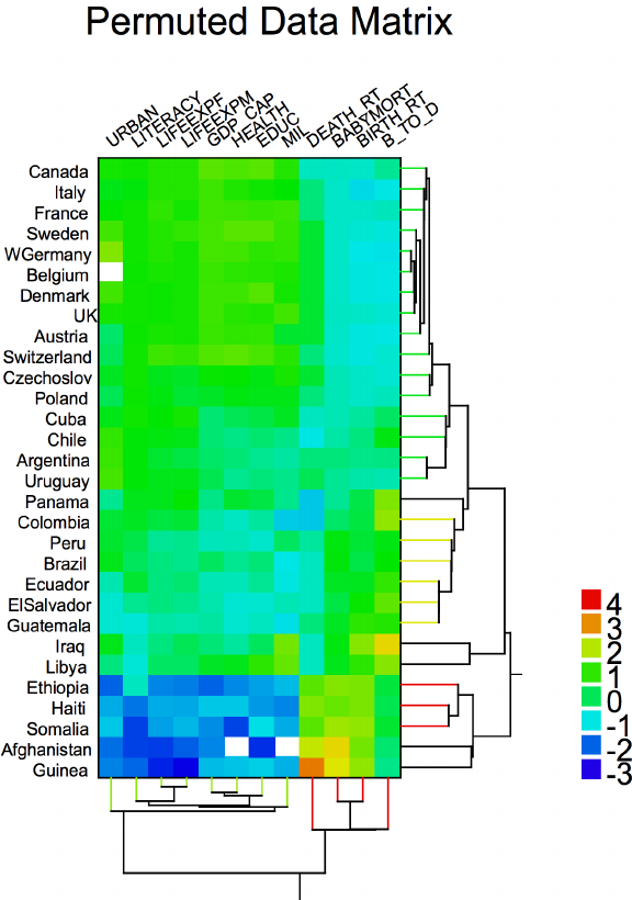
- "Cluster heat map from Wilkinson (1994).. Visualization of social statistics (urbanization, literacy, life expectancy for females, GDP, health expenditures, educational expenditures, military expenditures, death rate, infant mortality, birth rate, and ratio of birth to death rate) from a UN survey of world countries."
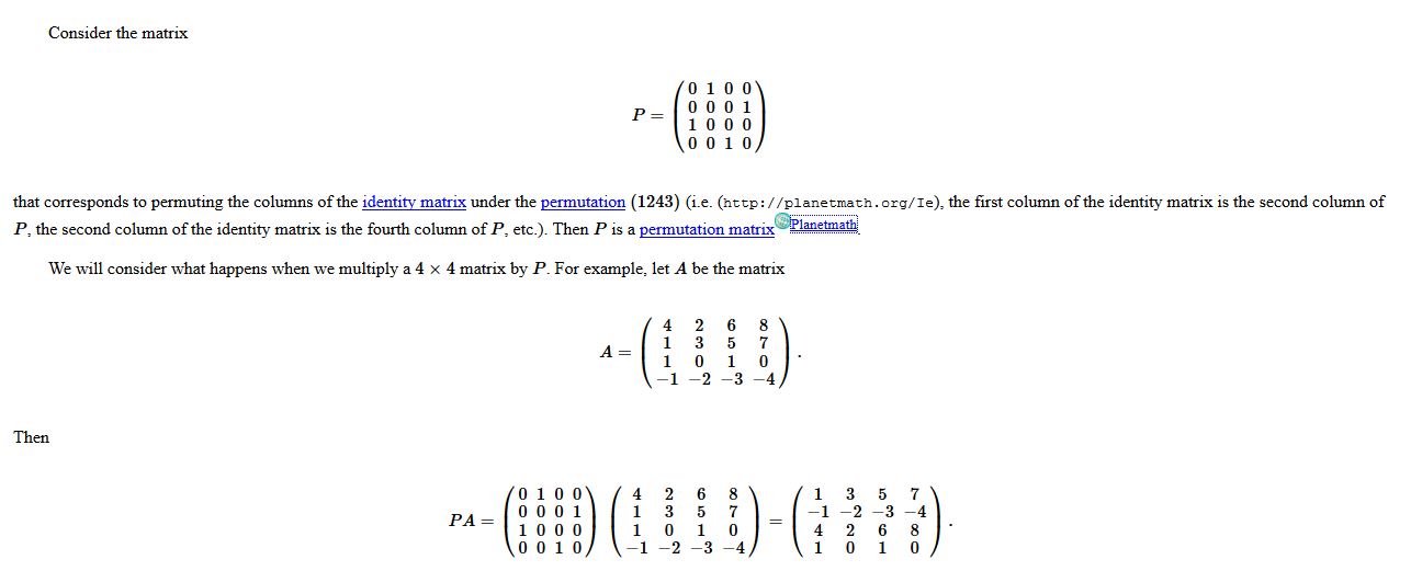
Classical Example (Perhaps it is just a name collision)
- Classical Permutation Matrix (e.g. below from PlanetMath)
Deficient Examples
Overall, I really couldn't find 'deficient examples' on the web.
Some notes on cases where this type of visualization may not work:
- In respect the theme of the permutation matrix, in some cases (for example time) where the row/column headings are shuffled continuously may not work well in certain instances when an axis continually changes so that it's difficult for the human eye to make a comparison.
- In some cases, for example this link, the visualization may be too dense so that nothing is gained at all from the visualization other to emphasize it's density.
- In addition to #2 above, in the case of sparse data, this overall visualization may not add insights other than emphasize it's sparsity.