This viz-type belongs to the same family as Sankey Diagrams and Radar Charts. The best use cases apply to multi-variate datasets, which require plotting individual data elements across many dimensions.
Basic Properties:
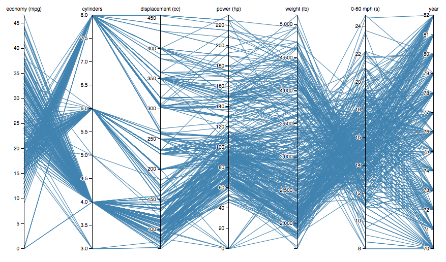
Each of the dimensions corresponds to a vertical axis and each data element is displayed as a series of connected points along the dimensions/axes.
To show a set of points in an n-dimensional space, a backdrop is drawn consisting of n parallel lines, typically vertical and equally spaced. A point in n-dimensional space is represented as a polyline with vertices on the parallel axes; the position of the vertex on the i-th axis corresponds to the i-th coordinate of the point.
The value of parallel coordinates is that certain geometrical properties in high dimensions transform into easily seen 2D patterns. For example, a set of points on a line in n-space transforms to a set of polylines in parallel coordinates all intersecting at n − 1 points.
Famous Example: Jason Davies' Plot of Multiple car marques and their specs
https://bl.ocks.org/jasondavies/raw/1341281/
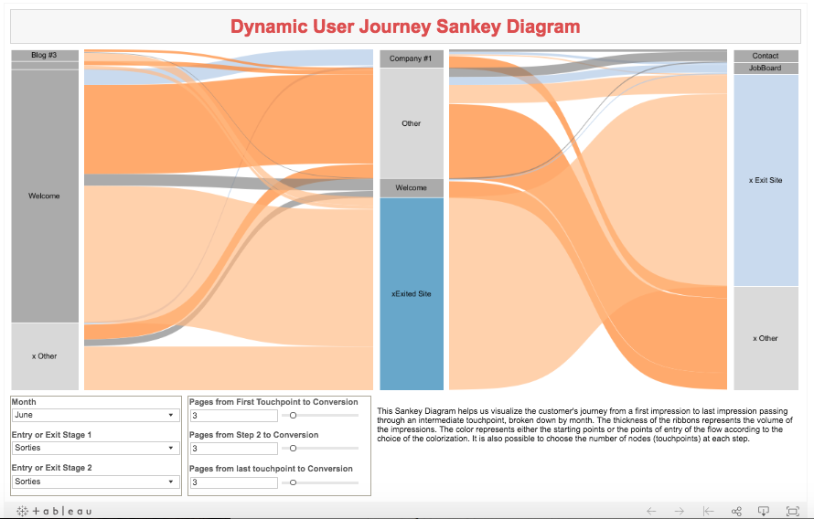
Analogue to the Parallel Coordinates Chart: Sankey Diagrams (Flow and Dimensionality)
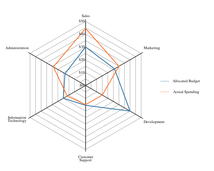
Radial (Spider) Chart depicting departmental budget expenditures
Dimensionality- each vertex of the spider web represents a department and the radial plot illustrates the departmental spend relative to adjacent departments in cartesian space.
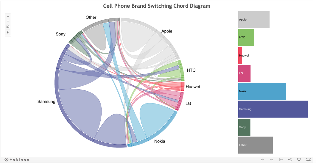
Analogue to Spider chart: The Chord Diagram (Flow and Dimensionality)
https://public.tableau.com/profile/christchild22#!/vizhome/PhoneChord_4/ChordDiagramBarChart
History
Philbert Maurice d'Ocagne introduced the design in 1885. The Parallel coordinates plot was re-popularized by Alfred Inselberg in 1959 and it gained currency in the 1970s as a way to visualize high-dimensional data. These charts are more often found in academic and scientific communities than in business and consumer data visualizations. This isn’t too surprising as parallel coordinate charts can become very dense and difficult to comprehend. Stephen Few has a typical reaction (PDF):
The first time that I saw a parallel coordinates visualization, I almost laughed out loud. My initial impression was "How absurd!" I couldn’t imagine how anyone could make sense of the dense clutter caused by hundreds of overlapping lines. This certainly isn’t a chart that you would present to the board of directors or place on your Web site for the general public. In fact, the strength of parallel coordinates isn’t in their ability to communicate some truth in the data to others, but rather in their ability to bring meaningful multivariate patterns and comparisons to light when used interactively for analysis.
Applications:
Collision avoidance algorithmsfor air traffic control (1987—3 USA patents)
Data mining (USA patent),
Computer vision (USA patent),
Optimization, process control,
More recently in intrusion detection and elsewhere.
Why Use Parallel Plots
help in showing many dimensions, limited only by horizontal space.
Like all good visualizations, parallel coordinates can also show both the forest and the tree. The big picture can be seen in the patterns of lines; individual lines can be highlighted to see detailed performance of specific data element
Benefits:
The order the axes are arranged in can impact the way how the reader understands the data. One reason for this is that the relationships between adjacent variables are easier to perceive, then for non-adjacent variables. So re-ordering the axes can help in discovering patterns or correlations across variables.
Downside:
The downside to Parallel Coordinates Plots, is that they can become over-cluttered and therefore, illegible when they’re very data-dense. The best way to remedy this problem is through interactivity and a technique known as “Brushing”. Brushing highlights a selected line or collection of lines while fading out all the others. This allows you to isolate sections of the plot you’re interested in while filtering out the noise.
Bad Examples: An Extreme Case
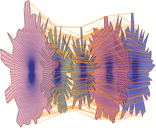
Problems with this:
- Meaningful patterns are obscured in the clutter of lines
- Lack of interactivity to guide the user