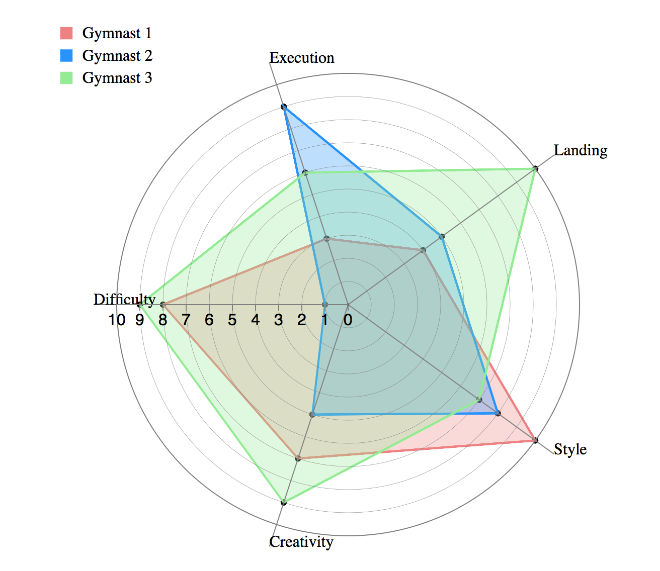
What
>> arranged radially as equi-angular spokes around a central point
>> the values for adjacent variables in a single series are connected by lines
>> the scale of any variable is represented as it's distance from the centre (making it effortless to find out the outliers)
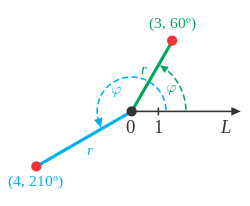
>> can be used with both Cartesian and polar co-ordinate systems
When
>> What variables are dominant for a given observation?
>> Which observations are most similar clusters of observations?
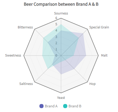
**The quantitative variables and their values represented on the various axes of a radar chart are distinct and unrelated.
>> categories on the x axis in the image above are simply named entities that have no intrinsic order
>> patterns our visual perception can really discern in a data set presented as a radar chart are similarity & extreme outliers
>> comparison between two/more entities based on various variables
Why
>> performance analysis
>> comparative analysis
>> designed to plot one or more series of values over multiple common quantitative variables by providing an axis for each variable
Weaknesses
>> they are limited to displaying a few variables at a time (practically speaking, no more than 20 ideally or (the web becomes overwhelming)
>> comparing values across access is cumbersome/error-prone and encouraged by this design although not always necessary
>> comparison in radar charts requires conscious thought to mentally project an arc of rotation to map a value from one axis onto another, something we are not particularly adept at
>> Solution? Grid-lines! but they bring in more issues -> they tend to add confusion around axis value, labels, reducing the readability
>> significant occlusion (overlap)
>> the only patterns our visual perception can discern: similarity & extreme outliers.
Better Alternatives
>> parallel coordinate charts
>> small multiples