What is it?
- A scatter plot is a two dimensional chart that uses points or “dots” to represent specific values.
- Scatter plots most commonly have two different values that are represented using the X and Y axis.
- This specific type of chart is best used to show the relationship between the X values and the Y values.
- Instead of simply representing X and Y as values, scatter plots effectively show the correlation between these two variables.
Usages:
- Scatter plots are beneficial to see the correlation between two variables, such as how X is affected when Y is increased.
- It is important to note that while scatter plots have been referred to as “disconnected line graphs”, they do not necessarily have to be linear.
- The example below represents a scatter plot of the average daily high temperatures by month using a non-linear graphing method.
- In some instances, the points on scatter plots may be completely random, showing little to no correlation at all.

- In addition to X and Y, the color, shape and size of the points on a scatter plot can also be seen as variables.
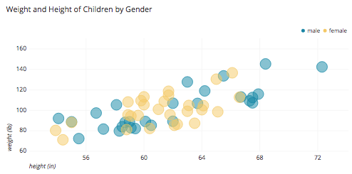
- The example below depicts a scatter plots of the height and weight of children by gender, with height and weight being the X and Y variables.
- The example also uses color as a variable to distinguish between male and female children.
Advantages:
- The many variables within scatter plots, such as color, shape and size, allow data to be categorized within the chart.
- Scatter plots are effective at giving an overview of the correlation between the X and Y variables.
- Within scatter plots, it is easy to find "outliers" as some points are made very obvious if they are not near the rest of the clusters.
- The example below demonstrates how scatter plots can be helpful for quickly finding deviances in data

Disadvantages:
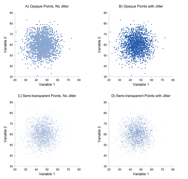
- If scatter plots contain too many points, they encounter "over plotting" problems.
- This occurs when points are placed over top of one another, making the chart difficult to interpret and read.
- However, as evidenced by the example below, transparency can be used as a solution to over plotting