Physical maps order elements by physical location, such as latitude and longitude points.
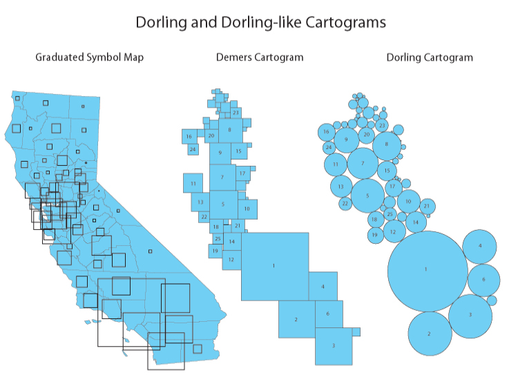
Cartogram types of maps distort reality to convey information. They resize and exaggerate any variable on an attribute value.
Density-equalizing cartograms are your traditional cartograms. In density-equalizing cartograms, map features bulge out a specific variable. Even though it distorts each feature, it remains connected during its creation.
As you can see, it’s easy to get information at only a glance.
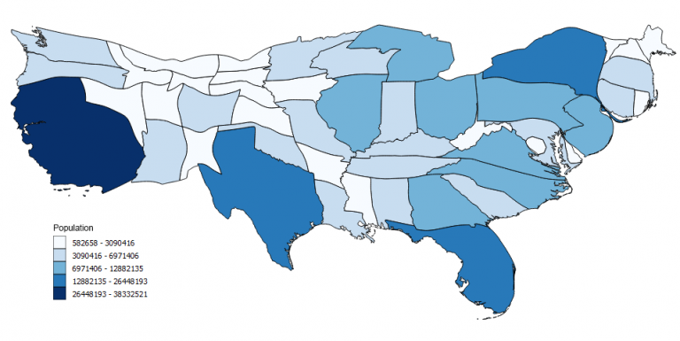
In this map, you can instantly see that a high proportion of population live in California and New York. While states like Montana and North Dakota are smaller proportions.
Disadvantages:
- Must be used with care because knowledge of the actual land area is essential for the reader to make sense of the distorted version shown in the cartogram.
Best Practice:
- Show the actual map before introducing the cartogram
The Dorling Cartogram uses shapes like circles and rectangles to depict area. These types of cartograms make it easy to recognize patterns.
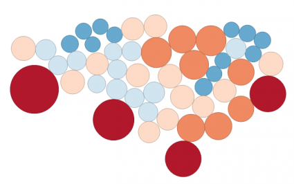
States are substituted with appropriately sized circles to represent clusters of population in the United States. However, the downfall for Dorling Cartograms is that it doesn’t maintain the shape. This means that readers may have difficulty understanding features in the map.
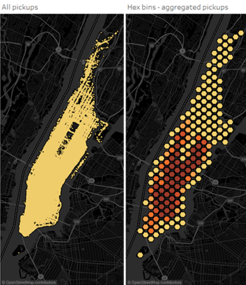
Hexagonal Bins
Hexagonal binning creates a grid in the map with regular hexagons.
Use:
- There are a lot of data points but you do not want to compromise on accuracy
- This map is great for understanding spatial distribution patterns of data
- Spatially aggregating the points into polygon regions to look at groups of data instead of the individual points
The image below shows the ares in which people hail taxis in NYC. On the left, it is difficult to make sense of patterns because there is not enough space between the individual point marks so that you can clearly see where one cluster of data starts and another ends.