A matrix is any two dimensional set of numbers, colors, intensities, sized dots or other glyphs. With ‘simple’ matrices, variations along a third or even fourth variable are often represented by color ranges and other types of visual variations between cells on the matrix. Half matrices are usually used for similarities or when two items are being compared against one another. Matrices are useful for illuminating variation and providing handy visual tools for decision-making. Pre-processing is minimal but can include selecting color ranges for heat maps, while mapping can range from simple selection of fonts to glyph designs on to interpolating numeric values for heat map colors.
‘Good Uses’
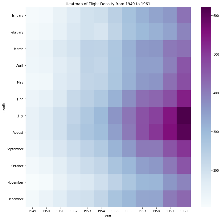
This matrix is a heatmap of flight-passenger density over time on a specific route, with the X axis representing years and the Y axis months. To achieve the ‘heat’ effect a third variable, monthly passenger totals, has been converted into colors, with greater numbers mapped along a range of values. The use of color values effectively enables a comparison of flight density by month and year. The 'raw' data of flight numbers have apparently been converted into the hex color value system.
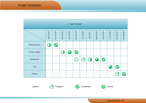
This project management matrix places months on the X axis and stages of business development on the Y axis. Glyphs represent non-numeric values of progress, enabling the viewer to quickly compare which business stage required the most investment of time. In terms of ‘pre-processing’, it’s likely that numerical ‘progress’ values have been assigned to the 360 degrees of the glyph circles, and then 'mapped' onto the circles, while a checkmark indicates completion.
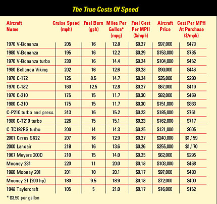
This useful matrix aimed at pilots of small aircraft looks at cost vs speed from a number of different perspectives. The X axis represents variables of speed, fuel efficiency, and cost. The Y axis lists different models of aircraft. As numbers fill the cells, there is only simple ‘mapping’ in terms of font selection and style. However, the raw data must have involved considerable calculation of aircraft performance. This matrix is sophisticated in that it offers pilots tools to find the ‘true’ cost of speed for their own flying distance and budget. Each pilot must decide what ‘works’ for them based on their own flying habits and needs.
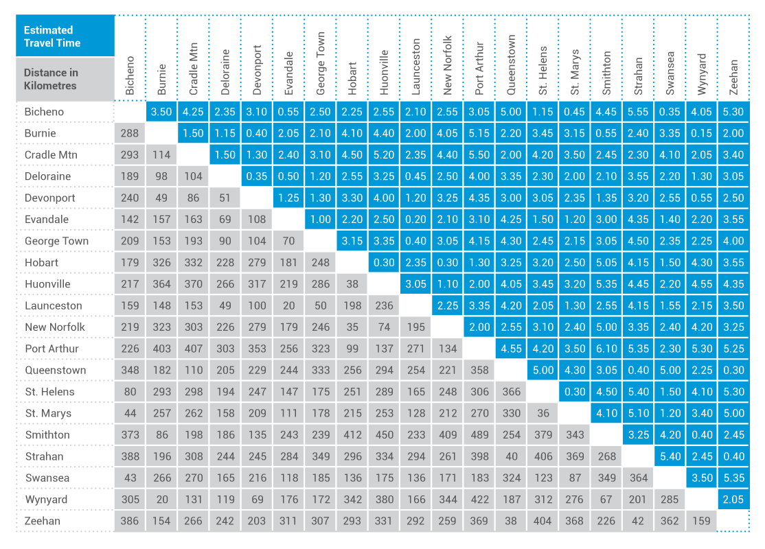
This ‘double’ half matrix for Tasmanian drive travel makes efficient use of available space by devoting one triangle to estimated travel (drive) time and one to distance. Pre-processing was unnecessary and mapping consists only of selecting column and row dimensions, cell colors and fonts.
‘Poor Uses’
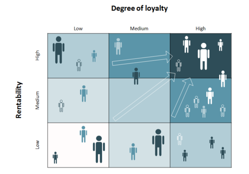
This ‘customer portfolio matrix’ is intended to ‘map the business customer portfolio within marketing research...and visualize the results using the matrix.’ The X axis represents loyalty and the Y profitability defined as ‘rentability.’ The matrix is deceptive and visually ‘noisy’ in three ways. Firstly, it appears to be a color-based heat map, but in fact there is no third variable represented by the lighter/darker shades. Secondly, randomly placed figures accomplish little purpose. Thirdly, arrows (and darker colors) serve no goal aside from visually stating the obvious: that business should increase profitability and customer loyalty.
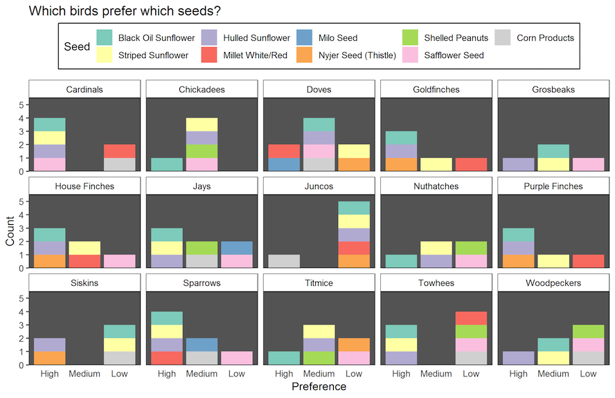
This confusing visualization of birds’ seed preference suffers from organizational and color overload, making it difficult to compare preferences and popularity of seed type. A simpler heat map with bird species on one axis and seed type on the other would have been more effective.
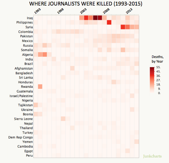
This matrix of journalist deaths assigns year to the X axis and country to the Y axis. The third variable, number of journalists killed, is represented in a red-based heat chart. I feel this matrix is misleading in that, it seems to indicate which country is most dangerous for journalists, but in fact only represents absolute fatality figures in a given year. Instead of absolute deaths, making the third variable a ratio of journalist fatalities/number of journalists in the country would likely change the heat map considerably and give this matrix more relevance.