In his blog series and video talk on encoding data through color, Robert Simmon makes a strong case for strategic uses of color in visualizations based on how humans perceive color– both technically and culturally. As we learn, this often means throwing away the rainbow scale in favor of a continuous or monochromatic palette, using content context to determine hue selection, and how spacial elements/proximity can be used effectively on atomic and universal visualizations.
Theory and Sequential Data
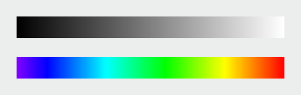
We often think of color within the context of the visible light spectrum–and that's correct--however, all colors in the spectrum are not equally distributed. To me, this is the most critical point in all of Simmon's discussion of basic color theory to support his subsequent points and principles.
Computer colors are linear and symmetrical, human color perception is non-linear and uneven
Because of the point above, we need to manipulate the liner shift in colors so we can perceive a consistent gradual change across the palette, even if it's not technically consistent. This is where the design side of visualizations come into play. (This is not much different than the concept of centered vs. optically centered). Our eyes work with our brains to play tricks on us, and we as designers need to adjust for that so as to not accidentally create optical illusions in visualizations which need to be universally understood.
Rule: basically, just don't use rainbow palettes visualizations with sequential data. Even if they are more pleasing to the eyes and provide contrast (which is often seen as a good thing in design)–our brains mess up the scale because we don't perceive the shift in colors correctly. The difference in 1–2 must be perceived the same as the difference in 9–10. Adjusting the lightness of a color will accomplish that both technically and to our eyes; however, adjusting the hue across the rainbow will not. Simmon's calls out the fact that the range of green is way larger than yellow, amongst other issues.
So what's the perfect palette?
Combine a linear, proportional change in lightness with a simultaneous change in hue and saturation
These palettes above are perfect for continuous/sequential data. Divergent or qualitative data (i.e., categorical) can benefit from contrasting sharp hue changes, which he gets into next.
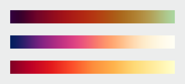
Divergent Data
If you need to visualize divergent data (data on either side of a breakpoint) like profit vs. loss or any positive vs. negative change, you want the positive change to have a sequential palette, and the negative change to have a different/contrasting sequential palette.
If this is done correctly, we can very quickly and simultaneously evaluate the magnitude of the positive change, the magnitude of the negative change, and the difference between the negative and positive changes together.
See the graphic below to illustrate this point.
Categorical Data
If we are visualizing categorical data, color is used to distinguish between values. Here, contrast is critical and therefore, changes in hue work very well.
But what about when the categorical data is also continuous within categories? This is where it get complicated. We are basically combining everything we've covered so far into a single graphic. Although, it's a little chaotic, I think the graphic below beautifully makes sense of this.
By clustering the similar categories together (if possible), we can perceive the difference and similarities in the contrast and the magnitude of the values within the categories.
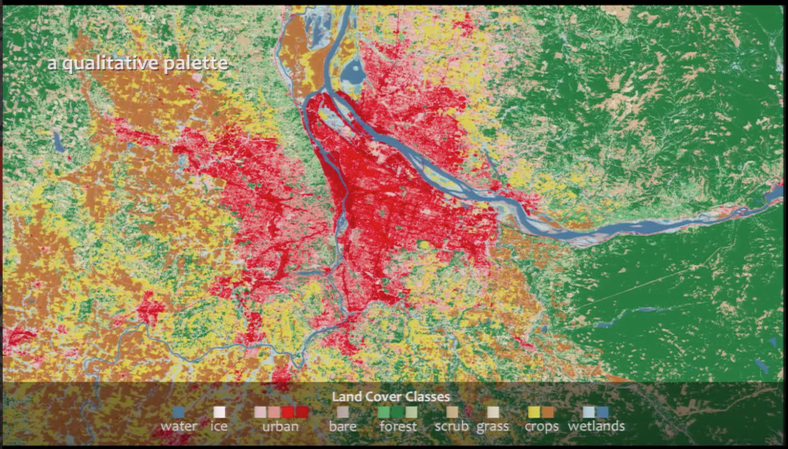
I was happy Simmon's addressed color blindness in his talk at this point, as I was waiting for him to address it. Basically, the takeaway here is that there are "safe" and not safe palettes to use for the population that does not have the ability to perceive the full color spectrum. When using color to convey meaning (i.e., coding data to color), this is extremely important.
Intuitive Colors
Now that we understand how to use color lightness and saturation with sequential, divergent, and categorical data, it's worth addressing what colors to pick. Time to meaningfully select your hue(s).
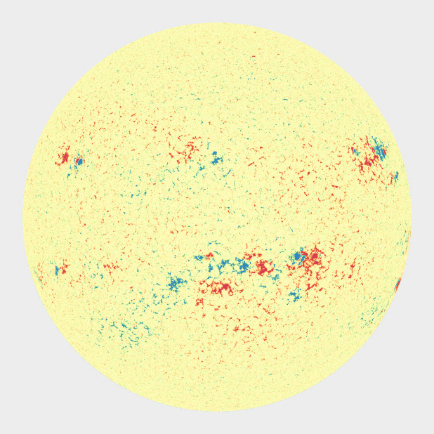
Red vs. blue vs. green? When should I choose what? This answer depends on the content and the culture. The visualization comparison below helps communicate this.
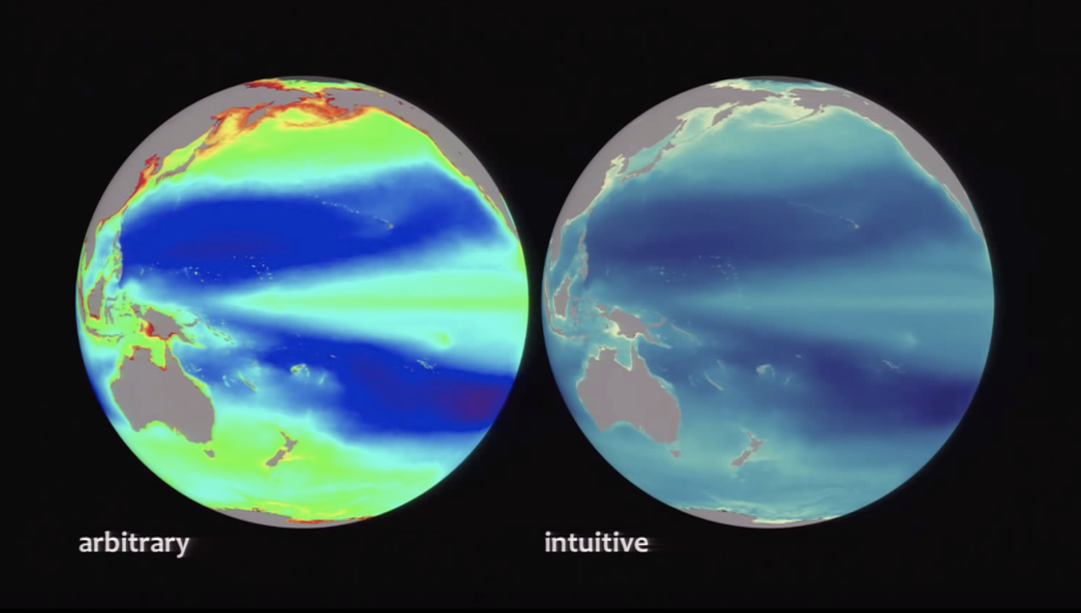
Crude interpretation: water is blue, land is green. That makes sense to everyone and should be used as such. Communicate the most meaning with the least amount of stuff (one of the 10 commandments of design i'm paraphrasing, obviously). By applying that principle here, we can pack more meaning into the usage of color. You know you're looking at water on a planet if there's a lot of blue on a sphere on a black background. Intuitive hue selection reduces cognitive load.
Additionally, we should think about color in different cultures. In western culture, red is passionate and fiery and maybe even evil, but in eastern cultures can be associated with happiness. All we can do about these cultural differences is be aware of them and your audience when producing visualizations.
Aesthetics and Conclusion
One of the more interesting points towards the end of Simmon's piece, is the role of aesthetics and judgement calls, especially within the meaning of color choice (hue). His example of the red palette to communicate heat makes sense on a global scale, but when zoomed into a specific area, the palette doesn't hold up. Interestingly, it's not that the palette doesn't hold up from a technical perspective (it absolutely does), but for a reason that's hard to explain, it seems to communicate the wrong information. It looks like the white is the hottest now, instead of the red– opposite of how we perceived the graphic on a global scale. And the funny thing is, I totally see it too even though I know it's not what the visualization is communicating. So he changes the color at the zoomed in perspective to adjust. That's the point. We need to use our judgement as designers to adjust and tweak, even when something is already technically correct.
It's a little frustrating that at the end of this rules based semi-technical guide for using color in visualization, it still ends like any designer would conclude–with ambiguity. Basically, all the previous rules generally hold up, but sometimes they don't. And were not really sure why these rules don't always hold up (which makes them principles and not laws) but it's up to you as a designer to use your judgement, even if that means breaking the principles.