Intro -> Image, Interpretation, and Interface -> Windows
Through the first section of her book, Drucker provides us with a crash course in the evolution of visual imagery as a legitimate form of communication design. She highlights how, from the beginning, design has been fighting to be taken seriously as a technical craft. An early example being mathematician René Thom not acknowledging visual or graphical information as a form of communicating knowledge.
Visual imagery has always been seen as artistic, subjective, emotional content because visual images "have no single identifiable code" and therefore cannot be counted as a standard form. Drucker concedes this as a legitimate critique, especially at a time when the "grammar" and "syntax" of visual language wasn't precise (it still isn't), defined, or well-understood; however, to me it's not much different than the origins of a written language (which does count as a form of communication, obviously).
If the audience doesn't understand the language something is written in, it doesn't do them any good unless they translate it. It's no different than looking at a visualization and having to learn the language of the objects encoded with data. Where this doesn't necessarily hold up is once you learn a language, you can then use that language across any type of content delivered in that language (if I learn English, I can expect to generally understand English in any context); whereas, with visual language, it's up to the individual designer to determine the language for their piece or collection and this may not be relevant outside their single visualization. Ultimately, this contributes to the critique that visual language should be discarded as not legitimate because is not standardized. But does this matter?
As we approach the 1950's "visual communication" and "graphical language" are commonplace. It seems like the pendulum has completely swung in the other direction as we get Swiss design comprised of rigid rules, step by step procedures and grid-adhering design to formalize and legitimize visual communication.
The idea that visual art might have a method that produced reliable and repeatable results gave it an air of authority.
Gestalt principles bind psychology to design, bringing logic to natural human perception, which also helps legitimize visual design. This is a big step forward in understanding the human factor. As Drucker states earlier in this section, "Design was uncoupled from the task of life drawing, but interestingly, not from the communication of affective experience."
Psychology is what separates visual language from art and brings with it enough logic to become a reliable and therefore legitimate form of communication. The best example of this are the principles of Proximity, Similarity, Continuity, Closure, and Connectedness. Once we understand how humans want to see patterns (subconsciously or consciously), we can design to take advantage of that natural visual language that we all share.
A melody's structure, not its specific notes, gave it a distinct formal identity, hence our ability to recognize it across different keys
Humans gravitate towards patterns so strongly, that we even do it with melody. We're one of the only species that can recognize sounds as patterns even when they are transposed to different keys.
Fast-forwarding to the digital revolution, we are introduced to computational processing to produce visual information, beginning with Cohen's AARON (see additional research below). Here we can discuss the codification of primitives used to generate these visualizations. While Cohen's primitives were based in the visual experiences of the natural world (like trees, faces, and landscapes), Marr's primitives were much different – they consisted of models of "vision and cognition in neurobiology and psychology." (opposite his peers in the graphic arts).
Marr was able to "define visual primitives in terms of the operations through which each property can be processed." This is important because it's was a major step forward in how our current computer processing tools and coding libraries approach data visualization. Different attributes could be isolated and defined independently. For example, setting color separate from orientation, size, or texture.
Towards the end of the section, we reflect on how visual knowledge is complex because it isn't defined globally and it relies on cultural training to interpret – this is especially difficult when we have different cultural experiences across the world. These conventions translate to semantic value in order to communicate effectively.
Now in the 21st century we have widely recognized and established design patterns. These patterns now begin to reduce cognitive load since we've seen them used over and over again – in visualizations, in UI for product design, in digital workflows, applications information hierarchy, etc. Visual design is closer to a traditional language now than ever before – but it's still not standardized (and never will be). To communicate effectively through visuals, we must understand and respect the cognitive burden we expect our audience to reasonable take on when consuming our visualizations.
Instead of syntax and grammar, we have principles of design. Therefore, bad design is like a misspelled word. It can be interpreted, but it requires a higher cognitive load.
Research - Harold Cohen's AARON
As mentioned above, Cohen's primitives were based on real world primitives - not just basic abstract shapes. To me, AARON provided a bridge between the old human-centric life drawing and the computer generated rigid visual language that contains strict syntax and grammar.
Cohen was a painter turned generative/computer/algorithmic artist. The combination of art and engineering is what many of us are drawn to in this field, both as designers and consumers. AARON dealt with the "internal aspects of human cognition" (Cohen)
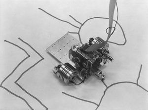
The number of primitives was limited, but very effective. It was able to distinguish between concepts like inside vs. outside, landscapes vs. human forms, etc. And because of that, it is able to produce an unlimited number of paintings based on this limited primitive knowledge.
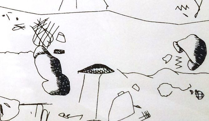
Overtime, AARON was taught new forms and basic symbol structures. It paints within the confines of its knowledge, making it "creative" in a sense. It matured over the years, eventually creating the Socrates' Garden piece below.

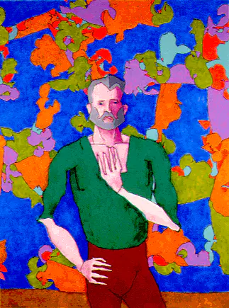
By the 1990s, AARON was able to use color.
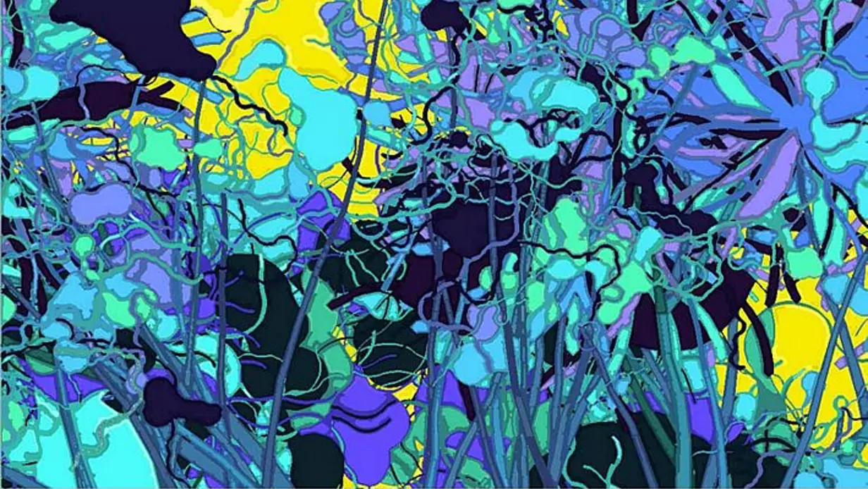
A computer-generated piece of art that evokes real human emotion is a thing of beauty, and is probably why we still argue about the difference (and importance) between art and design. I'm sure the mathematician Thom would point to this as the exact reason visual imagery cannot communicate effectively because it's too subjective. And while that's correct in this instance (because this is generating art, not visualizing data sets), AARON is an extremely important step in generative visual imagery that paved the way for modern visualizations while also retaining the emotional qualities of art as we crossed over to the digital frontier.
External Sources:
http://www.computerhistory.org/atchm/harold-cohen-and-aaron-a-40-year-collaboration/
https://newatlas.com/creative-ai-algorithmic-art-painting-fool-aaron/36106/