Healy's Look at Data: What Makes Bad Figures Bad
Sometimes we look at an infographic and we know it's bad right away. But why? Healy calls out the importance of distinguishing the badness of a figure into three separate but useful categories:
Aesthetic
Simplicity and the removal of superfluous aesthetic junk is generally the overall theme here (unsurprisingly, proper execution of general design principles yields better data figures), however it's worth pointing out that the art vs. design debate manifests itself in this section as well. Specifically, in regards to Holmes’s “Monstrous Costs” being more easily recalled than their "plainer alternatives"
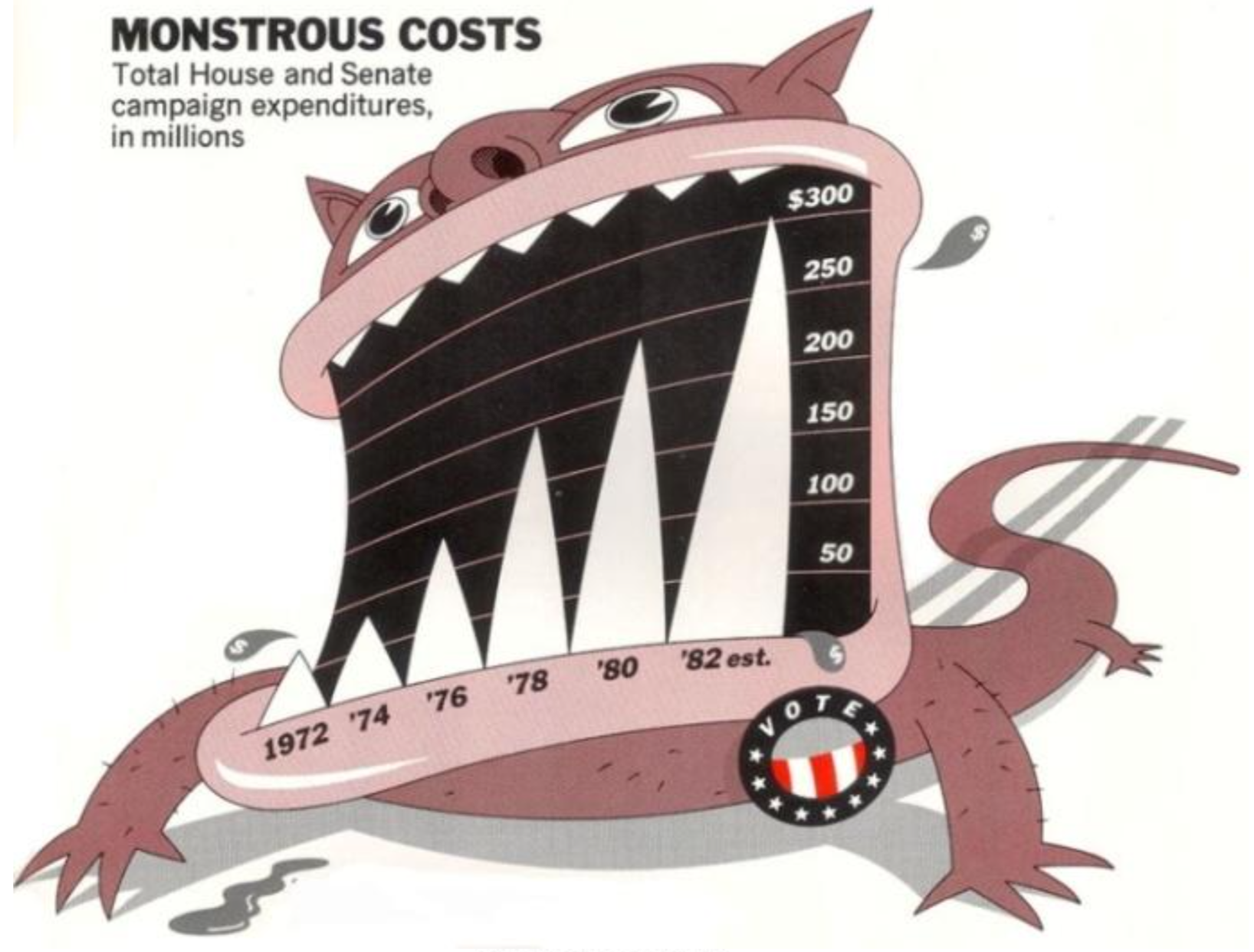
Q: Is it better to be memorable or to be practical? Art can be interpreted but design solves a problem – how does that paradigm relate to data visualization?
Substantive
The example of "bad data" here, centers around the infamous NYT graphic of respondents that think it's essential to live in a democracy. At first glance, the graphic is well-produced and aesthetically pleasing (I liked the acknowledgement that a graphic with good visual taste but bad data can often be more misleading since the professionalism of the aesthetic conveys a false sense of trustworthiness), however a deeper look reveals the misleading title and subsequent data points. It was not a decline in a yes/no question, but a slightly lower ranking on a 1-10 scale. The decline in "essentialness" is not nearly as severe as the graph is purposely trying to communicate.
Q: how far is too far for a publication when it comes to substance and impact? Is this wrong across the board for the NYT to do? Could you still make the argument that the perceived decline in "essentialness" of a democracy still represents a significant shift in our society worthy of being reported as the NYT did?
Perception
How easy is a chart to interpret? This topic lies between aesthetics and data as it's closely related to both. Basically, don't use 3-d charts when unnecessary.
Overall, I'm a fan of this structured way to breakdown visualizations. By categorizing and analyzing a chart according to its aesthetics, substance, and perception we can more effectively communicate just why a chart is effective or not.
Note: the rest of the article focuses on our perception of graphics as it relates to design principles. I chose not to focus on these standards as they aren't anything unique, and more of a lesson on general design best practices like Gestalt, color theory, perception, etc.
Bergstrom & West's Misleading axes on graphs
The last sentence in this piece captures the message of this article perfectly:
When you look at data graphics, you want to ask yourself whether the graph has been designed to tell a story that accurately reflects the underlying data, or whether it has been designed to tell a story more closely aligned with what the designer would like you to believe.
Unsurprisingly, I completely agree with this. Everytime I look at a chart I have this in mind – especially, when reading an article in a publication which often attempts to persuade the reader.
Throughout this piece, the authors call out examples of misleading graphs, most often related to the axis and their intervals. They argue that bar graphs should never start at zero since they are displaying categorical data of "absolute magnitude", whereas a line graph "emphasizes the change in the dependent variable as the independent variable changes" and may start at zero, except when it shouldn't...
I generally agree with this; however, I'm struggling with something here. The two examples given are the Average Number of Hours Worked bar chart and the Climate Change line chart. The bar chart is criticized for not starting at zero, and therefore overemphasizing the differences between countries' avg. hours worked. The line chart is criticized for starting at zero and therefore underemphasizing the differences in rising temperatures. However, it seems the changes are both significant, the only difference is the type of chart. Just like the difference in a few degrees in temperature is significant, the difference in 37 and 41 hours worked per week is more significant than it appears when the bar chart is corrected to start at zero.
Q: is it really always wrong for a bar chart to start at zero? What's an alternative to a bar chart for displaying significant change between categorical data when a small range needs to be emphasized?
Bergstrom & West's The Principle of Proportional Ink
Proportional Ink is a really interesting concept fairly specific to data visualization – one that I haven't heard much about in my studies so far (aside from Tufte's series of books, although not mentioned in his popular class).
The amount of ink used to indicate a value should be proportional to the value itself
This makes sense. If we perceive a larger area, we immediately think larger/more impactful absolute value regardless of is relation to other elements in the figure. Only if we evaluate and analyze after our initial perception does it become clear when proportional ink isn't used. And if it's not, we have to force ourselves to reconsider the graphic. As a data visualization student, that may not be too hard, but as a reader of a publication, it's deceiving.
The biggest impact of proportional ink, is the initial moment when the reader first sees your graphic. Difference in size is the easiest way for us to compare related items and judge value - more so than space, color, angle, etc. so the amount of ink must be proportional to the value.
Additionally, we read about 3d charts again in this article. My favorite quote regarding pie charts:
We cannot think of a situation in which the addition of a third dimension offers anything other than visual bullshit
As if we needed another reason to not use pie charts, it's clear how it does not follow the proportional ink principle.
This proportional ink concept is definitely logical, but one of the hardest to executive flawlessly once you break away from bar charts and line graphs. If I had to guess, it would be one of the most often broken rules of data visualization.
Q: Aside from only using bar charts that start at zero, and line charts without shaded areas (unless they also start at zero), what other chart types are acceptable that don't break the proportional ink principle?