Look At Data: What Makes Bad Figures Bad
Takeaways: The author argues that there are three varieties of bad graphs: Aesthetics, Substantive and Perceptual. On aesthetics, annoyingly there is evidence that highly embellished charts - like the Monstrous Costs example in the text - are often more easily recalled than their plainer alternatives (Bateman et al., 2010). Viewers do not find them more easily interpretable but they do seem to recall them more easily. As well, cues like labels and gridlines may often be an aid rather than an impediment to interpretation if it isn't strictly superfluous.
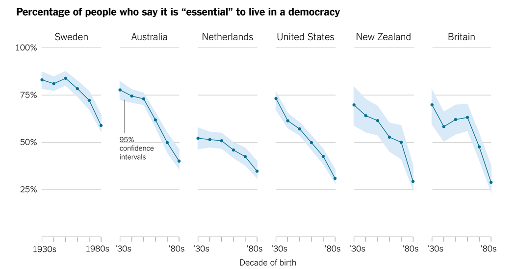
Bad graphs of the substantive variety refers to cherry-picking data so that it presents in a misleading way. A good example of cherry-picking data is the New York Times democracy graph that was also displayed in class. The designer of that graph specifically cherry picked the most extreme case of the results, making the insights seem more urgent and drastic than reality.
Bad graphs of the perceptual variety refer to perceiving graphs in a misconstrued way. Humans are bad at judging slopes on graphs, proximity (things that are spatially near to one another seem to be related), similarity (things that look alike seem to be related), connection (things that are tied to one another seem to be related), continuity (partially hidden objects are completed into familiar shapes), closure (incomplete shapes are perceived as complete), figure and ground (visual elements are taken to be either in the foreground or the background), common fate (elements sharing a direction of movement are perceived as a unit).
The Good: The author was quite humorous in this analysis.
The Bad: The entire text seemed dragged out and longer than it needed to be.
Misleading Axes On Graphs
Takeaways: Amongst other things, the author suggests bar charts should include zero but line graphs do not need to start at zero. However, a line graph should have something numerical on each axis. Categorical variables are not appropriate for display using a line graph. The author also argues that using logarithmic scales offer some challenges but one should never switch between a regular axis and a logarithmic one. This approach is very misleading.
The Good: The author's thesis was succinct and easy to grasp.
The Bad: There was nothing particularly bad about this piece. It seems like quite an obvious takeaway.
The Principle of Proportional Ink
Takeaways: According to the author, Proportional Ink is when the area of a shaded region should be directly proportional to the corresponding value.
On 3D charts: the author suggests that 3D charts violate the principle of proportional ink because the end-caps extend the effective visual length of each bar. Every bar has the same amount of ink used for its end-cap, irrespective of its size.
On pie charts: The author says that the message from pie charts comes at a considerable cost. Comparing values is more difficult with a pie chart than with a bar chart. Even when represented in two dimensions, pie charts are problematic because relative areas are difficult to assess visually in angular form.
For more on the pie chart debate, see Robert Kosara's research here.
On line charts: The author suggests that the principle of proportional ink does not apply because line charts don't use shaded volumes to indicate quantities; rather they use positions that indicate quantities. The amount of ink is not used to indicate the magnitude of a variable.
The Good: His thesis was succinct and easy to grasp.
The Bad: I found that the author did not provide enough visuals of good use cases. It would have been nice to visually compare and contrast good vs bad examples of proportional ink.
Questions for discussion:
- How do we remain as objective as possible while visualizing a topic that requires a narrowing of focus?
Sources:
http://socviz.co/lookatdata.html
https://callingbullshit.org/tools/tools_misleading_axes.html
https://callingbullshit.org/tools/tools_proportional_ink.html