Subtleties of Color
Robert Simmon discussed the importance of using color schemes in data visualizations and what makes the color scheme "perfect". Before choosing the color scheme, it's important to know the type of dataset that we want to translate. According to Simmon there are many types of data, each type can be visualized differently, the most common one is the "sequential data", the two other types of data Simmon mentioned are: divergent, and qualitative.
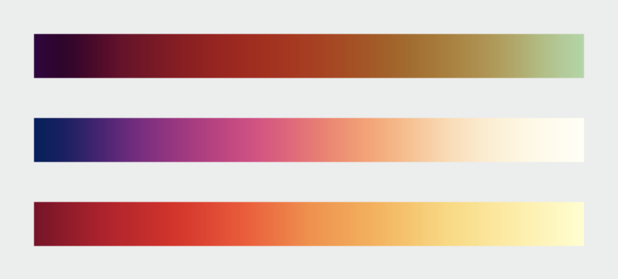
Sequential Data "is best represented by color palettes that vary evenly from light to dark, or dark to light, often with a simultaneous shift in hue and/or saturation."
example of color scheme:
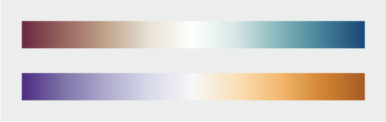
Divergent Data when data is unstable and changeable, it decreases or increases like stocks. The translated color scheme would look like the dataset, the color increases and it stops, then it decreases.
example of color scheme:
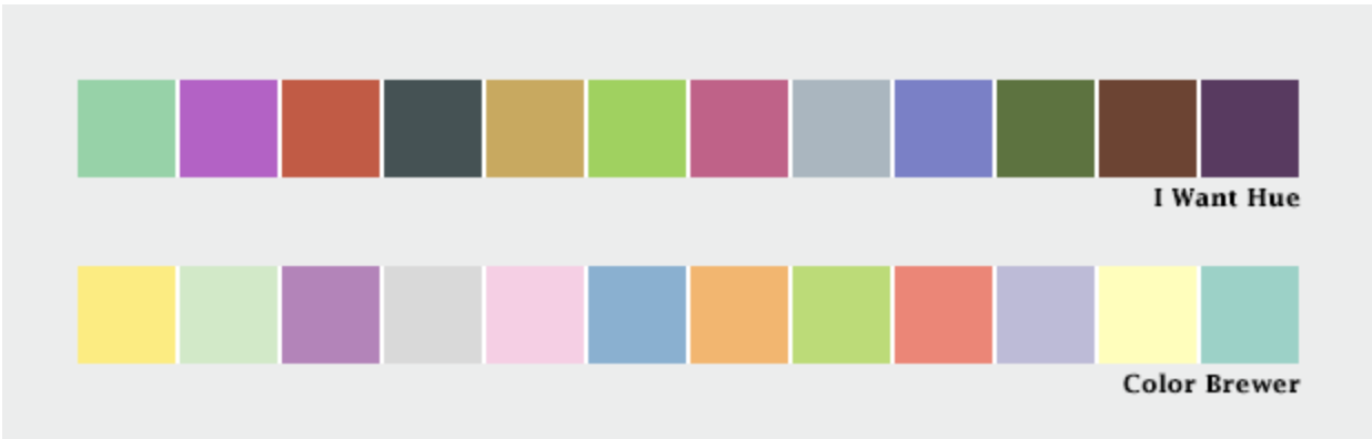
Qualitative (Categorical) Data
Unlike sequential and divergent data, qualitative data does not show relationships, instead it's used to show the distinction between certain areas/elements that are not necessarily related to each other.
example of color scheme:
Thoughts
I work with colors on daily basis, and because I am graphic designer, my ultimate goal is to create attractive pieces (most of the time). Yes, designers solve problems by using the perfect layout, grids, typefaces, visuals, colors...etc, but how many of us have ever thought about the "perfect color palette" as Simmon defined it?
In the graph (Iraq's bloody toll), he talked about the impact of the red color, and how the message changed when the designer played with the orientation, color and title. I think this is a good example of misleading data visualizations.
Psychology of colors, rainbow is happiness, red is danger, green is mint and green tea. Do you believe that colors really stimulate our brains?
Color Psychology
^ An interesting article about the psychology of colors.