I enjoyed this weeks reading a lot, because of it’s amazing overview over the different aspects of how to treat color in data visualizations. I liked how Robert Simmons manages to contextualize his experience with color but always makes his main points about design practice.
The most important learning for me in this reading is to be aware of consistent variance over a color palette or gradient and to try and implement it as best as possible.
There are two aspects of consistency in regards to color schemes or gradients:
- They should preserve the form of the data: Regardless of the position on the scale steps of equal quantity should be conceived as the same relationship (1 to 2 should express the same relationship as 101 to 102). This is what greyscale gradients do best
- They should avoid the perceptual errors induced when nearby areas of different color or lightness shift the way we perceive a color. (This is the so called simultaneous contrast). This is what gradients over color hue do best.
As Simmons lays it out it made perfect sense, that a good color gradient for data visualization would then combine both and the image of the spiral really stuck with me, because my expectation had been, that a “perfect” perceptual gradient was more a straight line through the color space.
“Combine a linear, proportional change in lightness with a simultaneous change in hue and saturation. Colin Ware describes this type of palette as “a kind of spiral in color space that cycles through a variety of hues while continuously increasing in lightness” (Information Visualization: Perception for Design, Second Edition).”

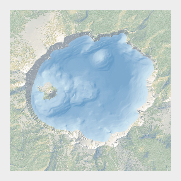
Another point where I agree with Simmons is his advocacy for subtle and muted colors. He showed very well and cautiously designed examples and my absolute favorite was this one:

This very modest use of color allows to even add other layers of information if needed on top of it. The Switzerland mobility maps are also amazing in this respect.
My questions are:
- Robert Simmons writes that the perfect color tool doesn’t yet exist. That was in 2013. He announced he would be developing one. Did you find out if he did or if there is a new, more complete color tool?
- In the text there is a warning that figure ground relations can change the way a visualization is read. When designing a color scheme you might sometimes loose sensibility of such subtleties, because you have your work much longer in front of than your audience will. What are your strategies to look at your own work “like it was the first time”?
- Good visualization choices also profit form good contextual design choices. Which of these contextual design choices are specific to data visualization and can/should be applied as a rule of thumb? Or to put it another way: Should a data visualization establish its own context or should it subordinate to its context?
There are so many references in this reading, that I decided to make a small collection of those, that I might want come back to: