I’d like to begin writing this essay by saying how much I love Graphesis by Joanna Drucker. I began reading this book over the summer and I have remained impressed by Drucker’s cinematic ability to describe this diverse (if not meandering) history of the development of data visualization as a field with depth, beauty, and impressively with brevity!
In the introductory chapter of “Image, Interpretation, and Interface”, Drucker outlines her plans to unveil the history of data visualization. She has a remarkable talent for connecting the dots to the variety of disciplines that have influenced the field we are studying today. We are introduced to the astronomers, economists, psychologists, policy makers, technologists and designers who were innovators in their own fields that inadvertently contributed to the development of this field. Drucker also smartly isolates data visualization as a specialty that exists outside of graphic design and the fine art canons in it’s own right. Drucker outlines the foundation of what she calls the eight visual approaches to knowledge production. They are:
- Knowledge and/as vision
- Language of form
- Dynamics of form/universal principles of design
- Gestalt principles and tendencies
- Basic variables
- Understanding graphics & editing
- Processing images
- Typology of graphic forms
I think it goes without saying that the introduction of ‘empathy’ to fields that study human beings and human behavior was really pivotal in terms of the ethical imperative to move towards diversity and inclusivity in fields like anthropology or psychology. Practitioners like Wilhem Worringer and Ernst Cassirer were finally in a place where they needed to take into account, all of the different ways human beings experience the world and therefore, interpret the world. In the reading, I found myself most drawn to the discussion of the theoretical study of graphic elements named the Gestalt Principles, because I explore the tension between reality, perception and the (meta)physical body in much of my own art work. I found my own curiosities to be aligned with the overall concern with how to make links between “visual knowledge, psychology, and the human experience.” I took an experimental film class several years ago where we were asked to create a piece that was a study on the ontology of the camera to test the limits of its ability to replicate the functions of the human eye. Human beings are often rendered temporarily blind until they readjust to suddenly lighted space, so I wanted to test the camera’s ability to recover from dark to instant light. I wound up making Double Darkness; a reflection of how I may personally be perceived based on my race and gender expression by using bright flashes of light in a dark space. The flashing patterns that roll along the screen add a layer of difficulty to detecting what you think you see.
The ideas behind the development of the Gestalt Principles emerged from the study of psychology in the 1930’s, and it is based on the observation that human beings seem hardwired to group things together or detect patterns in similar ways. This hardwiring is a survival tool whose use is impacted by the region where one lives, their beliefs about the world around them, and the affordances of life that may be available to them at any given time. While this realization had shown a light on the inherent problems of Western exceptionalism the fields of study in the 1930’s, the early works that are referenced in Chapter 1 also reflect the roots of Orientalism which continues to plague the social sciences.
That being said, there were a couple images that stood out to me. Anton Stankowski’s Visual Presentation of Invisible Processes focuses on skeletons, canal systems, networks and grids, and the fine structure of matter which can only be seen under a microscope.
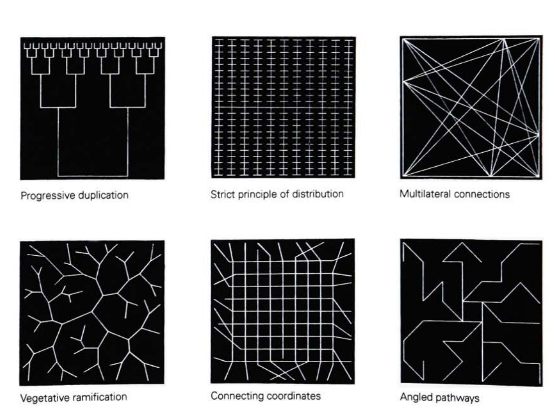
These images represent organizations in nature which can not be seen with the naked eye. These examples are linocuts which exemplify how a square surface can be divided into internal patterns, and these patterns can be compared to nature, used to create communication systems, and the function of a technological apparatus.
Rudolph Arnheim published Art and Visual Perception in 1954, and in it he wrote extensive chapters on Balance, Shape, Form, Growth, Space, Light, Color, Movement, Dynamics, and Expression. In the chapter on “Shape”, Arnheim discussed that magic that can happen when there is what he calls ‘the discrepancy of complex meaning and simple form’. For example, in the images below, in the discussion on memory traces, Arnheim displays the results of a study where a group of participants are exposed to the drawing (Fig. 38).
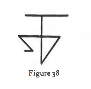
for “a split second”, and are asked to “draw with much reflection but as accurately as possible what they have seen.” The variety of the reactions on display are considered typical results, due to individual differences, and distance from the image. There are all simplifications of the image that lead to a large diversity of solutions and alternate patterns.
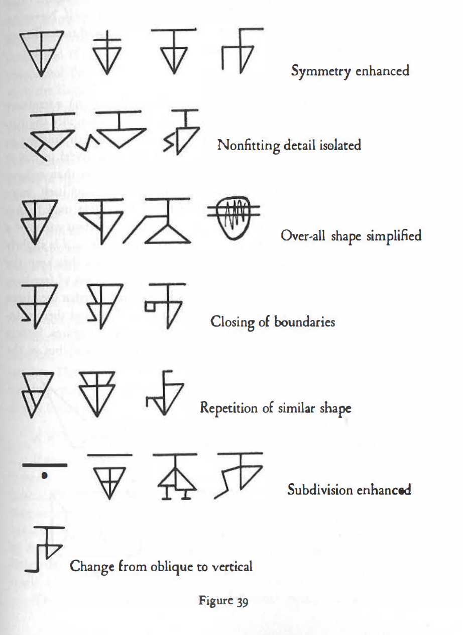
This small subsection of the introductory chapter is a great example of why it’s so important to take individual and cultural experiences into consideration when we interpret data visually for large audiences. The assumption that there is a “universal experience” is false, because what people see, remember, and believe is always relative.