From my point of view (based on the fact that I do not really have any knowledge or experience of the data), one reason that penetrates this text is that “good data visualization methods” should be 1) as complex as necessary, and 2) at the same time, maximize data readability.
This text helps us understand the basics behind “what is data visualization” by visually providing both good and bad examples of data visualization.
As an MPS student, I thought that the bad example of data visualization presented by the images was not a satisfactory design when viewed only from a “design viewpoint” without prior knowledge of data. This made me feel that the standards of visualization are not much different. What I found especially impressive was that it gives a warning about trying unnecessary visual effects.
But what I disagree with is that the junk-free plot in (1.11) makes it difficult to see the detailed trend of the category. The colors are clearly displayed for each category which allows the graph to be understood sufficiently in each detailed category.
I thought that perhaps there might be individual differences in readability when viewing data charts depending on the viewer (for example, a graphic designer may read the charts differently than someone without graphic knowledge).
This text also places an important focus on the relativity of visual perception.
I have found that the visualization of data is the best purpose for conveying
information. This should be considered more importantly and applied appropriately when choosing colors or shapes. In that context, I strongly agree with the text. When using the pop-out method to visualize the data, it is necessary to use modal forms and colors.
The question is whether there are instances where additional dimension (3D) is used as a good way to visualize data, and what principles should be followed if 3D is to be used correctly in a data bar chart.
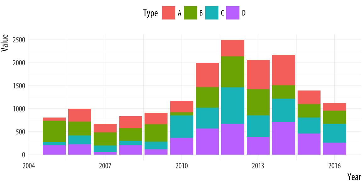
This text deals with more segmented content than the first text. Subtle choices, such as the range of axes in a bar chart or line graph, can have a major impact on data delivery. The text also says that it is necessary to remove elements that cause visual disturbances when they are added without any purpose.
What impressed me the most was that it is also the case that the line graph should not contain zeros. I realized that there are reasons why a line graph should and should not contain 0, but there are more reasons on why 0 should not be contained.
After looking at the table below, I agree that all line graphs must have numerical values on each axis.
And moreover, the point of feeling is that there should be no unnecessary logos or drawings on the graph, as there is no need for anything other than text. As mentioned above, elements added simply for a visual appeal without any purpose end up causing visual confusion. The choice of font and insertion of drawings seem to have a crayon-like vibe which feels like an ambitious attempt at design. As a designer, I can fully understand the intent of the producer, but I think the difference between design and data visualization comes from here. More important than design is the transfer of information. Therefore, the graph seems to have a problem on the graphing board as well as on the axis.
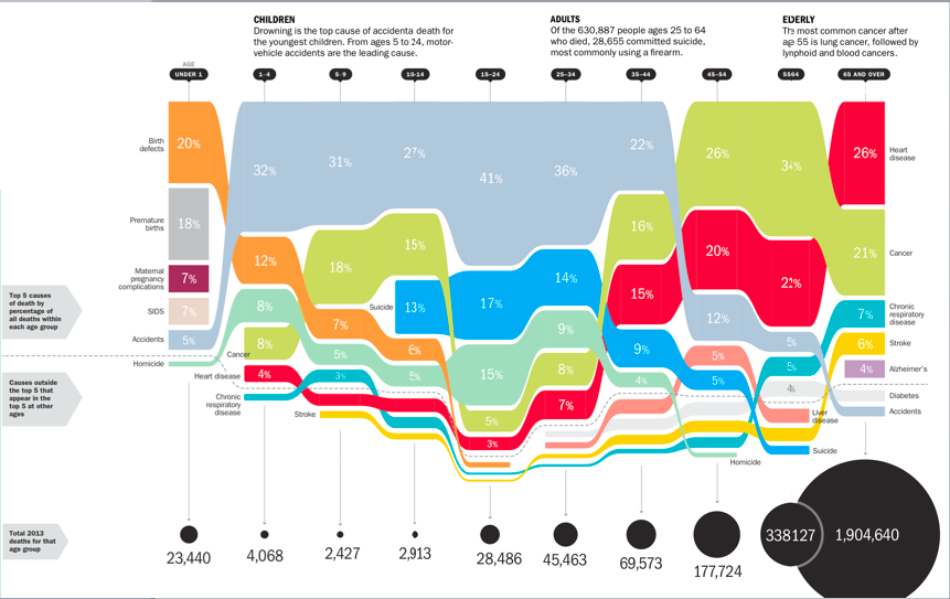
What I disagree with is that the person who produced the graph on the Florida Gunshot case is not deceiving those who see it. I think that graphs that have a primary purpose of delivering objective data should not reflect the individual's values, even if it was done under good intentions. I think that maybe it is getting closer to social artwork.
Question. I would like to know if there is a way to project the intent of the producer while conveying the data objectively and accurately through the graph. If the data is being conveyed correctly without any exaggeration and illusion, it may not be a bad idea to project the producer's good intentions.
3. The Principle of Proportional Ink
This text introduces the principle of proportional ink. This principle is the basic rule for designing data graphs, but can be easily violated in graphs that represent data.
This text also describes the line graphs discussed in the previous article. Unlike bar graphs, line graphs indicate that there is no need to include zeros in the dependent variable axis. The “filled” line chart uses area to represent the data values and states that there must be an axis with zeros.
What I was interested in was the part on bubble charts. I first came across this graph in the form of a bubble chart through this article. But here and in recent years, the bubble chart has been introduced by Hans. The feature of the bubble chart is that only the vertical and horizontal positions where the bubble is placed on the chart enable accurate comparison. The size and color of the bubble are nothing more than recognizing its approximate properties.
This text also introduces a donut graph that is rarely used, as well as a common data design method, and shows a bad example of data visualization. The donut graph can exaggerate or shrink the differences between categories depending on the design method, which therefore makes it easy to break the principle of proportional ink.
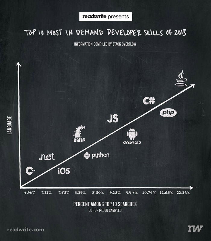
What confused me about the graph below is how much information can be visualized and displayed graphically on a limited page at a time. I learned about this type of graph through this article. I thought it was rather complicated and had too many elements to represent. So my curiosity lead me to another question.
Question. Is there a reasonable number of items that can be used to efficiently display information in a graphically designed graph?
And I had a question about an interesting point in the first article as to whether the 3D effect could be used for data graphics in the right way, and I found the answer in this text. 3D bar graphs actually violate the principle of proportionality in many ways, making it difficult to actually interpret the graph. The author of this text also mentions that he cannot understand why it is still in use when the trend of 3D technology has passed. It sounds like the author is saying that “When you visualize the data, do not use 3D effects anymore.” I agree with this view.