DVIA WEEK 2 READING 1 (R1)
Healy’s Look at What makes Data Bad:
“Good taste might make things look better, but what we really need is to make better use of the data we have, or get new information and plot that instead. In these cases, even with good aesthetic qualities and good data, the graph will be confusing or misleading because of how people perceive and process what they are looking at. It is important to understand that these elements, while often found together, are distinct from one another.”
In this reading, I found that this quote resonated most deeply with me. The thesis here is that apart from canonical principles, “good” data visualization is rooted in a deep empathy for the audience, and more specifically, producing clarity where there is complexity or illumination where information is shrouded.
The Power of Perception:
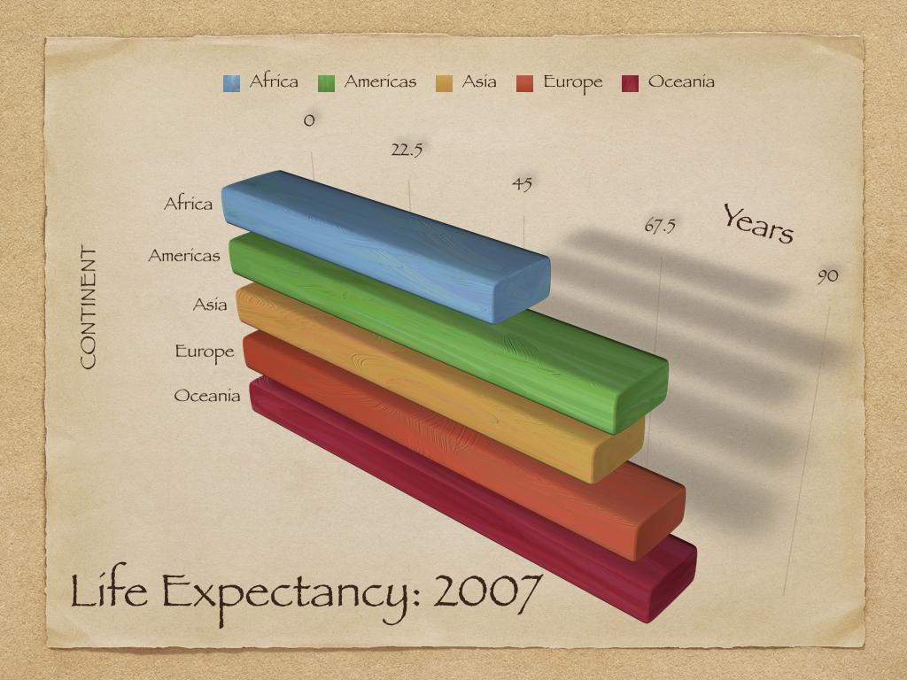
Because this is a visual medium, we must take great care to understand how optics, qualia and and "chart junk" can impact how the final result is received. I appreciated using the example of the “3d chart” here to highlight the practice of adding “visual candy” in the face of a dearth of information. Less is really more (to use another hackneyed saying).
Bad Design, Ugly Results:
To use another cliche- good data design is about applying Lex Parsimonae as generously as possible- a paradox captured well in Edward Tuft’s quote:
“ Graphical excellence is the well-designed presentation of interesting data—a matter of substance, of statistics, and of design … [It] consists of complex ideas communicated with clarity, precision, and efficiency. … [It] is that which gives to the viewer the greatest number of ideas in the shortest time with the least ink in the smallest space … [It] is nearly always multivariate … And graphical excellence requires telling the truth about the data. (Tufte, 1983, p. 51).”
Handsome Design, bad data visualization:
But bad design is even more deceptive. In the example of the NYT's article on the decline of democracy, the reader is guided to towards the (erroneous) conclusion that democracy was in precipitous decline in the western world. Several errors were made (with the ranges of the x-axis). An interesting point for me here is that the influence of authoritative sources can maximize the effect of accepting incorrect conclusions. He points out that the story gained outsized virality and its was accuracy taken for granted (it being published in the "Paper of Record" and also, in turn, sourced from an academic study). I imagine that this would not have had the same positive/ uncritical reception coming from less respected source(s).
Misleading Axes on Graphs: