This chapter focuses on the histories and analytic principals for nine traditional lineages in visualization and information graphics as follows: timekeeping, space-making, administration and record-keeping, knowledge trees, knowledge generators, dynamic systems, visualizing uncertainty and interpretive cartography, and humanistic methods.
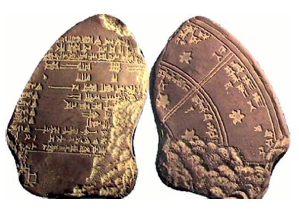
1. Timekeeping – some of the earliest calendars organized around 360 days are tracked back to the ancient Mesopotamian region around 2100 BCE. These diagrammatic charts “derive from observations of the heavens.” The figure below presented by Druckner (p. 72) is an image of early timekeeping visualizations.
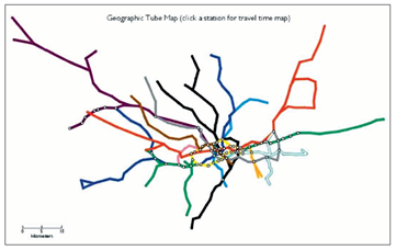
2. Space-Making – visualizations which “create spatial representations” perhaps “without referencing a pre-existing ground.” Druckner (p. 77) asks, “What is the figure of space that emerges from data, observation, experience, human record, when no a priori coordinates are used to structure that representation in advance?” This section explores the history of maps. One example from 1981 presented by Druckner (p. 83) is the London Underground map created by Tom Carden, as seen below.
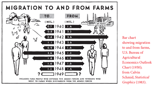
3. Administration and Record-Keeping – As indicated in the title, these visulazations arise for record keeping and administration. Druckner (p. 85) writes, “But as with mathematical forms, the graphical structures that support proto-writing participate in an essential stage of the development of graphical principles.” One visualization presented by Druckner (p. 87) shows the migration to and from farms as presented by the U.S. Bureau of Agricultural Economics in 1950, seen below.
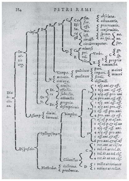
4. Trees of Knowledge – These visualizations are static, but traditionally represent “hierarchy, derivation, consanguity, proximity, and distance.” Ramus, as seen below and referenced by Druckner (p.98) is counted among the first to change the tree orientation in visualizations.
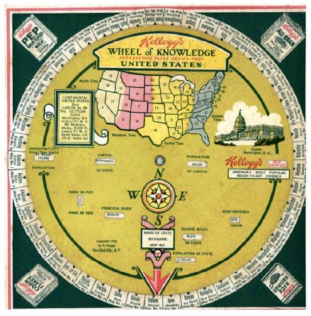
5. Knowledge Generators - These visualizations forms that support “combinatoric calculation (p. 105)” in that the “diagrammatic form produces multiple outcomes through the reading of variables against each other even though no part literally moves. (p. 107)” A landmark essay written in 1987 by Herbert Simon and Jill Larkin argue that “a diagram is fundamentally computational, and that the graphical distribution of elements in spatial relation to each other supported perceptual inferences that could not be properly structured in linear expressions, whether these were linguistic or mathematical. (p. 106)” Druckner (p. 105) references the below Kellogg’s Company Wheel of Knowledge.
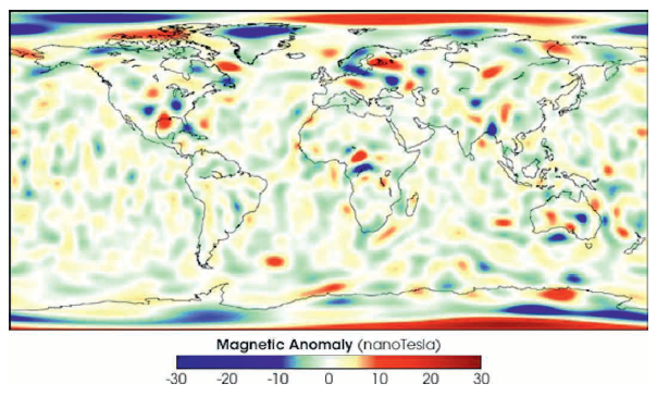
6. Dynamic Systems – Visualization which “make use of graphical organizations, operations, and relations to analyze or model events or processes. (p. 116)” Druckner explores visualizations by the Aristotelians for charts on earth, air, fire, and water. And, nearly ends the discussion with a discussion on magnetic activity visualization produced by NASA, as seen below (p. 123).
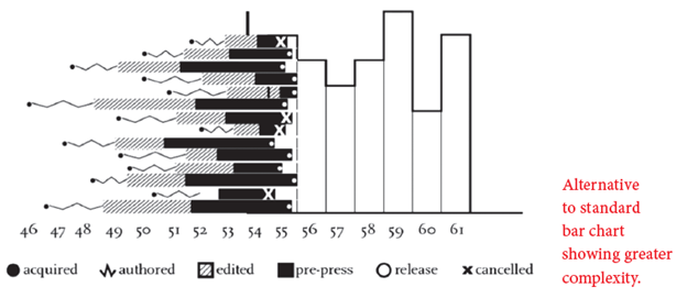
7. Visualizing Uncertainty and Interpretive Cartography – This section explores the ideas that “the fundamental parameters of chart production, are already interpreted expressions (p.129).” Druckner references the below image “Alternative to standard bar chart showing greater complexity” (p.127).
8. Humanistic Methods – are centered “in the experiential, subjective conditions of interpretation. (p. 130)” Druckner states, “The standard elements of graphic display for statistical information are simple and limited: scale divisions, coordinate lines, scale figures, circles, rectangles, curves, bars (or columns or percentages of pie charts or other forms) and labels (numbers and terms), signs of movement, flow, or state change (arrows, vectors, paths). The ordering and arrangement of elements within a chart create another level of information, relational information. Relational information is graphically produced; the ordering of elements by size, by color, by alphabetical order, by texture, shape, or other feature happens in graphical space. The resulting arrangement has a semantic value produced by features of proximity, grouping, orientation, apparent movement, and other graphical effects. (p. 131)”
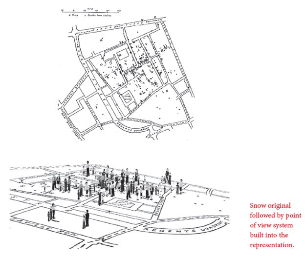
9. Visualizing Interpretation – Druckner (p. 135) references four basic levels of interpretation or knowledge production: (1) modeling phenomenological experience, (2) modeling relations among humanities, (3) modeling the representations of temporality, and (4) modeling the interpretation of any of the former. Druckner (p. 137) presents the final visualization by Snow on the deaths from cholera which she juxtaposes with a point of view system built into Snow’s representation, as seen below.