This work examines the importance of visualizing data. A visualizing exercise by Jan Vanhove (2016) shows 16 graphs of data.
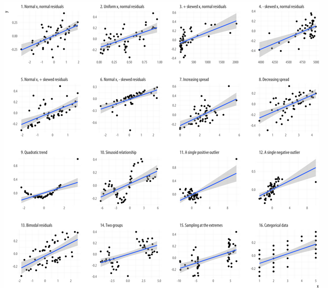
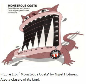
The graphs quickly show the viewer details about the data such as skew, outliers, trends, residuals, and categories. The same data represented in a table may not as easily tell the same story. One note to remember is to study the graph scale, tho, to ensure proper understanding. The author argues that what makes a visualization bad is “tacky, tasteless, or a hodgepodge of ugly or inconsistent design choices.” They present Figure 1.4 as evidence of their argument stating, “the bars are hard to read and compare. It needlessly duplicates labels and makes pointless use of three-dimensional effects, drop shadows, and other unnecessary design features.” The author then introduces Edward R. Tufte as an example of tasteful visualization. The author notes Tufte’s book The Visual Display of Quantitative Information (1983) as a classic with sequels (Tufte, 1990, 1997). Tufte cites Charles Joseph Minard’s famous visualization of Napoleon’s march on Moscow as that it “may well be the best statistical graphic ever drawn.” The author then discusses what makes a graphic memorable. He elaborates that it’s not the pen-to-ink ratio, the simplify-simplify paradigm, etc. He argues that visualizations need to be distinctive to be memorable.
Some other categories discussed by the author of bad visualizations include bad data and bad perception. The first property, “bad data” speaks for itself. Bad perception, however, is in the way the data is encoded into the graph—scales, ratios, etc.---both Tufte (1983) and Wainer (1984) give examples.
The work discusses perception and data visualization along with the visual tasks and decoding graphs. The author notes the following relationships that can be inferred within a visualization: Proximity: Things that are spatially near to one another seem to be related; Similarity: Things that look alike seem to be related; Connection: Things that are visually tied to one another seem to be related; Continuity: Partially hidden objects are completed into familiar shapes.; Closure: Incomplete shapes are perceived as complete; Figure and Ground: Visual elements are taken to be either in the foreground or the background; Common Fate: Elements sharing a direction of movement are perceived as a unit.
The author discusses channels for representing data and problems with good judgement. These include different “sorts of variables attributes can be represented more or less well by different kinds of visual marks or representations, such as points, lines, shapes, colors.” Both the channels and the perceptual details that we use to implement it inform the effectiveness of the visualization.
I agree with the author mainly from experience with visualizations in media, books, etc. I like the discussion about what makes a visualization memorable? I think that the author has a point with a graphic being distinctive. In fact, it is hard to remember one of many. I’m curious as to what the class thinks about what makes a visualization memorable.