1. Misleading Axes on Graphs
This essay focuses on the message that data visualizations can not only bring out important aspects of data but also conceal or mislead. I agree that subtle choices, such as the range of the axes in a bar chart or line graph can have massive impact on the story that the graph tells. For instance, drawing bar charts with a dependent variable axis that does not go to zero can be misleading, whereas line graphs with dependent variable axis that reaches 0 can obscure important patterns and make it harder to see relevant changes in a range. By looking at some of the examples laid out, it is important to understand the difference between a graph designed to tell a story that accurately reflects the data or a graph designed to tell a story more aligned with what the author believes.
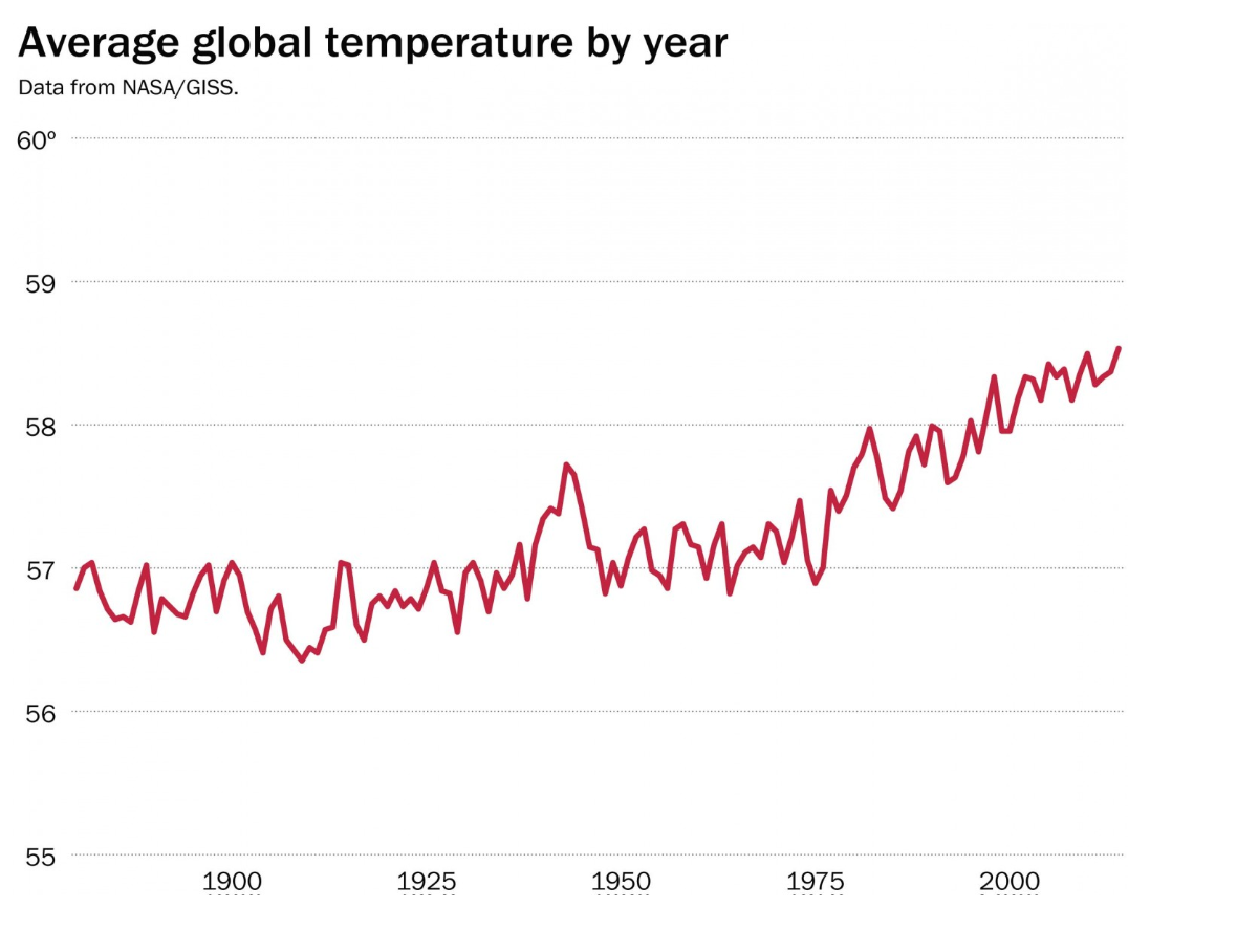
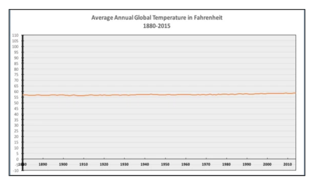
The importance between determining the proper use of the x and y axis can be seen in the following example. It is interesting to see how one small change can completely alter the message behind climate change: the first graph depicts a steady increase in temperature, while the second graph shows no increase over many years.
Questions:
In a time when stories form so rapidly and so many parties are involved (people, social networks, publishers, content distributors, etc.), who gets to decide what is real? How do we identify information that is tinted, incomplete, or manipulative that may support someone else’s agenda?
2. The Principle of Proportional Ink:
The principle of proportional ink discusses how many forms of data visualization use shaded areas to represent data values. To avoid misleading viewers, it is important that the size of the shaded areas in graphs are directly proportional to the value itself. Although the principle of proportional ink rule applies to bar charts, it does not apply to line graphs as the amount of ink is not used to indicate the magnitude of a variable. Instead, a line chart should be scaled so as to make the position of each point maximally informative. The article highlights several instances where this principle is violated, especially with the use of 3D.
By looking at multiple examples of poorly used 3D graphs, I agree that many 3D graphs are more difficult to interpret than 2D graphs because the angle that the graph is shown can make it difficult to correctly see the length or size of each bar. The sizes of some bars are fully visible, whereas the sizes of other bars are partially obscured. The 3D characteristics serve no additional purpose other than to impress the viewer.
Questions:
The article mentions 3D graphs serving a purpose when they are used to display values associated with a pair of independent variables, when are other instances that 3D graphs would be useful?
3. What Makes Bad Data Bad:
This article examines the “badness” of data, broken down into three main topics: substantive, aesthetics, and perception. The author provides both good and bad examples of visualizations in order to develop good taste-based judgements on how to represent graphics.
I agree with Tufte’s message that “complex ideas communicated with clarity, precision, and efficiency is that which gives to the viewer the greatest number of ideas in the shortest time.” Simple graphics that speak for themselves are most powerful, but most difficult to portray because of the careful balance between the data and the aesthetics. Perception, which lives in the gap between data and aesthetics, is one of the most difficult forms of “badness” to solve by the application of good taste or following the general rule to maximize data-to-ink ratio because we have to take into consideration colour, edges, contrast, relationships between data and how to represent them in a way that stays true to the fact we want to show.
Questions:
How do we make our data visualization distinct and memorable from one another?
How do we stay neutral in our style of representing data so as to not impose our own biases?