- Look at Data: What Makes Bad Figures Bad: Kieran Healy
Healy discusses the importance of considering 'how human visual perception works' while visualizing data. He describes why it is necessary to get into a habit of thinking about the relationship between the structure of data and the perceptual features of graphics. Although, the ggplot software can help us make the right decisions but it cannot really force us to be honest with ourselves, data and the audience.
- how even tasteful, well-constructed graphics can mislead us
- the perception of shapes, colors, and relationships between objects
- cognitive aspects of data visualization: we are quite literally able to see some things much more easily than others
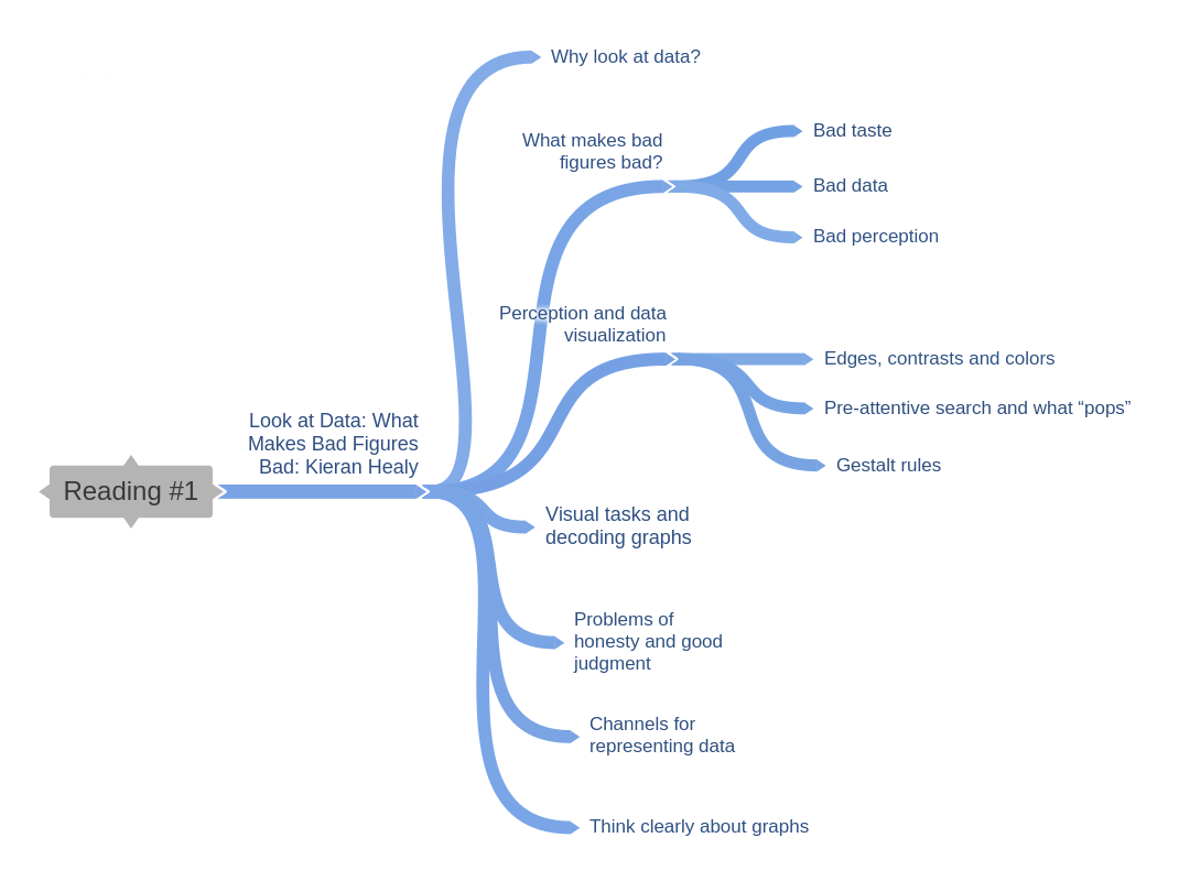
Why look at data: Anscombe’s quartet provides an argument about looking at data visually. It's demonstrates why it's worth looking at data but it's not all. Real datasets could be messier. Representing such datasets visually could mislead researchers and audience of the data.
What makes bad figures bad?: When the visualization is tacky, tasteless, or a hodgepodge of ugly or inconsistent design choices, we might never get passed the bad visual. In rest of the cases, even if the visual is aesthetically pleasing, it is not enough. We need to figure a way to make best use of the data. The graphs can be confusing or misleading even with good aesthetics which is of course needs to be taken care of. I feel if there's an alternate way to represent the appropriate data in a simplistic and a more comprehensible manner, an effort should be made to chose it. As Tufte states it using Minard's visualization of the Napoleon's march, there are no stated rules, we need to figure a set that works best for the representation of given content and avoid designing something that's a content free decoration.
The discussion about "data-to-ink" ratio reminds me of usage of 3D visuals where in-fact one can actually efficiently represent data with 2D visuals. Our understanding of data is largely dependent on how we perceive geometrical shapes and relations in general. Overly-elaborate presentation of simple trends may result into information overload instead of providing a simpler representation of the data. To grasp these issues we as data designers need to have an understanding of how perception works.
Perception and data visualization: As design can be used to help the audience is can also be used to trick them to the similar extent. The concept of cognitive bias has been explored and put to use in creating cognitive illusions such as:
- the snake illusion,
- the design of pattens and usage of colors in the carpets and wallpapers used in casinos that make you stay awake and play more
- The design of IKEA stores- like a maze- that makes you spend more time inside store and you end up buying more than what you anticipated.
Same is the case with using colors, contrast, light, shapes and positioning of these elements in relation to each-other. If shapes and colors bring in similar value to the visualization, it would be pointless to use both together and make the visual more complicated necessarily. If we look at the basics, Gestalt principles- Proximity, Similarity, Connection, Continuity, Closure, Figure and Ground, Common Fate - need to be considered while designing visuals. The mix and match can introduce more complexity in terms of additional patterns where there aren't any.
Visual tasks and decoding graphs:
- There are better and worse ways of visually representing data when the task the user must perform involves estimating and comparing values within the graph
- We misjudge areas poorly. Area-based comparisons of quantities are easily misinterpreted or exaggerated. Comparing the areas of circles is prone to more error
- we find it hard to judge changes in slope
Channels for representing data:
1. The channel or mapping that we choose needs to be capable of representing the kind of data that we have.
2. Given that the data can be comprehensibly represented by the visual element we choose, we will want to know how effective that representation is.
3. our graphics will depend not just on the channel that we choose, but on the perceptual details of how the implementation is.
4. The decision to encode a variable in a certain way of representation is not the same as deciding what type of plot it will be.
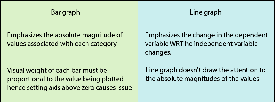
Every visualization tells a story. Any subtle choice by visualizer has a major impact on this story. Authors discuss some of these choices surrounding around how to choose the range & scale for axes of the graph. Authors talk about how the axes passing through 0 or not affects bar graphs and does not affect line graphs due to the difference in their visual density.
Following points to be considered while designing graphs in order to practice honest representations :
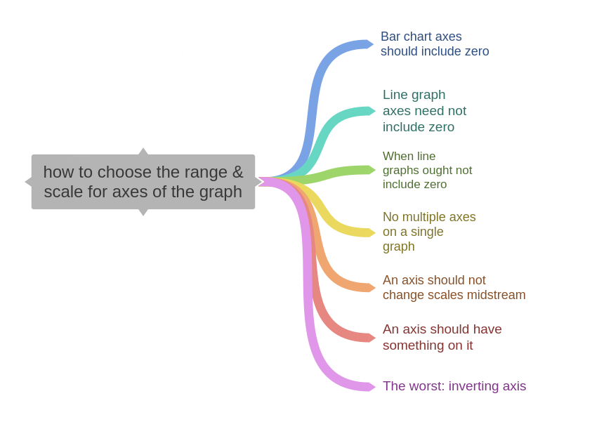
3. The principle of proportional ink
when a shaded region is used to represent a numerical value, the area of that shaded region should be directly proportional to the corresponding value.
- applies to bar charts while does not apply to line graphs
- The problem with bubble charts: only the vertical and horizontal positions allow easy and precise comparisons. Area based precise comparisons is not very intuitive to the human mind.